Forum Replies Created
-
AuthorPosts
-
Yes, Sue, that’s really great.
I’m looking for a slightly different pattern as shown in Mary’s #80959 Reply or my #80926 Reply. It looks like arrows all pointing in for lack of better description as opposed to a square middle of yours where the arrows point out. (not a great description, but take a look)
Maybe if you mirrored the two panels on the right and switched them with the left side it would all point in? I’m probably over complicating it.
Perfect, Mary! Yes, Rene’s way is perfect as long as the stripes are all the same thickness.
It needs a different method if the stripes have different thicknesses, or are different in any way except color – one more step, I guess you’d say. The last step is to merge the layers and do the Mirror rotate, 90 degrees.
I changed horses mid-stream and accidentally chose a stripe with different thicknesses, well, it wasn’t an accident, I just didn’t notice and didn’t know it would end up being important.
I recorded a script to do all this, and I was moving right along, with GUIDES and everything!!! But I don’t know where the script text went! I started, did my thing, and then stopped it. I went to look at the script to admire my handiwork and all that came up was the last script I used, which was one of Carole’s! Clearly I am not yet ready for Prime Time!
Okay, so I’m editing this because I got my threads mixed up. I clicked a link from email and thought I knew what he topic was.
And then I got my designers mixed up at Pixel scrapper. I just meant they all came from Marissa’s Store, my bad. Here’s the link for the above https://www.digitalscrapbook.com/sharon-dewi-stolp/designs/for-the-love-of-chocolate-paper-stripes-diagonal-graphic-pattern-blue. To be honest I just picked one I thought was namby-pamby (for non-native English speakers, it means “meh” or “dull and boring”. LOL!)
But The ORIGINAL from the OTHER Thread came from here.
I would link to the kit, but I’m not sure i can do that here, so I’ll add the preview pic. :))
See how it isn’t exactly 45 degrees? My first attempt was to make it a 45 degree stripe – DISASTER!
The first photo is what I came up with using Rene’s directions. It doesn’t quite match up
The second photo is what I came up with starting over and then somewhere in there using Rotating Mirror, Wrap, 90 degrees. Don’t know whether I could replicate it, or not, tho LOL!
If anybody wants one of these full size, let me know. The original came from Marisa Lehin @ pixelscrapper, CU, so it’s been changed enough to be passed around without violating the TOU.
Pirkko, What would happen if you merged the quadrants in Reply #80691 and then cut in half vertically and reversed right side and left side?
Mary,
These look useful, but they are both “pointing” out, not in. Rene’s test1 (Reply #80734) is the only one that is exactly as the example. I find it interesting that there can be so many variations for essentially the same thing, and that I only want one of them, LOL! I’m not usually so picky! And she’s right on the resizing. The paper in this kit is so bland, but when it is resized down and with the piecing I think it has more personality.
Suzy
That is perfect, Rene!! I have an image of how I tried that – more or less – but I’m embarrassed to post it. So I won’t.
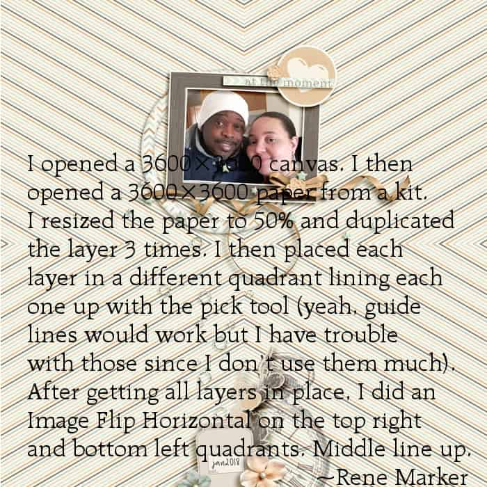
Once you get the hard part finished — the resizing and lining up — After getting all layers in place,
I did an Image Flip Horizontal on the top right and bottom left quadrants. Middle line up.
I think that’s where the Rotating Mirror comes in. But really, after you do all the hard part, what’s a little flip, right?
Thank you so much for doing this! I need to put it in a document.
You’re both right, I’m sure, except I can”t get the “arrows” to point in on all 4 sides. Mine looks like Pirkko’s. (And I’m sure it’s the Rotating Mirror, which is actually what I meant when I said Kaleidoscope, but now I’m also pretty sure there are 4 layers and you remove 3/4 of a layer from each layer. This from memory, though, of a long time ago.)
Our power went out so it will have to wait for the morning now. I’m on an iPad, so I can send this, but not test any more ideas.
thanks!
-
This reply was modified 2 years, 6 months ago by
Suzy.
Rounded corner, mostly the selection tool, so I guess thanks my fault, but the real culprit (today) was the eraser tool. All I know is the jaggies are still there in 2022 and it’s driving me crazy!
…..and you know what else is driving me crazy? It (2022] can’t read the webp pages. This girl isn’t selling any more, but I wanted to save the templates as little pictures to remind me to copy them ..https://czdesignshop.com/collections/frontpage?page=3
I can’t just copy because PSP won’t read the darn files! I have to do a million steps to save them. Can 2023 read these files?
-
This reply was modified 2 years, 6 months ago by
Carole,
Have they fixed the bug you talk about in this message? https://scrapbookcampus.com/Community/topic/using-scripts-in-paintshop-pro/#post-79886
And are the rounded corner shapes still pixelated? Have they improved any at all?
Hey again,
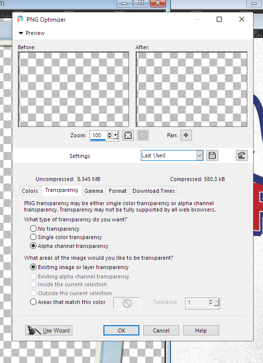
There is something called a .png optimizer…. it’s under File–> export.
At the bottom, there appears to be a way you can make the white background of a photo transparent, just by clicking that last radio button…does this work? Instead of tedious extraction? “areas that match this color”
Here is the popup.
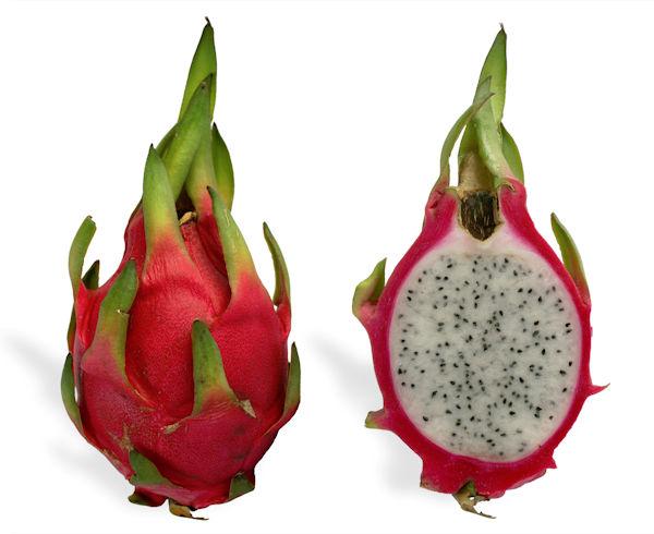
and here is the image I want with a transparent bg. in .png format.
I love seeing what you do with these scripts, Brian, and this is just as wonderful and amazing as your other posts! The blue and god is very, very nice, I assume you picked the exact shade of blue and it’s very rich looking.
I should also say that I am seeing scripts I have never seen or heard of before in your posts. No wonder: did you know there are 800 items in the store?
Ive been using PSP X2. On it, I have a bound script, see photo. All it does is add 30 pixels to all 4 sides of anything, .png or jpg.
I have a bound script in PSP x2 I want to put into 2022. The script is NOT where it says it is, (when you hover, the directory and folder pop up) and in fact, I cannot find the script anywhere! Apparently when you bind it, it makes a copy somewhere within paintshop files somewhere, unknown. Can you help me find it? THEN I can look at the directions to bind it to 2022, LOL!
Hey, You offer this in the Master Classes — Customizing your PSP 2018 and I was wondering – would it be time to do a Customizing your PSP 2022? Or is the 2018 about the same? I’m still trying to bind my scripts, and by that I mean I’m trying to get serious about doing it, so I am not doing very well. :((
Just in time for World Chocolate Day! Very nice attention to detail!
Very interesting about the flags…I didn’t know all that! And the brushed metals is good, too. 🙂
I’ll be going to Michigan in two-weeks. If you’re still interested in a postmark from Dowling, Michigan, let me know.Brian, this is amazing!
I went back to the store to see the script, and I am so impressed with how you used it! Totally different from what was shown in the photo, and so creative!June 19, 2022 at 1:15 am in reply to: Need ideas for captions for a storyboard array of photos #78177There’s my post!!! I didn’t forget to hit send! (Okay maybe t wasn’t as magnificent as I thought it was, LOL!)
Bees and Butterflies page – dang it! I knew that template script was too easy! (There is no space between the photos, and I think you’re right — that space is necessary in this case. ) There are two more template scripts in the store, and I own both of them, but I cannot find them. Don’t ask – this is part of the moving into PSP 2022 that isn’t going well.
Ok, primrose yellow coming right up. Well, I have to reboot it appears, but I will post it in yellow. And change the tags to yellow? I’ll go back and read what you said. And making them smaller after I get all the names and locations typed in. They will all be the same length. I deleted 80 EIGHTY gradients this afternoon! I have no idea how they got on there in the first place, but they were the awful violent ones I was talking about. Now I can see that I actually have a few usable gradients, and a few really nice ones.
I have a guy helping me with the style so he newsletter is more easily read on a phone….. That’s why they are so big – the text is really big. But he’s said size of text doesn’t matter as long as the columns are narrow, er I think that’s what he’s saying. I am sending him a test publication to see which articles are easier to read. I’m going to excruciating detail now so the issues all look the same..this one and the next one and the next one…
Going to see other comments and then reboot, then do Primrose….I’ll probably be posting when you have your morning coffee, er I mean tea???
Thanks, Sue
June 18, 2022 at 10:06 pm in reply to: Need ideas for captions for a storyboard array of photos #78134Hi, Here are my templates using the Speedy Scrap script :)) Then I broke the rows apart to add more caption space.
Is this what you meant? Because I could make these storyboards al day long!
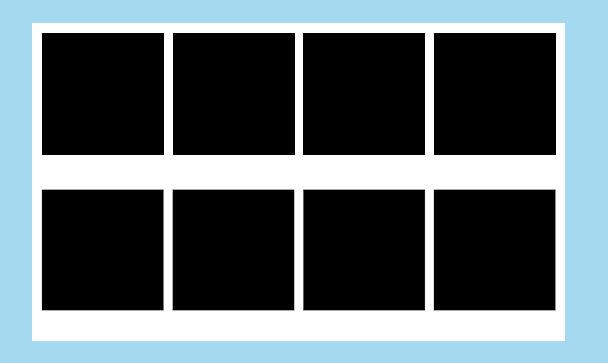
ere are 5 photos across — in case I ever need it, LOL!
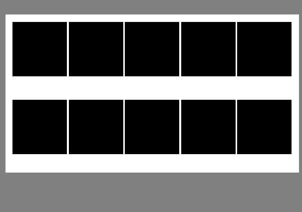
I could have made these all day long! You pick whether you want round or rounded corner or square. The how many rows, how many columns, and Voila!
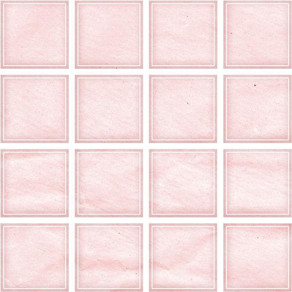
And then I found this in my stash – these are harder to use, because there is just one layer, but I liked the border. Never used it before and I’m not sure it won’t be visually confusing, but I thought I’d throw it out there.
I saw the gradient script – it looks too hard. We don’t get many of those colorful horizons here.
Oh, and I forgot — the blue tags on that photo is because I had a blue bg. and that blue is a color of many elements in the newsletter. (A style color)
This is what it looks like in the blue _but then I added a gradient just to see and forgot to delete it.
I was thinking the darkers colors made it pop, but its still a layered file and I can switch it back and forth. I don’t have the rest of the 2-page spread finished, so I’m not sure which will look better, though this blue is certainly more ‘gardeny’. But yes, I did have it as blue, with blue tags. (It goes out maybe July 1-3, so July 4th here)
Do you like the blue or the gray? Assuming I don’t use yellow – I didn’t realize that guy’s yellow sweatshirt would be so dominant!
June 18, 2022 at 4:19 pm in reply to: Need ideas for captions for a storyboard array of photos #78157I wrote a whole big post back on this and it hasn’t shown up – it was such a time consuming post, I wonder if I forgot to hit send when I got to the end? LOL! Let me wait another 1/2 day and I’ll rewrite it. It was rather magnificent and I doubt I can duplicate it. LOL! 🙂
June 17, 2022 at 12:15 am in reply to: Need ideas for captions for a storyboard array of photos #78116Ok. I was just going through my templates to try to find some that are lined out in a grid, but not much luck– I have thousands of templates, and they are all worthless because I can’t spend hours looking for the perfect one. I should just delete them all!
Soooo, next stop was the Creation Cassel Script Store (LOL) and I found not one, but TWO scripts for making templates…because I am not measuring every cotton pikkin’ square out pixel-by-pixel for every photo.
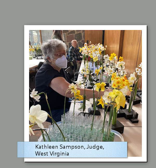
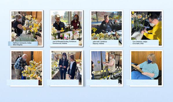
The problem with the daffodil photos is that they tend to be different sizes. Big collections are usually bigger than singles for example, and there is a lot of text with the names of the flowers.
I wish I had started with the winning daffodils and saved this stupid thing for last….it’s not even a good article, but there were so many people there wearing masks I thought it might be useful for posterity — But I might just buy the scripts to have.
I’m tired, but will address this in the morning…thanks, Sue!
June 16, 2022 at 11:48 pm in reply to: Need ideas for captions for a storyboard array of photos #78114Those are lovely – and exactly what I’m doing! So how’s that for service? Thank you, Sue!
Tell me about the background treatments on the Rose and the bees and butterflies — those look like gradients. How do you get them so subtle? I think it adds quite a bit to the design, but I do not think I have anything like that in my presets…mine are all sort of violent colors, maybe orange to purple back to orange again. Magenta and Neon Yellow.
This is what I was doing this afternoon…. It was using the Photo Effects. This is Dark Vignette Photo Effect. Maybe too subtle on the settings, though. I’ll know more when it goes up here. Sadly, it took me a very long time on PSP 2022. I am not handling the switch to 2022 very well. :((
Suzy
Hi, Rjay,
Welcome to the group!
Suzy
Such attention to detail! Well done!
My across the street neighbor was a Dowling (no natural children tho). He was a phenomenal person. Played tennis until he was 90, usually every day. I would come home from work and he’d be waving to me in his tennis whites.
Frank Stewart Dowling 1895–1986
Birth 12 DEC 1895 • Chicago, Cook County, Illinois, USA
Death 22 FEB 1986 • Indianapolis, Marion County, Indiana, USA
Father Samuel Dowling
Mother Margaret DowlingMOST excellent use of accordions…. So very clever, while also being useful.
These are all just excellent, but I’m going to comment on them all because they all deserve it.
I must say, that is pretty darn amazing! Well done!
Hey Brian, looks great!! We are cousins! (R1B cousins!). ? Sorry had to edit. The split migration path of mine is different from yours.
-
This reply was modified 2 years, 8 months ago by
So perfect! That Christmas poster is wonderful! Thanks for the heads up on Hitachi and the blog post. I was able to figure it out just by reading, so that’s really cool, but I haven’t done it as yet.
I had Google help, too.
Xenophon: General in the Greek army (c. 430-356 BC) renowned for his work “On the Art of Horsemanship” which described a progressive system of training horses and which became the basis for classical riding as we know it today.
-
This reply was modified 2 years, 6 months ago by
-
AuthorPosts