Forum Replies Created
-
AuthorPosts
-
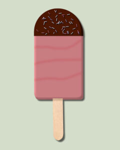
After the masterclass from last Sunday I wanted to have an icecream and as I haven’t one in the freezer at the moment I made my own! Strawberry and dark chocolate with some, not too many sprinkles. I made a sprinkles tube some time ago and now was the time to use it again. I follow many of the tutorials and have made a lot of stuff that is now ready for use. As you maybe notice my popsicle stick is not perfectly in the middle and a bit on an angle because I have never ever eaten such and icecream that had its stick in the middle, have you? This was all about making an icecream but the principles and techniques can be used for other projects.
Brian that are a couple of lovely patches and interesting how you used the script multiple times!
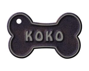
I was still doing those blockletters and Sue showed that you can have them transparent too. I’m not entirely happy with the result though; I think I have to make the angle of the block a bit different. But I wanted to make something with them. The heart with the paws was a freebie by CF today, very timely! On the pictures of the dogs I used the PaintSplash script and made nametags but in this resized version that is difficult to read so I include one of them and made them with the tutorial in the Lab for this month (Lab 12-7). The dogs are not mine but belong to my daughter and I took the photos when I was visiting in America.
Pirkko lovely colors in this layout!
Brian you have outdone yourself on this silver screen!
L = Loving
E = Endless
Michele I agree with you on the Block Shape and I think I’ll use it more often too because it is so versatile qua colors, patterns, gradients.Lovely Canada Day, so simple but effective!
Wishing all my Canadian friends a Happy Canada Day!!!
Dawn your memory is correct! I still make cards for family and friends and I’m always on the look out for new ideas. If by chance I do not have an appropriate card they all tend to be disappointed.
Have a nice weekend,
Corrie
A = Arguments, sorry to start with something a bit bad!
Dawn thank you and it is good to see you here again. I hope we get to see some of your wonderful work in the near future.
On Facebook Sue Thomas pointed me to the Block Shape tutorial and I gave it a try. This is not related to a project, I just played around seeing what I could do using different colors, texture and gradient on some letters. With hindsight I could have tried some glitter as well. Those blockshapes are very easy to make, maybe I’ll use this technique for a title someday.
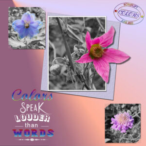
This is my scraplift layout. I followed more or less the given page and made the photos black and white with the flowers in color; the middle one is also done out of bounds. I liked the radial gradient and made one from the colors in the photos. The little photos have their corners slippd-in. Looking at the page now, maybe I should have included the names of the flowers. I’ll do that tomorrow because now it’s bedtime for me.
Pirrko, lovely page and nice to be able to go for a swim when it is that hot!!!
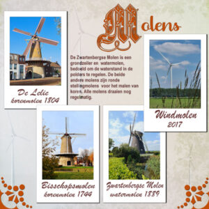
Okay, second try to post my letter M. I forgot that I had some wrapped text and of course lost it on resizing, but I noticed just in time. The M is for Molens (Mills) and shows the mills in Etten-Leur. The Zwartenbergse Molen was used for regulating the waterlevels in the polders. The other two are for grinding corn. All three mills are still in working order. There are a lot of the new windmills in the vicinity and I extracted one and put it as an overlay on the background paper; I hope it is visible.
Mary a lovely layout for that Lab, I admire you (and the others) that do all the Labs! I don’t have the time for it but I do pick elements that I like and save them for later use. I did make the tied string on a tag and have used it on some other layouts.
Michele nice to see some new Fab Divas and I especially like the Country Charm!
I don’t have a subscription either. I have more then enough with the free fonts and other goodies if I like them. Besides that, there are frequent offfers of a free bundle and there is the font of the week too. I get every day an email with the freebies of that day! The bulk of my fonts I collected this way. I have McAfee Antivirus and had no problem with the New Pose font, so who knows if there was a virus or not…
I wanted to give the cilinder shape a try, it is some time ago that I did one and made 2. But I find that a cilinder on its own is a bit boring to show off, so I played a bit and turned them into vases with some flowers. The border is made with the mitered-corner script. The flowers and leaves I have in my stash. It is a simple layout but I enjoyed myself.
I totally agree with Sue and Carol! Creative Fabrica has 3 freebies everyday and one is always a font. I have noticed that they circulate their fonts sometimes, so if you missed one it is worth waiting for it to turn up again. I am not interested in embroiderie, at least not nowadays, but I could make my cousin very happy with some of their designs. And of course it is always wise to be cautious what you download; my virusscanner does a good job on that part.
June 21, 2022 at 4:15 pm in reply to: Congratulations to the winners of the Corel Animal Photo Contest #78262Sue congratulations to you and very well deserved!!! Especially with your favorit topic: Insects
Y = Yorkshire Coach Horse, I knew from years of looking to the BBC and from traveling around Yorkshire there was a kind of horse mentioned. I did a google search and yes there is: this one.
Sue thank you for your comments; I learned a lot from looking at your layouts and it is all in the details, isn’t it!
Your Prairie Rose without the quote would make a great card too!
This “simple” TUT/TECH Challenge has a great result with so many so different layouts!
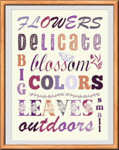
I did something completely different for this challenge. Because it is about multi-colored text I decided to go with some wordart. It is a while since I did some, In the recent Labs is a mention of colorpalettes and there are 2 called Blooms which I used for this layout. I used different fonts, the elements are fonts too. I used a frame, that Sue Thomas so generously shared with us a couple of weeks ago. It had the exact size I needed and saved me some time!
Sue your layout is gorgeous as always with those photos!
June 18, 2022 at 4:36 pm in reply to: Need ideas for captions for a storyboard array of photos #78158Suzy, forgetting to send after you have writtten a blogpost has happened to me more then once and it still does sometimes. I go to submit and when clicking on the button I move my cursor if I’m in hurry or just not precize enough. I learned to live with it. LOL!
Pirrko that is quick and I love this!
T = Thoroughbred
Sue and Lynda I too read the newsletter and so glad that both of you are finalists. Your photos are outstanding and good luck to you!!!
What, nobody here?
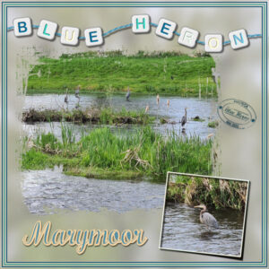
This palette, although it has sort of beach colors, didn’t let me think of the sea, but it made me think of the Blue Herons I have seen nestling in Marymoor Park. I came there almost every day with my daughter walking the dogs. At that time we couldn’t see the young birds but we certainly could hear them. My daughter told me today she sees them now flapping their wings on the edges of the nests; so it will not take long and they all are gone until next year.
I startes with a template from the Mask Workshop, but adapted it for my photos. The background is also a photo used as an overlay and blurred. I am making al sorts of elements from the tutorials and labs. This time I wanted to make letter beads and I used the colors from the palette. For the string and datestamp too. In the Q&A session from last Sunday Carole explained how I could solve the problem with an outline on text. Of course I wanted to show that I’m happy to be able to use it.
With the help of Google:
Q – Quarab, a mix of the Quarter horse and an Arabian horse.
Hi Rjay, welcome in the Campus! I hope it will help you learn more about PSP, as it has done for so many of the members including myself. It is up to you if you want to give scrapbooking a try, but whatever you choose you will benefit from all the workshops, challenges and tutorials and not to forget this community that is so helpful if you should need it.
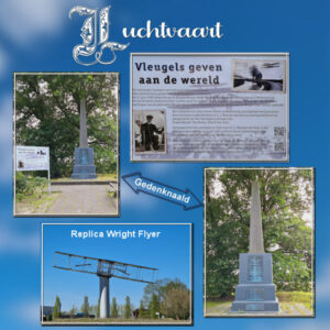
In my village was on the 27th of June 1909 the first take off and landing of a flying machine (Wright Flyer) in the Netherlands! It took only 6 minutes for 1 km on a maximum height of 15 m. The location was the “Klappenbergse Heide” and there was a crowd of ca 30.000 to 40.000 spectators from all over the country and beyond. On the spot where it all happened is now an obelisk (gedenknaald) and an information plaquette. On a roundabout is a replica of the Wright Flyer on a pilar. It was the start of aviation in my country.
My layout is very simple: the background is a photo of a nice blue sky with a lot of blur. I took a couple of sky photos some time ago for use when needed. The title “Luchtvaart” means aviation.
Wow, beautiful mandalas and lace!!!
-
AuthorPosts


