If you have followed some classes or tutorials in this Campus, you might have noticed the use of the "Lock Transparency" command. You might have just repeated the steps, without necessarily understanding how it works. But it works, right? Let's have a look at that specific command that we use so often in our tutorials.
What is transparency?
On any image, all the designs are created using pixels. Each pixel will have a particular color, and in many instances, a degree of opacity. Some pixels will be completely opaque, so you don't see anything through. Other pixels will be somewhat transparent and will let you see something behind them.
Let's look at an image like this one:

It is created using a brush. Some areas are more opaque (darker) than others. Let's have a closer look at those pixels. When you hover over a pixel with the Dropper tool, you will see a popup showing the color values and the Opacity level.
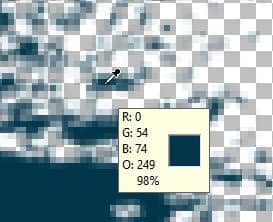

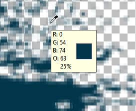
Notice that the darker colors have a higher opacity level (in %). Those faint pixels are particularly important when you have curved edges. If all the pixels were totally opaque, it would be really hard to get a smooth edge on a curve. It would be like trying to make a smooth curve using square blocks.
Selecting with the Magic Wand
When you use a selection tool like the Magic Wand, you can select the mode (based on color or opacity for example). You can also choose the tolerance value for the selection. However, whatever settings you choose, the Magic Wand will check each pixel and determine if it should be selected or not. So in the end, the selection tool will choose to include or exclude that pixel. Now, the problem is that, if you wanted to change the color of that area, based on the Selection tool, it will not take the opacity into consideration.
Let's make a selection of all the pixels on that brush imprint, in the example above.
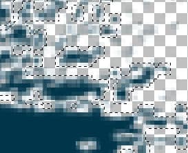
You can see that some pixels are darker (more opaque) and some are lighter (more transparent). If I choose to use the Fill tool and change the color to red, this is what I will get.

As you can see, the red color is applied to the individual pixels in the same way, no matter the opacity. It is EITHER filled OR not filled. No in-between option. In the end, that will give a pretty jaggied result, and the shading effect is totally gone.
Lock the transparency
In the Layers palette, there is one icon for the Lock Transparency.
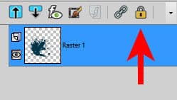
When you click on this icon, you will see a lock appear on the right side of the layer. This is to tell you that the transparency is locked for that particular layer.
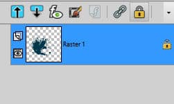
Now, let's undo the Fill command we did earlier, where the result was pretty bad. If we want to change ALL the blue pixels to red pixels, let's select everything with Ctrl-A. And now, let's apply the same Fill command, now that the transparency is locked.

Isn't that much better? No blue "ghost" pixels and no sharp corners. We really did replace the blue pixels with red ones, but without losing the variations in opacity.
Although we used the Fill tool, we could have painted that area by brushing with a Brush. The result would have been the same: the opacity level would be respected.
Once you are done, remember to UNlock the transparency or your next commands might not behave as expected.
What else to do?
Although the Lock transparency will allow you to maintain the opacity level of all the pixels where you paint or fill, there is another advantage of using this command. It also will ignore everything that has NO pixels. This means that you can paint without risking going over the edge! It just won't let you. This is how you can paint very intricate designs, like lace without messing up. Or, even if it is not as intricate, you can paint wordart for a custom result. Check out this article on how to paint wordart. And if you want to change the color of intricate lace, check this article.





3 thoughts on “Using the Lock Transparency”
I didn’t know the dropper had % of opacity! I thought it was just the RGB! Thanks!
Now if Corel could make it easier – like using the right click, and then make it easier to remember to “turn off”, it would be a lot easier to use.
I appreciate this tutorial, it’s very helpful. As long as I’ve been using psp, you still teach me new things all the time. Thank you Cassel! Have a beautiful day!
I had no idea why we locked transparency in some of the classes. Thanks for explaining it.