-
Posts
3,518 -
Joined
-
Last visited
-
Days Won
91
Content Type
Profiles
Gallery
Forums
Everything posted by Ann Seeber
-
U = utensils
-
P = pickles, of course...
-
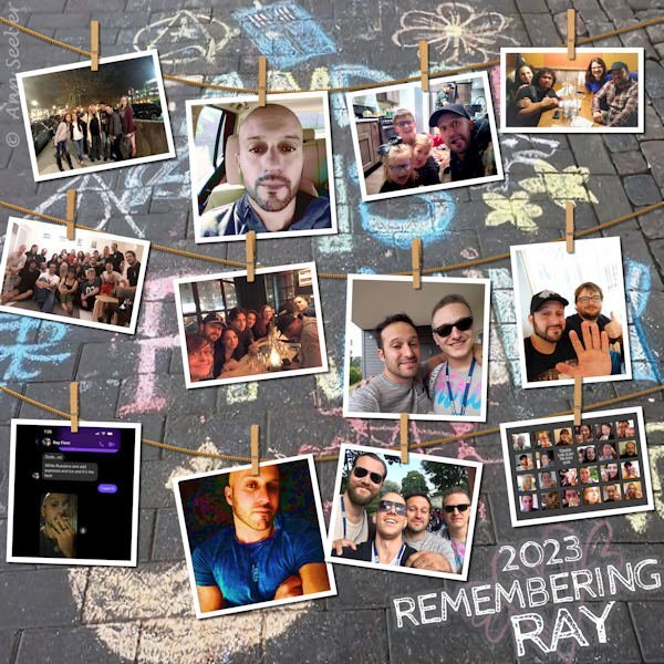
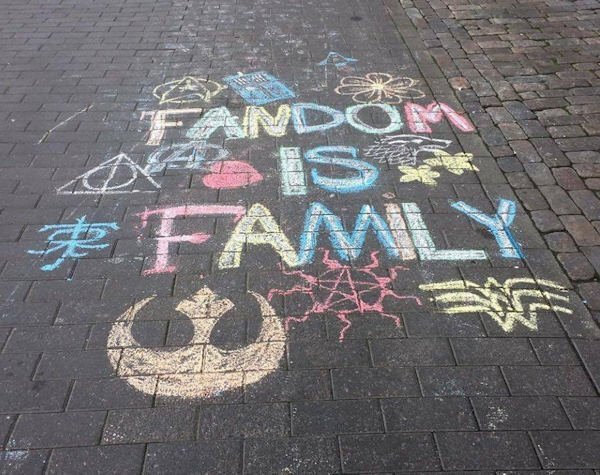
Here's a project I've been working on the last few days as a remembrance of a friend that passed away last week from a malignant brain tumor at the age of 43. He and I are part of this rather large Facebook group that were fans of pop culture and started with Game of Thrones. We're all devastated at the loss of Ray. We knew he was not in the best of shape, suffering total blindness, but the end came quicker than we anticipated. We had been recording book readings for him as a way to stay in touch. I gathered all the photos my friends were sharing on their individual posts for his friends and family (we call it our Fandom Family). I used the cass-hanging photos script because I had 12 photos to showcase. The background is from a photo of a chalk drawing one of our group did at a convention in Europe. I had two photos of Ray, alone, and tried out the new Corel engraving-brown script on them. After trying the saturation layer effect I was quite impressed. I'll let you see the originals, also. I spoke to Ray on the phone a few years ago, before he got ill, as he was looking into moving to my area. R.I.P. Ray Fiore, you'll be sorely missed. ? EDIT: Forgot to mention, the font is Cabin Sketch.
- 255 replies
-
- 12
-

-

-

-
L = Lettuce (I like lettuce on my burger, and in my salad)
-
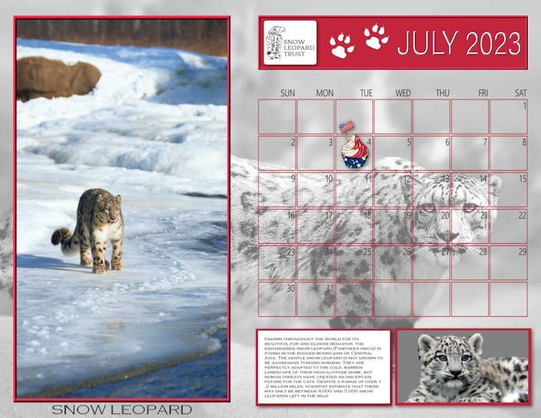
The first thing I like to post is my new Wild Cat calendar for the month. It features the Snow Leopard, the gentle giant of Central Asia. These calendar templates are very large, measuring 4200 x 3245 px. I've been using PSPs print function and get nice 11x8.5" prints on my desktop Epson. I have put a full size jpg in the Files section of our Facebook group: Scrapbooking with PaintShop Pro. The leopard photos are from Unsplash. Here's a copy of the journaling which is rather small in this version: Known throughout the world for its beautiful fur and elusive behavior, the endangered snow leopard (Panthera uncia) is found in the rugged mountains of Central Asia. The gentle snow leopard is not known to be aggressive toward humans. They are perfectly adapted to the cold, barren landscape of their high-altitude home, but human threats have created an uncertain future for the cats. Despite a range of over 1.2 million miles, scientist estimate that there may only be between 4,000 and 7,000 snow leopards left in the wild. EDIT: Unhappy with the background and lower image, I made some changes.
- 255 replies
-
- 13
-

-

-
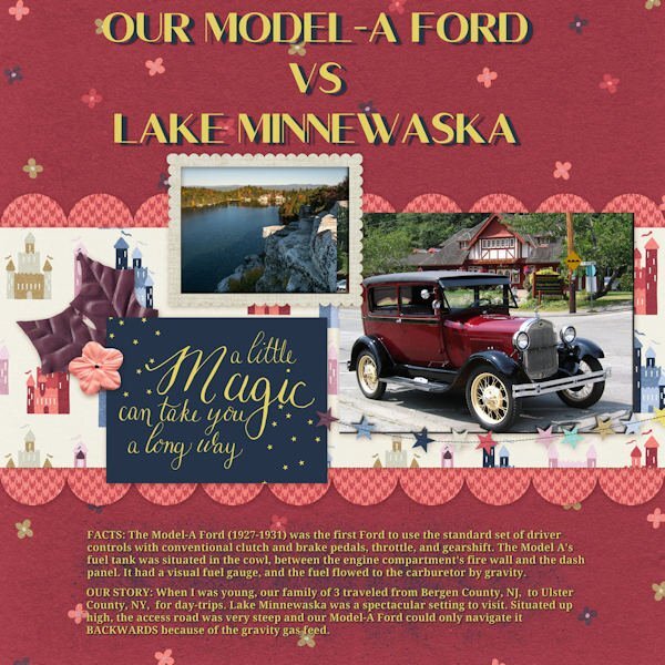
I'm not sure. I was quite young at the time. Here's the data about Lake Minnewaska if you're interested. It's quite spectacular.
-
Well, guess what? I have one more QP for the Day 8 assignment. I downloaded a few from Digital Scrapbook and this one is from Marisa Lerin called QP-Slovenia03. I decided to combine this with the Random Challenge to tell a personal story. The title font is Corlita Sans; the journaling is in Droid Serif. Behind the text I brushed some dark blue with a brush called cass-Dispersion2. The journaling is a bit small so I'll repeat it here;
- 15 replies
-
- 10
-

-

-
Well, guess what? I have one more QP for the Day 8 assignment. I downloaded a few from Digital Scrapbook and this one is from Marisa Lerin called QP-Slovenia03. I decided to combine this with the Random Challenge to tell a personal story. The title font is Corlita Sans; the journaling is in Droid Serif. Behind the text I brushed some dark blue with a brush called cass-Dispersion2. The journaling is a bit small so I'll repeat it here;
-
Thanks, Dorothy! If I wasn't in the mood to celebrate America's Birthday on the 4th of July, I am NOW! ?
-
Yes, I suppose that would work but unsure how to link to something that was posted on Facebook to begin with. That's why I shared Jackie's post to our FB group.
-
Gerry, yes. They looked healthy and content. The welfare of wild species in captivity is one of my passions, especially wild cats and my zookeeper granddaughter is following in my footsteps.
-
That's about how the ostrich at the safari looked!
-
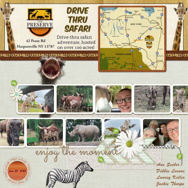
QP-7 - Our drive-thru safari. This layout was good for all the animals that were around and almost inside our car! The font is Brush Script and the ostrich head came from PNGALL. I scanned a flyer from The Preserve for the details and map on top. I will also post this in Facebook and in the comments post the little, very funny video that Jackie did from the front seat to the back and you'll see what I mean about the animals almost "in" the car. ?
- 382 replies
-
- 11
-

-

-
I think I hear Bing Crosby in my head, Gerry!
-
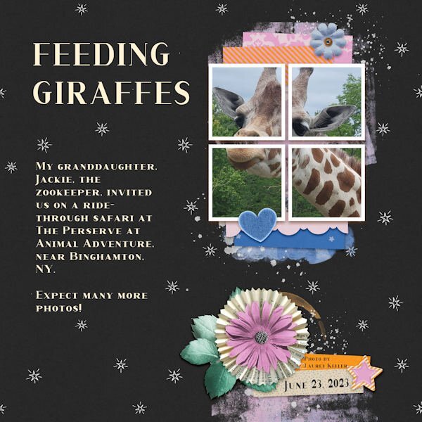
QP-6 EXTRA - FEEDING GIRAFFES. My visiting daughter, Debbie and her sister, Laurey, plus Laurey's daugher, Jackie, the zookeeper, went on a drive-through safari on Friday. It was at Animal Adventures, The Preserve, near Binghamton, NY. The font is Corlita Serif. The photo was taken by Laurey on her Galaxy mobile. (It takes superior photos!)
- 382 replies
-
- 12
-

-

-
- 382 replies
-
- 13
-

-

-

-
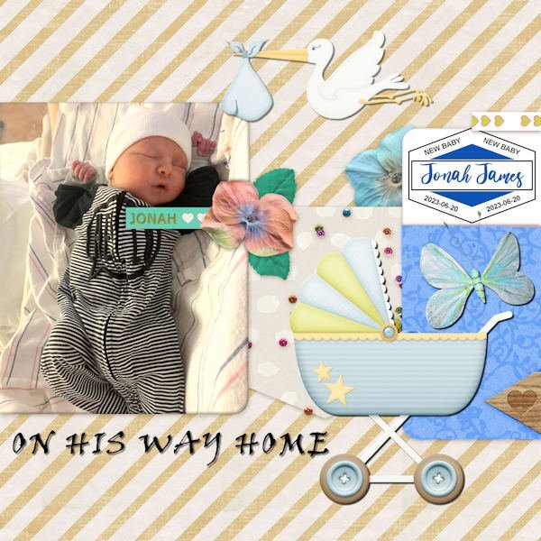
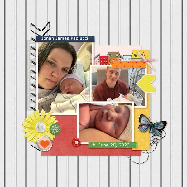
Getting started on catching up. I've been traveling around with family since Thursday so I'm WAY behind! This is QP- 5 - featuring new gg Jonah James on the day he came home from the hospital. The font is Viner Hand for the title. The label on the right was from Carole before she released her new script.
- 382 replies
-
- 13
-

-

-
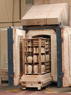
A kiln is a thermally insulated chamber, a type of oven, that produces temperatures sufficient to complete some process, such as hardening, drying, or chemical changes. Kilns have been used for millennia to turn objects made from clay into pottery, tiles and bricks. Wikipedia
-
Very well done! Next, Chanel's ad agency will come calling for your talents!
-
Jannette, as a solution for your background texture problem, I think I'd make separate layers for each section. Then I could fill a selected area with whatever and it would be confined to that layer. Allover, this looks very interesting.
-
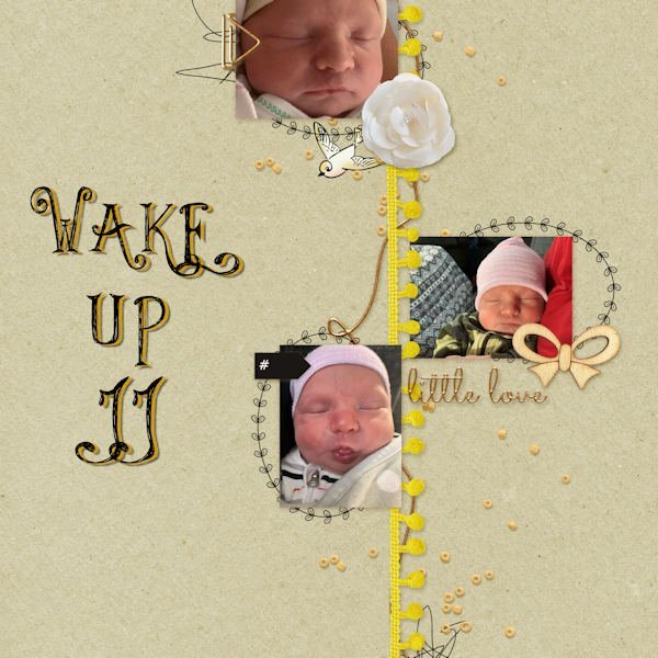
Finally got started on QP-3. Here's the new baby and family. His name is Jonah James but they call him "JJ"
- 382 replies
-
- 14
-

-

-
The font is Viner Hand but I treated the raster version to the sculpture effect with a gold pattern.
-
Now it is the correct Facebook header. Thanks!
-
Tried twice, re-booted the page but still getting the collage.....
-


