
Steve Kovacs
-
Posts
28 -
Joined
-
Last visited
-
Days Won
1
Content Type
Profiles
Gallery
Forums
Posts posted by Steve Kovacs
-
-
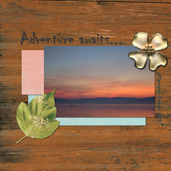
I am more relaxed when I am enjoying the outdoors. One of my favorite locations for hiking and camping is Algonquin Park. There is just something about the call of a loon that seems to melt away any angst that has built up and allows me to relax. Thanks very much for putting together these sessions Cassel. Greatly appreciated.

-
 3
3
-
 4
4
-
-
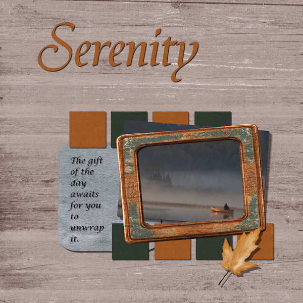
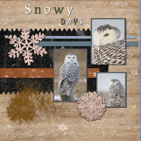
This is the adjusted image with frames around the images. I kind of like the effect that it did however the colour fill did not go all the way around the images. Thanks for the reminder of not having to put shadow on paint text or splashes.
-
2
-
3
-
-
Something new that I learned so far, just about everything as I just started digital scrap booking. Thanks for organizing these sessions Cassel and hopefully there are more progressive sessions to follow this up with.
-
Thanks for these. I will have to go back in later to see if I can edit the frame around the images. For now I just used another layer.
-
5
-
8
-
-
Hello. In doing this next project I am not sure why but when I chose the magic wand and click on the photo that I want to place a frame around it selects the entire back ground???
-
1
-
-
16 hours ago, Cassel said:
@Steve KovacsLovely quote and lovely photos. For your elements used to decorate, did you stretch them horizontally? They look a little... odd.
@Lesley MapleBeautiful cause and you showcase those photos very well. Good job in resizing the images without distorting them.
@GabrielaDid you create the text yourself? It is lovely and the combination of fonts gives a great result! Good work. You might want to adjust the paper width so the text does not end up over the edge.
@Ann SeeberI hope you share this page with the photographer! Who knows? You might convince him to showcase his photos in a "scrapbooking" way!
@Leslie JostesYou are doing a great job and photo books might feel "plain" while you can definitely add "scrapbooking" ideas and techniques to make them spectacular. Keep it up!
@TonimarieThose are such cute photos. They definitely deserve to be showcased! Great result!
@Gerry Landreth Great composition. I would be a little careful with overlapping two buttons! They would be hard to stick there. Also (and this is a tiny detail), notice that the light spot on the buttons indicates that the light is on the top RIGHT. You would need to rotate them 90 degrees to the left to be consistent with your shadows. This might have been a discrepancy from the start as the designer might not have noticed that.
@Mary SolaasI think I see a shadow on the text for your journaling. With small text, adding a shadow would make black text harder to read.
Are you ready for the 4th project? It is coming tomorrow!
Hello, as my supplies were limited at the time I did this project I did not have many elements to choose from. So yes, those were stretched out a little. I have since acquired more kits.
-
1
-
-
The paper and elements have been randomly selected from the digital scrapbook site.
-
1
-
-
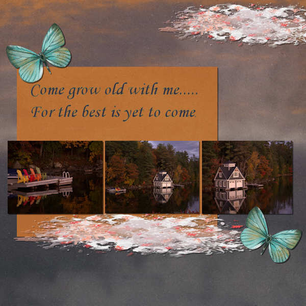
The quote is one that my wife has used over the years many times. This looks like a perfect spot to do just that.
-
6
-
 1
1
-
3
-
-
-
15 hours ago, Cassel said:
@Leslie Jostes Better late than never. Welcome to the Bootcamp and you will see, you should have time to catch up. I see you added not only personality, but your personal bite mark! I hope it was good!
@Anja Pelzer Nice tablecloth that you did from scratch. Thanks for sharing your process. For your project 1, be very careful about rotating the buttons. A small rotation might work, but if you look closely, the 3D effect is rotated too much. I tend to never rotate more than 30 degrees on any element that has obvious texture/bevel/shading.
@Suanne Bundy Did you get the first few links yet? Let me know if there is any issue.
@Lesley Maple It is quite interesting to have such an angle for a photo. Even though that is exactly what you see when you walk your dogs, that is not typically how people take photos! That is creative! And your page looks good too. I see that your shadows are all accurate and consistent.
@Thomas WillisGreat page. Did you take the photo yourself? Don't hesitate to share that! It is part of the story!
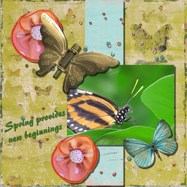
@Steve KovacsThat is a stunning butterfly (the metal one I mean). Can you share what resource you used? I would be a little careful with the width of the shadows. Can you try to make them about half the size you used? It will make your paper element stick more to the background.
I see dozens of registrants who have not posted. Don't be shy!!! We are all here to help you and appreciate all your projects. We want to see them!
The kit came from the first site that you referenced as a source for paper in day threes instructions. Fortunately one of them had butterflies as a subject.
-
1
-
-
-
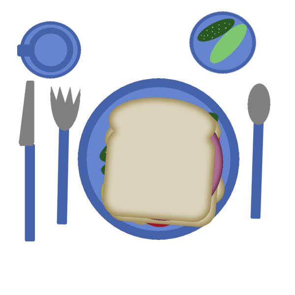
This was my enjoyable club sandwich. Although it does not look like it, it is toasted but the toaster was not working properly. There is a side plate of extra crunchy pickles.
-
7
-
-
I am having an issue in getting the two files to appear beside each other in the work space. You mentioned something about working with tabbed documents. It is not helping whether I am working with or not.
-
Sizing is correct now I just need to work on the image quality. Eventually I will get there.
-
1
-
-
Thanks for the quick response. I guess this would apply to the image that I am trying to use for profile as well as I cannot seem to get below the 51k threshold.
-
1
-
-
So, my first question is how to size the screen capture or image that I am posting here so that I do not improperly oversize them as it looks like I may have on the first one above. The sliding bar refers to image quality and not pixel size when saving. I want to make sure I am following the 600 pixel sizing. Thanks
-
1
-
-
This is how I will be set up within the editing screen for working.

-
3
-
-
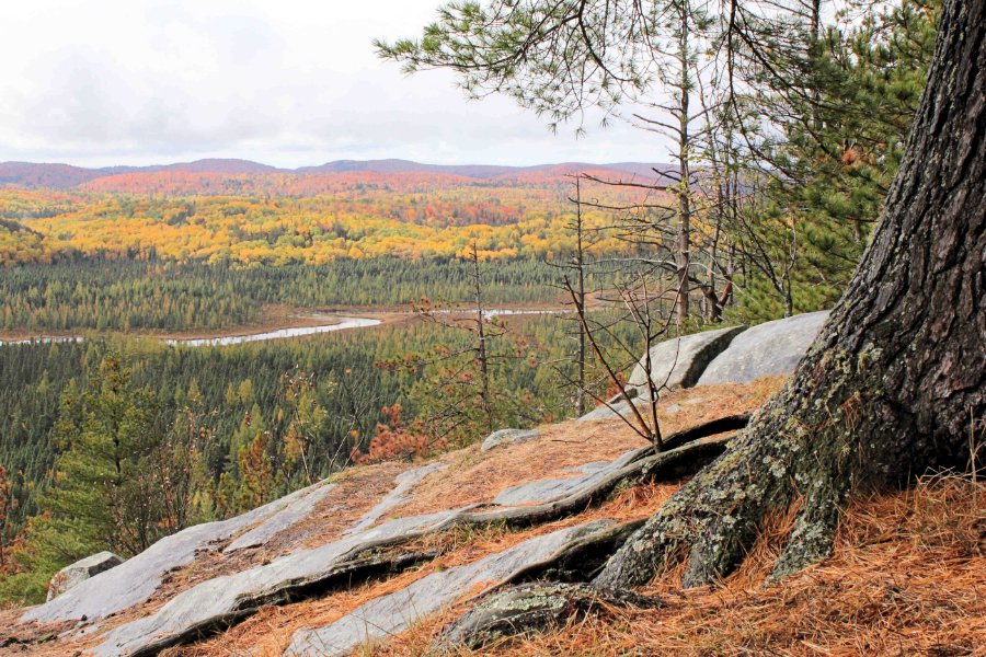
Hello. Looking forward to learning how to capture my memories in a different manner other than just photos. I mainly enjoy hiking and camping as a source for many of my photo inspirations.
-
3
-
3
-

Scrap Bootcamp - January 2023
in Showroom
Posted
Pretty well every lesson was new for me. The features that were used that I will use a lot is the merging of different layers so that you can move more than one element at a time. The other was the cutting of the paper using the erase tool. Thanks for organizing and your input Carole.