Susan Ewart
-
Posts
4,589 -
Joined
-
Last visited
-
Days Won
170
Content Type
Profiles
Gallery
Forums
Everything posted by Susan Ewart
-
 Quick Page Facebook Template Lesson 1
 -
 Quick page Extra - Lesson 1
 -
 Quick Page Lesson 1
 -
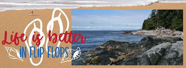
QP FB template Lesson 1 Again, another shot of the beach. You can walk for miles there with sandy sections and rocky sections to explore. I miss living near the ocean.

- 382 replies
-
- 11
-

-

-
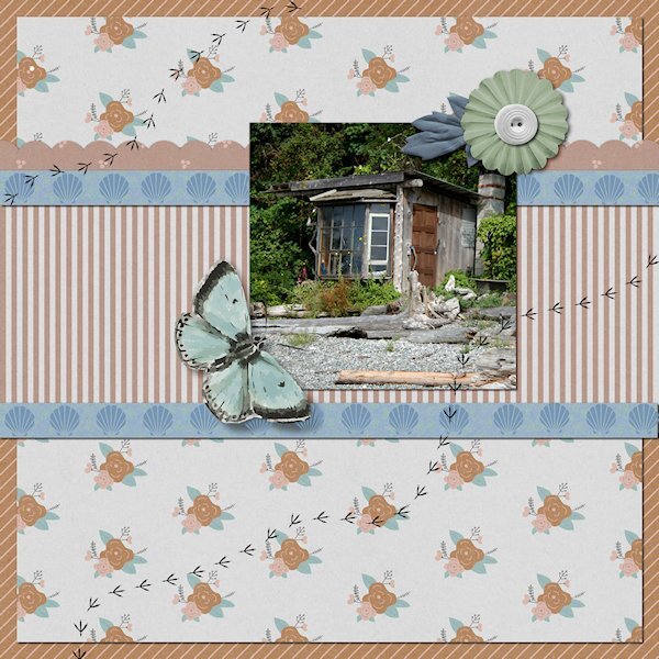
QP Extra Lesson 1 This was another little odd shack we came across on our walk. I would love to see inside these places. My friends cabin had been in the family 3 generations and they have a sizeable property going up the hill with another cabin and creek beside that they had the water rights to. Because of the close proximity to Vancouver, there is now huge mega houses on this beach. I love the quirky odd shacks, too bad they are all gone now.
- 382 replies
-
- 13
-
-
-
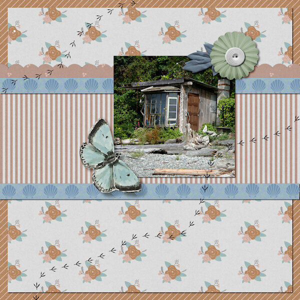
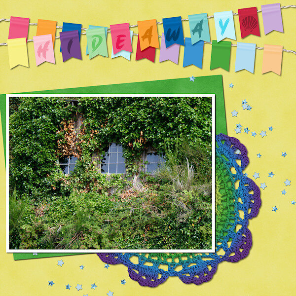
QP Lesson 1 Front used: Brush King Photo: mine from 2007, Visiting at a friends cabin in Gibbsons, BC. Also known as the Sunshine Coast along the Straight of Georgia. It is 31 kms from Vancouver, BC and 40 minute ferry ride...even though it's actually on the mainland BC and not an island. My friends cabin is right on the beach (Pacific Ocean) and this was one of the old cabins we came across while walking on the beach. All you could see was these three windows and bit of the roof, the res was covered in greenery.
- 382 replies
-
- 14
-
-
-
They are a good challenge and keeps me focused on actually creating something, instead of sitting down and staring at a blank screen and not knowing what to do.
-
I'd like that too. I dont use it as often as I want. I still have much to learn about PSP. It's hard to find the time to fit everying in that I want to learn.
-
I'm in too. I might do the non scrapbooky layouts this time around. Or not. I dont know.
-
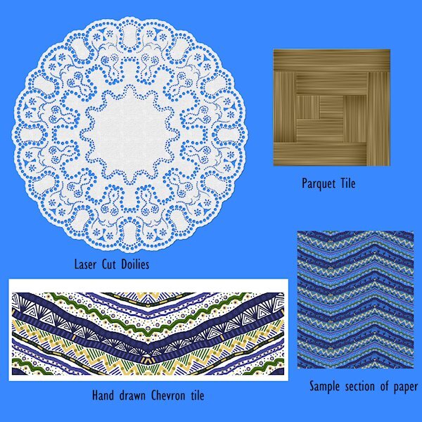
 Lab 6-10 Hand Drawn Chevrons Laser Cut Doilies Parquet
 -
Thank you Suzy. It was really absorbing to make the pattern. It was too busy as a full size paper, for me anyway. But I played around with sizes and changing color and made something I liked. I managed to mitre the corners on the frame around the parquet. that was brain teaser....might have to get that script. I like your idea of using that patter in a letter or shape. Same with the doily, you can get absorbed in making the dots. They will always be one of a kind elements.
-
here's the elements from Lab 6-10. I left the background off the chevron so you could see just how crazy I made it.
-
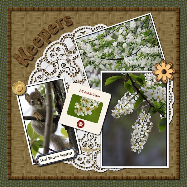
Lab 6-10 Hand Drawn Chevrons Laser Cut Doilies Parquet This was a fun Lab. My hand drawn chevrons were too busy so I had to make them really small in the layout (background paper). Good learning for next time. Fun to make though. The doily was cool how it comes together. Thanks to great directions I managed to get it done. Again, i was a little too ambitious with the design. My favorite was the parquet tile. Funny, I neve liked parquet floor, but I loved this tutorial. the color I chose makes it look like bambo (albeit a little darker). I used the original tile (used to make the parquet square tile, which is used as a pattern for a paper) to make a frame around the "table" my pictures are on. I used an alpha instead of a font and changed the color a bit to match and really liked the look. Go Alphas! Here's the deets: Flower/brass button/slide frame: from my kit in the Build a Kit workshop Bookplate: KMRD-A Good Day-bookplate (Digital Scrapbook) Screws: cass-screwheads (picture tube) from Creation Cassel Alpha: Digi-Dewi-Kumbaya Photos: mine
-
Weird to get complaints about FF, I know I had asked for it(the class). If you have something I dont have or do, it's still interesting to me to see what it's about so I know if I want to get it or not. And usually later on, it does become something I want and I am pretty grateful there's a workshop on it.
-
These are fabulous. You will make good use of them, and they are one-of-a-kind too.
-
It's all done Mary, the illicit contrand has being uploaded. Enjoy! And thank you for the signs and especially the snowflake. I love snowflakes.
-
I just posted the original in the files section on the FB page. Cant wait to see the script in action. I love concrete and have my eye on a chiped out piece on my steps that would make a cool mask. I'm happy to say I am a fully fledged texture-holic.
-
WOW! unreal, the change. You are doing really good works with this tool. I loved your layout, it's well done. And the photo, it's cuteness overload.
-
I sure can. Just running out for an errand and will do it when I get back. Good information about what FB lets you post. This is so cute. You make good use of your hour or two. What you create in that short time would still take several days.
-
I love old dilapidated buildings too. Same with old machinery, industrial stuff, etc. Not much around where I live though. I like going to resconstructed ghost town attractions, train museums as well, there is a lot of texture in places like that.
-
I'm glad you told me about it. I think I will pass on it. I have to decide where best to spend my time. I think I need to really concentrate on learning PSP before I lose time to learning another complicated program. I really like what you did in a short time using that program, the papers are very nice and I'd love to have them.
-
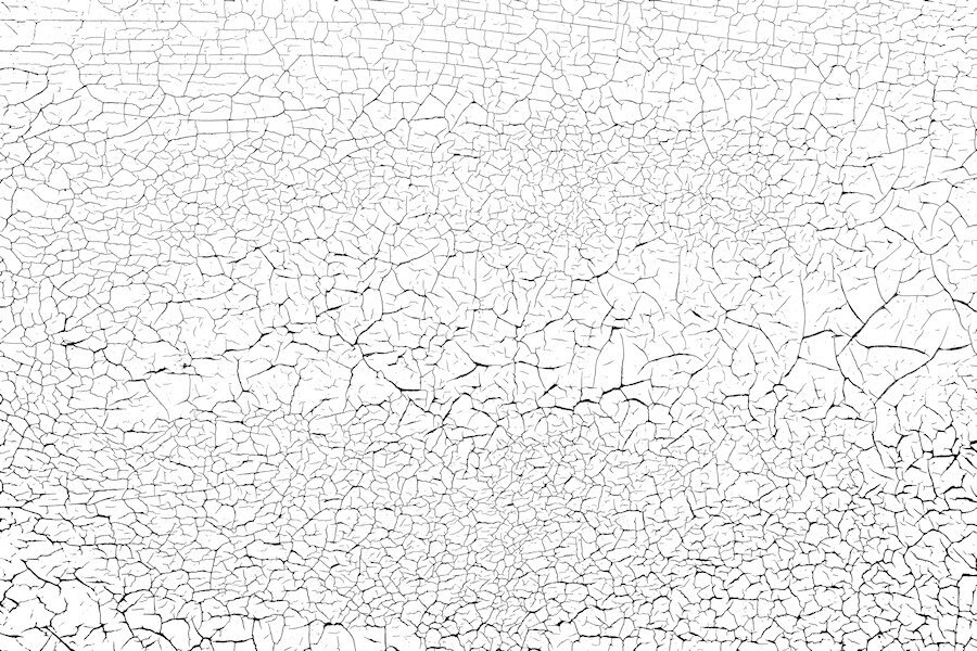
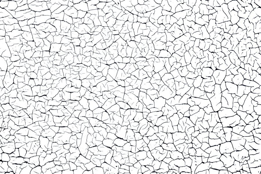
Here's another one I can also send. I shot quite a few (it's actually the horizontal slats on my garage door) different areas and will try shooting with my wide angle lens if it ever stops raining. I love shooting this kind of thing. Once I learn how to zip and use something like drop box I can send more and the orignal photos for you to make the overlay in the way you would like. these are reduced size so might not be that great. This overlay was made using a lower tolerance with the magic wand where the one above had a higher tolerance and produced thicker and blacker blacks. that's why you might want the photo as well.
-
Of course you can. Just home from work (late) and need to hit the bed. I will get to it tomorrow. I think I can put the file on the FB page. Do you want the overlay and also the original photo as well so you can make an overlay. I changed the brightness contrast when I was trying to make an overlay (never done that before) to emphasize the black lines and used different tolerance levels with the magic wand and got different thickness of black crack lines. to me they are a little too thick so next time I would try and contract a pixel or two and see what that does. I also just left the photo and did unspeakable adjustment with the brightness and contrast and came up with a cool paper on it's own. I'm just learning how to make them and guessed my way through it. Here is the one I used, a smaller sample. i will upload the full size file tomorrow. I would love copies of what you made too.
-
Love the background map paper. Good idea there.
-
I find myself looking at textures everywhere now that I know they are good to have for layouts. Finally the old wooden garage door is good for more than just opening and closing. we have a fence that needs replacing that has some promising textures too. Garden fences would be great, especially if they are old and weathered. Thank you for your kind words on my layout.