-
Posts
4,252 -
Joined
-
Last visited
-
Days Won
141
Content Type
Profiles
Gallery
Forums
Everything posted by Susan Ewart
-
Good luck Fiona!
-
Quick Page Lesson 7 This is 20 years ago! How did that happen? It only feels like yesterday I was getting up at 3am in the days before a show to re-load the kiln. This is the years I set down my camera and got a point and shoot digital camera. Ugh, it was awful. so much lag time between depressing the shutter button and it actually taking a picture...this wasnt a cheap camera either. fonts: Madelyn calligraphy, Showcard Gothic, Magic Hopes (Creative Fabrica) Photos: mine
- 382 replies
-
- 14
-

-

-

-
Wowzers! that is really cool.
-
What a wonderful story.
-
Such a great idea isnt it. The homeowner I talked to said one person showed up with a bag full of books to put in. She also said she has extra books in the house to replenish with. The "librarians" are really quite inventive with their library structures.
-
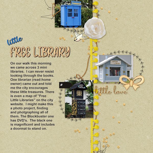
Quick Page Lesson 6 I had no idea what to do for this one as the photo space is very small and doesnt lend to detailed photos. On our walk today we came across 3 little free libraries. I have known about two of them, but I needed 1 more for the layout. And bingo! There was the blockbuster one (it has DVDs in it). I would like the do separate layouts in the future that shows them. the black one is exceptional. And we got to have a chat with the library owner of that one. Photos: mine, from today fonts: Rose Birth Flowers and Spring Garden Script (both from Creative Fabrica)
- 382 replies
-
- 15
-

-

-
Monique, they look great where they are.
-
Wow! those are so beautiful.
-
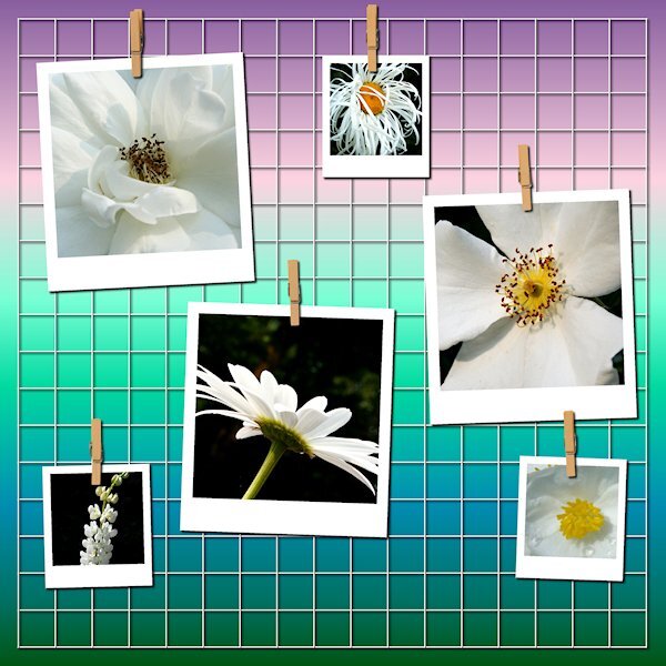
Quick Page Non-Scrap Lesson 6 No words, just photos circa 2010. It was hard to find enough white photos. I will be on a mission to start taking more white flower photos. This is a neat way to showcase photos. I think I'll be putting that script on the list. Now onto the actual Quick Page for lesson 6.
- 382 replies
-
- 12
-

-

-
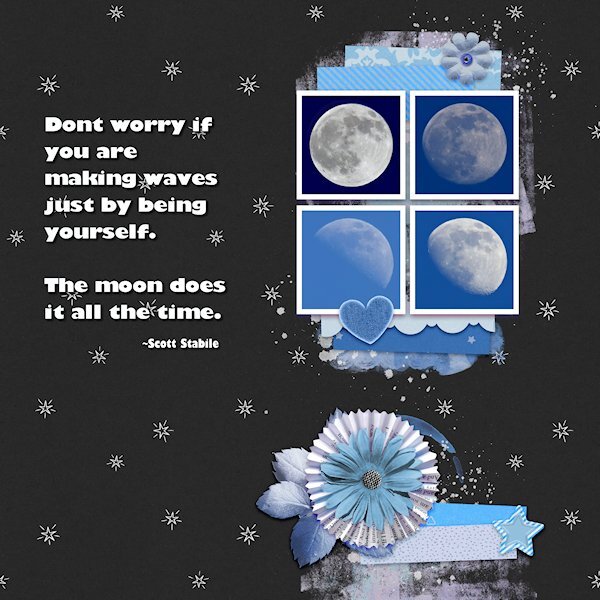
Quick Page Extra Lesson 6 I'm starting Lesson 6 with the extra. I love the layout of this quick page (I mean the QP as itself). For such a small area for the photos you eye is really drawn to that spot. I dont deny it, this is a challenge for my shooting style where it's hard to get photos that fit into a square. It's a good challenge for me. I dont have a great lens for moons, they are tiny in my images so i have plenty of space for getting that square layout. I took some creative liberties with the backgrounds going from the darkest blue of the full moon to the lightest blue in the less than full moon the lightest one is. Three of the moons were actually shot in the day...I call them Day Moons. The full moon was shot at night. I had to extract it and put it on another moons background (with permission of the "other" moon of course). i like using the selection to put the quotes in. I changed the colors using the Hue Map, it took several times going back to it. Photos: mine Fonts: Gill Sans Ultra Bold and Gill Sans Ultra Bold Condensed (windows)
- 382 replies
-
- 12
-

-

-
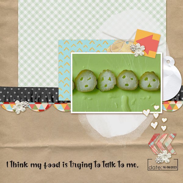
All I could think of when I was slicing them was them screaming, "noooooooo". Food shouldnt freak you out. I felt kinda bad eating them...but they were so tasty.
-
Mine 1st attempt failed too...I was editing my photo's and was happy with thd 4 I chose (for the Extra layout) when *poof* out went the power. I will try again. I love the message in your layout. although I very squeamish about insects I do appreciate them and remember to give them a water station out in the yard so they dont drown in the bird baths.
-
This is so nicely done. They are very interesting boats too.
-
Love this layout. I never get tired of watching birds bath. they do it with such gusto, it just makes you happy.
-
Thank you Mary. It's sad to hear you lost your husband well before his time. I would feel the same and I'm at that point in life (58) that thoughts of losing my husband is terrifying. You have a positive outlook on it, i like how you worded it and it's a nice to feel comforted by those words.
-
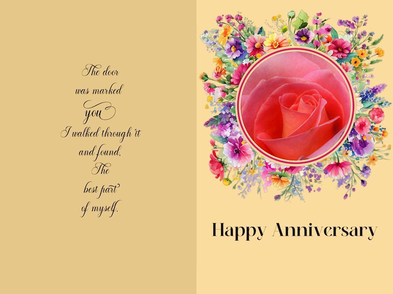
Quick Page Non- Scrap Lesson 5 I wish I'd thought of Mary's idea. Love the change of color you used, Mary. I couldnt think of what do for this and was thinking I'll just pass on it. But once I started looking at pictures, the ideas start to come together. I reduced the Clarity to make it a bit softer and dreamy. I think I should have made it even softer, but I am a chicken. it's a challenge for me to make things soft instead of crisp. It's a good lesson for me. I forgot to credit the quote on the card I just realized. It's a comma after the word "found" but it looks like a period so it seems like bad grammar. I think I will take it out. Quote: Mary Anne Radmacher Fonts: Alevandar (for the quote), Meiland Geogeous (both from Creative Fabrica) Photo: mine
- 382 replies
-
- 14
-

-

-
Quick Page Extra Lesson 5 having hamburgers a couple weeks ago I was slicing pickles and well, there you have it, very judgy pickles. How rude. ? Fonts: The Chocolate (Creative Fabrica) and Arial (Windows)
- 382 replies
-
- 16
-

-

-
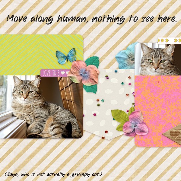
Quick Page Lesson 5 I used the page as is. Added text. Saya is an energetic playful and snuggly girl. But she always looks cranky in pictures. I had put the blinds down to see the computer screen and she kept trying to go behind them so I pulle out over the ledge and she has been using it as her sunning/sleeping spot. Maybe in the winter I'll be able to pull the blinds up again. Font: The Wild Chaos Stamped (Creative Fabrica) Photos: mine, taken a week ago.
- 382 replies
-
- 14
-

-

-

-
STUNNING!
-
Gerry, sorry to hear about your loss. Love that quote.
-
Excellent Idea!
-
It looks like a sugar cookie, one of my favorites. Good job.
-
What a cool experience. And rather freaky too.
-
The rain drops are like mother natures diamonds. I love them too and find them fascinating to look at.
-


