Susan Ewart
-
Posts
4,252 -
Joined
-
Last visited
-
Days Won
141
Content Type
Profiles
Gallery
Forums
Everything posted by Susan Ewart
-
A beautiful tribute Ann. Sorry for your loss of one of your fandom family members.
-
I love libraries too. And my bestest friend for 46 yrs is book lover (and has an English degree) so I will look forward to your kit!
-
It's a walk-in little library. What a great idea.
-
I know what you mean. To experience one would be something wouldnt it.
-
Yikes! Backwards uphill. How long of a road was it? If must've been exciting for you...maybe not so for your parents. I love those old cars.
-
English is my native language and still it doesnt understand me. The post from Mary earlier talked about something called CFSpark Prompt Builder. I will have a look for that. Maybe that would help us. it seems to be all about time doesnt it. Do I have the time to put into learning to "talk" to CFSpark or should I be concentrating on learning how to do something else I need to learn. Do you find if you try to learn it all, then you spread yourself thin and nothing really soaks in well enough. That's me. I can go off in many directions and then never really get anywhere. However, we should find time for play, with other techniques because good suprises often come out of it. Argh...my kingdom for more time!
-
the blue one I did on my QP 7 also had only DVDs.
-
I enjoyed your story. how wonderful your picture found it's way back to you, thanks to an anonymous reader. There is one about a 5 minute walk and two that are about 10 minute walk from my house. they are the ones I had in my quick page. As I mentioned, an owner had come out to tell me about the Free little libraries. She told me the city encourages them and there is even a map on the city webpage of the locations. I looked through them and as I always had a camera in hand I chose not to take anything home. I will take some books with me on our next walks by them though. They are fun and put a smile on my face when I see them.
-
These are fabulous. Such interesting and intricate designs. I can see how you would get lost in playing with them. I love pattern. And weirdly I never used to like patterned paper, but I'm really like the seamless ones Suzy and others have been making.
-
I love that! It's a work of art. Great picture too.
-
Thank you Corrie, for giving me some insights to think about for printing. Even if I just did my favorite layouts for a book for myself, would be a cool thing to have and like you say, to show people what I do.
-
I think me and their AI dont speak the same language. I have tried and all I get is hideous stuff that isnt anywhere near what I "thought" I described. It's same as when you contact a company and they use a AI help "person". You ask a simple question, how do I find my monthly invoice, and it sends me to look at how to hook up my new streaming box (that I didnt order, cause I already have one).
-
What a great way to use this layout. I LOVE that graphic on the top layer. Wish I cold see it bigger. Textural stuff like that is so fun to photograph (and see). Where I come from (my home province, not the one i'm in now), Garibaldi is a mountain; skiing in the winter, hiking and camping in the summer. So I was thinking, when did you come to Canada?
-
Wow, these are cool. And this is with PSP and not another program? It's hard to pick a favorite, I love them all.
-
What a happy looking Lucy. If ever a dog could laugh allowed, she would be it. I love Van Gogh's work, esp Starry Night. I couldnt bring up the song in my head so I looked it up. It's really nice.
-
I agree with Anja. I am quite captivated by this. The art is amazing.
-
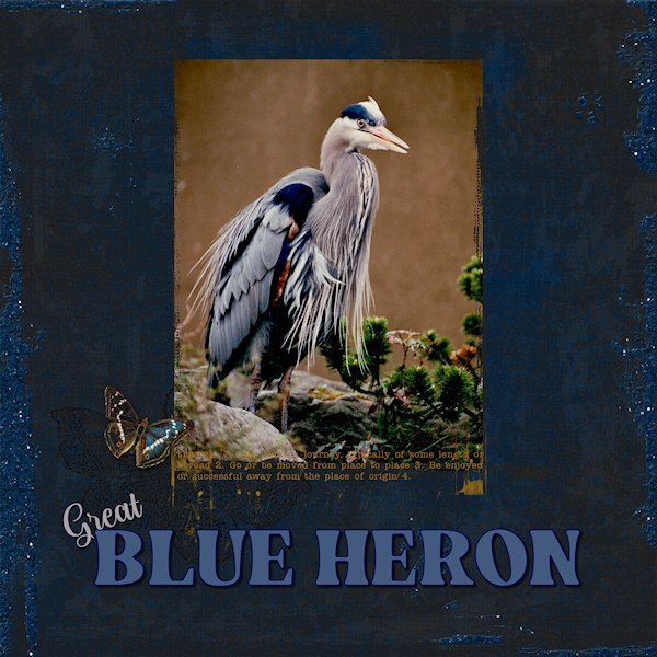
Quick Page Day8 Quick Page from Digital Scrapbook (Marisa Lerin - Tunisia Quick Page 01). Photo is mine, very old...actually comes from a negative that is too old to reprint now. I scanned a smaller print (the one hanging up is 17x22 and would not fit the tiny old scanner I have) version I have and it lost all detail in the shadows. I chose this photo after I was looking for a Quick Page and saw right away, the color was perfect for that photo. This the quickest Quick Page I've done to date. Fonts: Resnick and Reneo (Creative Fabrica). Thank you Carol, for a wonderful workshop. I have enjoyed all the variety of layouts everyone produced. The active forum was fun and I looked forward to checking in to see the new pages and reading the comments.

- 382 replies
-
- 12
-

-

-
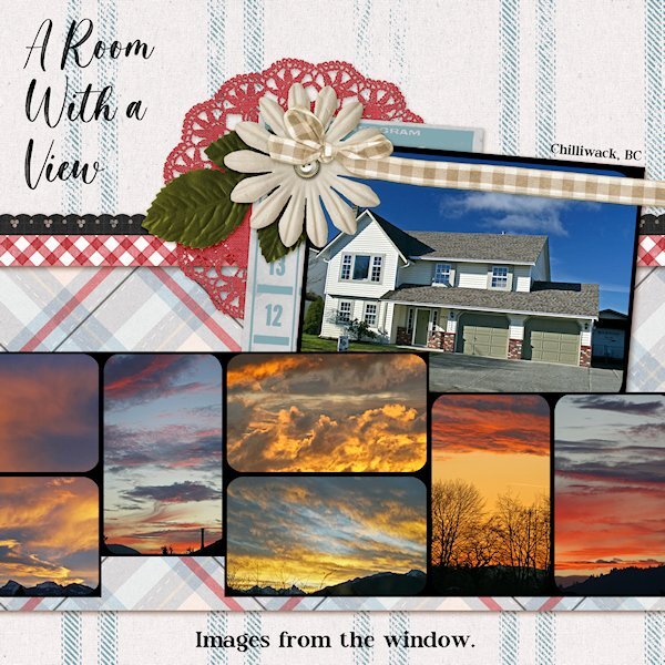
QP Extra Lesson 7 I didnt change anything on the page. Photos of crazy sunsets taken from the windows (front or back) of my house in Chilliwack (British Columbia). Being in the Fraser Valley, surrounded by mountains it was a treat to have days that there was a sunset. Normally we'd have grey sky days. Where I live now, there is less rain and sunsets almost everynight. Fonts: Magista Brush and Maxim from Creative Fabrica.
- 382 replies
-
- 12
-
-
-
This is beautiful. It makes me want to try getting something printed.
-
OMG! Lucky you!
-
This is so beautiful!
-
I know what you mean. You start doing one hobby and that leads to another hobby which leads to another one. I started making glass beads, then I needed to use them, so I learned silversmithing. then I needed to take pictures of them so back to photography....where I started out in high school (and I was a photo mini lab supervisor for years).
-
I sold all my glass studio tools and supplies when we moved to where we are now (almost 10 yrs go we moved), and last year I sold all my silversmithing tools and supplies to buy a new camera. It's like the pre-pre-downsizing. I chose photography and PSP to be my hobby going into that phase. Glass/jewelery took up a lot of space. Now I laugh because I have a photo room that is too small, and another studio in the basement for paper supplies, for paper art, photo props (huge amount taken up with this0 or whatever. More purging to go, I want a nice streamlined studio.....that is about size of an aircraft hanger! (that might not be enough?) .
-
That is so peaceful looking. I love the sound of running water. I love fountains, you can often see rainbows in the fine misty spray of water in the air.
-
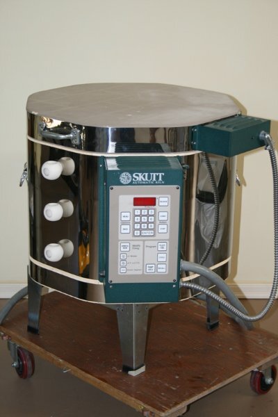
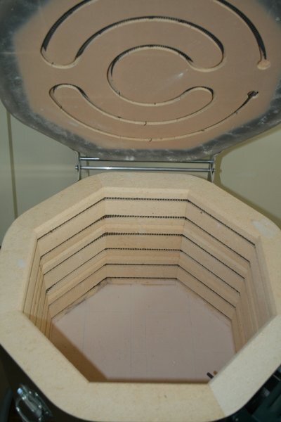
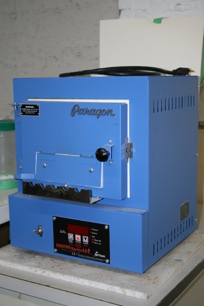
Ann answered this below. Most people would know it when making pottery/ceramics. But there is different types of kilns. Mine was for glass, fusing pieces (melting or partially melting) together. Because of the themal shock that can happen with glass (think when you take a hot glass out of the dishwasher and put cold water in it and it thermally shocks and breaks), kiln ramp up in temperature by certain amount of degrees per hour, usually stays at the top temp for a period, then needs to ramp down in temperature quite slowly so it doesnt cool too fast(releieving internal stress - also called healing. the bigger the pieces the longer the time it takes. Here are my two kilns. One I used for glass fusing and the little blue one was a table top one used for glass beadmaking (called Lampwork, using not a kiln to melt glass, but a oxygen/propane torch). There are many kinds and shapes of kilns. Glass blowers have huge ones like in Ann's photo and they will them ovens.