Susan Ewart
-
Posts
4,251 -
Joined
-
Last visited
-
Days Won
141
Content Type
Profiles
Gallery
Forums
Everything posted by Susan Ewart
-
I'm glad you told me about it. I think I will pass on it. I have to decide where best to spend my time. I think I need to really concentrate on learning PSP before I lose time to learning another complicated program. I really like what you did in a short time using that program, the papers are very nice and I'd love to have them.
-
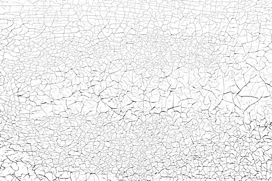
Here's another one I can also send. I shot quite a few (it's actually the horizontal slats on my garage door) different areas and will try shooting with my wide angle lens if it ever stops raining. I love shooting this kind of thing. Once I learn how to zip and use something like drop box I can send more and the orignal photos for you to make the overlay in the way you would like. these are reduced size so might not be that great. This overlay was made using a lower tolerance with the magic wand where the one above had a higher tolerance and produced thicker and blacker blacks. that's why you might want the photo as well.

-
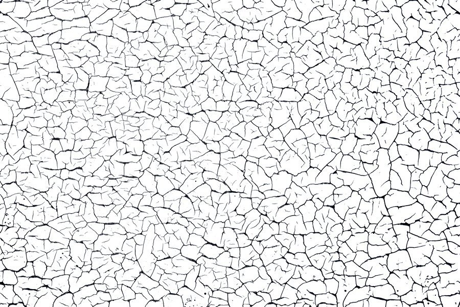
Of course you can. Just home from work (late) and need to hit the bed. I will get to it tomorrow. I think I can put the file on the FB page. Do you want the overlay and also the original photo as well so you can make an overlay. I changed the brightness contrast when I was trying to make an overlay (never done that before) to emphasize the black lines and used different tolerance levels with the magic wand and got different thickness of black crack lines. to me they are a little too thick so next time I would try and contract a pixel or two and see what that does. I also just left the photo and did unspeakable adjustment with the brightness and contrast and came up with a cool paper on it's own. I'm just learning how to make them and guessed my way through it. Here is the one I used, a smaller sample. i will upload the full size file tomorrow. I would love copies of what you made too.
-
Love the background map paper. Good idea there.
-
I find myself looking at textures everywhere now that I know they are good to have for layouts. Finally the old wooden garage door is good for more than just opening and closing. we have a fence that needs replacing that has some promising textures too. Garden fences would be great, especially if they are old and weathered. Thank you for your kind words on my layout.
-
If you look closely at the snowflake, it is all sheared off (all sides). In fact it would fit perfectly into a hexagon shape. It's pretty cool and would make an interesting mask. I like the papers and hearts too. Looks like an interesting program.
-
I really love this one. Is it fairly straight forward to use? what was it called again?
-
I cant wait. I have an itchy old green corrugated fence in the yard this is often my "background". Be nice to change it. I'll have to find some time to try out those tutorials. I really liked what you did.
-
This is really cool. I would have thought that's how it was, the only 'tell' was a piece of blue above the yellow flower. I wouldnt even know how to go about using this tool. Hopefully when I grow up I'll be as brave as you. (I'm not sure I'll ever grow up though ?)
-
Thank you Michele. The lowered opacity lady is that little extra that elevates the design. it's subtle enough that it's one of those wonderful discoveries you make while looking at the layout.
-
Thank you. The flower is something you could really use in kits. I think they are really quite pretty. next time I do one I will make it bigger to start, so I can downsize or keep it larger without it getting fuzzy. There is tons of possibilities in the wire clips with different shapes. Enjoy the lab. they (the Labs) are a good challenge. And a good way to get some vector experience in a number of them.
-
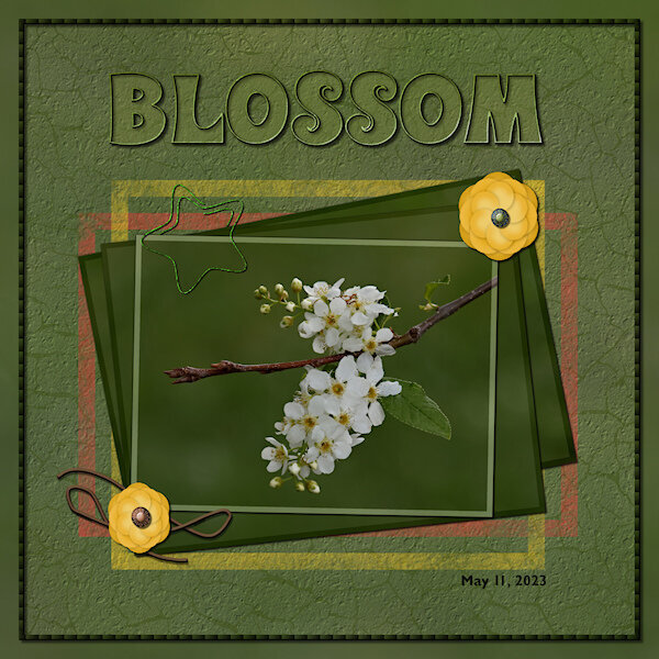 Lab 6-9 Wire Clip Flower 2 Overlapped String
 -
Back in the Lab again! This time Lab 6-9 Wire Clip Flower 2 Overlapped String The wire clip was fun to make, making sure I read the WHOLE instructions on how to use the clip properly in my layout is another story. At first I thought my flower was going to be ho-hum boring but after getting to the end and adding the shadows and the color on the edges it really took shape. They are quite pretty when they are done. The string, well, let's just say I did get two parts overlapped. I wont be known for making fantastic string. I used the see-through technique on the title. And I used the painted frame freebies from the store blog. I put the same asphalt texture (or is it called cement?) on the layer so it looked like it was painted on the asphalt/cement. I also used the eraser tool to make it look scuffed up. The cracks are from my garage door that I photographed and extracted the cracks and made an overlay. Fonts are: Wonderbar 2.0 (title) from Creative Fabrica and Gill Sans MT for the date (windows). Photo is mine. two little brads on the flowers are from Gina Jones Delish Brad 09 (Digital Scrapbook)
-
me too!
-
I love this style of layout. The font has a darker glow around it, is that a layer style or drop shadow? i really like how you used the lady with the lower opacity on the orange background.
-
B = Bob or Bobbie, the name of my father. Although when my mom was shocked at something he did or said, she called him Robert (Bobbie is the actual birth name, no one called him that)
-
I like your fractals too and would also like to know what they are. This frame is perfect for this.
-
So cute!
-
I love this layout. this is me. i have a horrible sense of direction. I laughed at the "Oops Wrong Way".
-
My hubby said the moon this morning was a red sliver (he leaves around 3-3:30am), wished I'd looked out the window, I was up at 5am. Ann, yes, this reminds me of Dune as well.
-
Doing well where I live in Alberta (close to Edmonton), hazy and smokey out but not super smokey smelling. We can have the windows open for "fresh" air. Hoping for some rain. Still lots of communities getting evacuated (some for the second or third time).
-
Thank you for showing them. It really helps to see them in action. And wow! the photo's are stunning, so crisp and detailed.
-
This is beautiful Julie. It goes so well with the first one. I really like that wood frame and the background layer is just like I wish I could do.
-
Beautiful layout. That background is outstanding. I cant imagine the scope of the grand canyon. This picture goes on forever it looks like. I like how you did the pictures. They look like cards one would collect at the attractions gift shop. It will quite a ride, armchair riding along on your vacation. Only, it wont be as whirlwind and packed for me! ?
-
These are so cool. My favorites are the bottom left and bottom right and the centre row second from the top.