Susan Ewart
-
Posts
4,847 -
Joined
-
Last visited
-
Days Won
187
Content Type
Profiles
Gallery
Forums
Everything posted by Susan Ewart
-
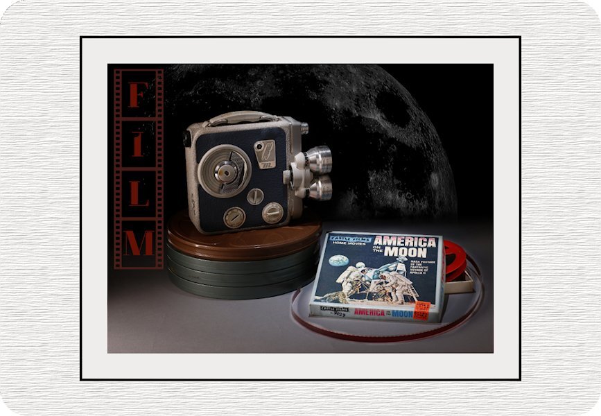
Alphabet Photo Challenge - Letter F Film... Thanks to Jeni I got an F word. I know, I love photography and you would have thought I'd be able to come of with that word but I was 'F"loundering what to use for an F word. This is for my American friends in the Campus, to remember the amazing, positive and inspiring accomplishments you made in history. There are no borders in Friendship! This didn't come together the way I wanted (the background moon looks like a dusty screen and I found myself trying to wipe the little dust particles off), but it's time to let it go. the darkest on the background and the movie camera was intended so the spotlight would be on the film itself. I think should have tried to stretch the title down. And, it was faster to pick a moon off pixabay than find the moons I had shot. I also found out somehow I deleted my Build a Kit psp files from the first kit. I had made film strips and I see that I missed deleting something and now I cant go back and fix it because I lost the PSP files. I clicked something bad one day because it's gone in the back up too.

-
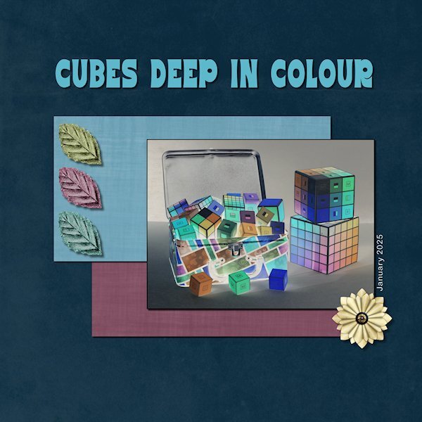
Project 2 I used blend modes on the photo. I thought it looked kind of neat, like comic book art, the colours are all opposites of what they are. I used Nellie Bells kit, it had nice paper in it. The font is Behumble from CF. the photo is mine from some of the tools we download in one of the recent BTC (Breakthrough Color) courses, that we print and assemble. This is more a play kind of course and different than the 6 courses I originally took. There is shadows on everything, it's not going to show up well on the dark and at this compression. I'll put it on FB later today. Must go "adult" now (read: do housework).
-
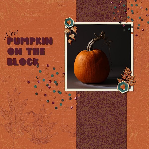
Project 1 I used the Behold Autumn bundle that I had. the layouts I just scrolled through are really awesome and inspiring. I'm onto looking for some photo's for Project too and now I get to get a tea and watch my favorite TV show of the moment (Bootcamp TV! 😁 starring Carole....and that's all!). Photo is mine as usual. Probably will be much darker than it really is. It's supposed to be as if lit by the moonlight.
-
That's hilarious! If I photograph it I'll have to clean it first!
-
Bee, your mother is so beautiful.
-
OMG! Yes! these are great, I have all of the mentioned words except the French horn. I know (*GASP*), how can I be the only one alive who doesn't have a French horn? I had wanted to do this rather funky bathroom hardware that came with this house as it is a 'fleur de lis' motif, but I'm really trying to stick to one word. You have given me some ideas and I will be using one of your words...if it works out. (I cant believe that I didn't think of 'film' when I love photography and I used to be a photo lab printer back in the 'film' days).
-
Oh that's to bad about the oven. Mine is on it's last legs too, and the fridge sounds like a semi truck at idle. I'm still trying to find an F object.
-
Happy Birthday Julie. Hope you had a wonder-filled day.
-
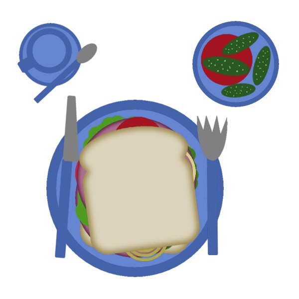
Here's my yummy sammy. I like pickles and tomatoes(mine had "toes" - honest) so I had some on the side. Also, some tea in a demitasse cup with a teeny tiny cute little spoon. As I am practicing my levitation techniques today, my setting is floating in mid-air....going to be a challenge trying to cut my sammy (because I'm levitating too!). But I'm up for it. That's my story and I'm not sticking it, because I'll forget it in 10 minutes.🤪
-
Awesome Bee, you are first "on the table" with your sandwich, which looks yummy! Glad to have you aboard for the bootcamp.
-
Wow, that's an impressive super organized layers palette. I'm jealous!
-
Glad you joined us Sharla. I'm thinking of going to a lighter workspace like yours. I'm starting to like it and it my dark space wont influence the appearance of the colors in the layouts (I watched a PSE video where they talked about that).
-
Hubby and I will be done too, after the our current two cats. I actually grew up with dogs and love them, but both of us were out of the house for many hours a day working. We thought it wouldn't be fair to a dog to leave it alone that long.
-
Adam has that judgmental look down to a T!
-
Looks like you have 25 more dogs yet to be in your life and since you like to have 4 sets, that's another 100 dogs you'll be having.
-
I just love the clothes they wore. When I was a kid if my mother put a dress on me, I just cried. I was not a girly-girl.
-
Oops forgot the photo. I might use this or if I have time to take any pictures I'll find something else. I looked to see when the last time I did the Bootcamp and it was May 2023. That seems like it's so long ago. this is my 9th time. Ann, how many times is this for you now. I cant believe you forgot to register, the Bootcamp is in your DNA, I thought you might have an automatic alarm for it. 😁
-
I like my workspace dark, although i might try the medium grey to see if I like it. I use the rulers on a UNtabbed workspace. I closed the palettes i dont use. And have added the Instant effects and Script Output with Auto hide on the side of the materials palette. I have the history just below the materials palette. I added the repeat icon to the layers palette and the bound the open as layer and have the jpg and png optimizers on the task bar (? at the top). Yay, for the first time this year I think I'm actually posting on time.
-
I wish you could turn your money to gold too. I'd be the first the line up for a hand out. Your elements look great. I like how the texture is retained in the elements.
-
I'm in. I'm hoping to use the bootcamp to re-boot my creativity. Carole, when I used the link in the email I just received it took me to the January Bootcamp page. I havent decided on photo's yet. I have a sort of idea, but I need to photograph stuff for it. I'm glad the Bootcamp is 14 days, maybe I'll actually get to finish it, since I'm way behind in two other workshops, long past (Paper WS and Build A Kit). I think I'll be using 2022 because I'm having the same problems as everyone was describing (wrong layers being selected, or if I hide a layer it hides another layer instead and just lots of random shut downs). I will use it for the blend modes though.
-
it looks like water could have gotten spilled on the top of it, adds nice texture. At least you can make a duplicate and erase the clouds on the duplicate layout. I love shift-D.
-
The snowy ice looks like marble. These are "bugs" I dont mind. When I worked at this one farm and lived in a converted barn (tiny barn, the bottom floor was z-brick and sand in some parts, still we loved it. Anyway, each spring we'd have a beetle invasion...in the barn (lids were mandatory on all pots and pans while cooking! We have lady bugs and little green and blue iridescent beetles, they were so pretty. Ladybugs are pretty but pack a punch when a cat tries to eat them (foamy kitty mouth).
-
thank you Julie. I found it and bought it. although you got a real deal, I got it on sale, but not as good as you got.
-
Ann, you are on a fantastic roll. Love how the clouds turned out.