

Susan Ewart
-
Posts
3,884 -
Joined
-
Last visited
-
Days Won
119
Content Type
Profiles
Gallery
Forums
Posts posted by Susan Ewart
-
-
34 minutes ago, Sue Thomas said:
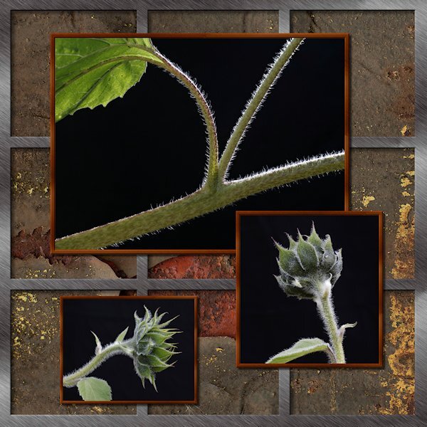
Thank you. I love what you did with the sketch. Creative photography, beautifully done, you can't beat natural lighting, capturing the fine hairs on the stems. I sometimes use boards as wind breaks, but never as a background. lol Did you have the sun behind the plants? As part of the leaf appears translucent. I call it the telephoto effect, backlighting, which I often like to do to capture the translucency of flowers petals, and Autumn leaves.
Thank you for your words. My heart is singing...and windows are breaking. yes, the behind and a bit to the side. I planted cosmos in pots (as a test to see if I could actually grow anything) and I have been able to move them around according to the sun. the sunflowers were in the garden and the big wind we had made them all lean over at waist height so I was able to photograph them before getting them moved back upright. I will use that idea of a wind break next year. I have been doing the cosmos like that too. I look out the window and see the sun shining through and run for my camera. My backyard has too much dappled light that is distracting since the neighbour cut down two huge trees that gave me beautiful deep dark shade in one corner. So the backgrounds are not great, I had to come up with a plan. Foamcore was first but it blew all over the place, even on lighting stands, so I went to a backdrop I have and put a weight on the stand base. I love translucency in petals and leaves.
-
 2
2
-
-
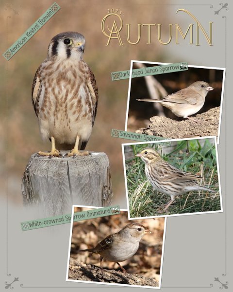
5 hours ago, Sue Thomas said:
Another Autumn page in a series that I'm doing, on the birds that stop off for a brief visit, before continuing their long migratory journey.
The border is a combination of a corner element which I added a thin border all around to, overlay. Phrase strips which I created, adding one of Carole's new punches. I really do love these, they are ever so easy to use. I do recommend using guides or grid when using them. Text on a text path, masks to slot the photos in . Photo frames are done using the vector rectangle tool.

that kestrel is so cute. I love that border and the what you did with the word strips, in and out of the frames and the punches (which I bought but havent loaded - scripting is taking more time these days).
-
1
-
-
Here's my take on the Sketch Challenge. No words, just pictures. It was fun to do. I did the silver frame with vectors, not sure why, just seemed easier to do it that way. the outer frame is one object and the 2 verticals are one object and the 2 horizontals as one object. It just occured to me to make it a preset shape. Wonder if it would be useful. The background is a patter I got of rusty metal. It only has a number name (02) but I think it came froim of the ...eezy website (Brusheezy, Vecteezy etc). Lighting by mother nature...background by a non-descript black background I dragged outside....and had to weight down because it was like sail on a windy day and kept blowing over onto the poor subjects.
-
 12
12
-
-
17 hours ago, Sue Thomas said:
I know, the photos depict the layout etc, etc, etc.
We are slaves to our photos and we must obey.
-
 3
3
-
-
On 9/8/2023 at 10:30 AM, Doska St. said:
Hello Carol and all members,
I'm Doska (nickname from first, last name and city). Jenifer already told me something about you, but because I'm still working with Photo Impact X3, I thought I couldn't take part here. But now I'm considering maybe getting a PSP because I'm afraid that with the next WIN 11 or 12 my beloved PI will no longer work. And I love digital scrapbooking, it's still my only hobby.
I'm 72, have already celebrated my golden wedding anniversary (sept22), worked in emergency medicine for decades as an intensive care and... Anesthesia nurse, volunteering with my husband in the emergency services and now volunteer fire brigade (friends of my age) doing digital scrapbooking with PI-X3 since 2005. Before my PC days (since 1996) I drew. I love animals and have had cats and a dog as pets. I also have a personal relationship with Jesus Christ, since HE speak with me 2013..
I would like to ask whether I can still show my PI works until I take a course? I'm also on Merisa Lerin's DigitalScrapbook forum.
Thank you for the invitations Carol and Jenifer, I hope we have fun and I learn new things.
Kind regards
DoskaWelcome Doska. Looking forward to seeing posts from you in the forum. Definately join the bootcamp in October, it's what got me using PSP after buying it for several years and not using it. Happy Anniversay by the way, that's a milestone event. I am also a member of DigitalScrapbook...although I've never posted in the forum.
-
1
-
-
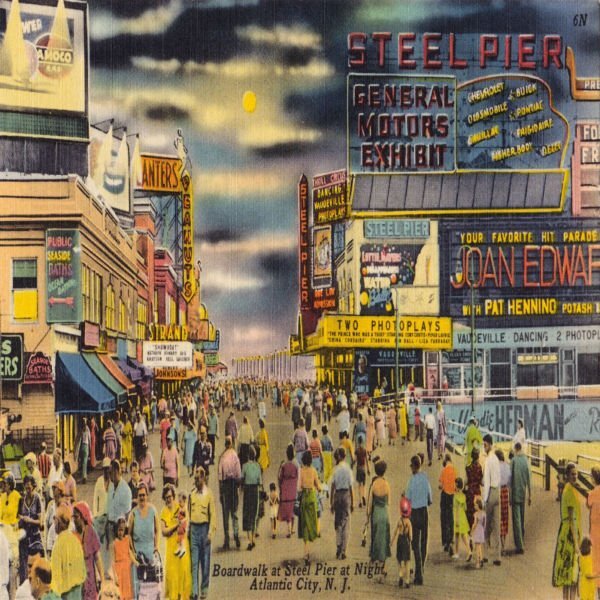
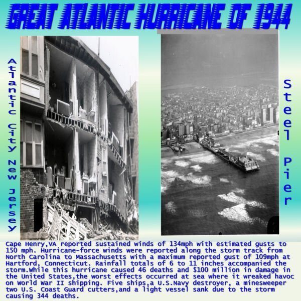
4 minutes ago, Dorothy Donn said:
My Day 7 - Needless to say , Mom carried me out on the steel pier a few times when we were living in New York and Philadelphia back in my baby days. Post card of boardwalk & Steel Pier entrance.
The New York layout(at the top) is so cool. The loss of life is very sad.
-
 1
1
-
-
2 hours ago, Anja Pelzer said:
for day 7 I show you some funny trees around my home
I made the template with the instructions from Carole
Love the top tree, it's got an alien face, actually the middle one does too.
-
3
-
-
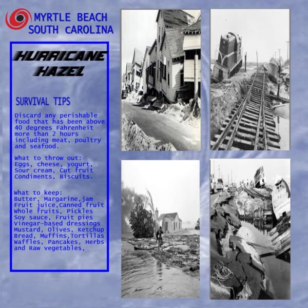
25 minutes ago, Dorothy Donn said:
My Page 6. Amazing the difference in Myrtle Beach from the 1950's to today.
This is interesting, what to keep and what to throw out.
-
1
-
-
I haven't been to anything like this. I do know of them, they have them in Edmonton. I would love to go in person. I really liked the music in the video you shared.
-
1
-
-
13 minutes ago, Michele said:
Day 5. I decided to add a pop of color to this page. Is it too much? It's really difficult to get out of the "scrapbook" head.
I think it's just right. Love the color! And what you did with the gradient is really neat. I would not have thought of that, it sure put the focus on the girls.
-
3
-
1
-
3
-
-
11 minutes ago, Ann Seeber said:
I went back to college for an AAS in Visual Communications and had the opportunity to do an elective in Auto-Cad, which is what the draftspeople and architects now use instead of hand drawing everything (which my daughter preferred - she hated Auto Cad. I call her my Luddite! LOL If she could she'd stick with a slide rule instead of a computer) Well, I LOVED Auto-Cad and begged my advisor to ok Auto-Cad II for me. I'm clumsy at hand drawing, myself, but Cad was a dream! Deb has Cad in her office but hires people to do her drawings with it. ?
I love the drawings, hand done ones, they are like art to me. My friend and I used to draw houseplans when we were 12-13 yrs old. I can imagine how bad they must've been. One course in drafting(in high school) told me, I couldnt visualize the 3D space. We had exercises where we had to draw the exploded 2D view of a cube with indents in the cube, or we have to draw the 3D version from the exploded drawing. I couldnt do it. I wished I'd paid more attention and wasnt so shy that I never asked for help. I never really was taught how to "see" it both in 2D and 3D.
-
I do love "naked" tree silhouettes. In "Tree Architecture" is that moon I see peaking through the tree on the left. AWESOME!
-
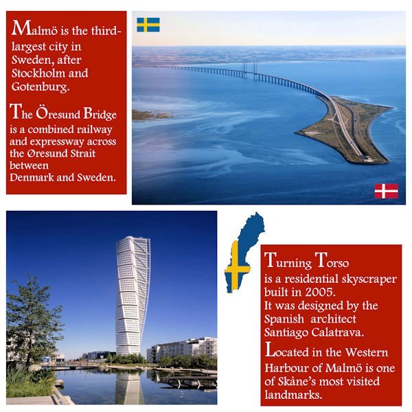
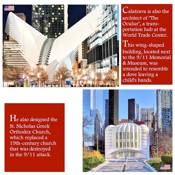
4 hours ago, Cristina said:
Last week, I stumbled upon a video suggested by YouTube, and it was about the reconstruction of Ground Zero... I was surprised to hear the architect, Santiago Calatrava, was responsible for the designs of two buildings... It's interesting because before looking up the Öresund Bridge, I'd never heard his name before.
In the USA, he is also the architect of the Margaret Hunt Hill Bridge in Dallas, Texas, and the Milwaukee Art Museum, Wisconsin.
So, I decided to include this information and create another layout page for Day 2. Now, it will be a Double Page.
It's not exactly complying with the Day2 template, but being the "editor-in-chief" of this magazine, I think it's OK this time. ?
I think your magazine needs become a hardcover coffee table book. What beautiful photos and the architecture is like large permanent art installations. My hubby's parents were from Denmark.
-
1
-
1
-
-
5 hours ago, Ann Seeber said:
Yes, she literally writes by hand in Copperplate Gothic. They had an entire course on it in college. She has lots more pieces on display on her website here if you'd care to explore.
I did a drafting elective in high school and penmanship was one of the things we had to learn. I love architecture. But I sure bombed at drafting. My Calligraphy teacher has the most amazing handwriting and printing. Calligraphy is considered drawing letter and not writing, that's probably why I was so bad at it, that and I was a heavy handed lefty.
-
18 minutes ago, Shirley said:
Thank you Susan. You have done a great job with your cameras, I can relate to some of those older ones.
Me too! Some came from my Grandfather and some I've collected. I was shocked to see the vintage (yikes, that's my era) SLR's are gaining in value. I used be able to get 70's or 80's SLRs at thrift stores for less than $15, now some are in the hundreds.
-
1
-
1
-
-
Day 7
Working more with blend modes with the same background paper. I might see if I can use that paper throughout. In the coming week(s). Work is still needed on this one (and most of the rest) but I wanted to get it up tonight. Tomorrow, back to my scripting homework and work on these layouts in between.
Thank you for a wonderful workshop. I learned a lot about manipulating masks and really liked Day 7 mask technique.

-
10
-
-
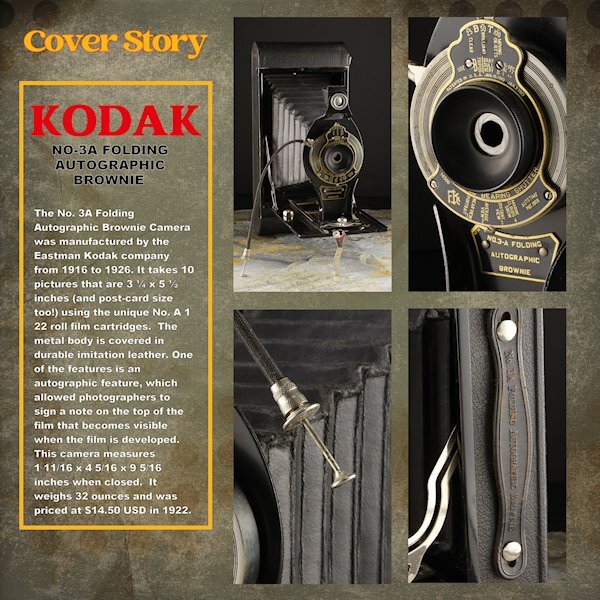
Day 6
Thank you to Sue and Rene for giving me some ideas using the blending modes. I used a white layer above the paper layer (Brook Gazarek, DigitalScrapbook.com) and used a blend mode (I forget right now, sorry) and then reduced the opacity a bit so I could control how much of the layer below showed through. The red kodak word is a bit overpowering (as Red tends to do) but is the color kodak uses - perhaps I should have desaturated it a bit. The yellow frame is the other Kodak color. On to Day 7. I think it will be one page though. I didnt photograph enough cameras and the night is coming to a close.
For practice, I did do the lesson where we made it one mask. here I used all 4 as it was better suited for this layout. I'll try and get these posted on FB in the next week as I finish them all. I see blurry Kodak and Cover Story, but they are arent blurry in the full sized image.
-
11
-
-
1 hour ago, Shirley said:
Day 7, side 1 and side 2. I made a couple of minor changes to the first side to correspond with the new design. I enjoyed this workshop, I have learnt a lot about those dreaded masks that have tortured me for all this time. Thanks Carole for your kind remarks on my pages.
it has been such a pleasure to see your art. Your layouts are so consistant and the project as a whole is beautiful and cohesive.
-
2
-
1
-
-
4 hours ago, Ann Seeber said:
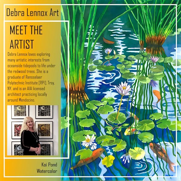
Here's my Back Page for Debra Lennox Art. I mirrored the Front Page mainly by sliding the parts of the photo group over and moving the double frames. I used the same gradient as the cover. I'm still using the same font: Agency. I have this watercolor on my bedroom wall but had to position it so you see it as you walk down the hallway as it is quite large @ 32" h. x 40" w. with matting and frame. Deb has 2 children, both married, and there are 2 grandchildren, Magic and Raja.
I meant to also post the thumbnails of all 8 pages. I've added it now.
WOW! Ann, this is really beautiful. What a diverse artist Debra is. And an architect, she must have beautiful penmanship as well.
-
3
-
1
-
1
-
-
6 hours ago, Ann Seeber said:
@SusanEwart, the blend modes were the main reason I now lean on PSP2023 as they are so handy to just scroll through and see the effect in real time on the image. It's a new feature of '23.
That's why I want to get back to it too. But it's too laggy if I have more than one large photo open and my project open. Soon I hope to be using it again.
-
10 minutes ago, Sharla said:
I'm a little late but here is my day 1. It took me a while to find some photos to use - they were all taken by me and not far from home.
STUNNING!
-
1
-
2
-
-
16 minutes ago, Rene Marker said:
I play with the blend modes all the time with papers. You can get a completely different look depending on the mode your use. Also like Sue said using different colors on the layer below give different results. And, some times with the patterned papers, I will put the plain paper on top and use the blend mode on it which can let the pattern show through but not be real distracting. So many different looks can be created through the blend modes.
these are really good ideas for me to try. going to copy/paste these posts so I dont forget.
-
4 hours ago, Corrie Kinkel said:
I like this lighter version better than the darker one. On this one the cameras get more attention, at least that's what I think. Oh and I recognize the Pentax camera on the right which was my dad's and when he died it came to us. We (hubby and I) used it until it was beyond repair. It had a long life and all the lenses we sold at some point because we went digital.
I was flipping back and forth and they do stand out more. I do need more contrast in the background and the mask layers. I will try all the suggestions I'm getting...probably next week if I get all the workshop days done and caught up on the scripting. I'm quite behind now.
-
1
-
-
47 minutes ago, Sue Thomas said:
I agree with Rene, I prefer this one too. I often use the blend mode, with a lighter solid coloured layer below. It often tones down the original top layer. You have total control on how much you want to tone it down by. Even try other solid colours besides white. Different colours will yield different results.
Thank you. I'm not sure why it didnt even occur to me. I was playing with opacity with the gradients that I tried (with white below or black below) but always seem to forget about the blend modes. I will play a bit with them...probably after the workshop since I'm a bit behind.


September SKETCH Challenge (2023)
in Challenges
Posted
You are lucky. We are getting read for thundershowers. Hoping it clears though and I heard tomorrow morning it's supposed to be good too. I'll be getting up and seeing if it's sighting range for me. Looking forward to seeing your results.