

Susan Ewart
-
Posts
3,884 -
Joined
-
Last visited
-
Days Won
119
Content Type
Profiles
Gallery
Forums
Posts posted by Susan Ewart
-
-
4 hours ago, Corrie Kinkel said:
I like this lighter version better than the darker one. On this one the cameras get more attention, at least that's what I think. Oh and I recognize the Pentax camera on the right which was my dad's and when he died it came to us. We (hubby and I) used it until it was beyond repair. It had a long life and all the lenses we sold at some point because we went digital.
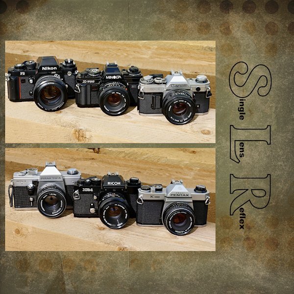
My first camera was a Ricoh KR10, that my brother gave me for Christmas (That's his Nikon F3 in the photo - he just gave that to me for my collection this year), but what I really learned on was the Pentax K1000 in high school. In fact that camera was in many high school photography classes. It's a real workhorse and all manual, no Auto or Program modes. I got that one this year as I had wanted one for my collection for a long time. I'm thrilled to hear your dad had one and that you (and hubby) used it for many years. I sold my Ricoh years ago and am now trying to find one for sentimental reasons. The Minolta, Canon and Ricoh (KR5) came from my sister-in-law (married to the same brother who gave me the Nikon F3) as they cleaned out all their old photo gear and only use their phones. My sister-in-law was a manager at a camera store for years. I had a number of other SLR's over the years (I worked in a Camera Store for 7 yrs as a photofinisher) but you always remember your first (first owned, first learn on).
-
 1
1
-
-
Day 5
This is the one I tried a gradient (it's a light one) with a Effects>Texture Effects>Texture
it's a bit bland, okay, A LOT bland. I tried dark ones too, but the photos were too glaring. Looking at the two of them, the darker version is better so i think I will explore a darker background version. Thanks for the help, more sets of eyes are better

-
 5
5
-
-
2 hours ago, Cassel said:
Another advantage of the digital world: you can try as many colors as you want or change your mind. If your background is "neutral" in the photos, maybe the background could be a bright color. Maybe one from the photo itself or one that makes sense based on the logo, or other meaningful element. And you don't have to have the same color all over. You can alternate also to have consistency instead of all different colors. Or choose one color palette that makes sense with the mood, and use that. Also, you COULD consider using a gradient or a textured solid. All possible options.
Thank you Carole. I did play with backgrounds on my day 5. I think I tried every gradient I have and I textured them and left them untextured. I ended up with a background paper. I also played with red color in the small type of the logo as well (Red) but in the end the black seemed better. Would have like a letter with an O or if there was S, L and R in the lower case I could have just did those letters for a little surprise pop. anyway, I used a paper for Brooke Gazerak for this one...for now.

-
2
-
8
-
-
6 hours ago, Shirley said:
Day 5.A very good tutorial, I learnt a lot about masks, and I have sorted the text issue that I had .
These are so beautiful. I love the watercolor one.
-
4
-
2
-
-
1 hour ago, Royanne Hewko said:
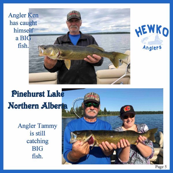
Day 5, the anglers are still catching fish. Still having FUN.
Look at that beautiful blue sky. Did you get a look at the moon tonight! Wowzers, it's half a moon, and tipped over a bit...must be drunk.
-
 2
2
-
-
1 hour ago, Corrie Kinkel said:
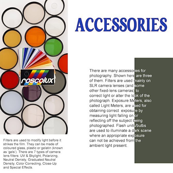
Nice! I recognized a lot of those a accessories from my youth. My dad was a hobby photographer and had his own darkroom which was in fact our bathroom that he could make 100% dark. I liked to be there with him and see the magic happening. In those days it was all black and white of course; he stopped when color photography came and switched to slides.
I also shot mainly slides, the color is what the color is. With print, as a printer it was my interpretation of what the negative should produce. I rarely shot film once I got into photofinishing because it was cheap for me to buy slide film. although we had to sent it to our head office in Ontario. bummer, I would have loved to learned that aspect.
-
1
-
-
1 hour ago, Ann Seeber said:
Wow, this is super informative, Susan. A clear explanation for all those thing-a-ma-bobs real photogs use. ? Can you put s separate white background behind just that left photo? I've done that on occasion, myself.
I was thinking of ways to separate it. that is a good idea and one I had not even thought of. I could try, but not sure how the filers would reacte as they are transparent. But I am intrigued and it's worth a try for sure. Or I'll put a black border or green to match the swatch around that mask group.
-
1
-
-
1 hour ago, Corrie Kinkel said:
Nice! I recognized a lot of those a accessories from my youth. My dad was a hobby photographer and had his own darkroom which was in fact our bathroom that he could make 100% dark. I liked to be there with him and see the magic happening. In those days it was all black and white of course; he stopped when color photography came and switched to slides.
that's awesome. I was lucky enough to print black and white in high school. The school had a huge darker with 10 enlargers and a central station for the developing. A far cry from when I worked as a photofinisher. But that training winding film into cannisters came in handy when customers came in with the leader of the film sucked in, or it was wet and I had to open the cannister and wind the film into these little single light tight boxes so the film could be processed.
-
1
-
-
3 minutes ago, Corrie Kinkel said:
Day 5 features the rooftop garden restaurant were we had a lovely lunch and some much needed "sit down time". Like the whole building it had glass windows everywhere and mirrors in the ceiling. A bit unsettling at least that's what we thought at the time, but maybe we were just tired. Same font, other colors.
Wow, that would make me dizzy, looking at the ceiling.
-
1
-
 1
1
-
2
-
-
Day 4
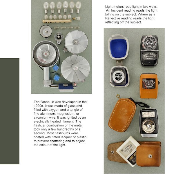
Right off the bat I see I forgot to take the stroke off the title. I was going with the yellow-red color on the pouch of the light meter but changed my mind. I like the way we changed the color of the (rasterized) font. It's a neat effect. Still cant decide on a background as anything makes the left photo look dull and grey. Unless I go for a very dark background. My "virtual" editor of my "virtual" magazine would faint of the cost of a full color page! ?
-
10
-
-
58 minutes ago, Marie-Claire said:
I don't think I can draw well enough. What exactly should I look for to find these tutorials? Pen art?
Look for Zentangle, or ZIA (Zentangle Inspired Art). it's very relaxing thing to do. I used to do ZIA. Actual Zentangle has rules and rules aren't relaxing so i went with ZIA. Google Zentange and you'll find Rick and Maria's site ( i knew of her only from Calligraphy), but for lots of freebies and how to do the tangles go to Tanglepatterns.com
-
 1
1
-
-
44 minutes ago, Cassel said:
When you have the Fill tool active, do you get that Dropper tool when you press the Ctrl key? Maybe, like for Suzy, the Dropper tool setting does not have a checkmark for the "Use all layers"?
yes, I use the ctrl key with the fill tool to get the dropper. It used to work. I checked the "use all layers box" (it was already checked but I unchecked it and checked it again) and it would only use the active layer, it even says it's the active layer on the dropper, but the "check all layers" box was checked. I'm using 2022. I'm going to be moving to 2023 when the new computer build is done. 2023 is quite laggy, even with 64 GB ram (new ram, not old), but the video card is old. I just use the actual dropper tool and it works, so it's not really a big deal. I'm going to try the classic Materials palette too. Mine acts weird when I use the dropper and the dialogue box is open. It wont put the color into the Current box. it just keeps reverting to black...if I used the Text tool previously. It's something I'm doing that I probably didnt do before and dont realize I'm doing it.
-
1
-
-
16 minutes ago, Marie-Claire said:
I have always had animals, I also wonder if I will be able to do without them.
The photo you see is from 6 years ago. I have very few photos of myself because I'm always the one taking the photos.
Meanwhile, post-covid, I decided not to color my hair anymore, and now I'm completely gray. That changes a person, I still have to get used to it.I am getting grey too and same, no more dying it. although I only dyed it for a few years (at home) and just got bored of doing it. Yes, the person looking back at me in the mirror isnt the one I see in my head. Where did all the lines come from? Therefore I painted all the mirrors black. hahaha, just kidding, you need mirrors to make sure there isnt a piece of lettuce stuck in your teeth when you leave the house. ?
-
4
-
-
1 hour ago, Sue Thomas said:
I agree, I love their pastely (if that's a word) earthy toned palettes.
If it's not a word, it should be. I make up words all the time, it's awesome.
-
1
-
3
-
-
3 hours ago, MoniqueN. said:
I'm having a bit of trouble finding the best background colours..........especially when you want consistency, but maybe I have to let it go a bit.?
Me too. I have some that have white background in the picture, which of course only "looks" white to the eye. So if I add a background of any other color it looks dull and gray (which is probably what it really is despite what my eye thinks). So far I'm just leaving it white and in the end will decide if I'll add a colored background or put a frame around any photos with too much white at the edges before adding the non-white background.
-
4
-
-
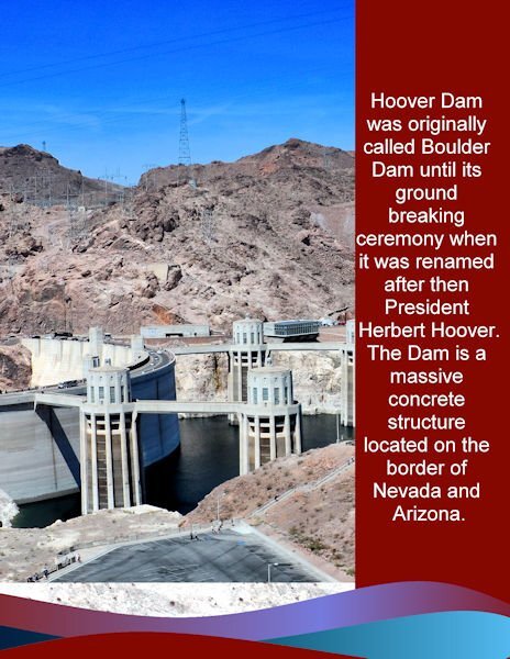
2 hours ago, Donna Sillia said:
My day 2: I was side tracked the last two days designing a new business card for my son. The photo was an overview of the dam. I used the same background, stripes and colors as the first page. The font is Arial. My photos cannot do justice to the immense size of the dam and its surroundings.
Even visited by Transformers and secret base for Sector 7. Just sayin'. all kidding aside, I love these pictures. I've been to a tiny dam in British Columbia and thought it was awesome, can't imagine what The Hoover Dam would be like.
-
2
-
3
-
-
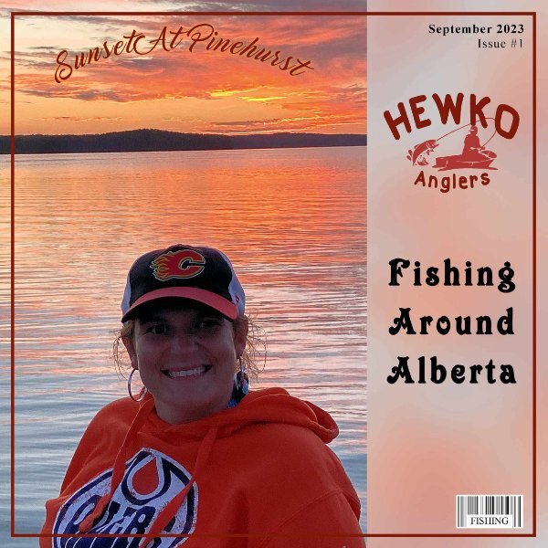
1 hour ago, Royanne Hewko said:
There is some really GREAT ideas here ...... I designed the logo, the fishing boat is from Free transparent background PNG cliparts free download | HiClipart. I used CASS Airbrush script on the paper and CASS barcode script. Fonts used Marguerite, Isrety, GUMS and Times New Roman. Thanks Cassel this is a great idea. Having lots of fun with it.
Beautiful Royanne. And you've got your Oilers hoodie on. Are you in Edmo (my name for Edmonton)? I'm in St. Albert.
-
2
-
-
6 hours ago, Ann Seeber said:
I've started working with a local shelter to trap and home local stray cats. Most recent was a female calico that had 4 kittens. We lost one kitten but all the rest are safe in homes now, including "my mama, Maybelline." Now I'm leaving out food for a young calico, but it is very elusive, and I rarely see it, though it's eating the food, mostly. It took me over 6 months to get Maybelline to be calm (though she still hissed at me if I got too close LOL) I'm just glad she got her own home and is safe now. My two pampered brats would not have allowed her in the house.
Ann, that is so wonderful.
-
1
-
1
-
3
-
-
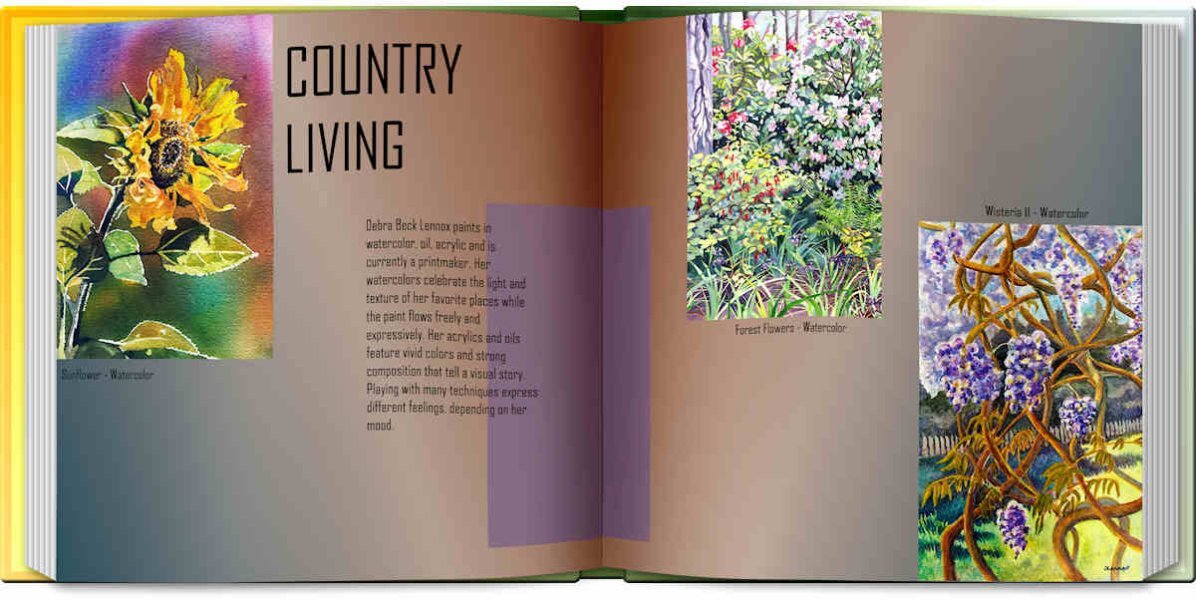
15 minutes ago, Ann Seeber said:
Time to post pages 4 & 5 of Debra Lennox Art. Since the two pages go together, I whipped out the Open Book script. These pieces are from her Country Living gallery. The font is still the same. I'll post the text separately as the book is not as readable.
"Debra Beck Lennox paints in watercolor, oil, acrylic and is currently a printmaker. Her watercolors celebrate the light and texture of her favorite places while the paint flows freely and expressively. Her acrylics and oils feature vivid colors and strong composition that tell a visual story. Playing with many techniques express different feelings, depending on her mood. "
That Sunflower is STUNNING! I grew them for the first time. They are mutant sunflower though. Supposed to be 6-6.5 feet tall. they are almost 10' now. The open book works great in this format. It would be cool to have a "Magazine" script, thinner and both sizes...hint..hint..hint Carole. ?
-
4
-
-
19 minutes ago, Ann Seeber said:
And the love between you and Poncho shows in every photo and layout. I feel the same about my cats. Since I am 82 and they are 13 & 9, who knows who will go first? If I'm ever left alone without at least one of them, I might adopt an older cat. They languish in shelters and deserve some love in their waning years, also.
I was thinking about that too...adopting an older cat. Or maybe volunteering or fostering.
-
2
-
-
36 minutes ago, Marie-Claire said:
Thank you Corrie. Yes I love him so much, as much as my previous collie. They give so much. Thanks to my previous collie, I came out of a severe depression without any other help.
Now, I fear this will be my last dog, although I fear I will have a hard time without such a friend. But this year I will be 69 years old, I hope Poncho will stay with me for a long time. But then get a dog again?...then I think, what will happen to that animal if something happens to me. Hospital, or not being able to go outside anymore, or what if I were no longer there.It's amazing what pets do for us. Dogs are special. You are their world. And they are so pure of heart. I worry too about life without animals. If my cat girls make it to old age I will be close to 70. I cant image life without animals. yet I worry about the same thing. I have to say you look way younger than 69.
-
4
-
-
Day 3
I'm late, it's actually almost an hour into day 4....and I have to get up a 5am. Not real happy with the shot. Even thought they are all Kodak Brownies they dont play well together in a shot. Tried lots of different thing and finally just stuck them on the very old (probabably) 70's photo cutting board. Perhaps it will look better when the background is in place. I am not sure I'll still with those colors in the title, but they are the Kodak colors.
-
3
-
12
-
-
1 hour ago, Suzy said:
I am so slow because I went down a rabbit hole on songs with color in them. ?
QUESTION: Cassel, on Day 3 video, around 4:43, you are able to color sample the red shirt while your plain text layer (a different layer) is active. I used to have this ability YEARS ago, but had lost it. Can you think of the setting I have messed with which precludes me from sampling any layer except my active one? It is a terrific time waster!
I have a problem where I used to be able to do with the flood fill tool, control something and it would give you the eyedropper for sampling and it's not working anymore. I have to go pick up the actual eyedropper. when I use control it shows the dropper but wont sample. I wonder if we both have a setting messed up.
-
1
-
-
2 hours ago, Corrie Kinkel said:
Day 3 and we are still in Het Depot at a floor with different areas for restauration, conserving and packaging for transport of the divers art works. At some point there was a cabinet filled with all kinds of pigments and paint tubes. It was a pity that I couldn't take a shot of it due to all the reflections in the glass doors. The whole building, if you can call it that, is full of glass inside and out. The elevators have glass walls, the stairs have glass panels and there are even glass floors, which will be in another photo.
I kept the same font Copperplate Gothic but with colors from the photo. I added an artist impression of the building with some statistics.
Love what you did with the title! What an amazing building. It would day several days to really explore it all I bet.
-
3
-


Magazine Workshop 2023
in Showroom
Posted
Excellent idea. Thank you.