

Susan Ewart
-
Posts
3,884 -
Joined
-
Last visited
-
Days Won
119
Content Type
Profiles
Gallery
Forums
Posts posted by Susan Ewart
-
-
27 minutes ago, Sue Thomas said:
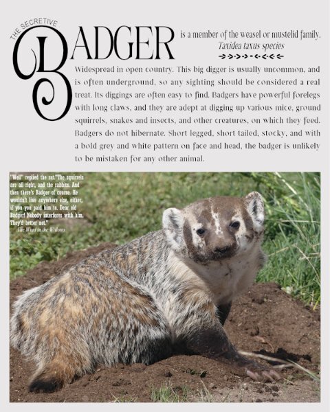
The front cover of my magazine read that there was going to be an article on the secret life of the badger. Here it is. Badgers are frequent visitors, they keep my rodent population under control. This lovely female was digging to get under the work shop, where several ground squirrels resided. I added a quote from rat, from The wind in the Willows

Beautiful. I love the mustedlid family. Your title is out of this world. Love all the little touches you do. Like the words "The secretive", and larger "B". How do you manage to find so many creative ideas. (Full disclosure: I really just want to get my face all up in that soft fur..it probably isnt soft at all, and they are probably cranky animals if you mess with them. I bet they have teeth and a jaw to match the power of their claws.)
-
 1
1
-
 1
1
-
-
47 minutes ago, Brian Smith said:
Wow! Just Wow! After the workshop, I do hope you keep posting layouts with your photos in the "What are you working on now" forum.
-
2
-
-
4 hours ago, Ann Seeber said:
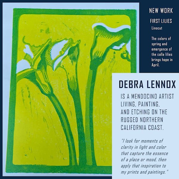
My page 2 is now ready. It features Debbie's New Work, and I chose this piece mainly because it fit the portrait format. The pale blue is part of the piece. The font is still Agency.
Love the quote!
-
Day 2
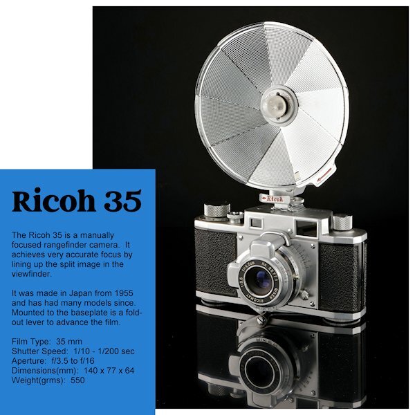
I turned the template upside down again. This was the photo I most liked in what I shot. I had wanted to do a straight on shoot with the full reflection but the camera would be quite small in the end. In the reflection you will the film advance lever that folds out to advance the film. I am not going to change the blue layer or the background (and the text color) until the end to see where I want to go with that. I just realized I forgot to add it has a 'Bulb' setting as well - oops.
Marie-Claire, WOW, what a great angle of Poncho and beautiful composition. He looks so regal.
-
10
-
-
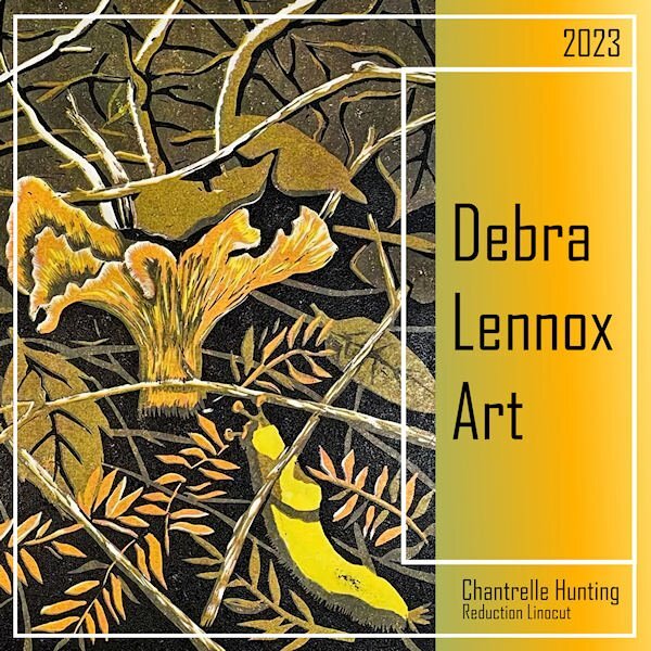
52 minutes ago, Ann Seeber said:
I didn't either so I looked it up. (I searched using Bing this time.) My search yielded these facts: "Reduction linocut is a method of block printing in which each colour layer is carved into the same lino block. Part of the design is carved into the block and printed. The process is then repeated for each layer of colour. The design is often printed working from the lightest first to darkest colours last. Often referred to as a ‘sabotage’ print."
Wow, that is intricate. So, the lino is carved, then printed, then carved and printed and so on. You really need to know what you are doing and where you are at in the process. My brain would implode trying to organize the steps in my head. It's more involved than the very basic linocuts I did 30+ yrs ago. I switched to eraser carving (not really erasers but large sheets of eraser like material) pretty quickly; the stuff carved like butter. I was never as much an artist as your daughter is though. I like the look of linocut art.
-
 2
2
-
-
1 hour ago, Corrie Kinkel said:
Yesterday I wasn't all too happy with what I did and this morning I had a bit of spare time (half an hour or so). I changed the font for a more readable one (Copperplate) and changed the color too and put the barcode and price on the page, after all it is suppoost to be a magazine. Now my cover is ready!
What a cool building Corrie, I love looking into the refleciton (is that a reflection I see, or is it painted?). Are we all supposed to finish the colors, or is that to come still in the workshop.
-
2
-
-
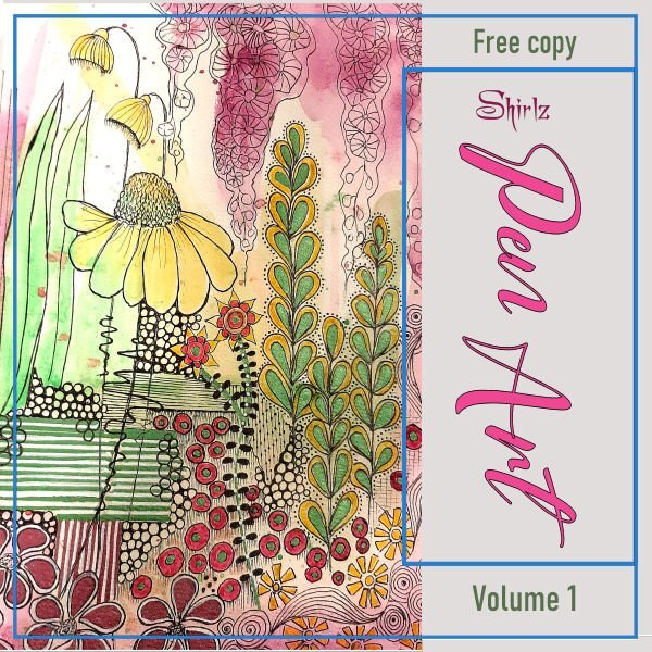
40 minutes ago, Shirley said:
Magazine work is new to me and I wasn't sure how far to go, but I see others have completed their pages so I have added the background and some more text. I have tried to colour the borders, but the whole background page fills in with colour, so I guess there is a trick to that.
I love looking at this. Is that a watercolor background too. It's so nice. On the borders: did you lock the transparency?
-
1
-
-
8 minutes ago, Ann Seeber said:
I finally hit on a topic that got me enganged so I did the cover. Debra Lennox is my daughter. The font is Agency and the background gradient is one from my files titled Tulips. *shrug* That bright yellow guy on the right under the mushroom is called a banana slug. ?
Beautiful art. that's an exceptionally detailed linocut, especially the mushroom. I dont know what a reduction linocut is but the result is stunning.
-
1
-
1
-
-
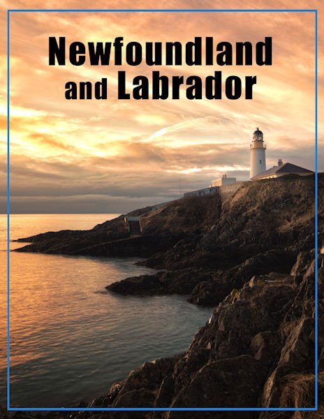
3 hours ago, Ann Seeber said:
Beautiful cover and camera, Susan. I'd buy that magazine in an instant!
Ann, Thank you. That means a lot to me.
-
Day 1
I rotated the template so the camera would look inward. I couldnt bring myself to put the title sideways. After all, my masterpiece will be in bookstores near you soon, and in the rack, after the first row you just see the top title of the magazine. ?. I used a retro font for the word "camera" and in red, a power color in photography.
Since it's my first time through this workshop I will wait to see where we go with this cover.
There is magazine covers I see in the forum I wish i could buy in the store! Great work everyone.

-
2
-
10
-
-
26 minutes ago, Brian Smith said:
Hello People ... I decided to go with the 8.5 X 11 inch format ...(Is that the same as A4....?)
I also decided to make my image take up the full page... I'm hoping this will be ok down the road.
Wow, beautiful photo!
-
1
-
1
-
-
1 hour ago, Cassel said:
Yes, the wrong email was sent. I will send the correct links in a minute. Stay tuned.
All good now. Thank you.
-
24 minutes ago, Rene Marker said:
Same.
Must be computer gremlins at work.
-
Carole, the link for Day 1 is taking me to the Travel Tale Workshop.
-
On 9/12/2023 at 9:03 AM, Ann Seeber said:
I did an entire magazine with those templates in Aug 2021.
I've commented on this (it's beautiful), now I want to thank you for posting all the pages. I can now shoot for the photo types (landscape, portrait etc).
-
1
-
-
43 minutes ago, Ann Seeber said:
Mine will be about whatever topic has the most photos. ?
I hear ya. Mine too. I was hoping to shoot some cameras but not sure if I'll have time. I might go ahead, they wont be the best photos though. But being a Diamond member perhaps it show up in the workshop section and I can always redo it down the road.
-
2
-
-
23 minutes ago, Sue Thomas said:
Only to satisfy my own curiosity, I looked up the meaning of the word spare in my very old Collins English dictionary, which I have had since I was a child. Adjective: not used/needed, not being used or not needed at the present time. A duplicate kept as a replacement. word origin Old English: to refrain from injuring. Spare the rod save the child.
I use the word quite often, when someone asks me if I have for example eggs, I will often reply with, I can spare you some eggs.
Not everything on Google is accurate.
The English language is perplexing. Now, that's a word (perplexing), I really dont know what it means, but I used it anyway *GASP*. People are always telling me, when I use a "big" word...."you better go look that up". I think I should stick to one syllable words...except syllable is more than one. YIKES!
-
 2
2
-
-
52 minutes ago, Sue Thomas said:
Susan and Rene, I have to agree with you both. It appears I started quite the conversation. Changing gears slightly, but on the same subject, which is a relevant point, which I think has just been proven, when it comes to creating a good magazine cover or page, the text should be easy to read and understand. I believe it's a good idea to use simple short sentences. The same goes for the layout, it has to have balance, variety and emphasis to be an appealing and a functional design, that will make sense to anyone. Of course it doesn't only apply to magazines, but to any creative page. Should there be any typos, just read over them. Simple and minimalistic ( I wonder how many meanings these two words have!! lol) should be my middles names This is my opinion!
Good advice, I'm a first timer in this workshop.
-
I didnt know spare could be elegant. I have an "elegant" room in my house for company. hahahha, nothing I have is "elegant". I use the word "Spare" when it describes something extra and I use the word "Sparse" when there is not much of something.
Like money is "sparse" these days, does anyone have "spare" money to send to me.
Basically the two words look similar but to me they are opposites.
-
2
-
-
41 minutes ago, Cristina said:
Carole, I can only imagine how upsetting it was for you until everything was clarified. ?
And the person who cried the loudest was the one who took credit for somebody else's work. One needs strong nerves to deal with this situation!
I went through this (not as bad as Carole) when I made a product for the rubber stamp community. I had a commerical order from a stamp maker and she used solvent to clean the product I made which caused cracking of the product. When she informed me i asked her to give me a couple hours as I was going to go the the raw material supplier to see why this was happening, which turned out be the solvent (they were 45 min drive away). By the time I went there, had the meeting and got back home she has smeared me and my product all over the craft forums (I never saw it as I didnt follow them but was informed by a friend who did). So I sent out a return for refund letter to every client, and only this one client took the refund. Luckily, most sent me nice emails that they were happy with the product and were keeping it. I stopped production and that very client asked me: "So, can I make an order?". It was a relief to get rid of that, as it was labour intensive and took me away from my main source or income (silversmithing and glass art). Social media wasnt as big as it is now, what Carole went through was horrible. Especially the one who took credit for someone else's work. Strong nerves and the ability to keep calm. I think if I had looked at the forums where my client was bashing me, I would have acted in a bad way. I wanted to remain as professional as possible. Not always easy as it's a very personal attack.
-
1
-
 1
1
-
3
-
-
4 hours ago, Julie Magerka said:
In my determination to keep producing a layout regularly, I made this one. I did a "curved photo" from a tutorial on a photo I used for something else (likely from Unsplash or Pixabay), and then just started "playing around". I used a punch from Carole's new batch on the strip, added some other stuff and called it a layout. Fall colours and "busy" backgrounds are things I like.
This is a beautiful fall layout Julie. I love the punch, I bought them but havent even loaded them yet. They make a striking element. this layout is really well balanced.
-
2
-
1
-
-
4 hours ago, Cassel said:
The discussion about "thieving" can be interesting and as Susan says, we all imitate in some way, and learning is about copying what we see (until we learn by messing up). There is a big difference between copying an idea to "play with" versus copying an idea and taking the credit.
Many years ago, someone saw a new product in a store and she bought it, however, it was limited to 4 particular words, and she had no use for those words. She asked me if I could code a script to allow her to use other words and other fonts. I did. However, at the time, I didn't know who had designed the product I was recreating, and it caused a HUGE uproar when designers started calling me a thief because I "stole an idea" that one designer had created and it was very unique. They said I was just going to cause her to lose all sales because "everyone" would buy the script instead of her PNG product. That turned out to be a horrible week of name-calling in a very popular forum. That is, until one designer recognized the technique from an online tutorial. It turned out that the designer who claimed to have "created that unique effect" was, in fact, just copying it. She was using the same text, the same font, the same settings, and claiming it HERS and "never done before". In the process, *I* was called a thief.
All that to say we all get inspired by something else, whether it is another digital project, a TV ad, a craft tutorial, or even nature! Being inspired is one thing. Taking credit is just something else.
What a horrible experience. That is one reason I rarely did commissions when i sold jewelry/glass. We used to say, nothing is unique, because somewhere in the world someone is doing the exact same thing you are.
-
5
-
-
8 minutes ago, Michele said:
I have no sense of direction. Could you please give me the link so I can download them, too? Pretty please.
https://scrapbookcampus.com/Bonus/MarkusFaces.zip
hope this works
-
2
-
1
-
-
11 minutes ago, Ann Seeber said:
Got them! Thanks!! Now to find something yellow ~ ?
Stick him on a banana. I dont have a color printer and not likely to get to the office supply store to get copies in the next few days.
-
5
-


Magazine Workshop 2023
in Showroom
Posted
you are so lucky. Such diverse subject you get to encounter. I did not know they moulted (if that a word - I do make up words now and then). My cat has fur the same color on her sides. She has tufted ears, and black ringed tail. We call her our "Bobcoon" cat (cross between bobcat and racoon). She is the only wild thing we encounter...lately she has being hunting all the falling leaves (they are outside, she is inside - seems to work for her).