

Susan Ewart
-
Posts
3,884 -
Joined
-
Last visited
-
Days Won
119
Content Type
Profiles
Gallery
Forums
Posts posted by Susan Ewart
-
-
1 hour ago, Cassel said:
Good question. The Clip to it script was created to simulate the "clipping mask" in Photoshop, and it will use the paper/photo you place on top of the shape.
The Raster-to-mask will do the same thing as the Clip to it EXCEPT that it will stop at the mask creation while the Clip to it will ALSO grab the layer above (paper or photo) and move it inside the mask group.
So the Clip to it might be more convenient when you want to use a specific image/paper, while the Raster to mask will stop after the mask group creation when you might not yet have decided on the paper/photo.
Thank you for this explanation. I've been using the long way so I don't forget how, but the scripts are great if I have a ton of masks to do.
-
 3
3
-
-
1 hour ago, Anne Lamp said:
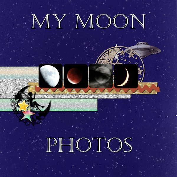
Day 5 Moon photos are mine. Font is Castellar. I have lost track of where the background and other stuff are from. I didn't make notes while working on it.

Love this. The spaceship is a great touch.
-
2
-
-
1 hour ago, Julie Magerka said:
Very dramatic and effective. Dark colours are not used very often, and I like the effect. Poor moon, all those "unspeakable" things you did!
hahaha, I know, right (poor, poor Moon). But don't feel sorry for it....isn't it always "mooning" us?
-
 2
2
-
-
1 hour ago, Bonnie Ballentine said:
Corrie, I am almost "really old"...79. Age is just a number to me. Some say your age is the number of years the world has been enjoying you. I did realize yesterday that others see me as really old. Two neighbor children came over to shovel my sidewalk and a neighbor who owns a tractor came to plow my driveway. While I can still do those things, it was a real blessing to have the help this time.
I am really enjoying this workshop. I have day 6 almost complete but all of you will have to wait until I return. I leave tomorrow for sunny, warm (hopefully) Florida for a pickleball clinic. It will be a nice change from our frigid and snow covered ground. I am flying this time so I will not take a computer. I'll have my tablet so I hope to be able to check in but will have no new layouts until I return on Thursday PM.
Judy is so confused by this trip, she has been no help and at times a real hinderance. Any change to the "normal" routine throws her for a loop. We will not be taking any other trips for a long time. This trip was planned months ago and I did not realize how quickly Judy would decline. Thankfully, we are traveling with friends who really love Judy and will help where they can. Of course, they should not give up any of the activities they paid for. I am sure it will be a delightful time...and we plan lots of board games too! Everyone stay warm, keep creativing and I'll see you when I get back.
I've said it before. You are an amazing friend to Judy(and to all your friends, I am sure) and a real powerhouse, so inspiring to me.
-
3
-
 1
1
-
-
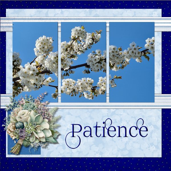
1 hour ago, Corrie Kinkel said:
Day 6
Today I'm sticking with my flowers but this photo is from last spring and I choose it because I'm fed up with the cold and the remnants of the snow that makes the footpaths slippery! The timing of this workshop is great as we, my hubby and I are getting a little bit afraid of taking a fall on those slippery paths/roads and that is maybe a sensible thing regarding our ages. Why don't I like being sensible..............
I wanted to use this photo and therefore I used the extra diamond template because I could combine the mask layers in one layer (something we learned in the Magazine Workshop). The papers come from a kit called Denim and I got the dark background by using 2 papers and a blendmode. I really like using the blendmodes and in PSP 2023 that has become so easy. Instead of using the flowers that are in the kit I have chosen I bouquet from my stash. The font is Prida01 and that one has nice glyphs and I gave the text a bevel.
wow Corrie, those flowers are beautiful. (the real ones you photographed). About why you don't like being sensible....because it makes you feel older than you are. No matter how old I get..."sensible" will always seem like something "older" (than me) people should do and not me.
-
2
-
1
-
-
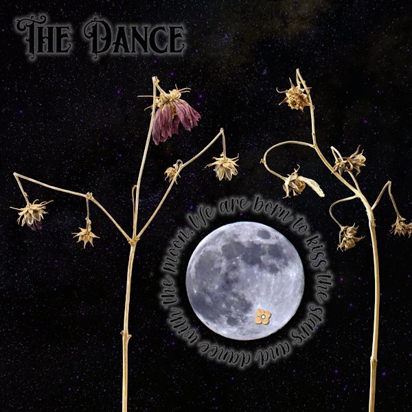
Day 5
First, apologies for really messing with the template. I did keep the round circle that the stitching was around and turned it into a mask and fit the moon (yup, I did some unspeakable things to the moon to make it not as real). Also, the little flower on the (*Ahem*) private "underparts" of the moon (you know, it looks like a cat walking away from you with it's tail up). They are right in the spots they started at too. I couldn't seem to make the template work with the small pictures like I have in the past so I had to improvise. I used "text on a path" for the quote around the moon, and wanted to add the author but it would have looked weird with a big gap of small lettering. For both the title and the quote I used a layer style of outer glow. That is an odd thing. I had it at the lowest possible setting and 50% opacity and it's really still too big. I did have to lower the opacity of the layer as well so it wasn't too overwhelming. I wonder if there is a better way, and not have to use the layer style as there is not much fine control with it. Once I had that I turned the font color black. The stars was a starry background paper I got somewhere, that I put above the photo layers and used "screen" blend mode. I thought these subjects looked like they were dancing when I shot them, they are the Forgotten Moonflower Fairy Queens.
Font: Title is Morgan Tattoo and the quote font is Morning both by Creative Fabrica
Quote: by Avijeet Das
Little Flower: Digi-Dewi -Relax, flower-brown (Digital Scrapbook.com)

-
4
-
 1
1
-
 10
10
-
-
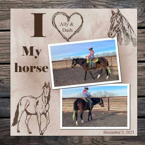
3 hours ago, Royanne Hewko said:
Day 6. I am on time ...... Another great handout. I really like the reverse shadow, I have saved the PDF for future reference. I did not use the flowers as I wanted it more horsey!!!!
...and who doesn't want more horsey. They are the best!
-
2
-
2
-
-
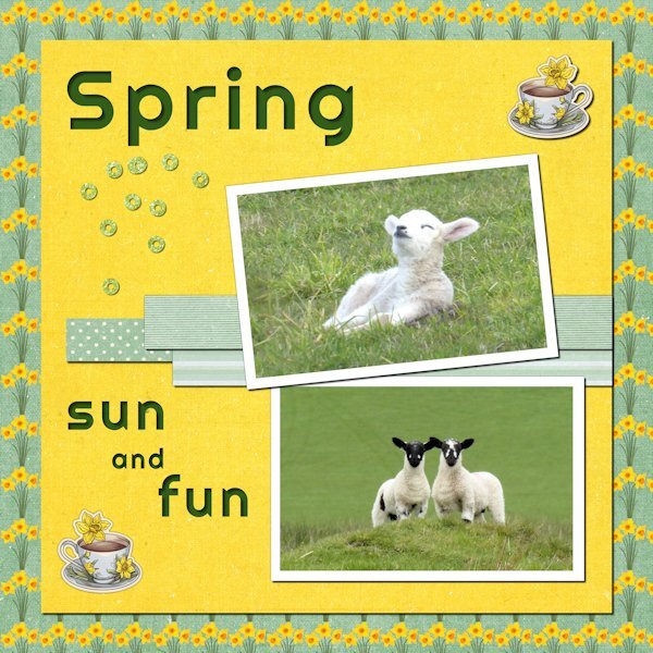
1 hour ago, Sharla said:
Day six: The photos are mine, taken a couple of years ago. The papers and teacup are from the Afternoon Daffodil kit by Jessica Dunn - I changed the background paper by adding a pattern of daffodils to it from a png graphic from Freepik. The glitter bits are from somewhere else – I can’t remember where. The font is Righteous.
I love that little lamb in the top picture. This is what happiness looks like!
-
3
-
3
-
-
3 hours ago, Cassel said:
No worry. I think it is a little concerned with links. We had spammers post links, so it seems that some links are flagged, and I am sent a notification to approve or decline. If it is a legit post, I will obviously approve it!
Thank you. Make sure to tell me if I do overstep. I did live 20+ years in Surrey, BC; nothing you say to me will phase or offend me.
-
4
-
-
Yikes Carole! I just make a remark on a post that I thought was interesting and it has blocked it. Did I say something offensive? Or is this the AI-police at work?😨
-
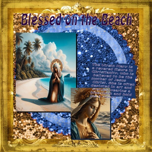
2 hours ago, franbvm@aol.com said:
Again...more AI Virgin Marys with a short paragraph about her using chat GPT
This did not come out the way I wanted this page to look but I posted it anyway.
The paragraph was very interesting. Do you know why the cloak is usually blue? I'm curious.
-
2 hours ago, Leslie Gifford Cook said:
A few more of my turnings. The darning mushroom is made from a piece of a lilac bush. You should be able to just see the purple lines in it. The sawdust smells a lot like the flowers. The pendant and earrings are made from some small pieces of tulip wood. The papers I used all came from Marisa Lerin's DigitalScrapbook.com.
I hope you keep doing layouts of any sort long past this class so I can keep seeing your beautiful works.
-
1
-
-
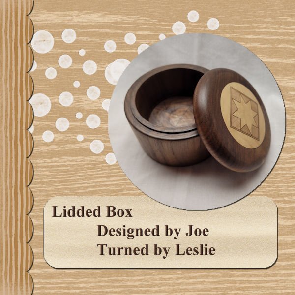
2 hours ago, Leslie Gifford Cook said:
A little late in getting through these lessons and posting. My pictures will likely all come from the things I've turned since I may want to use some of these layouts in my advertising. Thanks for the great info. This one shows a Walnut lidded box with an inset in the top. I wish I could take credit for the inset, but I purchased the material from a retired woodturner and we didn't have time for me to learn how he put the shape together. The turning work is all mine though.
That is beautiful and one thing I had wanted to learn once upon a time. I used to work for my brother (when i lived in another province) who made custom Japanese furniture and shoji doors. Now he works for his son making Italian cooking tools (gnocchi boards and all kinds of stuff wooden and brass). I love wood and a part of me dies a little inside when I see someone paint it (I'm talking nice stuff like walnut, spalted maple, curly maple etc). Your work is really nice. If you ever want to see my nephews work, it's at etsy called: Nonnas Woodshop. Or or look for Dan Ewart on Instagram and see him rolling out pasta dough (he was a chef at a high end restaurant in Vancouver, BC). I'm not trying to sell anything, if you like nice wood products, it's a treat for the eye. Even I couldn't afford to buy any pieces.
-
1
-
-
3 hours ago, Corrie Kinkel said:
Nice trick to only use the shadow. In this layout it works perfectly. I must remember that!
I believe I learned that from Michele, it's pretty cool isn't it? I'm not sure if she did something different when I saw hers, but as always, it was eye-dropping awesome!
-
1
-
1
-
-
11 hours ago, sharon thompson said:
Day 5 result. I had promised another new dragon themed tag for a guy who has a "Dungeons & Dragons" group (he has a truck, I don't, but I need one to haul soil etc for my garden so I make tags for his group emails all year). I did try and work with the template but, after inserting all those menacing dragon eyes into the photo slots, I quickly abandoned that idea and deleted them. There was a circle and some rectangles left and, in the spirit of moving placeholders and using the pick tool for scaling, I went completely off script. The paper was a rescaled and recolored wallpaper, the dragons & flames were already in my stash but, because I usually work in tagger scale, I was constantly rescaling things. The pale dragon at top right was a jpeg so I had to tube it (I hate tubing) and there was no clear color definition. After adding it to the paper, I realized that I should have misted it as blurring the edges didn't work well. It was going to be blended into the background so it doesn't look too bad unless you zoom in on some of the edges. It took several attempts with drop shadows to make the flames leap out a bit. Font is Brush Script Std.
Wowzers! This is fabulous!
-
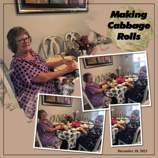
1 hour ago, Royanne Hewko said:
Day 4
Yummy! I miss my mom's cabbage rolls.
-
3
-
-
1 hour ago, Julian Adams said:
I love the crisp clean look Gerry
Me too!
-
1
-
-
1 hour ago, Julian Adams said:
I like your aesthetic, Susan
Thank you so much Julian. When covid hit, I still had to work through it and found it quite stressful. One day (to distract me from the world) I bought this table top photo course and was hooked. it brought me back to my first hobby that I started in high school (Photography). Design is hard for me. But I'm told - Practice, Patience and Perseverance will get me where I need to be.
-
3
-
-
2 hours ago, Julie Magerka said:
I used to grow many plants from seeds. It was fun to watch them grow. Now, I'm just too lazy, and have a smaller garden (thank goodness!)
Last year was the first time I tried to grow flowers. I'm making the most of them still. I put the seeds direct into the garden and didnt expect anything and some into pots so i could move them around to photograph them. I was surprised and happy that some actually grew. I am going to try again this year.
-
3
-
-
2 hours ago, Julie Magerka said:
I knew this was yours before I saw the name. You love your seedheads and do such a beautiful job of presenting them.
Thank you so much Julie, it means a lot to me.
-
Day 4
Font: Nelson (Creative Fabrica - Laura Worthington)
Paper: Riley B Graphics (Creative Fabrica)
The word "Echo" is the shadow only (of something once that was and now isn't) and I used it in the literary sense from a google search below. I shadowed the frame but not sure I like it or not.
What does echo symbolize in literature?
In literature and art, an echo can symbolize memory, the past, or the idea of something being repeated or reflected back. In many cultures, the echo has been used as a symbol of communication, reflection, and the interconnectedness of different elements.Feb 26, 2021
-
5
-
10
-
-
1 hour ago, Corrie Kinkel said:
Susan glad that you have started! I like all 3 of your entrees with those wilted flowers and they look their utmost best on the black background and the subdued colors of the rest of the layout. What do you use as background when you take the photos? Black paper, cloth, a painted surface and in a studio setup with lighting?
I will use either black foam core or black Velvet. Velvet is problematic as it wrinkles and it picks up all the dust, hair, threads etc. But it so black that it's really good to use. With foam core the trick to make sure the light is not lighting the background, so the subject farther away is better so you can have the light fall off faster, and I even use black foam core to block the light from spilling onto the background. My set up is very "mickey mouse" (rag-tag) and not at all professional in any way (I dream of owning strobes, flashes, and light modifiers but they are too pricey at this time). I am in a "studio" (aka: the spare bedroom that was once my hubbies office...now he is relegated to the "cat room" for his office). It's small and I risk tripping over light stands and my camera on the tripod as I work. But I am ever so grateful I even have that opportunity to have what I have and so I do the best I can and try to learn how to make the photos I want. When I know better I'll do better work and when the time comes that I get the equipment I want I'll be ready for it (and the huge learning curve that goes with it).
The photos I'm doing with the aged plants don't look great in my layouts as they really need to be shown bigger to see the beauty in the line, form and color of them. I'm also still learning about my newer camera. I had being using assisted manual focus but still not happy with the sharpness I thought I should be getting. Well, I learned that I could zoom in BEFORE I take the shot (as well as after like I had been doing) to make sure what I want in focus is in focus. I only just learned that two weeks ago. Yeesh! Why didn't I look that up before. So these shots aren't as focused as I like. It's a learning curve isn't it?.
-
3
-
1
-
-
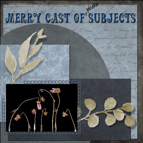
Woo whoo! Day 3 Done!
This was an accidental photo. I had just photographed these and had them lined up on the table and thought they looked like "players" on a theatre stage, so I snapped them, even with their little stands showing (kind of like looking under a skirt *GASP*).
Papers (all): Riley B Graphics (hmmmm...a pattern forming here eh?)
Fonts: title is Action Is and the written script is Adorable Mother Script - both from Creative Fabrica
It took me some time to find the right color to use with the blend mode to get what I wanted, but it was fun to see what the modes do. I love in 2023 that is shows you as you scroll the modes.
Onto Day 4 now...
I'm really enjoying all the forum posts, such beautiful and creative work from everyone.
-
4
-
9
-
-
I'm on a roll. Here is Day 2
Papers: Riley B Graphics for the dark brown and light beige inside the frame
Scallop: Creative Fabrica (I think)
The ring: a gradient with lots (like 253) repeats then inner bevel
I added frames (with inner bevel) around the photos to give them separation
Quote/paper under it: Frank Lloyd Wright and paper chosen from photo and textured
Font: p22 FLLW Exhibition (found on the internet - based on a font made by Frank Lloyd Wright)
-
6
-
11
-

.jpg.ea0de3bb5afd63d9d8be16f6b989c0f3.jpg)


January 2024 - P52 Challenge
in Challenges
Posted
I am looking forward to seeing your project come to life! What an interesting idea. You have good resolve, I often thought about doing something like that, then by day three i see something shiny and forget what I was supposed to be doing. (seeing something "shiny" is a joke my friends and I have about how easy it is to get distracted by something else).