

Susan Ewart
-
Posts
3,882 -
Joined
-
Last visited
-
Days Won
119
Content Type
Profiles
Gallery
Forums
Posts posted by Susan Ewart
-
-
Day 3
Plugging along at a snails pace. Had fun with this one. I wanted one object in color but still with the Pencilsketch2 effects. I believe I used hard light blend mode with an extracted version of the pipe wrench (is that what it is?). The two little box wrenches(?) in the corners were originally photographed (along with a third ugly one that I didnt include in the layout) with the main group of tools. So I extracted them, inner bevel added. I used the Letter press script again with Gill Sans Ultra Bold font (formerly from MSWindows). This time I added the spaces you get when you add a space (I think) when entering the text. And this is a one row box you have the option of making. I did desaturate it to make it look like metal and I had to resize it because it was wooden and the box bottom shows through. The Letterpress script is quite customizable with the each element on a separate layer (when you choose adding the box for it it all goes into layers and I recomend using this because you can choose to use or not use the box and you can also group it all for easy resizing all at once for for copying and pasting into a layout as a group. It's much easier than handling each element separately.
And like everyone else, I went down the rabbit hole for a good hour playing with the kaleidoscope effect. One to Day 4 now.

-
 5
5
-
 9
9
-
-
1 hour ago, Donna Sillia said:
Day 6 - The photo is from my daughter in law. I made two backgrounds with different colors. The font is Lovely Valentine and Love Valentine Extruded from Creative Fabrica. I had to go to the blog to figure out how to do layered fonts. I made a picture with the font, the background and the preset shape, merged and copied into the circle mask.
I really need an intervention on fonts since I cannot stop downloading them. Now I am looking for layered fonts because of Carole's explanation of how to use them.🤣

I think I need to join you in that intervention. I'm so bad and I have loads I haven't loaded (installed) yet.
-
 2
2
-
 1
1
-
1
-
-
4 hours ago, Corrie Kinkel said:
Susan it is such a great script, I like it too and you make good use of it!
Oh man, there is so many ideas running around my head that I couldnt sleep last night. I've said it before, I really need a 48 hr day...lots of money....and no job to go to! Okay, I added the last two items just for good measure. I'm about to post again. I had fun, but did a lot of extractions to get what I want that I think masks would be better for (like what I see in PS tutorials but for some reason I cant wrap my head around translating it to PSP.
-
1
-
1
-
-
5 hours ago, Jen Brown said:
Lesson 2, the plaid background was such fun to make.
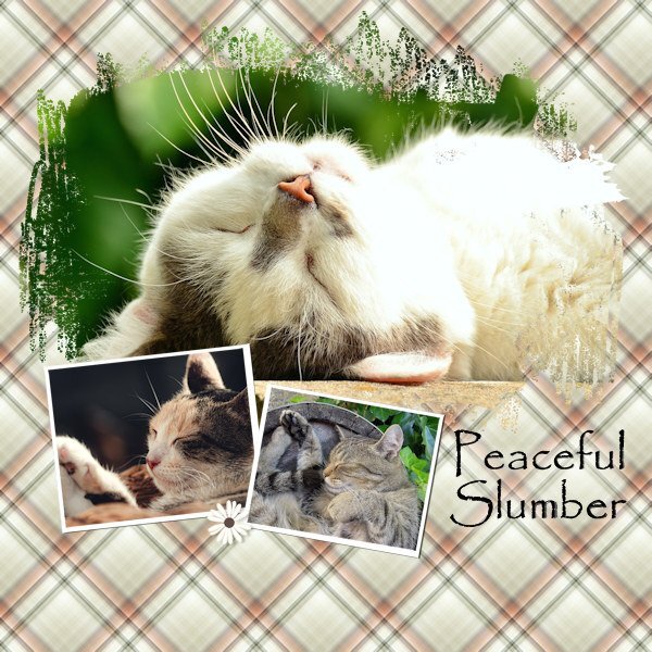
There is nothing more peaceful than looking at a cat(s) sleeping. Am I right?
-
1
-
-
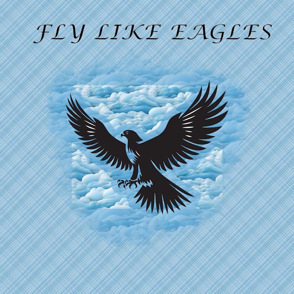
5 hours ago, Randy said:
Day 4
Eagle and clouds from Creative Fabrica
Font is Lucida Calligraphy
Love that plaid!
-
2
-
1
-
-
1 hour ago, Sue Thomas said:
They are ever so sweet, but difficult to shoot, as they are constantly on the move. I suspect the ones you have are the Red-breasted Nuthatch. As they have a black eye stripe and are a buff orange below. (breast and belly). Their blue grey colour on thei upper back and folded wings are very striking, even on a cloudy day.
Yes, that's the ones we have around my house. They are zippy little birds for sure. The cats (and us humans in the house) love to watch them.
-
1
-
-
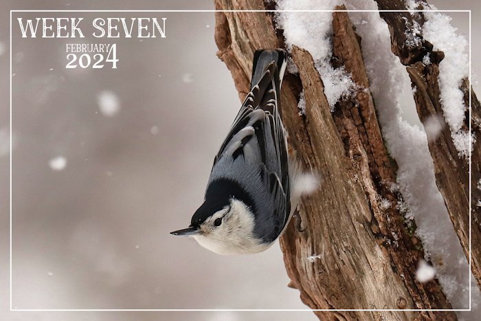
1 hour ago, Sue Thomas said:
This past week we have had snow, and blowing snow. Once again the landscape is blanketed in the white stuff. A delightful White-throated Nuthatch. Nuthatches are short tailed birds which walk up and down and a round tree trunks and limbs. The ones I have here, and enjoying the suet, sunflower seeds, and peanuts.
I love these little guys. They are tenacious and make a cute little sound. the ones I see have brown/rust(?) color on them. This one is so pretty in a blue tone.
-
 1
1
-
-
1 hour ago, MoniqueN. said:
Day 3 and 4 🙂
"Zo gaat de molen" is the title of a Dutch song for children, my granddaughter loves to sing it with me, well I sing, she does the movements (she is 2 years now since thursday🥳) The kaleidoscope I totally forgot it was in PSP, was nice to use it again.
Sometimes it's nice to have a "calm" pages, with not too much things added.
Day 4 is a shipyard form the old days from the Netherlands. It closed in 1947 and rebuilt in the museum in 1948.
Font is Bree serif and I used a brush form the link Carole had in her lesson.
The brush work on your Day 4 layout is really beautifully done. So perfect for that image.
-
1
-
1
-
-
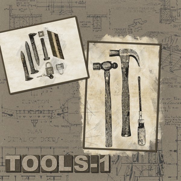
Day 2! I'm just moving right along now. I might even get done by the end of next week! Yeesh, what week to have a heavy workload.
Continuing on with playing with the PencilSketch2 Script and some old tools left by the previous homeowner when we bought the house (and he was "kind" enough to leave numerous mystery liquids in unrelated containers that we had to take to the hazardous materials dump since we didn't know what any of it was 😨). But, the tools were cool so I kept them. the railroad spikes I had already. I used the Lady 22 template 158 and changed it to fit my photos. I didn't do the plaid...mostly because I forgot and because it didn't fit with the idea I had, although plaid shirts and tools go together so maybe I should re-think that.
For the title I used the Letterpress Script (Creation Cassel) and I used the steel version but added a bit of color.
Background paper is from Sheila Reid VPS Set 01 - paper texture - 06 (Digital Scrapbook) - it's originally blue, I did a negative image then changed the color with HSL.
I love the PencilSketch2 script, there is a lot you can customize with the layers you get after the script is finished. You might see a little more color in the smaller photo. The photo you use is also in the layers palette (a duplicate as your original is not harmed in any way) so I brought it up above the background layers then lowered the opacity so add a little more color.
-
3
-
12
-
-
1 hour ago, Marie-Claire said:
DAY 3
Template: Lady22 (lady22.eklablog.com) - Butterfly: Janet Kemp (Digitalscrapbook) - Cluster: Jessica Dunn (Digitalscrapbook) - Wordart: Freebie (Creativefabrica)
The kaleidoscope patterns were always overpowering, so I solved it this way.
PERFECT way to solve the Kaleidoscope! It makes it look more like an art piece. What a great idea.
-
2
-
1
-
-
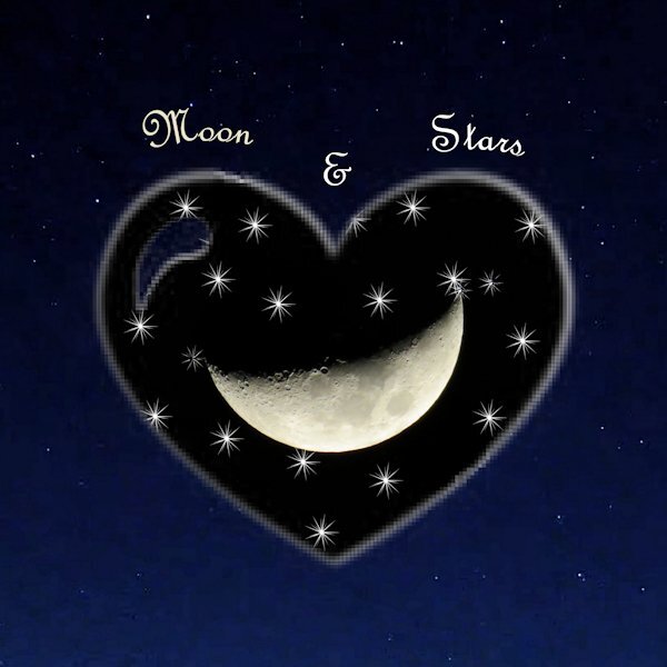
5 hours ago, Anne Lamp said:
My day 5. I did something different. I used a heart brush set to white on the mask and also star shaped brush. I then used the same heart brush set to white on a new layer and put it behind the mask group to make it show up better because it was on the dark background. The moon pick is mine. The background paper was created from a screenshot taken on an Explore.com live cam. It is so much fun to play play play.
Stunning moon shot Anne!
-
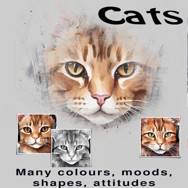
8 hours ago, Randy said:
Day 1 - Yes, I am just getting started.
The pictures are from Creative Fabrica.
I saved the full size image also as pspimage as I should be able to change the pictures and add things as I want.
For the short term, there is a family member who loves cats and I am thinking of changing the cat pictures to actual pictures.
Thank you to all who are sharing their creations.
Randy, I love the cat pictures. I have one that looks just like this. I am way behind too (four days now). It's been a long hard/physical work week and it's not over yet.
-
1
-
-
8 hours ago, Rene Marker said:
Sharon, I always use the JPG Optimizer that you show here. Like you that is how I learned to save images years ago. Now whether that was back in the 1990's when I first started with PSP or when I started digi-scrapping in 2007/2008, I'm not sure since I don't have the early versions to check! But I've been doing this for years and it has always worked well for me.
When I save my pspimage files using this, I set the compression value to 13 (always) and save to my folder for the images I will be printing. Since using this does not change the pspimage file by renaming it, I then resize it to 600x600. Then using the JPG Optimizer I adjust the compression value so that the Compressed number on top right reads between 200 and 250 kB then save the image to a folder set up for only 600x600 images.
The only time I use the "save as" is when I start a layout using a psd template so I can save it using the file name I want (and to not overwrite the psd template).
You are right on the money. Doing what you are used to. I am a "Save As" girl, which is how I learned with general computer stuff. I must admit to cringing when I have to compress files. Throwing away detail and pixels; might as well throw away all my money. I'm a dinosaur, I think in terms of photography from back in the "film/slide" days. I will compress to the least amount for the forum (Sorry Carole, I'm probably being a space hog) every time. I don't limit myself to specific numbers since every layout is different, more compression is more loss of detail. I get that it's just for the forum, but with such fabulous layouts (from everyone) I'd love to see them in all their detailed finery. Not everyone posts on FB, I'm bad for even remembering to do that myself. I also do that Rene, where I will open a template or image and if I do do shift D (because I'm too lazy to re-type the name when I do "Save As"), I'll just do Save As right away and usually I add WIP (Work in Progress) to the end so can find it right away. When I'm finished I take the WIP off or I'll put FINAL in it's place. I really enjoy seeing how everyone's work flow, flows, it's quite interesting to me.
-
4
-
-
7 hours ago, Carolyn Rye said:
Day 3 of the Mask Workshop. This day tested what I have learnt about Masks. I feel so much more confident now.
My problem now is how to respond to others on this site. I don't know where to go to respond to anyone. Cassel is there some literature that I can get regarding this? I feel a bit silly that I do not know.
In addition to the the post Carole advised you to check out you can just click on the word "Quote" at the bottom of every persons post and it allows you to respond. the persons post and photo pops up and you can type in what you want to say and then below that on the bottom right is "submit reply". Just click that and it should come up. Sometimes it takes a few seconds and even sometimes posts go missing in cyberspace. Usually we add a post to Carole saying we posted something but it didnt show up. She can sometimes find it.
-
1
-
-
1 hour ago, bina greene said:
Font is Omnia, graphics Marisa Lerin, Jessica Dunn and myself. Haiku myself.
This somehow sits better with me.
It does make quite a difference. I like this version best as well.
-
1
-
-
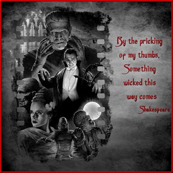
1 hour ago, sharon thompson said:
Day 3 - Still can't figure out how I locked that color palette for my project but decided to work around it. If anyone can help sort that for me, I will redo the project but with a colored background paper as originally planned. I flattened the image & exported to a jpg and then reopened it, treating it like any other jpeg & then finished the lettering & border. That restricted my background to b&w instead of the red bloody splattered grunge paper that I wanted but, it seems to work. I did have to change the quote though as my original choice went better with the bloody paper. The film style mask is a snag from Pinterest, the monster collage is from a horror movie archive, the paper texture is from Freepick, and the font is Anger Styles from Dafont. I am not a fan of the kaleidoscope effect but that is just a personal preference. I am too busy making more plaid patterns from yesterday's lesson.
I had this problem once too. I never did find a reason. I think I just read did the layout. it was frustrating because I didnt know what I did to get to that point where I couldnt get back a color palette.
-
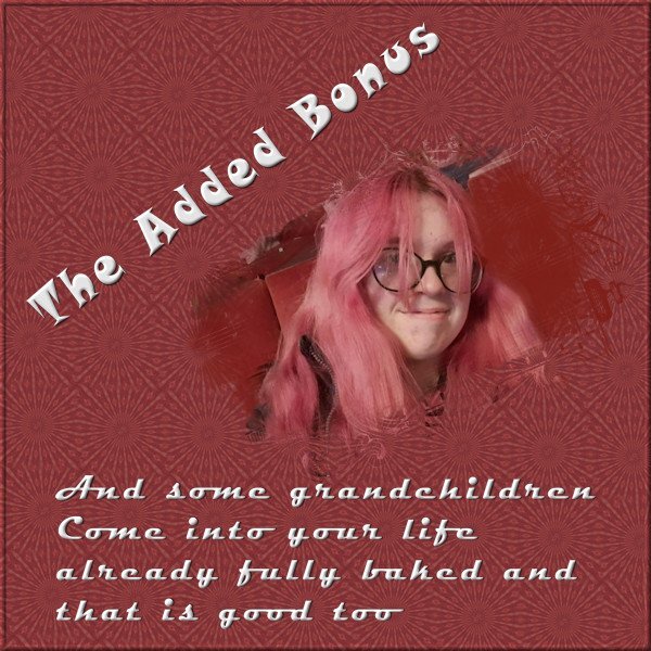
1 hour ago, Harmony Birch said:
Continuing with the theme of grandchildren, not all grandchildren are directly descended from your own flesh and blood that doesn't make them any the less important. The title font is Snap ITC, and the journalling font is Magneto. I used a free mask from Jessica Dunn's nesting mask kit. https://www.digitalscrapbook.com/jessica-dunn/kits/nesting-masks-kit-baby-birds-precious-love-black
That kaleidoscope is awesome!
-
2 hours ago, Ann Seeber said:
Beautiful, Corrie! I seem to recall Creosote having a strong smell. Does the bush have an odor, too?
We used to paint the farm fences with it so the bird-brained thoroughbreds didn't chew on it.
-
2 hours ago, kasany said:
L1.
It's a beautiful layout Kasany, and sad at the same time. Poor bunny.
-
2
-
1
-
-
11 hours ago, Cassel said:
It is interesting how you combined the two photos into a single mask. Great job.
Thank you Carole, but I'm not sure if I did it right in the first place. I lowered the opacity of the photo and overlapped them onto the small rectangles (to be made into masks) and moved and resized those rectangles to fit the photo. then once happy with the placement I made them into masks, then duplicated the photo (which I had put back to 100 % opacity) and moved each one into each of the masks. Is there a different way to do it? I've done it this way before but curious if there is a different/better way to do it.
-
1
-
-
1 hour ago, Harmony Birch said:
Here is my day 2. I addded blend mode of dissolve for the plaid because I thought the texture looked good for these photos. I also used a darker colour to make the text stand out as I was using white. I kept the paint spatters from the template and turned them red, just for fun. The fonts are Jokerman and Poemione. I seem to be building up a collection of what I consider are playful fonts.
That plaid is OUTSTANDING!
-
2
-
1
-
-
5 hours ago, Bonnie Ballentine said:
This white crane was at our pickleball clinic. The yellow plaid and the green/pink plaid were created from that photo. The blue plaid was from Day 1 layout. Neither the yellow or green/pink plaid looked good with my layout.
The big question is.....how did the crane do at the pickleball clinic? and who got to partner with him/her...the badger? or maybe a giraffe, both having long necks and all? 🤣. All kidding aside, good choice to leave the background a textured yellow and great touch with the little foot prints. Beautiful photos.
-
2
-
-
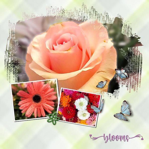
6 hours ago, Gerry Landreth said:
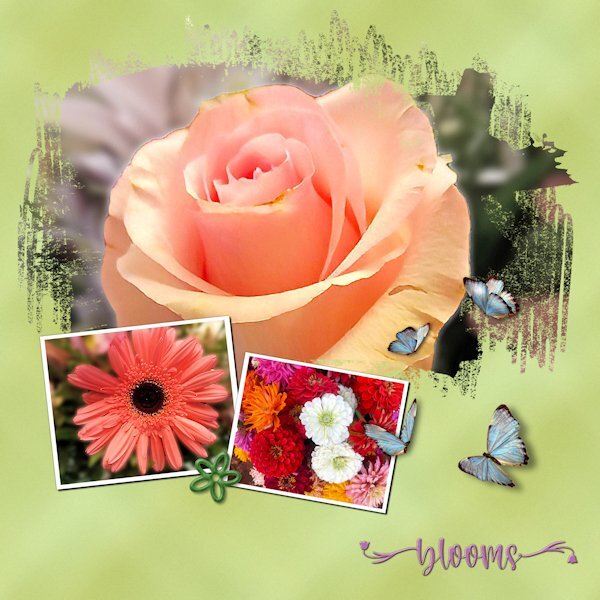
I spent lots of time experimenting with the plaid, including tinkering with the settings for seamless tiling. Since the photos are "busy," I wanted a pattern that wouldn't compete. The green "plaid" looks closer to a grunge effect.
The photos are mine. Although I'm not a good photographer, I keep finding little bits of a picture that look nice enough to showcase.
The font is Welcome Spring from Creative Fabrica. The butterflies came from Pixabay. They already had shadows but in the wrong direction. Flipping them solved the problem.
Gerry, your flower photos are beautiful, I love the rose. Really cool effect with your plaid too. That's a neat way to use it, especially the top green one.
-
2
-
-
1 hour ago, Barbara Caulton said:
Never used a Mask before and no idea what I m doing ! but I have managed to put something together no doubt with many mistakes !The video was excellent, it was my brain and my version of psp letting me down! My idea was to showcase the first 7 weeks in a puppys life one week a day. After taking two days to do day one I am not sure how that will turn out! Never mind life is a learning curve ..Just realised I have not put a date they were born on . opps ! The papers and graphics were from MARY FRANS... FARLEYFRIENDS
It looks great to me! Such sweet sweet photo subjects.


Mask Workshop (2024)
in Showroom
Posted
thank you Carole! This is how I did do it. I couldn't make selections of the objects with the magic want even though they were on a white background. So I ended up using point to point and then "edit selection". the article is great and has reminded me of the two master classes that I was watch and follow along with since I couldnt seem to make the selection tools work well. I wonder because some of it was metal which has highlights so it wouldn't choose the outline. I have much to learn.