

Susan Ewart
-
Posts
3,884 -
Joined
-
Last visited
-
Days Won
119
Content Type
Profiles
Gallery
Forums
Posts posted by Susan Ewart
-
-
1 hour ago, Barbara Caulton said:
Never used a Mask before and no idea what I m doing ! but I have managed to put something together no doubt with many mistakes !The video was excellent, it was my brain and my version of psp letting me down! My idea was to showcase the first 7 weeks in a puppys life one week a day. After taking two days to do day one I am not sure how that will turn out! Never mind life is a learning curve ..Just realised I have not put a date they were born on . opps ! The papers and graphics were from MARY FRANS... FARLEYFRIENDS

It looks great to me! Such sweet sweet photo subjects.
-
1 hour ago, bina greene said:
@Cassel: I tried to dl the template that was linked in lesson2 (many thanks for that lesson and the video, Carole💓) but the link for that template has expired. The template is not available any more it seems.
Same happened for me too
-
 1
1
-
-
1 hour ago, Corrie Kinkel said:
Fiona by looking at your screenshot I noticed that you have the shadow layer inside the mask layer, probably by mistake. That shadow layer has to be outside the mask layer and on its own layer under the mask layer. Look how the other 2 small photos are done in your layers palette. You can pull that shadow layer out of the mask layer and place it below the mask layer. I hope this makes sense to you and isn't it nice to have some notes on "old fashioned" paper next to the computer!
I am a compulsive note taker. Sometimes, I take too many different notes on one piece of paper that I cant make sense of them, later when I come back to them.
-
 3
3
-
-
Mask WS Day 1
I used the .pspimage mask from the Extra1 folder. And it tipped it over and moved/resized the other two masks to fit the image. Here is a before and after of using the new Creation Cassel PencilSketch2 script. I had fun with it and if all goes well with my photos I will probably use it for the whole workshop. Background paper is from Creative Fabrica called Vintage Paper Textures - Apothecary. The font is Maraton, from Creative Fabrica as well. I also duplicated the larger mask group and hid it and merged the copy layers so I could add a texture to simulate the texture in the background paper.
-
 2
2
-
1
-
 13
13
-
-
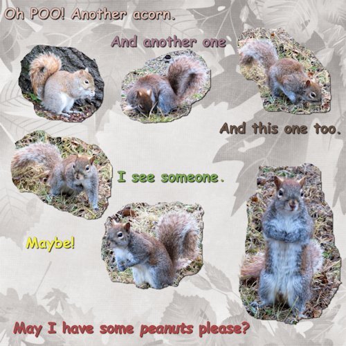
3 hours ago, Anne Lamp said:
I made this using some pictures I took last month.
Love this! Great photos.
-
1
-
 1
1
-
-
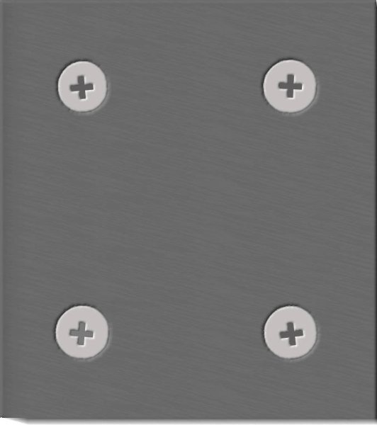
8 hours ago, Mary Solaas said:
I think I am done with Labs for a while. Wasn't happy with this one as I am not sure what I will ever do with a paper bow and a metal plate. Couldn't figure out how to use it for this layout and I am not happy with it anyway. Think I will try to get my mojo going again in the Build-A-Kit that is coming.
@Susan Ewart Really impressed with what you are doing with that new script and your photography. Way to go girl!
Thank you ever so much Mary. You have done such amazing work with the Labs. Undertaking a long project is daunting to say the least, and no doubt your energy for it ebbs and flows. I love that metal plate you did and can see lots of cool applications for it. Maybe placing a colored layer above it and using a blend mode would add some cool interest, or try using a grungy layer above it, although you want to keep that nice brushed metal texture you have now. And you could have a debossed letter or symbols in the middle. One day you will know exactly what to do with it.
-
2
-
1
-
-
1 hour ago, Rene Marker said:
Have you watched the Master Class on Masks? It touches a little bit on what you did and want to do.
I have but I have forgotten it. Thank you for reminding me, that is a good idea. I'm glad there is other more supple minds in the Campus to aid my stiff one.
-
1
-
-
1 hour ago, Corrie Kinkel said:
Susan. I like what you did with the script, the results differ but together it works great. I will have to play some more with it, if and when I have a bit of free time. At the moment all different kinds of things are going on that need my attention too.
I am going to play more too. Thinking of what type of photo works best and doing two different edits maybe. Also, I would like to further learn about masking from a layer. I would actually like to have a full black layer then bring back what I want (with white). Using the Mask from image made a strange looking mask that wasn't either white or black, so I need to play with that some more too. it's hard to see the little thumnail of it. Either way, I did something with masks that I've never done and was really happy that I might be on the cusp of learning something new. It's kind of what PS does in the tutorials I watch (usually I'm watching a photo tutorial and then they do an edit of the photo afterwards ; lightroom then in PS to use layers and masks). I know there is a way to do it in PaintShopPro, just need to learn. More than that, I really need a good understanding of it. It's easy to say; black conceals and white reveals, but to really understand it is what I'm after. Teachers always make it look so easy don't they.
-
1
-
-
1 hour ago, Ann Seeber said:
Presenting a new member of my small feral colony, "Little," the kitten on the right. Short and very fluffy, it bounces around as kittens are prone to do. 😆 On the left is "Bae" who is not much older than "Little" but was flummoxed when the smaller one showed up and stole the only toy!
Ann, this is so sweet.
-
1
-
1
-
-
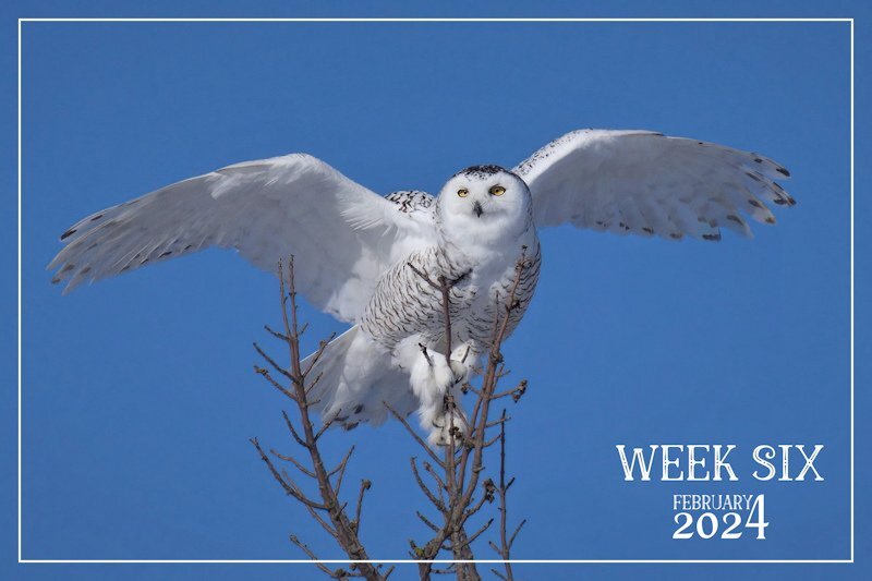
2 hours ago, Sue Thomas said:
A mature female Snowy Owl dropped in yesterday, whilst I was out back in the trees filling the bird feeders. It's quite unusual to see them perched in trees. They are either on telegraph poles, fence posts or on the ground.
I must say that I'm overwhelming impressed with all the creativity being posted. Such diversity. Well done to you all.
Wow, this is INCREDIBLE! This is the perfect shot with the perfect background. Awesome, just awesome! I also agree about the creativity of the posts here.
-
1
-
1
-
-
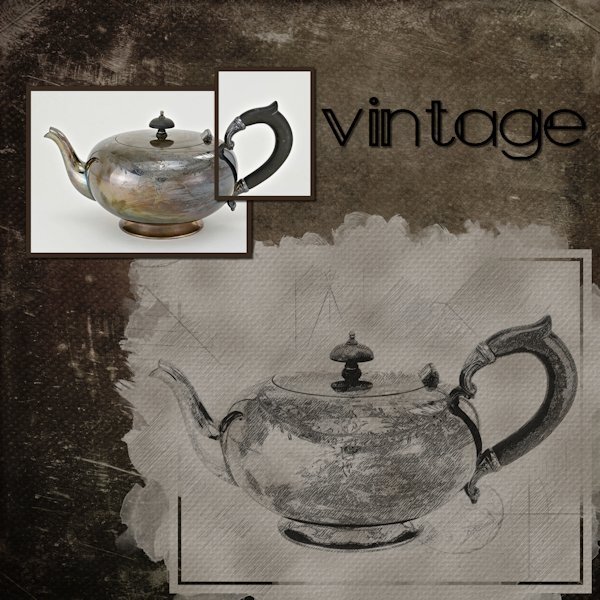
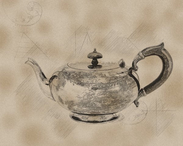
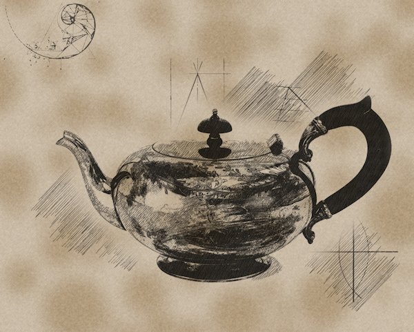
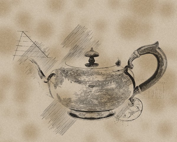
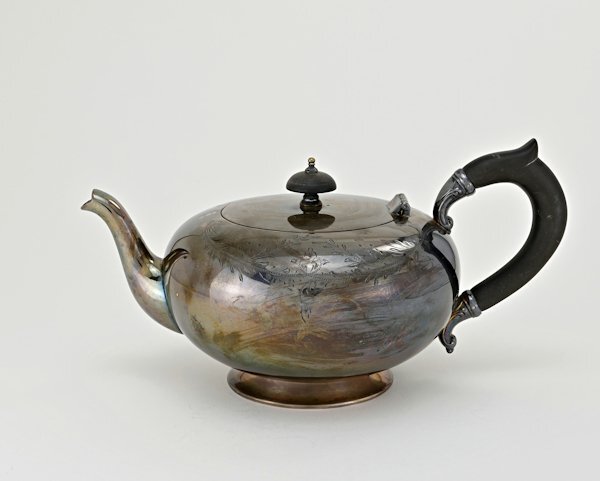
2 hours ago, Doska St. said:
Susan,the pencil script makes your teapot look even more interesting to me than the original photo of the silver teapot.
It does, doesnt it. I have been thinking of other possible photo projects aimed at using the PencilSketch2 script as an end result. There is much to be discovered in this script.
-
Here is made a mask from the layer (which I've never done before) with the darker (photo1-script1) one as the mask and use white to reveal the edges that was lost on and black to conceal the darker parts. On the second one I had the lighter (photo2/script2) on top. I'm getting confused at what I did now. when I look at the mask group, there is white on the group top layer the actual mask has black on it. It's all a learning experience. I did try and manipulate the layers the script makes but it seemed to lose detail and the composite way and mask way, gave me better results. I must try and understand the how the "Mask" from image works because it's pretty cool.
All in all, this is really nice script. I did not change the background because I wanted to keep everything the same to compare. There is so much potential in this script and for further tweaking. I'm going to play with it some more.
-
8
-
-
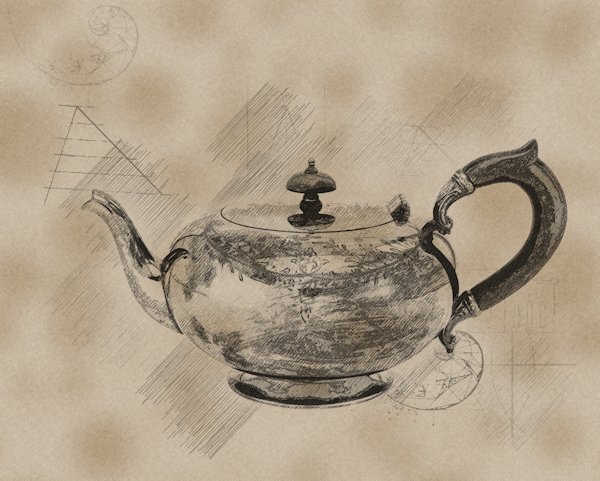
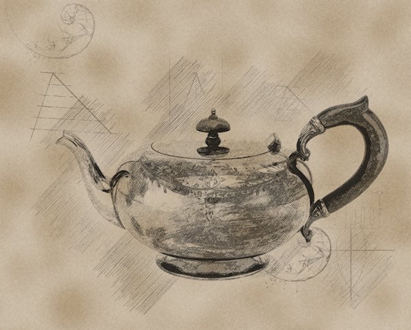
So I put the two together in layers with the light one (script2 using photo2) on top and used a blend mode of screen and opacity at 73. then I put the darker script1(photo1) on top and use dissolve and 40 opacity.

-
7
-
-
The darker photo 1 resulted in a darker end product and the light photo resulted in a lighter end product. the dark was too dark and light was too light is some areas where I lost detail.
-
5
-
-
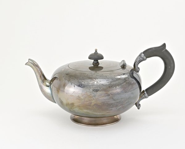
I managed to salvage some of the day (now late night) to try the PencilSketch2 script. Since I tried a few things I'll have to post a few times. here's the two photo's. It's the same photo, and I originally edited it darker, then went back after the first run of the script because it was too dark. Also here is photo 2. the next post will show how the script ran on it's own with these two images. Photo 1 is the dark one, Photo 2 is the lighter one. these are just the edits before the script.
-
1
-
3
-
-
1 hour ago, Corrie Kinkel said:
I love to see what you come up with!
Nothing so far, my day off, and I wasted it on trying something that didn't work out. 😪 Hopefully tonight I will get to try it out.
-
 1
1
-
-
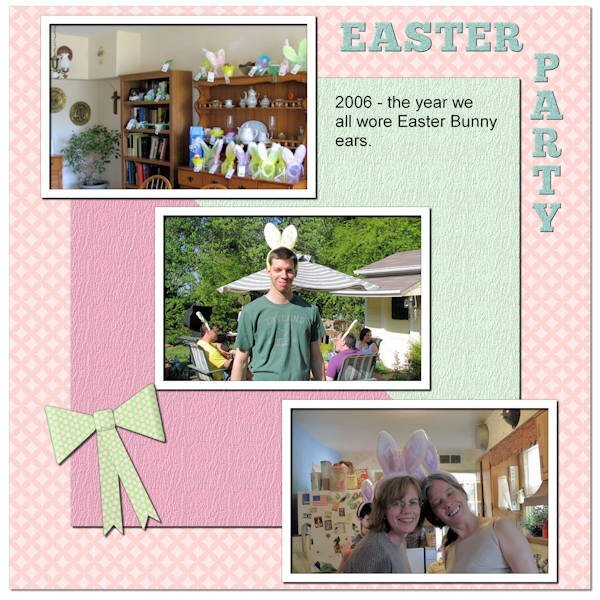
4 hours ago, Bonnie Ballentine said:
Easter, 2023. My niece and my nephew's soon to be fiancee. We usually have a craft for special occasions.
Template 4 by Lady 22.
I love the quote!
-
3
-
-
1 hour ago, Corrie Kinkel said:
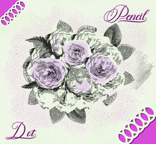
I have been playing with the Pencil Sketch 2 script which I won last Sunday and this is one of the images I created. I used this month's Lab to make the dots and an edge punch just for fun. The font is Fadilla.
When using the pencil sketch I find that it gives the best result with images that have very defined edges with colors that are not too light. Here I decided to give some of the flowers a little bit of color.
Thank you for the tips. I had planned on playing with the script tomorrow.
-
1
-
-
Possibly this: but I thought there was a different (more modern) name for it. (the bold part below wasnt me, it was from google, it's like it's yelling at us).
What are the characteristics of cloisonnism?(from Fr., cloison: 'partition'). Style of painting associated with some of the painters who worked at Pont-Aven at Brittany in the 1880s and 1890s, characterized by dark outlines enclosing areas of bright, flat colour, in the manner of stained glass or cloisonné enamel.Or possibly this one?Toon style, also known as cartoon style, is one of the oldest and most recognizable comic book art styles. It is characterized by exaggerated, simplified, and often caricatured characters with bold outlines and vibrant colors.OrPop Art often features hard, defined edges and thick outlines, which can be achieved using stencils or masking techniques. These edges give the paintings a graphic quality, emphasizing the flatness of the image.-
7
-
-
Doska, your frames are outstanding. I look forward to seeing more of your postings here in the forum. How sad that in your other forums they are so focused on little details and seems they've totally forgotten about the art that is being created.
-
4
-
1
-
-
4 hours ago, Rene Marker said:
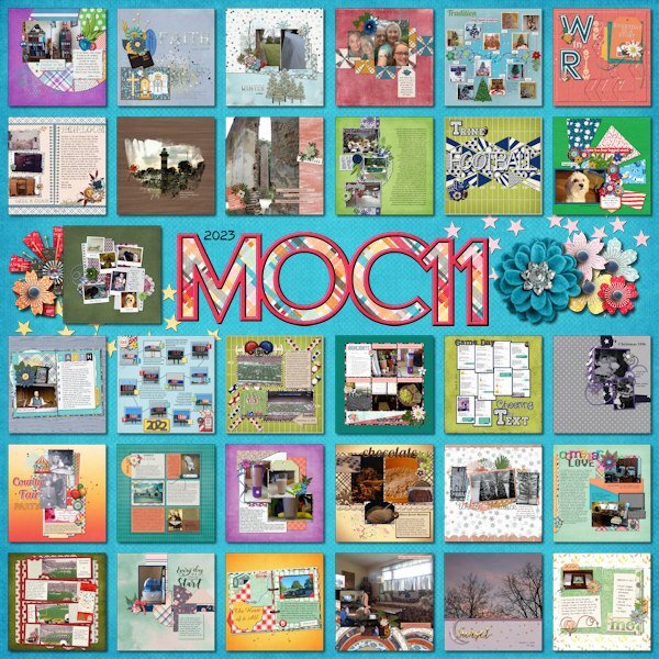
Fiddle-Dee-Dee has done this collage template for several of the MOC challenges in past years. They are always free. I've used one of them to make a collage for my Document Your December layouts (31 layouts for the month of December) and for last year's October Daily layouts. She includes the letters and numbers on the template but I don't like the font that she uses because of the number 2. So I actually used the alpha that came with the kit I used and placed it where those spots were on the template.
Here is the collage for the 2023 MOC. On this one I used the lettering she had on the template.
I really like the look of them. This could be fun. I just bought the script Mosaic Maker and I think it would make similar type layouts. I'm inspired to play with it.
-
2
-
-
On 2/1/2024 at 9:58 AM, Rene Marker said:
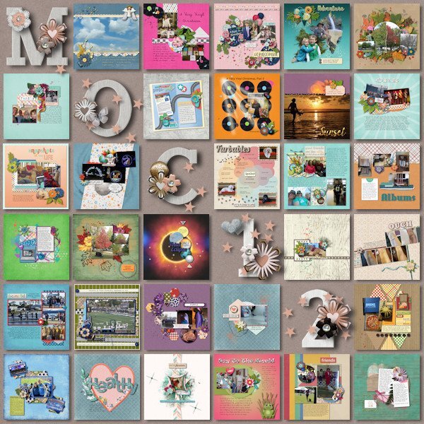
I spent the month of January participating in the Month of Challenges at The Lily Pad. 31 challenges in 31 days. Even with 4 days away from the computer I was able to get them all done. One of the designers graciously provides a free template to showcase all of the layouts. I finished that today using a kit by Bella Gypsy. Also, all layouts must have only product currently on sale at the store or retired products by the current designers.
Some challenges were a real challenge! Some challenges were easy because of things I've learned here at Scrapbook Campus (hello Mask Workshop). And some were full of ideas to use in future layouts.
That is a monumental achievement Rene. It looks wonderful. And that template is really nice. Did you do the alpha as well, or was it part of the template? It's very nicely done with the clusters.
This is like a contact sheet of a group of layouts, a person could do that for all their layouts or themed layouts. I was thinking of posting a 13 layout wrap up every 13 weeks for the P52 challenge. I had envisioned doing 12 layouts around/beside/under/over (in other words, where ever) the 13th layout which would be, maybe, the favorite of the first 13 with a little title on it. this idea has never made it past a passing thought stage, but this layout is motivating me to consider it.
-
2
-
-
2 hours ago, Barbara Caulton said:
Hi All. I will be in with you but I have never used a mask so another learning curve for me! Having read other coments I will have my pen and paper at the ready !! At least I have found you all without having to ask as I have had to previously, so nice to see my brain is finally remembering something!
You will do well, Carole teaches it so thoroughly and you are a Diamond member so you'll have access to it afterward too.
-
1
-
-
1 hour ago, Cassel said:
You can also post them in your personal gallery as a way to have them all together.
I have that on my list to do. I'm quite behind in adding to the gallery, but I will make the time soon as I want to get it up to date.


Mask Workshop (2024)
in Showroom
Posted
Gerry, your flower photos are beautiful, I love the rose. Really cool effect with your plaid too. That's a neat way to use it, especially the top green one.