Susan Ewart
-
Posts
4,810 -
Joined
-
Last visited
-
Days Won
187
Content Type
Profiles
Gallery
Forums
Everything posted by Susan Ewart
-
Loved your examples, especially Adam and Eve. Yup, my best (weight)lifting days peaked in 2019! I peeked through the blinds to see if there are birds in the yard and saw the neighbours cat...peeking can be a good thing. Echo was chased off gently (a tap on the window does it), after all, I also want my yard to be friendly to all who need to use it. Thanks for the lesson. You wouldn't believe how bad I am a using "big" words and get corrected, I just laugh now. I often think I should just stick to one-syllable words. And lastly, what can you do about my horrible math skills?
-
I agree. The Basic Scrapbook course was the first thing did after the first bootcamp I took (where I finally learned how to use PSP after buying for 3 yrs and not touching it!). and now with a diamond membership I was able to do the new ones Module 6 and 7! It's such a good course, where i learned so much and also learned how to bind a tool among other gems to make the workspace better for the user. Also the suggested settings for the shadows, that really was a go-to over and over for me.
-
I have seen the show. My husband works at a large tire warehouse and they load mining tires on the trucks that are destined for the ice road.
-
How about two points of view on peaking and peeking. 1. The sun itself it peeking at look at Anne on the shore, cause the sun is nice like that 2. Anne, on the shore is thinking, the sun is peaking out and having a look a me! Either way, it's an awesome ex'peer'ience for Anne no matter who is looking a who.
-
Right? I'm with you, although as a child I live on a lake (okay, not "On" the lake, but lakefront) we used to skate on the frozen part for miles. But to drive on a lake, no way.
-
Wow, those are beautiful photos. I don't recall every seeing a partial eclipse.
-
That's so awesome. Your dogs treat their toys better than I treated mine.
-
I haven't tried that. I should add that to the Q and A and how to make metal swirls like you used in the bootcamp tutorial.
-
I was happy with the gradient (Thank you PSP!) and didnt want to cover it with a paper so i just made the round rectangle selection and promoted the untextured layer so the gradient would carry through. I liked the result. I was thinking, how will I make it standout so I added a little bevel (thicker paper?). I'm glad to have finished the workshop, unlike the other workshops I did not finish. I'm am hoping the wedding stuff is all finished by the end of the month so can resume the workshops and projects I have started and ones yet to be started. You must be close to your holiday. I hope you come back with amazing photos like the ones you have being treating us to from your last holiday.
-
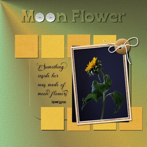
Project 5 This time I pulled a photo from my files, I think I shot these in October. I had another photo in mind but this one beckon me to use it. I made my own background paper with a gradient (looking like a beam of light on the flower) and for the rounded rectangle which I selected then promoted and added a small bevel. The squares I followed the tutorial and used scrapbook papers. Fonts: Briantone, Bricktown and Borensa (title, one of my faves) buttons: Melo Vrijhof button 04 and Billie Irene travel button 4 (DigitalScrapbook) frame: Marisa L gl21 frame 3 (DigitalScrapbook) Little squares: Janet Scott Dark yellow Fabric and DigiDewi Princess Paper Sparkle yellow dk (DigitalScrapbook) Photo: mine

- 181 replies
-
- 10
-

-

-
This is so pretty. the petal looks neat tucked behind.
-
oh my gosh, this is really interesting. Again, your letter G fits perfectly with the story. Well photographed, I can see all the details and it is really detailed. The craftmanship of this Mastermark is unbelievable.
-
I've never seen a gold one, I love it. the cutout looks great (grate-r?).
-
What a beautiful layout with the mask and all the blending. This is a really cool looking bird.. It looks similar to the Magpies where I live in Western Canada.
-
Project 4 Here is Ver. 2. the one I do like.
-
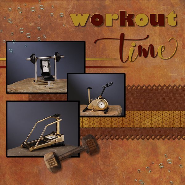
Project 4 One of the emails asked what tips/techniques did we learn that we liked. I will have to say it's SHIFT-D (duplicate), to duplicate the layout. I never really thought about how much I use tip, turns out I use it a lot. And this layout is a case in point. I will post the version 1, early in the layout it wasn't working for me, so I duplicated to test switching the background paper with the rectangle pinking shear paper. These "clocks" I've had, I thought for about 25, but hubby informed me we've being together 38 yrs, so they are now about 35 yrs old, which means i've been working out longer than 35 yrs. No wonder I'm tired. I did not shadow the lines I made because I wasnt sure if I should since they fad out. Does anyone have any advice on that? the photos dont show the time I had getting a light beam to shine on the background the way I liked, when I cropped it was all gone. bummer. The fonts used; Gill Sans Ultra Bold and Adellia Heart the dumbbell is an extraction from my Alphabet Photo Challenge letter D. and is my photo of a dumbbell in my arsenals of free weights. the water drops and both the dark background(Ver 2) and light background (Ver 1) are Jessica Dunn (copperspice and plum hill kits) The smaller selected rectangles are Gina Jones (zig zags on V2) and Marisa Lerin (V1) The two lines under the top photo are fading lines as learned in the Q&A November 10, 2024 (first way of doing it out of 4 ways) Here is version 1, the one that wasnt working for me.
-
that's great Ann, you are lucky. My 2023 wrapped text has never worked. I never thought to change it to a shape though. did you manage to duplicate it first and keep one as a shape. Even duplicating it would change mine to one long line.
-
I agree, I've tried that before and I I gave up when I couldnt achieve the colors I wanted for the kit. It's a really good challenge to come up with different looks using one kits. I'm almost finished project 4, hopefully tomorrow.
-
Strangely 2023 is somewhat behaving this week. Still if I need to do text wrapping I go straight to 2022. It did randomly close a couple times today and yesterday, but I had a huge image open with 3-4 other huge images in the layers palette each with a mask group. I think it got overwhelmed. And I'm sure Photoshop elements is using resources in the background, at least that's what the CPU thingy is telling me. the of the best advice I got from Carole is that it's okay to have more than one version on the computer. I'm glad I did that this time, as I used to delete the older ones off. I'm still pretty new at this graphics stuff.
-
I love these old posters and that time in life too. Is this the very park that the song Palisades Park by Freddy Cannon is named after? I remember loving that song when i was young. It was probably something my parents listened too, or even maybe heard on the TV show Happy Days (it was a favorite of mine, the older shows, before it "jumped the shark" - literally). You did better than me on the roller coaster. In 1972 we went to Disneyland and I was seated beside my mom on the Magic Mountain ride, the car slowly climbed the big hill and at the top of the hill I was so scared I tried to get out and my mom had to clamp me between her legs for the rest of the ride. Probably not very safe, but safer than me trying to climb out.
-
I'm sad to see you go Doska. And I glad to have been able to see your creative work. I wish you the best going forward and will look for you on DS. Hope to see you back, even just to check in and see what we are up to. This layout is beautiful.
-
I stopped at crocus because I didn't know the plural...and I was in a hurry and had no time to look it up. Now I know what it is.
-
I often wonder about watermarking too. These are stunning!
-
Don't you just love Gill Sans Ultra Bold. It is one of my most favorite fonts. Such pretty crocus (did I get that right?)
-
I used to buy the pancake mix from the grocery store, then I found one online that I printed out. The bottom of the page says 6/2/2008, either June 2 or Feb 6 depending how the date is set up. It's called "Plain Griddle Cakes" and it's the easiest and most yummy pancakes that I've made. And it's really quick and simple to make. A paragraph a the bottom of the page reads: The recipe is based on the pancake recipe in "The Settlement Cookbook ("the Way to a man's heart") by The Settlement Cookbook Company Milwaukee Wisconsin 1903, a book every serious food reader ought to own. I add cinnamon to the dry mix and use the mix for both pancakes and waffles. For the record, I like waffles better. I have never checked to see if that book is still in print, I should do that.