Jeni Simpson
-
Posts
263 -
Joined
-
Last visited
-
Days Won
9
Recent Profile Visitors
1,547 profile views


Jeni Simpson's Achievements
")


-
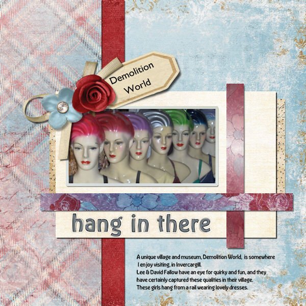
Module 7 I found a kit from LouLou called de souenirs de vacances. The colours were nice and bright, while the photograph is very earthy tones. The Moeraki Boulders are a mysterious and weird group of 50+ boulders on the coast about 3 hours north of my home. There are many stories of their origin, some quite wild, some scientific, yet the wild ones get lots of favour. The elements in the cluster came from Sand & Beach kit from Elif Sarin of Digital Scrapbook.

-
Thanks for that idea, Carole, I checked, and it must be the font. So, instead of using Kristen ITC, I chose Memories, and it worked fine.
-
Module 6 Thank you, Carole, it was the font. I tried a different font, and it worked immediately. I used Jessica Dunn's Cherish mini-kit, I wanted something a little vintage, and this fitted my idea of what I wanted. The colours also blend in well with the photograph. Font is Memories, and Gill Sans MT Regular on the tag.
-
Thank you, Carole. I will try moving the stroke layer. I have redone this three times in x8, and tried it twice in PSP2023, same result each time, so I don't know whether moving it is the problem, and I will take extra care with it to see it doesn't get moved at all.
-
Module 6 I need a bit of advice here. I am trying to get the alpha sorted, and, although on different layers, the black stroke appears to be out of place. These are my layers currently, I added a paler grey layer so as to be able to see better, I hope. I haven't moved anything yet the black line looks like it has moved to the right a bit. Any suggestions, please?
-
Module 5 'This was a challenge, I'm not sure whether or not I managed to get all the shadows right, but hey, it was fun . I chose a photograph of butterflies in the Butterffly House at the Otago Museum, in Dunedin. It is an amazing experience to walk amongst butterflies; they will land anywhere - on your shoulder, your head, your hand, wherever they choose I tend to be reminded of the changes they go through in their lives, from the caterpillar to the stunning creatures they become. The kit I used was Jessica Dunn's Crafty Evening mini kit and the alpha is Brooke Gazarek's Distressed Alpha Tan. The kit didn't have a dark paper, so I chose to select a rectangle and, on a new layer, poured white, and bringing that layer's opacity back below 20%. I didn't want the text to be dark, so chose white in Garamond on a white paper.
-
Yes, I agree, I have also found out about some Affinity tutorials through the last bootcamp.
-
Susan, I need a notebook to write the tips in; they are invaluable. One with my laptop would be useful. I have the books Carole has available, in Kindle format. The participants in the Bootcamps also give out great tips.
-
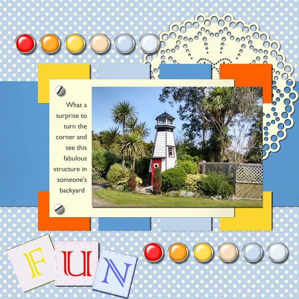
Module 4 Using the kit supplied by Carole, Fire and Ice, I wasn't sure how this would work with any of my photos, however, I found the perfect match. A bright, colourful photograph of a lighthouse, possibly a child's play hut, such a fun structure, on the road alongside the estuary outside of Invercargill. I think the colours match beautifully, like this kit is so uplifting. The screw is mine, from one of Nanson's tutorials from the days of PSP8. The journal font is Gill Sans MT Regular. I have loved Eric Gill's typographic work, since studying his font designs in 1994.
-
Thank you, Carole, I am enjoying these. I am also learning great information. I have never bound a script before, and, although I have customised my workspace, I hadn't done any customising a layer palette. So, no matter how long I have been playing in PSP, I'm learning so much more now. As I said earlier, using alphas is new to me, too. Thank you.
-
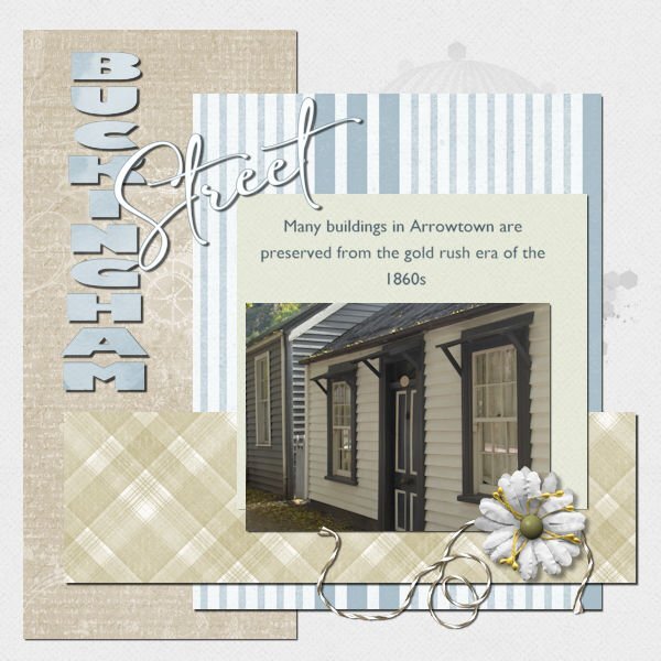
Module 3 The Arrowtown Autumn Festival is on shortly. Arrowtown is an old goldmining town, with most buildings still standing, including this row of miners cottages on Buckingham Street, the main street of the town Many cottages have been set up as boutique shops selling ice cream, wine, chocolate, and sweets, and New Age shops selling incense, crystals, etc. There are a few cafes and restaurants tucked away amongst the cottages. I used Jessica Dunn's Bohemian Sunshine kit, I had the papers and embellishments already. I colourised the papers to match the palette of the cottages. Fonts used are Gill Sans Ultra Heavy and Gill Sans MT Regular, and the script one is Amalfi Coast.
-
Module 2 Using Marisa Lerin's Let's Shop mini, this kit worked even though the title doesn't...this page is not about shopping, in fact, Waipapa Point is so far removed from anything like shopping To secure the photograph of Waipapa Point Lighthouse, I used a button and a piece of string. Wildlife is prevalent nearby, I saw a sealion sunbathing amongst the tussocks leading up the sand hill to the lighthouse on top, a while ago and I also saw 2 of them fighting over a female when one male and one female rose out of the water to bathe on the beach. The lighthouse was built in this spot after one of the worst maritime tragedies in New Zealand waters back in 1881 when 131 lives were lost.
-
Module 1 I thought I posted this in another forum, and it seems to have disappeared, so looking around, I found this forum for the Basic Scrap Course. I chose a couple of photographs I had taken around Waipapa Point on the south coast of the South Island. For this project, I used Heather T's kit Love Spoken Here provided for this module. I have never used alphas before, in fact, although I do have a few, they sit unused in their folder on my hard drive. The alpha in this kit was perfect for the title, and the only item I colourised was the brown button, which I toned down a bit to match the colour of the tussocks in the top photo. The trees in the lower photo are bent over, thanks to the force of the wind coming at them.
-
They are both beautiful creations, I couldn't choose between them. I love the rich colours you have used, and clocks, wow, they are gorgeous. I had to look closely to see the timepieces on them. At first glance, I thought they are in beautiful condition to be used regularly as fitness equipment.
-
Day 11 I felt the need to correct my page after Ann questioning the frame. I looked back at the tutorial and realised the frame should have been on top of the photo, so have now corrected this. We have had a crazy few days and trying to get this finished meant mistakes happening. Apologies for the confusion.