-
Posts
2,683 -
Joined
-
Last visited
-
Days Won
22
Content Type
Profiles
Gallery
Forums
Everything posted by Michele
-
I love gnomes. I have them for every season or holiday. 🙂
-
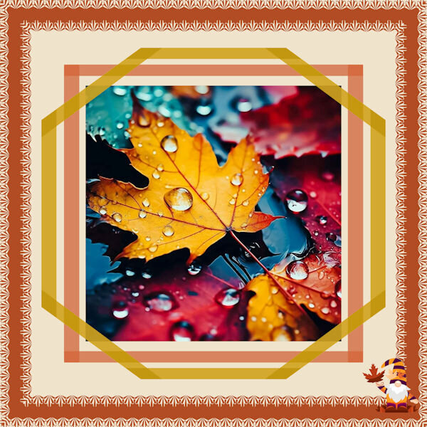
I'm a day late, but I'm here. I used one of Cassel's edge punches on a straight line, then ran the Mitered Corner script for both frames. The original tries were done manually, but I'm hard on myself and couldn't get them to line up perfectly. I couldn't resist adding a little gnome. I found the pic on Google.
-
From the album: Michele Fineron
-
Fantastic!
-
I thought of doing that, but I was too tired to do anything more. lol 😴
-
I happen to be watching Band of Brothers right now and he's in it. That was a long time ago. I don't normally watch war movies/mini-series, but this one is exceptional.
-
I did use the texture command. If Corel added an angle option, that would be great, but it doesn't sound promising. Adding the texture was a last-minute decision and I was tired so I left it as is. I like your idea of rotating the file and saving it as a new one. I'll keep that in mind (if my mind works lol).
-
As per Cassel's request in the Day 12 email, here is something I learned (or relearned) during this workshop. Believe it or not, I don't think I've ever used the Magic Wand Tool set at opacity to select an element. I've always used it to select outside of the element, and then invert the selection. It's definitely quicker using the opacity setting.
-
So clever!
-
I love it. It looks like a magazine page without the shadows. Another option would be a drop shadow on the template to make the pics look like they are below it.
-
I told you I have a bad memory. 🤣
-
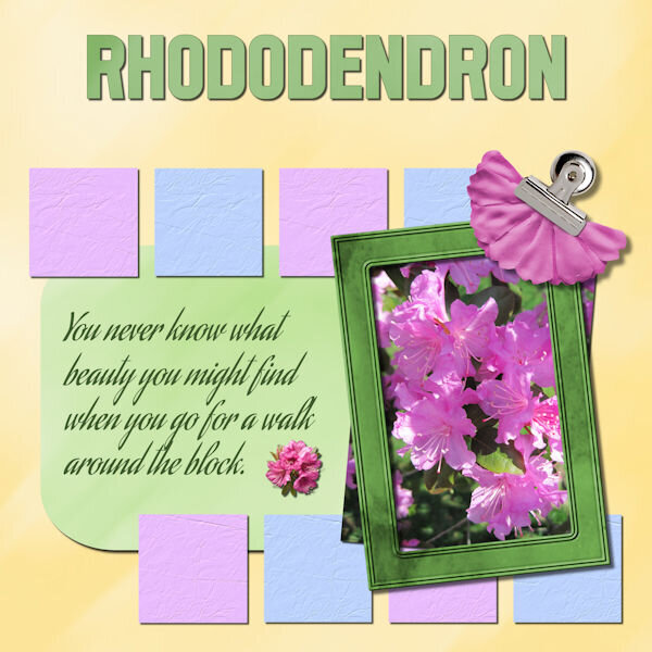
Day 11 - Project 5 I'm not very good with flowers so I hope I identified it properly. If not, please correct me. The photo is mine. I used various papers and elements from Mizteeques, AnnieC, Melisa Lerin, Janet Kemp, and the little flower under the text from Freepik. Whew. I made the little boxes by filling in selections with triadic colors and adding some texture. I can see now that I probably should have varied the textures. The clip and flower were two separate elements so I tried adjusting the drop shadows as we learned in the Shadows Workshop. I think I did it right. The title font is Acmatic Personal and the text font is Aguafina Script.
- 197 replies
-
- 10
-

-
I've found that I need to Merge All (Flatten) before I resize mine. Otherwise weird things can happen. I've had my text disappear.
-
I already sent him a copy of the layout in the messages on his 501 North Photography FB page. I hope he likes it.
-
It could be my bad memory, but I think this is the first of your pics that doesn't have wildlife in it.
-
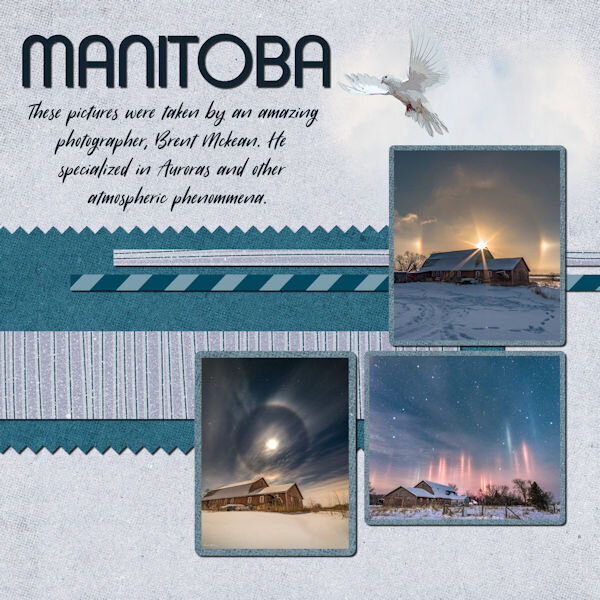
Day 9 - Project 4 I absolutely adore this photographer's work. If you're on Facebook, you should check out his page. He goes under 501 North Photography and has some amazing pictures of the Aurora Borealis. I decided to share some of his barn shots. I created an uncharacteristically (for me) muted layout so the pics could be the real stars. I used a bunch of supplies from the ALFLT Blog Train Jan 2021. The title font is Xpressive and the text font is Sugarstyle Millenial.
- 197 replies
-
- 12
-

-
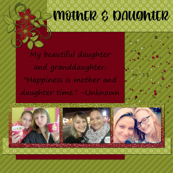
Day 7 - Project 3 The papers and flower are from a mini kit by Marjan De With that I obtained in the Nov 2018 Blog Train. I made the scatter using Cassel's Punch Confetti script. For the glitter, I took a maroon glitter paper from Marisa Lerin, added a layer on top with the foreground/background gradient using the maroon and green from the papers, and changed the blend mode to Hue. The title font is Romantic Crafty and the text font is Segoe Print.
- 197 replies
-
- 14
-

-
-
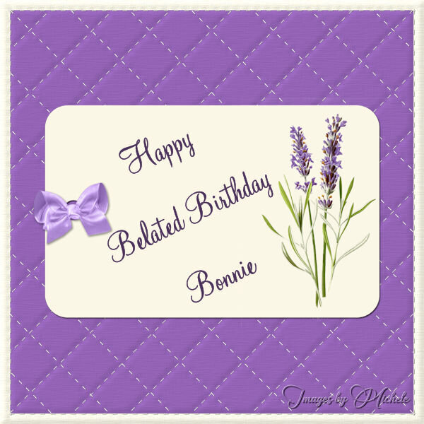
Happy Birthday month to you, @Bonnie Ballentine. You have wonderful friends who celebrate you. What more can you ask for?
-

Happy Birthday Bonnie Ballentine 2024 belated 600.jpg
Michele posted a gallery image in Member Albums
From the album: Michele Fineron
-
I already told you on FB that I may be "scraplifting" this idea; I love it so much.


