-
Posts
2,660 -
Joined
-
Last visited
-
Days Won
22
Content Type
Profiles
Gallery
Forums
Everything posted by Michele
-
Thank you so much, @Sue Thomas. I try to challenge myself as I am not intuitively creative. I get so much inspiration from everyone here.
-
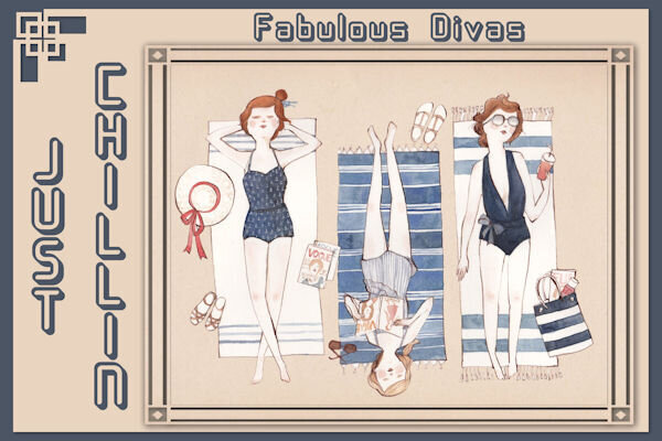
Back to my gaming group now. I've had the illustration for years so I don't remember where it came from; I used a mask to frame it. In order to balance it out, one of Cassel's corner punches came in handy. The font is 11S01 Black Tuesday Offset; I got it free from somewhere about ten years ago. I didn't have a system for saving information about the fonts, etc. back then. I'm doing a better job now. lol
- 139 replies
-
- 10
-

-

-
From the album: Michele Fineron
-
Here's a card I made for an old friend. I used a mini kit from Gina Jones at PS. The musical element is a nod to how we met years ago...Concerts at Jones Beach Theatre. The font is Blaster and it's in my system fonts.
-
Most of the elements are from a template by AnnieC included in the March 2021 ALFLT Blog Train. There was a lot of improvising to fit it into FB's new pic size. I had the opportunity to add a paper fold I made in the Creative Scrap tutorials; it helped balance the l/o. The font is About Loving from CF. Hope my cousins liked the card.
-
From the album: Michele Fineron
-
From the album: Michele Fineron
-
@Suzy You're probably being too hard on yourself. I understand that as I agonize over almost every detail of my projects. I've had a tough time with the border punches, but the more I use them, the easier it gets. When you have time, just play with them. That will give you more confidence as you'll be learning while you play.
-
Thanks, Sue. I keep most things I create in pspimage format so I don't have to start from scratch either. It makes our creative life much easier. ?
-
I've been doing a lot of the Creative Scrap tutorials lately. For the vast majority, I've been following the Detailed Handout so I can listen to music while I'm doing them. For this one, I had to watch the video. As great as the handouts are, sometimes I just need Carole's voice to get the technique into my head. ?
-
I was wondering where you've been, @Sue Thomas. I should have figured it out after knowing you all these years. Looking forward to seeing the results of your summer photography.
-
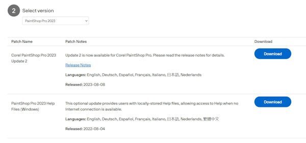
I have 2023, but I never installed it due to all the bugs people were experiencing. I downloaded the updates, but I'm curious as to why one of them is called Update 2. Where is Update 1?
-
They are absolutely adorable!
-
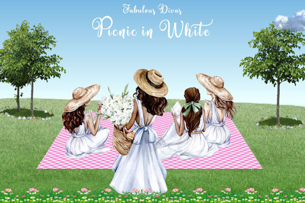
Sometimes it's fun just to use picture tubes, clip art, and a gradient. The background sky gradient is mine; the grass, trees, rocks, and cloud are from various picture tubes; the flowers are from GoF Designs; the ladies in white are from CF. Oh, and the blanket is a paper that I changed with the Perspective Mode of the Pick Tool. The font is Amastery Script.
-
From the album: Michele Fineron
-
Thanks so much, @Sue Thomas. It was Linda Bloodgood, but she's not in the maniacs group anymore. I don't now why.
-
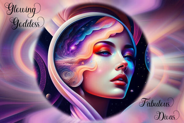
The original illustration is from Freepik by Sketchpedia. For the background I decided to follow a "Swirls and Twirls" tutorial. It was shared by someone in another group and I hadn't used it in a few years. The background is made using the original pic and there are a whole bunch of layers. The tools used were mainly the Radial Blur and the Twirl Effects. If I didn't have my daily deadline, I might still be playing with them. The font is Hesthia Austine from Creative Fabrica.
-
From the album: Michele Fineron
-
From the album: Michele Fineron
-
I love the color combo you used. In fact, I'm going to save them to a palette! How did you make what looks like a flower chain that's above and below the main blue part?
-
I totally agree. I've never thought of extending anything beyond the border. I love the look of it, @Mary Solaas
-
Happy accidents!
-
I've been working on the creative scrap tutorials and I love how this one came out. The first one was adding noise with monochrome checked which was cool. But then I did it with monochrome unchecked and what a nice surprise!


