Michele
-
Posts
2,726 -
Joined
-
Last visited
-
Days Won
22
Content Type
Profiles
Gallery
Forums
Everything posted by Michele
-
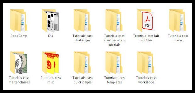
This is how I keep track instead of a spreadsheet. I have a folder called Tutorials with sub-folders for the different types of tutorials. Within each category, there are more sub-folders for the tutorials.

-
J = Juicy Lucy, a cheeseburger with the cheese inside.
-
You are so clever, @Ann Seeber. Thanks for the smiles.
-
You challenged me to use my newly-learned vector skills from the workshop in my gaming group, @Cassel. Challenge accepted! I added the cup from Lesson 4 to my original pic from 2016. I even used lesson 7 to add some decorations where I wanted them. The font is Parisienne, free from I don't remember where. Thanks again for a wonderful workshop.
-
From the album: Michele Fineron
-
This is an updated version of a theme they first gave us back in 2016 (see 2nd pic for the original). If I want to reuse an idea from then, I have to modify the dimensions for FB. The background was made using the Balls & Bubbles effect over a black layer. Before you give me credit for that lovely text, on a rare occasion back then I used Flaming Text logo designer. I updated it for today's layout. I imagine I could have created it myself, but I didn't have enough time.
-
.jpg.0f10a601e8a728adc291539d82aeb1cd.jpg)
From the album: Michele Fineron
-
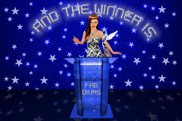
Thanks, Ann, but I cheated and used a pic of a podium on Google, removed the background, and changed the color (it was originally purple). I can't imagine how long it would take me to create it from scratch. Maybe I'll try that challenge!
-
It's sometimes challenging to make a layout that fits FB's parameters. Hence, the sideways text; the font is SchwabachDeko, free from fontspace. The background is a solid layer to match the sepia effect applied to the pic. On top of it is a lovely overlay paper from Digital Scrapbook, formerly Pixel Scrapper, by Janet Kemp. The "border" around the pic was made using the Magic Wand on the outside, changing the size of the selection and adding a cutout on a separate layer. To finish it off I used the 3D buttonize effect on top of it all.
-
I was working on this about a week ago (before the Vector Workshop) as an album cover for contests we hold in my group. After the workshop, I'll be able to do so much more! The font is Digital Tech, free from dafont. The "winner" is my avatar from the game.
-
From the album: Michele Fineron
-

From the album: Michele Fineron
-

From the album: Michele Fineron
-
Wonderful layout, Royanne. I prefer simple so the photos are the focus.
-
Very cool technique, Carole. This workshop has taught me so much. Thank you so much for putting it together.
- 714 replies
-
- 20
-

-

-
-

-
-
Now that I think about it, I think I might have used your sequin script. And, yes, I did increase the step for the Gimp Trim tube; I was playing with all the settings.
-
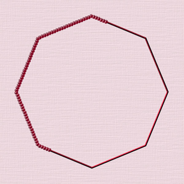
I was just playing with the nodes on the first one and, boy, was it fun; I used one of Cassel's chain tubes. For my initials, I used one of her gimp trim tubes (I found it interesting that the tube was applied differently on the S, almost like it was reversed). Then I thought I would have some fun with the lips I made for Lesson 2 and used a sequin tube I made a while ago from one of the tutorials. For the last one I used a star cutout shape I made several years ago and a star tube I also made. I wonder what is in store for us in Lesson 7!
- 714 replies
-
- 21
-
-
-

-