Michele
-
Posts
2,564 -
Joined
-
Last visited
-
Days Won
22
Content Type
Profiles
Gallery
Forums
Everything posted by Michele
-
Having fun with my Daily Look today. Lots of clip art and some of the game characters. The font is Mrs.Monster Academy.
-
Just a little fun with the Daily Look today. A mixture of a bunch of clip art and characters from the game. The font is Mrs.Monster Academy.
-
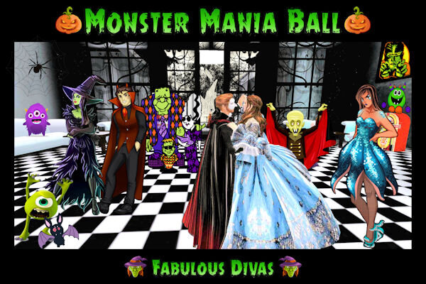
From the album: Michele Fineron
-
Welcome, newbies! Hope you enjoy this course and you become Campus residents. And, remember, we all started somewhere. ?
-
I love my CF subscription, too. What a fun project you created! I love how you integrated so many different things into it.
-
T = Terror!
-
P = Pumpkin Patch

-
 I'm glad you enjoyed it; thanks. ?
 -
Pennywise scares the heck out of me. The original one was played by Tim Curry who can be terrifying.
-
K = Killer Clowns!
-
C = Cemetery
-
V = Van Helsing, famed vampire slayer
-
L = Lycanthrope
-
G = Gory
-
Thanks, @Julie Magerka, but I have trouble drawing a stick figure!
-
There's no deadline. Keep at it!
-
A = Apparition
-
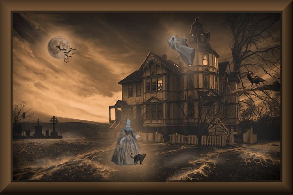
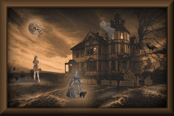
Did this one back in 2016 after watching a Corel tutorial. (It was before the wonderful Spooky master classes that Cassel offers.) I changed it up a bit in 2021. Corel even gave me props on the original! I was as excited as a kid on Christmas morning.
- 22 replies
-
- 10
-

-

-
I didn't. Thank you so much. More gnomes for me!!!
-
I don't know who decided on the size, but 3600 pixels x 3600 is a standard digital scrapbook size due to the standard paper scrapbook size is 12 inches x 12.
-
R = Raven ~ a pretty scary bird.
-
Dark Shadows was my introduction to the vampires and I still love all things supernatural.
-
I - Incantation for those who dress up as witches or wizards.
-
Fun with clip art! The background is from years ago so I don't know where it came from, but I'm sure it was free. The gnomes are from CF (I love gnomes and d/l them all). The bee is by AnnieC from a Scrap Designers blog train a few years ago. The fonts are a duo called Bee Kind, also from CF.
- 257 replies
-
- 13
-
-
-

From the album: Cinders Stuff


600.jpg.0be65bd2087edec85e203a201667120e.jpg)