Michele
-
Posts
2,730 -
Joined
-
Last visited
-
Days Won
22
Content Type
Profiles
Gallery
Forums
Everything posted by Michele
-
I leave the "raster" or "vector" and add the name. It's easier for me to distinguish as opposed to the icons.
-
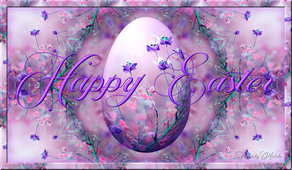
Made this several years ago but I'd like to send my wishes to all who celebrate.
-
From the album: Michele Fineron
-
Thanks so much, @Mary Solaas. I think we all take turns looking for our mojo.
-
The link was in the last newsletter. https://scrapbookcampus.com/promo/easter-hunt/
-
Even though I did the original back in 2017 (starting from scratch), I spent a bunch of time editing it for this year. It has soooo many layers now. The fonts are Bernard MT Condensed, JLR Big Girl Bed, and KR Coffee Dings. In order to make it look aged, I duplicated the text layers and converted them to rasters. Then, grouping them into one, I used a grunge brush to erase portions. Carole mentioned recently how grouping makes it easy to resize multiple elements at once. I now use groups for lots of different things. I added the barista character from the game for my group members (they like it when I do that LOL).
-
From the album: Michele Fineron
-
Done! I couldn't wait. I love your scavenger hunts.
-
Great to see you back!
-
No way you'll only have one. I recently ordered some stuff from Nuts.com and had to stop myself from ordering these. But you can get them pretty much anywhere. Have a dozen for me!
-
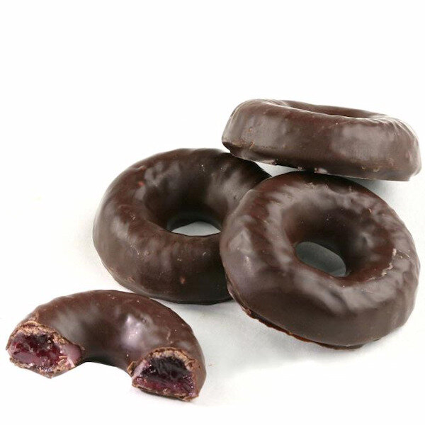
J = Jelly Rings ~ Raspberry jelly/jam covered in dark chocolate. It's a favorite treat during Passover since it doesn't contain any ingredients that are "forbidden" like leavened flour. I don't dare bring them into the house or I would eat them all in one sitting!

-
How to make it your own! Great use of Carole's punches. I don't think I've ever used multiple different punches in a project.
-
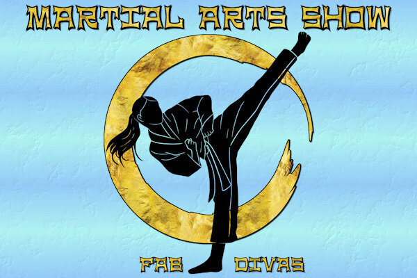
I was going for the look of a poster/ad and took inspiration for this from several different pics I saw on Google. The silhouette is from Pngtree and I made use of some gold foil images I had in my stash. The font is NinjaLine, free from DaFont. I wasn't completely satisfied with the background (an old gradient I made), but as usual, I ran out of time.
- 148 replies
-
- 10
-

-

-
E = Eskimo Pie (renamed Edy's Pie)
-
From the album: Michele Fineron
-
Thanks for sharing. It just might have been the artist's inspiration.
-
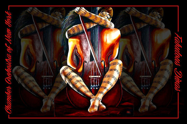
Chamber Orchestra of New York was a very boring theme until I found this amazing oil painting by artist Daria Sadkova. I removed the black background and used it on several layers with varying opacities and adjustments. Cass's Word Frame script gave it just the right touch without drawing attention away from the subject. The font is Cellos Script free from DaFont.
-
From the album: Michele Fineron
-
W = White Chocolate anything!
-
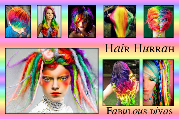
I made several iterations of this silly theme. I liked the idea of the bright rainbow hairstyles and wanted to keep the rest of the l/o simple. I tried adding a rainbow border to each of them and adding shadows, but I wasn't happy with that. I finally decided to do a frame over all of them and used a cutout effect under each "hole." The biggest issue I had (I really annoy myself sometimes) was picking the gradient for the frame. I lost count of how many different gradients and blend modes I tried. I left them overnight and when I opened them today, I was instantly attracted to this one. Sometimes putting the project away and looking at it later helps if you have the time. The font is Will&Grace free from DaFont. Speaking of having a personal style, I think the purpose of the page plays a big part in it. What I did here is very different than say a birthday card I would make.
- 148 replies
-
- 12
-
-

-
-
From the album: Michele Fineron
-
T = Tortoni ~ an Italian ice cream or custard with cherries, almonds, and Ameretti (almond flavored) cookies. I lived in a predominantly Italian neighborhood in Brooklyn when I was little so this dessert is very nostalgic for me.
-
I have a curious mind and want to keep learning...anything...until the end.
-
Thanks, ladies! ❤️ I need to pay more attention. I've really been more scatter-brained than usual.
-
I only got two jpg's and a pdf with her tou.