Gerry Landreth
-
Posts
443 -
Joined
-
Last visited
-
Days Won
3
Content Type
Profiles
Gallery
Forums
Everything posted by Gerry Landreth
-
Day 3 and 4. The cats are napping, allowing me some alone time to concentrate.

- 409 replies
-
- 12
-

-

-
Jnet: I wish you the best on the move. The stress can take a toll on you, so take care. For the passwords, yuk and double yuk! When you can, check into password managers. There are several free versions of the more popular ones. Also, current browsers have built-in managers. I use one that can store information in the cloud and access it from anywhere and on any device. Good luck!
-
Day 2 - I started over a couple of times today, but overall, it was easier. Carole: Unfortunately, the cats are not supervisory material. Ever since River watched a documentary on ancient Egypt, she has constantly reminded me that her ancestors were worshiped and that she needs to be fanned.
- 409 replies
-
- 15
-

-
-
-
Day 1 - I kept getting turned around with this project, and I'm unsure why. It was likely the distraction of purring cats. Daddy was cornered in his tiny office, and they took full advantage.
- 409 replies
-
- 12
-
-
-
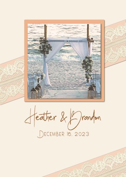
This could have been the cover of an invitation or thank-you card for my niece's wedding (the mother of the 10-foot-tall teenager). The script font is Billie Ashley, and the sans serif font is Satreva. Both are from Creative Fabrica. Thanks to Carole for another fun and interesting workshop.
- 356 replies
-
- 18
-
-
-
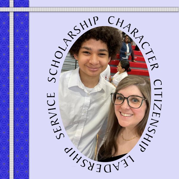
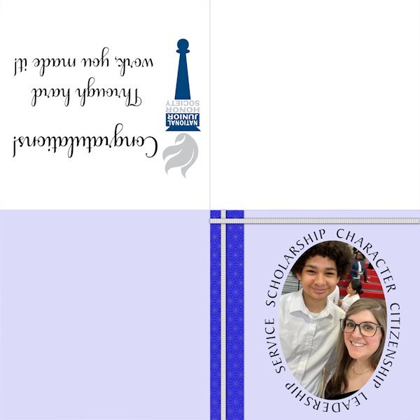
The picture is of my youngest niece with her middle child, my great-nephew, Londyn, who appears to be 10 feet tall. He was recently inducted into the National Junior Honor Society.
- 356 replies
-
- 16
-
-
-
That is a great ribbon. I love your work.
-
The script is Samantha Upright. The blocks were created using the Baby Alpha Block script by Cassel. The ribbon was also created with a script by Cassel, Glitters-C. I've added one for a boy. That way, I'm covered. With two great-nieces and one great-nephew added to the brood, I can't leave anyone out.
- 356 replies
-
- 15
-
-
-
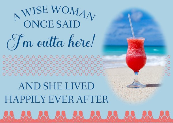
The inside of this card would read, "Happy Retirement!" The text treatment recreates a card I have waiting to be sent to a friend who retires at the end of May. The picture is a stock picture I've had for years. The sandals across the bottom and the suns in the ribbon are from Cassel's Summer Punches.
- 356 replies
-
- 19
-
-
-
-
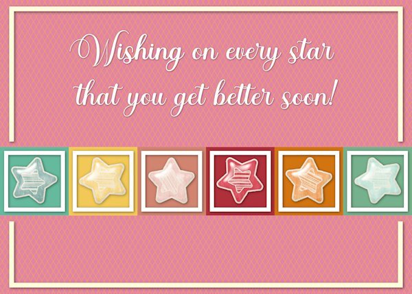
The stars are from a kit by Sheila Reed on Digital Scrapbook. The font is Ernestone Script from Creative Fabicra. It's a nice calligraphy font with lots of glyphs and swashes.
- 356 replies
-
- 20
-
-
-
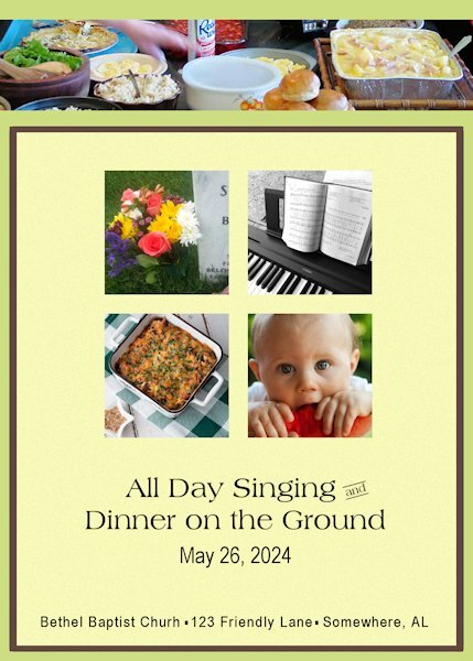
Memorial Day (United States) was formerly called Decoration Day. Families would gather dressed in their Sunday best to decorate the graves of their loved ones. On the Sunday before Decoration Day, churches would host an "All Day Singing" and a huge picnic. Gospel singers would perform in the sanctuary and congregational singing in between. It was a tradition in the South and is still celebrated in rural areas, particularly in Appalachia. The inside of the card would have instructions about where to leave your casserole on your way to the worship service. A few volunteers would get everything ready. It would also include some of the groups that would be joining the festivities.
- 356 replies
-
- 20
-
-
-
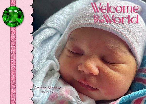
Aminah is the third addition to our family this year, preceded by her cousins Felix and Ansley. The font is Romland from Creative Fabrica. The ribbon was created using Cassel's Glitters-C script and is adorned with an emerald, the birthstone for May, from cleanPNG.com.
- 356 replies
-
- 18
-
-
-
My alarm clock is set! Looking forward to it.
-
Highlighted cursor for the Masterclass and Q&A
Gerry Landreth replied to Corrie Kinkel's topic in Let's talk
It's part of a set of tools called Powertoys, a free add-on to Windows. The mouse highlighter is great for finding the cursor, particularly on a busy screen. Just shake the mouse, and a big highlighter shows up, which shrinks down to highlight the cursor. -
Highlighted cursor for the Masterclass and Q&A
Gerry Landreth replied to Corrie Kinkel's topic in Let's talk
I agree with Corrie. The highlighted pointer is a great help. I am using something similar to Windows Powertoys called Powertoys Awake. When I shake my mouse, a highlighter appears so I can find it. -
Carole - the 2nd image had revised shadows. It seems I made a bad design choice. Below is an image of how I got to that place. The left one is what I started with followed by the routine shadowing. The third is a cutout of the title with the fourth showing the shadowing. This is the one that I used. Had I put that on top of a solid color or a subtle pattern, the eye would have seen it for what it was. However, putting it on top of a bold and colorful pattern confused the eye. Using the original title, the eye would no longer be confused. From a little detail comes an important lesson, which is why I enjoy these workshops.
-
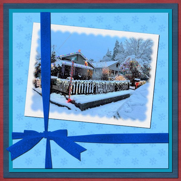
Day 7. The picture is my cousin's house in Northern California. She loves holiday decorating and snow. The papers, Winter Day, are by Janet Kemp at Digital Scrapbook. The ribbon was created using Cassel's "Attached Ribbon" script. Instead of polka dots, I used snowflakes.
- 359 replies
-
- 14
-
-
-
Carole - I was overthinking the shadows. I used a cut-out for the title and exaggerated the shadow. Below is a revised version with normal shadowing.
-
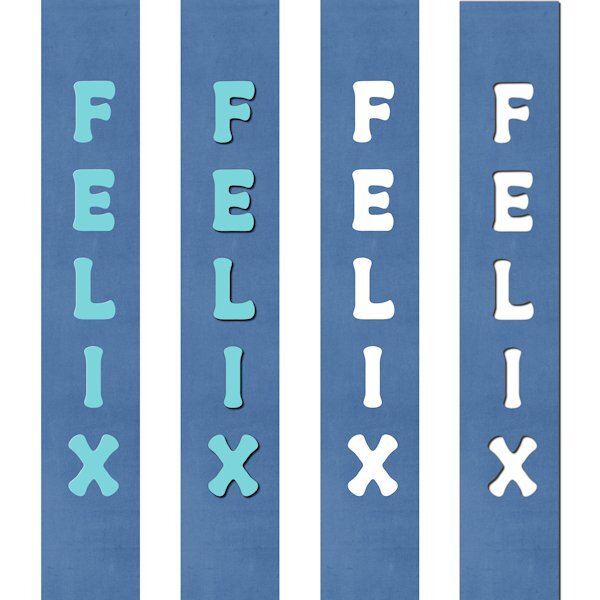
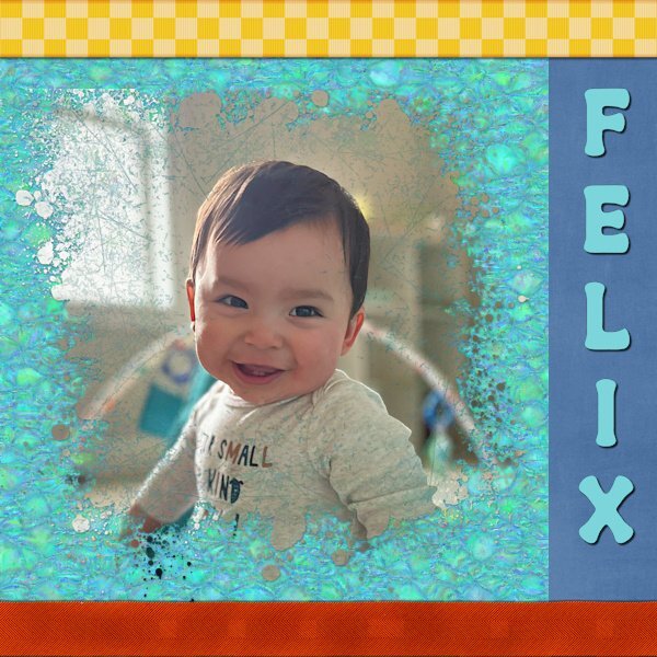
Day 6. Felix is my youngest great-nephew. The top ribbon is from Marisa Lerin at Digital Scrapbook. The bottom one was created using the Ribbon Factory script from Cassel. The mask was created with the help of the Paint Slash script, also from Cassel. The font is Retro Real Wavy from Creative Fabrica.
- 359 replies
-
- 13
-
-
-
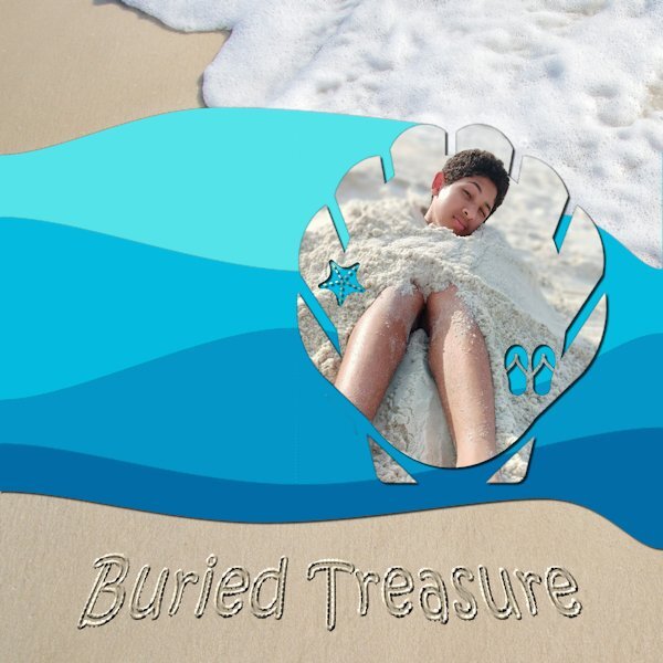
Day 5. The mask was made using Summer Punches from Cassel. The waves were made using the Waving script, also from Cassel. The beach background is from Pixabay. I used the Sand Writing tutorial in the Campus to create the title. The "treasure" is my oldest great-nephew, Brelan who will be 16 in a couple of months.
- 359 replies
-
- 13
-
-

-
-
This one depicts random thoughts. If it needed a title, it would be My Mother's Day. Years ago, I started calling my mother on my birthday to thank her for being my mother. I called it My Mother's Day. When I moved back to Alabama to be with her, I would take her to dinner to celebrate (usually at a restaurant that gave a free dessert for my birthday!) This will be the first birthday without her. I may still go to a restaurant. After all, she wouldn't want me to miss out on a free dessert! The mask for my mother was made using a watercolor brush from Rikard Rodin. The raggedy edges and the gold from were made using Picture Frame in PSP.
- 359 replies
-
- 12
-
-
-
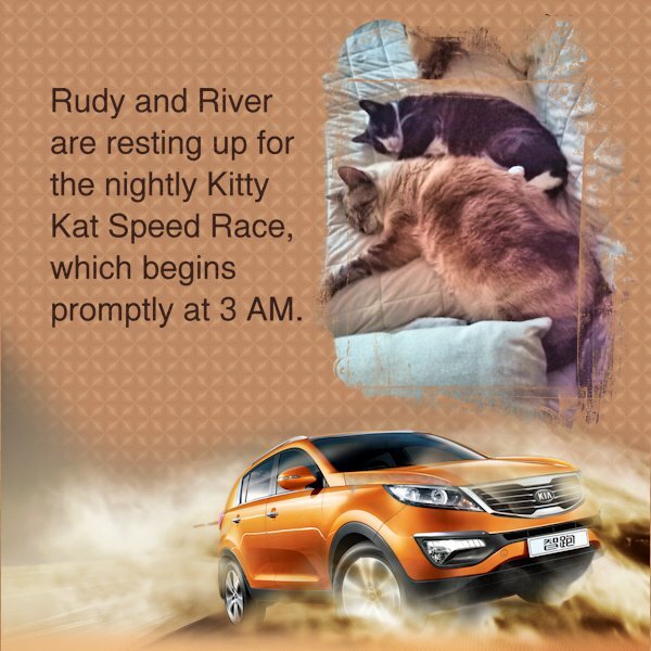
The car is from CleanPNG. The mask is from Graphics Creation. When I saw that it was Kaleidoscope Day, I set aside a couple of hours to stare mindlessly at the changing shapes and colors.
- 359 replies
-
- 12
-
-
-
-
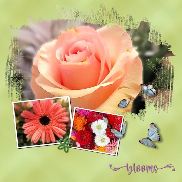
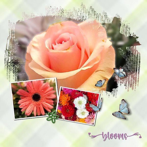
I spent lots of time experimenting with the plaid, including tinkering with the settings for seamless tiling. Since the photos are "busy," I wanted a pattern that wouldn't compete. The green "plaid" looks closer to a grunge effect. The photos are mine. Although I'm not a good photographer, I keep finding little bits of a picture that look nice enough to showcase. The font is Welcome Spring from Creative Fabrica. The butterflies came from Pixabay. They already had shadows but in the wrong direction. Flipping them solved the problem.
- 359 replies
-
- 17
-
-
-
I had the same problem. The link kept redirecting me back to my Dropbox account. Since I had the template from the previous mask workshop, I was able to use it.
-
Day 1. The script is Shocking Script from Creative Fabrica. The paper is from Pet Papers by Marisa Lerin on Digital Scrapbook.
- 359 replies
-
- 17
-
-