Gerry Landreth
DIAMOND-
Posts
384 -
Joined
-
Last visited
-
Days Won
2
Content Type
Profiles
Gallery
Forums
Everything posted by Gerry Landreth
-
I added a cookie as a reward/incentive. Although you can't tell by looking, it's sugar-free, as is the latte.
- 172 replies
-
- 10
-

-

-

-
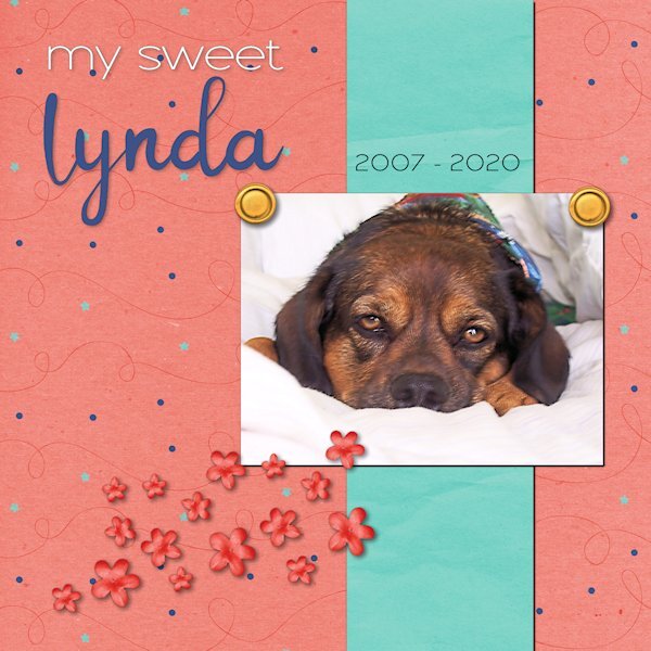
There have been unexpected challenges this week, and I haven't had time to make a sandwich - figuratively and literally. I hope to find a few minutes this afternoon to prepare both. "Linda" means beautiful in Spanish. When she was handed to me, I changed the spelling to a non-traditional one because that's how we do things in our house. She had a beautiful spirit that was always calming. The anniversary of her passing is this weekend. The kit used for the layout is called "Celebration" by whispy's D'zines from GoDigitalScrapbooking.com.
- 172 replies
-
- 13
-

-
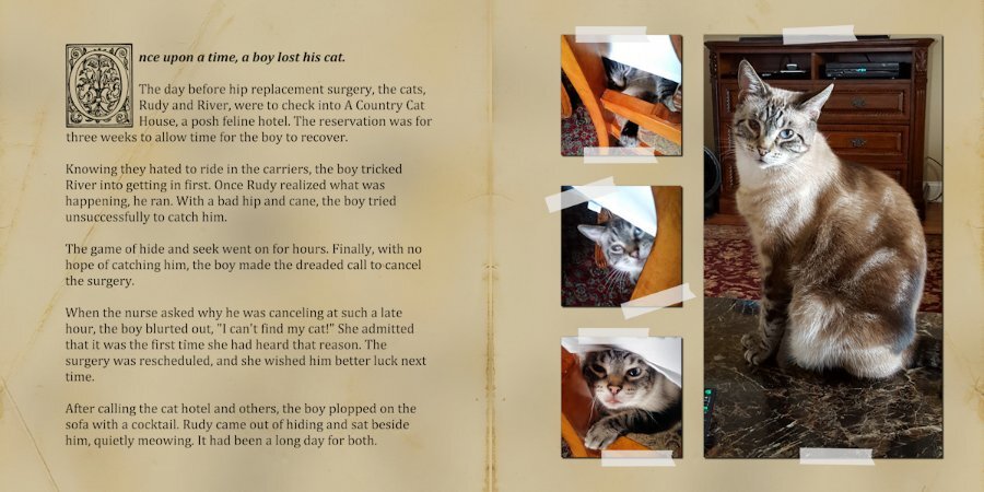
Day 6. Every time I had a follow-up visit with the surgeon, someone would always ask about Rudy. How's Rudy? Or where's Rudy? Followed snickers. I added an overlay over the grunge to give it an aged paper look.
- 203 replies
-
- 14
-

-
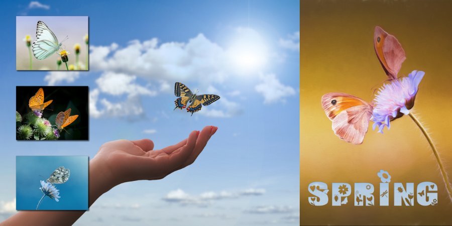
I lived in the historic district of Salem for many years. Spring was spectacular on the North Shore.
-
I'm going to leave this one unfinished for now. There were lots of visitors to see my mom today, which diverted my attention. It also sparked the idea for the theme.
- 203 replies
-
- 14
-

-

-
I wish I could take credit. I forgot to mention that they are from Unsplash. Most of them are from the same photographer.
-
I used another one of the templates from Yin Designs. The Clip-to-It script is an indispensable tool when working on a layout like this. My parents were armchair birdwatchers. The feeder was strategically placed where it could be seen through the sliding glass door, and the tattered reference books were nearby in case an interloper flew in for a snack. When I moved back to Alabama, I carried on the tradition. Several feeders were strategically placed where we could enjoy the birds when the dining table. Mother even dragged out the 20-year-old reference books when needed.
- 203 replies
-
- 10
-

-

-
- 203 replies
-
- 13
-

-

-

-
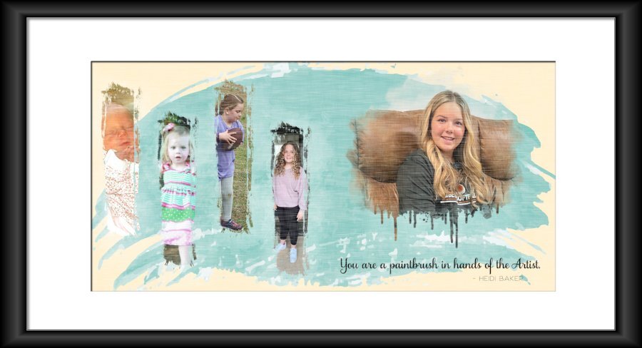
Carole - The black frame for Day 2 was created using IMAGE/PICTURE FRAME. The one I used is square, which is why the sides look a bit thick, and the top/bottom look stretched. On the layout, I used a brush set called Paint Strokes by Resource Boy (don't remember where I got it.) I used them as masks.
-
My oldest great-niece, Maggie (named after my mother). She will be 15 in June. I used the picture frame function in PSP 2022. It seems the proportions may be off a bit, but I'll have to let it go for now. My time has run out for today.
- 203 replies
-
- 13
-

-

-

-
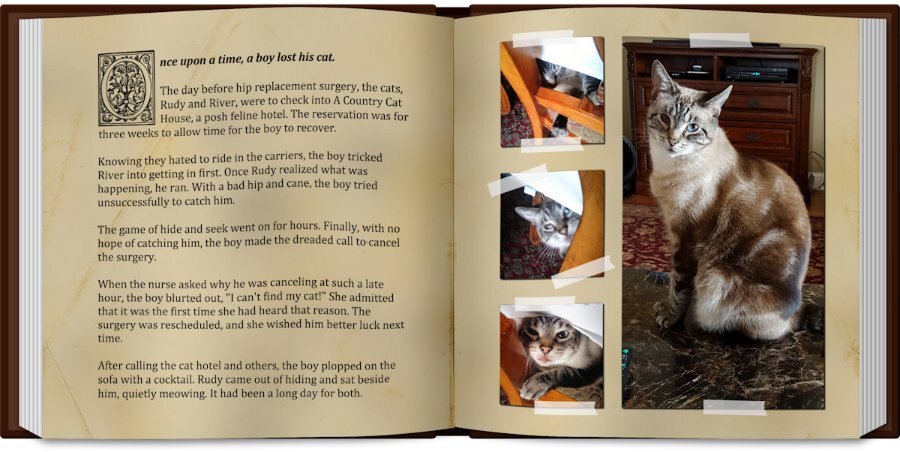
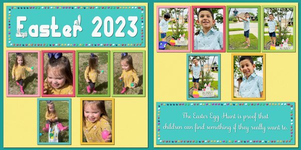
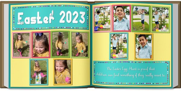
Double-page projects are always challenging. In this case, there were not enough pictures to fill the spaces, and I had trouble finding clip art that I liked. So I resorted to an old theater technique ... spread them out and make it look full. I've done a couple of picture books, and Carole's Open Book script is an excellent tool for previewing the layout. NOTE: The blurb may be hard to read: "The Easter Egg Hunt is proof that children can find something if they really want to."
- 203 replies
-
- 11
-

-

-
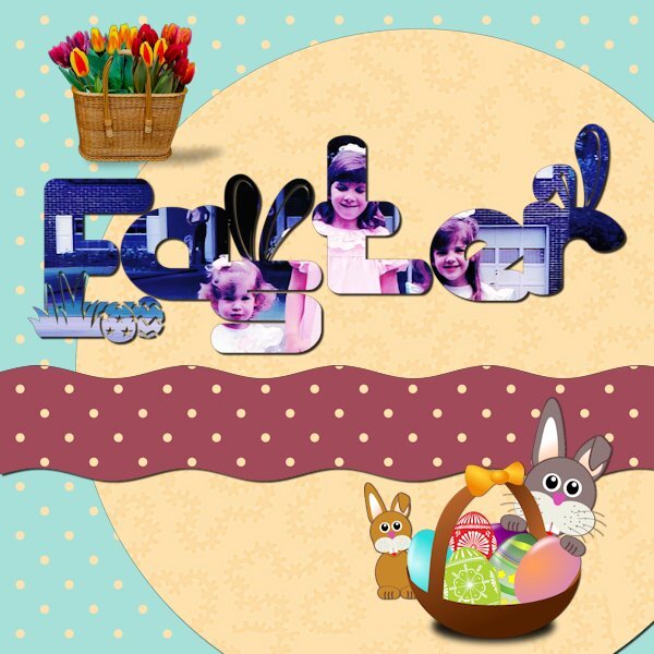
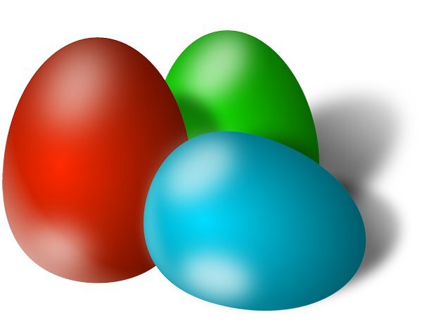
Day 7. I found several fun graphics on Pixabay but kept running into shadow problems. I couldn't use the eggs because the shadow angle was wrong for the layout. The font is Thanks Bunny. It has lots of fun glyphs.
- 331 replies
-
- 14
-

-

-
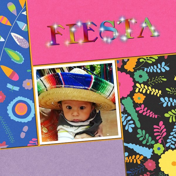
Day 6. I accidentally found that adjusting the settings could give some cool variations. The tube is "flare." The picture is my youngest great-nephew, four years ago. He lives in Texas, and this was his first trip to Mexico with his abuela.
- 331 replies
-
- 12
-

-

-
I'll try that. Thanks, and ugh! Chasing down bugs used to be fun 20 years ago.
-
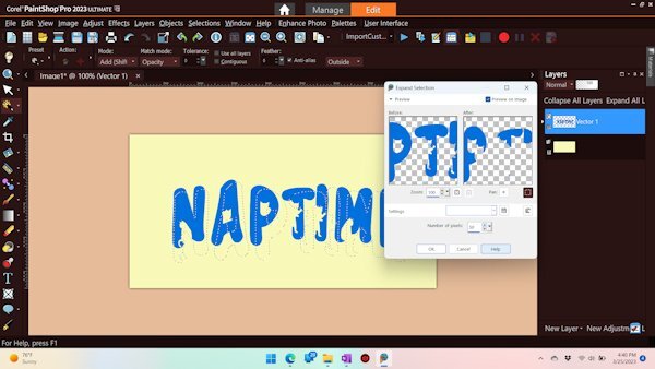
I want to mimic the example. I used Expand Selection, but the selection is offset. What am I doing wrong? UPDATE: Before I hit SUBMIT, I realized the first question would be about what version I was using, which reminded me to test it in another version. It works in PSP 2022 but does not work in PSP 2023. More often, I have to revert back to PSP 2022.
-
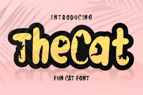
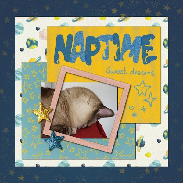
Day 5. Rudy, my Siamese mix, who is blind in one eye. He has odd sleeping habits. The font is The Cat. The kit, Sweet Dreams by Melo Vrijhof, is from Digital Scrapbook
- 331 replies
-
- 14
-

-

-
- 331 replies
-
- 15
-

-

-
Day 3. This was taken a few years ago. She was mad because she still had to use the car seat. Once they got on the road, her mother informed her that she was going to the pediatrician. From that moment on, she became as incorrigible as she could.
- 331 replies
-
- 17
-

-

-

-
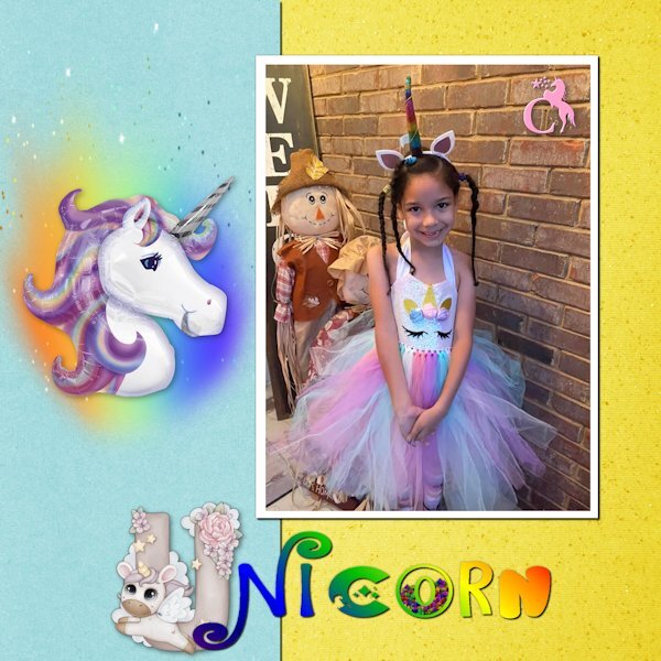
Day 2 - All of the fonts are unicorn related: Cute Alphabet Unicorn, Unicorn Express, Star Unicorn, Magical Unicorn, and Groovy Unicorn. The monogram at the top corner of the picture is Star Unicorn Monogram. My niece loves unicorns, just like her Uncle. Although, unlike her uncle, I think she is starting to outgrow them. Such is life in "Honah Lee" ...
- 331 replies
-
- 16
-

-

-
- 331 replies
-
- 16
-

-

-
@Gerry LandrethIs that a multi-layered font? Carole: Below is a link to the font. It's a fun one with lots of possibilities. I didn't have time to play with it, but I'll revisit it soon. School Rules Font by Salt and Pepper Fonts · Creative Fabrica
-
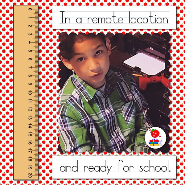
Londyn always made sure he looked his best in case the teacher in case he had to be on camera. This is 5 years ago. All of the elements, including the apple I used for the paper, came from Creative Fabrica. The font is School Rules, also from Creative Fabrica. It is a set of three fonts, one with letters and lines, one with only lines, and the other with only letters. Because I couldn't figure around the blank space using the combination letters and lines, I did them separately on layers and aligned them manually.
- 389 replies
-
- 10
-

-

-
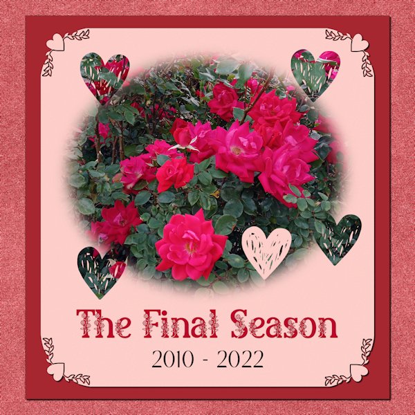
The Knockout Rose bush always showed out every season with spectacular blooms. At the end of this season, it died. A new little bush has taken its place. Soon we will see if it can fill the roots of its predecessor. The decorative font is Beauty Reason from Creative Fabrica. The top and background papers are from Annie Digital. The middle is a simple flood fill using a color from the background paper. The corner punches and heart brushes are from Cassel.
-
Rudy and River in a reverie. Carole: The font from yesterday was a freebie from Creative Fabrica called The Romantic by Lettersiro Co. I checked to see if it was still available, but it is now $15. This is the first time I've used it.
- 389 replies
-
- 11
-

-

-


