Sue Thomas
Members-
Posts
3,067 -
Joined
-
Last visited
-
Days Won
107
Content Type
Profiles
Gallery
Forums
Everything posted by Sue Thomas
-
It was my pleasure, also thank you Carole for allowing me to contribute to the countdown again this year. As usual it was a great success.
-
You mind you use it in one of your lovely festive pages. Also your kind words are very much appreciated.
-
I may save this one or the other one I posted for next year's Christmas countdown. Possibly by putting it to a vote. Thanks for all the loves, wows and likes.
-
I was taught it would depend on the quotation. If the quotation ended the sentence, in a complete grammarly sentence, then the full stop would be inside. Otherwise it goes outside. For example " I love your creative style." "Effects, 3D effects, drop shadow was used in this project". The word the was taken away making the sentence incomplete.
-
Brolly is most commonly used. I can not recall anyone ever calling it an umbrella, not even my parents. Even Umbrella manufacturers refer to them as brollys in their marketing. It isn't a slang word either.
-
A suggestion and request for a masterclass on being creative using vector swashes, swirls, flourishes, dividers. For this decorative festive wordart I used several of the above vectors. To create the banner I used a flourish, duplicated it, mirrored, flipped, then added another decorative swirl in the same manner for extra curls on the banner. Using a vector I was able to easily created text following the path of the banner. I used a divider for the main stem of the mistletoe. added foliage which I took from a font monogram. The holly and berries, stars, snowflakes, ribboned bauble and date also came from font extras. Pen tool to hang the 2 decorations from the banner. I find it rewarding to be able to create my own. It is also much quicker than endless searching for something suitable online which would be in PNG format. Although I will scroll through some for inspiration. The beauty of using vectors is that you can use a 100 pixel size and resize it to 1000pixels plus whilst retaining it's clarity and sharpness. Using the pen tool you can also make adjustments to your liking. For those that didn't know or was curious to know, this is how I created the above festive wordart.
- 87 replies
-
- 11
-

-

-

-
Would you like to use this festive word art in a seasonal page. If so head over to facebook, files, to download the PNG file. Perhaps you would like to change the colours to suit your project, if so, it's easy to change. It is unique, you will not find it anywhere else. Once again created using vectors.
- 87 replies
-
- 11
-

-

-

-
Very nice. I like the inner yellow frame, a nice added touch. To clarify, did you use adjustment layers? If so saying transparent frames may be misleading. As the adjustment layers doesn't lower the opacity. Unless you did what Mary did.
-
I always appreciate your kind words, my dearest campus friend!
-
Now then, don't anyone dare laugh, but seeing as I had completed all my festive cards, calendars and everything else related to the festive season a while back. I decided to start thinking of Christmas 2024. I'm currently working on greetings for the inside of cards, something other than the usual plain journaling. I posted the wordart tree earlier. Since then I have done 3 similar to the one below. Although it's white vectors on a black background, they will be colourized. This is how I start any of my word/subway art. I used from vector shape to cut out the & from the bauble.
- 87 replies
-
- 14
-

-

-

-
I'll take it as a compliment, and it's my pleasure to widen the realm of creative possibilities within PSP. I can see, we are going to have to start another holic group. Only this time for scripts. For scriptaholics. I hold Carole totally responsible for this addiction. As how can anyone resist the temptation of her wonderful time saving scripts. hahahahaha.
-
You emphasise 'easy way'. 🙂 Most things become easy or easier with a little know how and practice. I firmly believe, that once you have created an adjustment layer, there'll be no stopping you. It only takes about 5 steps. If I was you, I would use the adjustment layer the conventional way, contracting by the number of pixels of your frames. Then save as a PSP. To be reused over and over. I have never created an adjustment layer template.
-
Where as you created actual frames around your image, and then lowered the opacity of those frames, the image stayed the same. The brightness and contrast adjustment layer alters the actual image, whilst still retaining the sharpness, colours, and quality, although they might be made brighter or less bright. It doesn't alter the opacity. There are a lot of adjustment layers to play with, depending on the look you want to achieve. While you still have the selection tool active, you can add textures, even an inner bevel. Personally I rarely do that. I'm only making you aware of some of the possibilities.
-
You are so absolutely right. The brolly is a necessity, all year round. I've packed my British waterproof clothing. My Canada winter clothing will be to hot for home. I won't be taking a laptop this time, but I will have my phone to check in on you all.
-
It wouldn't be christmas without cold, and the white stuff in the northern hemisphere. A perfect combo. You have a nack of arranging elements, creating beautiful layouts, without going overboard.
-
You are absolutely right, I fly out on Wednesday afternoon, arriving at mid day the following day. I will be away for more than a couple of weeks. I fly back on the 31st January. It's going to be a wonderful, special time. I'm told that the girls are now counting down the days of my arrival using their advent calendars. Thank you!
-
You lazy, so and so!!!!!! lol, only joking. Carole spoils us with all her wonderful scripts. 🙂 You know, once you have created one adjustment layer, you'll be able to do more, with ease. It really isn't a complicated process, slow or tedious. Yet the effect, like masks will produce a delightful page. Which will allow you to be creative, like I did some out of bounds and more in the leaf layout.
-
Providing you save the file with as a PSP, the adjustment layers will reman in tact, and you can slip another photo, of the same size, although you could size up or down, depending on the image, above the original photo. There will be several layers, but you can hide what you don't want to reuse. So yes, you can. They work like masks, you will be able to adjust those layers to suit the new image.
-
Now I think I know what you are trying to achieve. For this effect may I suggest you use the adjustment layers. I think you will achieve a much better result, not that I'm saying what you have done isn't lovely, it is. Although you have created 3 distinct frames, you still do that using the adjustment layers. In my example, which I did back in 2018, I have done many different ones since, including oval ones, within a rectangle image, which has distinct frames, like yours. Using the selection tool, and the adjustment layer brightness and contrast. Of course you can still lower the opacity whilst the frame is still selected with the selection tool, within the adjustment layer. The adjustment layers are like masks, you can go back at a later time to change it, when saved as a PSP. There are masterclasses on using the adjustment layers. 'Adjust what' is one. I hope this helps you.
-
I put this page in November by mistake. I like the gold. I'm going to use this in some of next year's festive cards, as the greeting/verse on the inside page. It ill make for a novel layout. I will also be able change some of the wording, depending who the recipient of the card is going to be.
- 87 replies
-
- 14
-

-

-
I'm sorry, but I'm at a loss. The only other thing I can think of is creating and using a frame or frames in a mask, where the opacity of those frames will be sporadic throughout the mask. Or using a vector shape to create a frame, using from vector shape, go to the photo layer promote to a new layer, and change the brightness and contrast of that layer. You now have me baffled!
-
I saw something similar online, which caught my eye. I decided to create my own. I'll make it more festive with colour, holly etc. Wordart using only fonts.
- 201 replies
-
- 12
-

-

-
Carole has transparent frames script. I replicated one of them, it's below. The only other thing I can think of is using the adjustment layers.
-
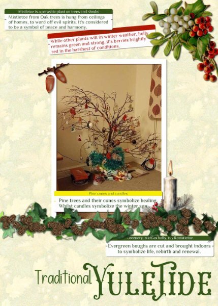
I dug out one of my very old photos from home. It wasn't that long ago that we were discussing the origins of Christmas and it's relation to the Winter Solstice during pagan times, in the campus. I mentioned that my children and I would go out gathering greenery for decorations, and branches for a tree. I have created a Yuletide page. I still make paper chains. I used Carole's label script for the journaling, the pine cones come with PSP. The other elements I have acquired over the years, which I use over and over in other pages, particularly the ivy, which you may recognise.
- 99 replies
-
- 12
-

-

-
Ann, I like the background. Did you consider using guides, or better still objects, distribute, space evenly horizontal and vertical, to align the months.


a.jpg.3b3457c8bfc9bfc8635f927741c3522d.jpg)


