Sue Thomas
Members-
Posts
3,002 -
Joined
-
Last visited
-
Days Won
101
Content Type
Profiles
Gallery
Forums
Everything posted by Sue Thomas
-
Carole's border and page punches, along with her fancy fonts, really don't need any introduction. For the date I created a wooden token. As for the hedgehog I went with a semi watercolour effect. Frame and mask my own. Whilst home with the little girls, I would take them up Badgers lane, once at the top the view is spectacular. They would take their magnifying glasses, I spy insect book, and magnifying insect jars. Needless to say I got those for them. We would turn over stones, to see what was underneath. On one occassion we saw this Hedgehog. Of course I had my camera with me.
- 148 replies
-
- 12
-

-

-
Creating and using masks has opened a door for you. Taking your creativity to a whole new level.
-
Exactly, you can't beat outdoor entertainment. BBC earth is free on the telly this month. Planet Earth 111 is now airing on a Sunday night. I was home when it was first aired in 2022 in the UK. I'm a huge fan of Brian Cox too.
-
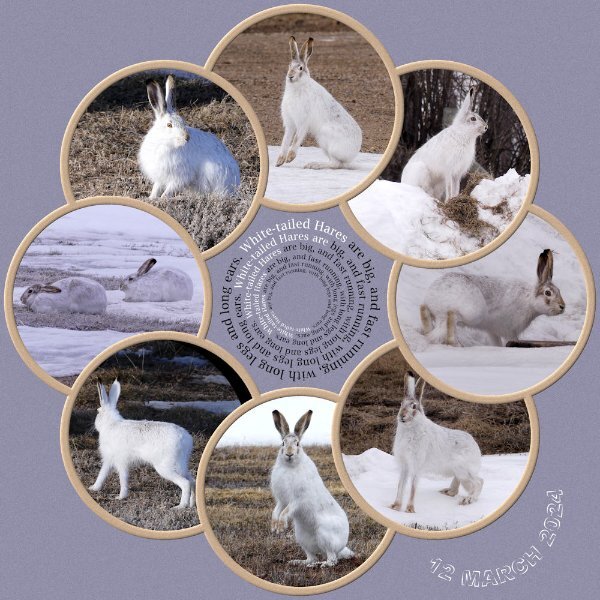
As you can see I've had a superb day outside, being entertained by 6 hares. At home we have a saying Mad March Hares. They aren't mad at all, instead it's the courting behaviour of mating hares. They spent the day, running up, down, over and around the snowbanks in the yard and out in the stubble, chasing one another. Mating suitors.
- 148 replies
-
- 15
-

-

-

-
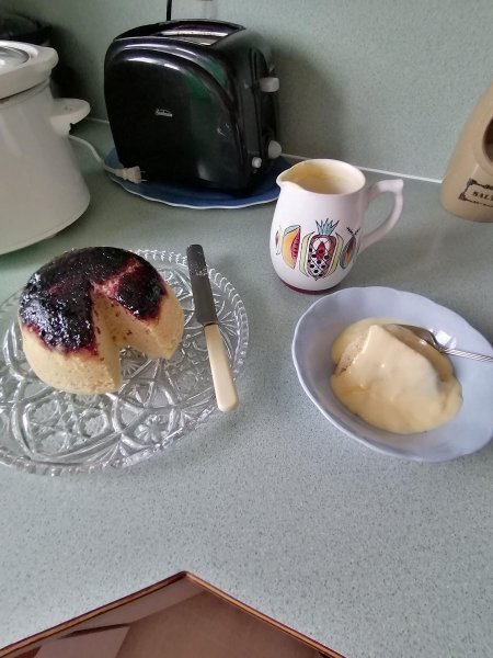
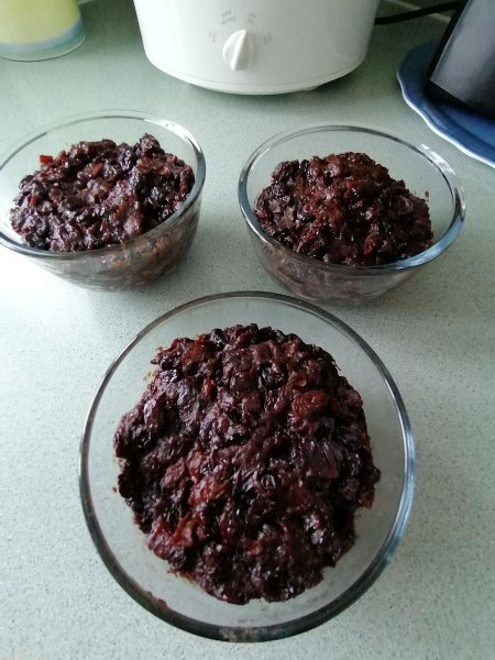
Spotted Dick. Is a tradtional steamed pudding made with suet and dried fruit. This is the blueberry steamed pudding I made yesterday. Variations can be jams, or treacle, always served with piping hot custard. There is a misconception between pudding and dessert. A dessert is sweet, whereas a pudding can be sweet and savoury. I was always taught, that one uses a fork and knife with a dessert, and only a spoon for pudding. Corrie posted Xmas pudding. These are three I made to take home. Using 1lb pudding basins. Cooked in the pressure cooker.
-
Rice pudding, one of my favourite puddings, served either hot or cold. I make a rice pudding once a week. Traditionally made with all milk, and pearle rice, in other words pudding rice. I love the skin, which is flavoured with nutmeg.
-
The word gloomy comes to mind when I look at your photo. Depicting long, dark, bleak winter days.
-
This is going to sound really daft. I downloaded the freebie. I had a complete mental block, not knowing how to use it. So I decided to do what I always do, and that is create my own slip it in. You will often see the slip it in technique used in many of my pages.
- 29 replies
-
- 12
-

-

-
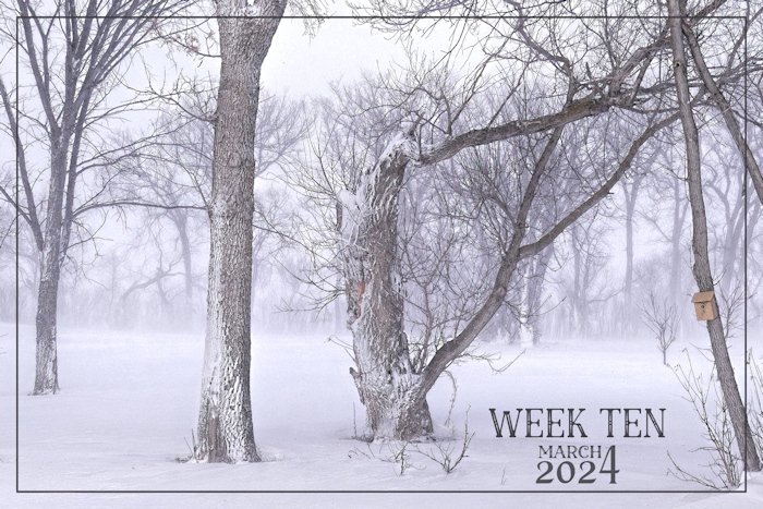
It has been a week of snow, blowing snow and white outs. Image taken out back in the trees. To me, I see, An eerie stillness, even with blowing snow, in the woods, in the depth of winter. A typical March day.
- 62 replies
-
- 11
-

-

-
Arctic Roll. A British favourite. I still make them.
-
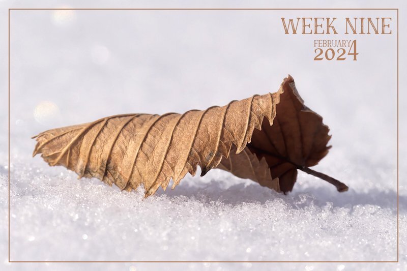
Spring is a long, long way off here. I'm pleased that the cold resonated through the photo, as it was bitterly cold, -29c, calm, with a clear blue sky. I can only expose fingers for a vey short time, batteries drain quickly. It's great taking photos at ground level, during the winter months, as the snow moulds to my shape, making being sprawled on the ground comfortable. The snow is ever so dry, that I don't get wet, I brush it off like you would icing sugar.
-
Week nine, chasing yesterday, in a mamnner of speaking. I was out shooting photos of what was left of the Autumnal leaves. This leaf caught my eye, as it had finally descended, landing onto a blanket of fresh snow.
-
I can remember you mentioning that you have hares where you work. A friend of mine who lives in Saskatoon, have a lot of them at the local park, which are out and about during the day. I rarely see mine active during the day. They leave plenty of evidence behind after their nightly activites, for me to find.
-
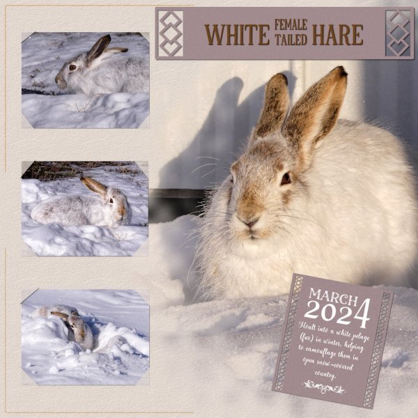
They are well adapted to their environment.
-
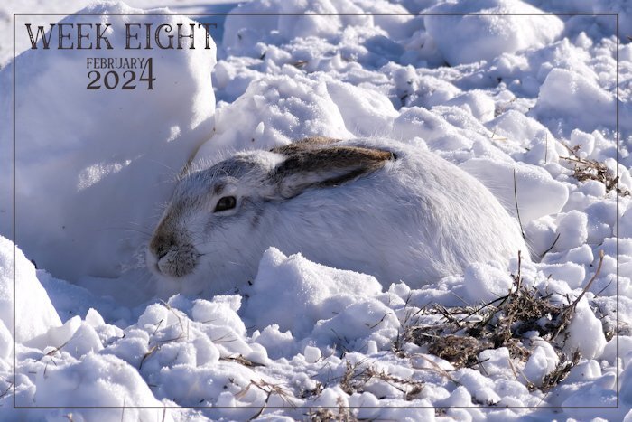
I know I'm a litte early, as it's anyones guess what I will find to photograph in the next few days. There isn't any doubt in my mind that this photo is going to be weeks 8. White-tailed Hare. North Americans call hares Jackrabbits. They are not rabbits. They belong to the same family, different species. They are are extrememy difficult to find, as they blend in well with their habbitat. From dawn til dusk they sit motionless, regardless of what mother nature throws at them. (-24c this morning) Like many animals they are capable of sleeping with their eyes open. Of course they are nocturnal. I will be able to observe this one from the kitchen window, using bincoulars, as it is cwtch down, out in the stubble, where we have moved snow from the yard. I stumbled across it whilst out tracking their movements last night in the snow.
-
Like all North Americans, the Candians are not any different, they call the spanner a wrench, pipe wrench or monkey wrench. I have and always will call them spanners. The word spanner is derived from a German word. It's inventor was Swedish several hundred years ago. I've had this conversation with many Canadians who didn't know what a spanner was, over the years.
-
I agree with you Corrie, the boy's name Caspian derived from the Caspian Sea. Caspian is derived from the latinword Caspii, meaning white. It's also the name of the Central Asian people in the Caucasus. I wonder if CS Lewis named the hero of his children's book Prince Caspian in The Chronicles of Narnia. It is an area of outstanding beauty.
-
They are ever so sweet, but difficult to shoot, as they are constantly on the move. I suspect the ones you have are the Red-breasted Nuthatch. As they have a black eye stripe and are a buff orange below. (breast and belly). Their blue grey colour on thei upper back and folded wings are very striking, even on a cloudy day.
-
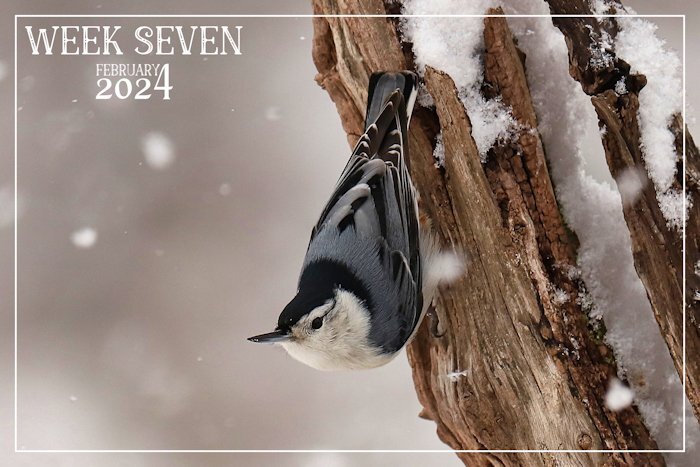
This past week we have had snow, and blowing snow. Once again the landscape is blanketed in the white stuff. A delightful White-breasted Nuthatch. Nuthatches are short tailed birds which walk up and down and a round tree trunks and limbs. The ones I have here, and enjoying the suet, sunflower seeds, and peanuts.
-
Just before I left, the Hyacinths I bought for my daughter and daughter-in-law were almost in full bloom. What a gorgeous colour your flower is. Makes up for the dismal weather outside.
-
Like you Michele, I to have evolved over the many years under the tuition and guidance of Cassel. When I look back at some of my very early work, I realize how basic, simple and amateurish my work was. Both are lovely, but the latest one is even more lovely. I love the blured frame, which blends the image into the background paper prefectly. As for the corner punches, they resonate pure elegance. As I am a huge fan of all the Punches.
-
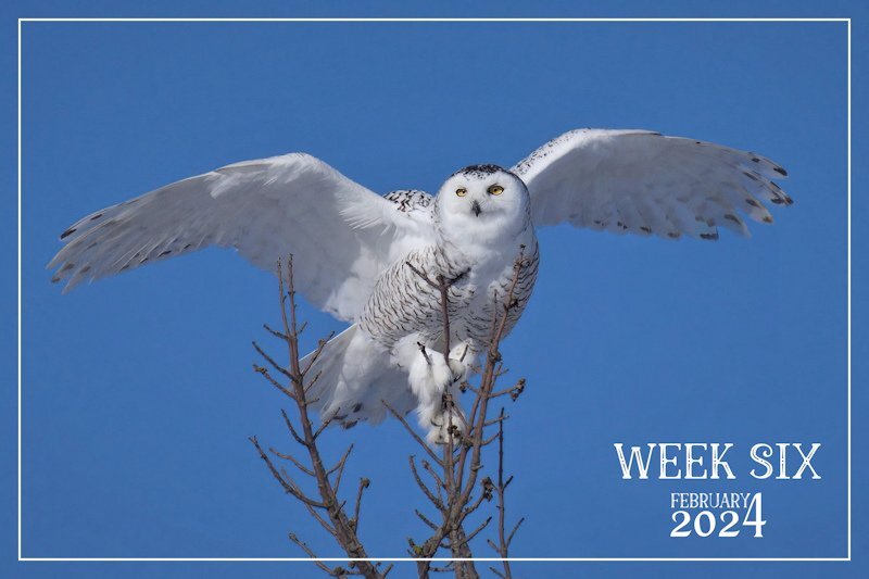
I felt privilaged and humbled when this beautiful female graced the trees out back. She even allowed me to take a few shots, before flying off. I certainly do appreciate how lucky I am. Give me the harsh climate over the Welsh weather any day of the week. The UK weather is the only thing I don't miss about home.
-
It was purly by chance I had the camera with me whilst filling the feeders, when she desended at the top of a tree not to far away.
-
Thank you! It has always been my philosphy to be inimalistic with my pages, in order not to distract from the subject in hand in any shape or form. This page wasn't any different.
-
A mature female Snowy Owl dropped in yesterday, whilst I was out back in the trees filling the bird feeders. It's quite unusual to see them perched in trees. They are either on telegraph poles, fence posts or on the ground. I must say that I'm overwhelming impressed with all the creativity being posted. Such diversity. Well done to you all.

.jpg.48e47647f2803f6afd893725cdae7a2a.jpg)
