Sue Thomas
Members-
Posts
2,652 -
Joined
-
Last visited
-
Days Won
80
Content Type
Profiles
Gallery
Forums
Everything posted by Sue Thomas
-
Beautiful shot! Chaffinches are one of the most widespread birds in the UK. This one is a handsome male.
-
They provide endless entertainment. I appreciate the compliment. The one fold had to have more lift, to take into account the tag being under it.
-
To quote Carole " a great starting point to display photos............," Once again she is right! I edited the one template and created what Carole demonstrated in, I think was the 4th project in the masterclass using grids. The paper with Carole's corner punch is a paper template. The others are my own. I did rotate the stipes, but it didn't look right to me, so rotated back to how I created it. The tag is one I made a while back. Wood tokens, and a wood burning tag. The heart paperclip is my own, which I colourized, using the sculpture tool. (silver) It doesn't really look like it, but the wood burning tag is actually not only under the folded paper, but also it's shadow.
- 24 replies
-
- 11
-

-

-
Thank you Julie, no, it's not ticked off. This one was calling to others, as it's the breeding season. Males can be ferocious towards each other over territory and females. I have shots of them fighting, and of them licking their bloody wounds. They have the teeth and claws to cause harm. They will also make warning calls, of potential predators.
-
I couldn't agree more. I saved the templates after converting the photo slots to masks.
-
Another excellent masterclass today. When I read what it was going to be about, I knew what I was going to showcase. I used the first layout which Carole demonstrated.
- 152 replies
-
- 13
-

-
-
You did ask me how I did that!
-
I'm going to suggest that everyone watches the tutorial Folded Corners in the creative scrap. Achieving a realistic effect or not, anything goes in digital pages. I'll let Carole weigh in on this one.
-
You could do that.
-
Ah right, now I understand where you are coming from. You are right. Probably should have folded another paper instead of the photo. To look realistic. Wouldn't the same apply to papers too.
-
That is probably due to the way you are switching the cut corner, once you have made your cut using the point to point. You can either mirror horizontal or flip horizontal. Then rotate to align the corners. I believe there is a tutorial in the creative scrap. I think its titled Folded paper. Unless it's in the blog. I'll take a look for you shortly.
-
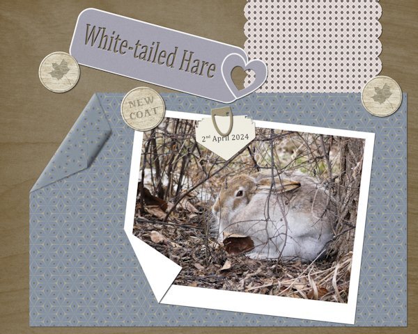
I used paper templates. The heart tag I saw on the telly, which caught my eye, so I created my own. Paper clip, ( I had previously made, all I had to do was colourize it.) Wood tokens and folded corners. I used one of Carole's punches on the arrow note. Every day, the hares are getting darker, casting their white winter coats for summer ones.
- 24 replies
-
- 11
-

-

-
Absolutley!
-
I agree, and thank you ever so much. It's one of those photos where the eye is drawn to everything, and not to one specific spot.
-
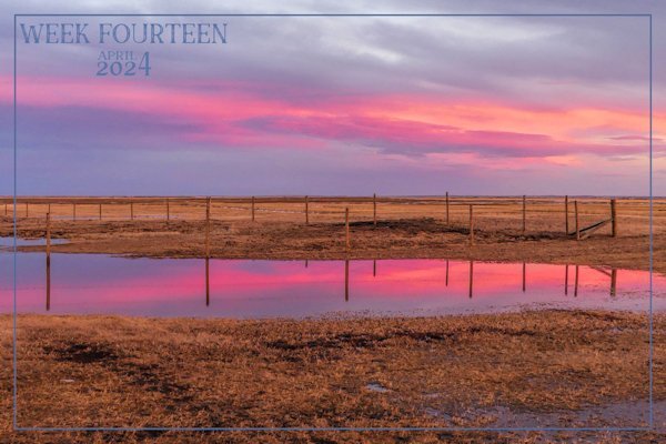
Thank you ever so much Michele. It's also the view I have from my kitchen window. Mother Nature repaints the landscape regularly. Not this morning though. It's foggy. It was +16c yesterday, then dropped to -4c overnight.
-
The no kit masterclasses are my kind of layouts for showcasing many of my photos. There is a template which Carole made available to us for the weave layout. Perhaps she will send it to you if you were to to ask her for it. It isn't that difficult to create yourself. Take your time, I'm confident you can do it.
-
This past week we have some stunning sunsets and sunrises. The temps are rising slowly, obviously the ground is still frozen, hense the standing water. Rainbows are created by water droplets in the air. The colours are wave lengths of light. Like in a sunrise, as in the image below. Red is recalled the red shift, as the light is stretched. Stretched light causes the red colour.
- 66 replies
-
- 10
-

-

-

-
Excellent!
-
Take a look at the masterclasses NO KIT 2 and 3. To create squares using guides. Of the top of my head I can't remember which class it actacually is.
-
A neat, delicate layout.
-
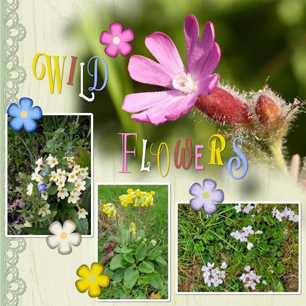
For me it is very colourful! lol I'm pretty certain you will be familiar with these native wild flowers. It's still very drab here, there are signs of grass starting to green. I enjoyed looking back over the recent years for photos I have taken when home, for this layout.
-
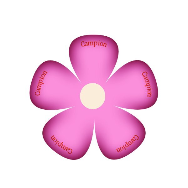
UK WIld Flowers. I have many favourites. The Campion which flourishes in hedgerows all over the country, can flower almost all year round in some areas. Wales and Cornwall, especially so. I used one of Carole's lace picture tubes, edge magic script on the flower elements, which I created myself, adding the flowers names on a curve, as the flowers are vectors. As for the tile, I went wild using many different fonts, and colours from the photos. Due to compression, some of the flowers names in the flowers may not be legible. Forget me nots, Primroses, Cowslips, Shepherds smock. The main photo is a macro shot of the Campion flower.
- 41 replies
-
- 12
-

-

-
I mistakenly called the masterclass paper templates. I have just checked, the masterclass is titled 'using element templates'.
-
I got a feeling you will like using paper templates.

.jpg.5e00fa1ef3e89be94a195fd748295ca7.jpg)


