Sue Thomas
-
Posts
2,652 -
Joined
-
Last visited
-
Days Won
80
Content Type
Profiles
Gallery
Forums
Everything posted by Sue Thomas
-
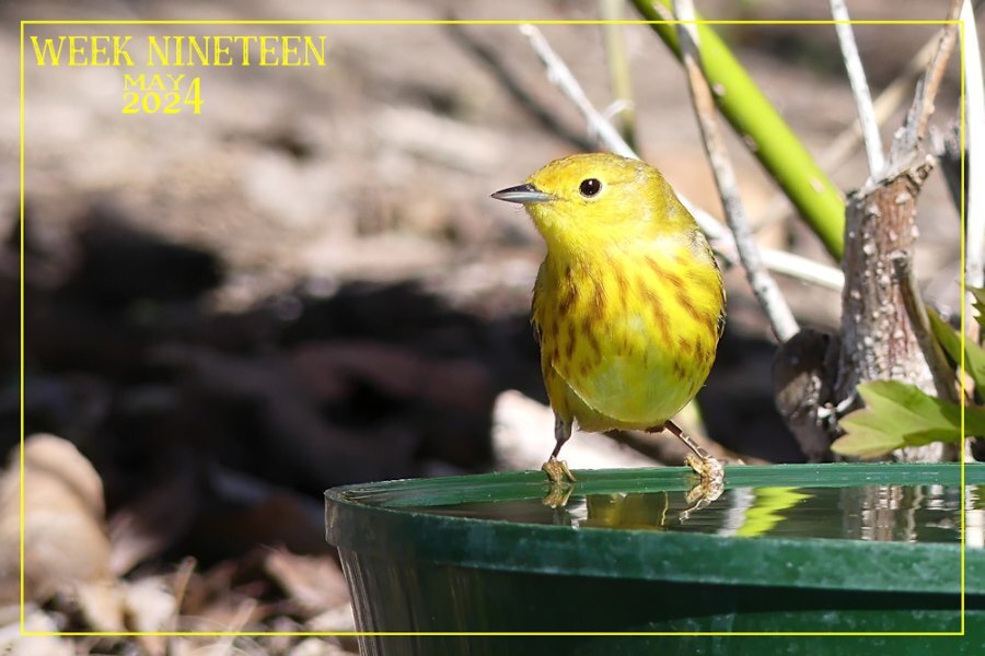
Male Yellow Warbler. I heard him yesterday, and got to take a photo today.

-
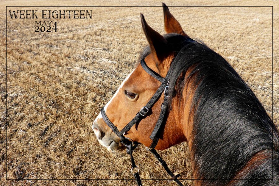
Meg, lovely to be out riding with longer, warmer days.
-
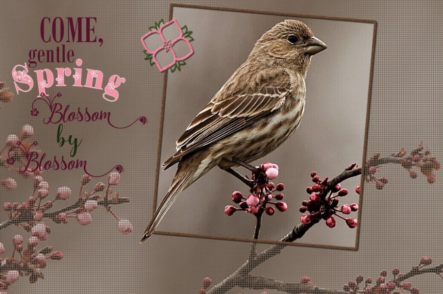
Many of the native sparrow species have already arrived. Much to my delight the White -crowned Sparrows turned up yesterday. I was pleased to welcome them back. A perfect opportunity to create a banner after watching the live masterclass on Sunday. The sparrows of the open field will stay, those like the White crowned will move on further north. I used a gradient which I created for the pennants using colours from the photo, and the light coloured wood frame
-
Looking at what Fiona created, I don't think it would have been a vector. I suspect she used Polar coordinates effects to create the circle. There are other techniques, but I would use the polar coordinates. There is also a circular element script. Rene is right, you don't have to use the selection tool to create a bevel. Make sure you have the right layer selected. You did a great job Fiona!
-
I agree with Rene. All that I have on my C drive are the programs which I am currently using, everything else is stored on one of my two 2TB external hard drives. BY doing so, and keeping the C drive just below half full, maintains the speed of the laptop, and the programs running efficienlty. I'm hoping that by dramatically cleaning out your C drive will resolve your issues. As a full C drive is problematic. To be perfectly honest, even though Corel has told you to install PSP on your D Drive, I wouldn't, as it's not the choice of PSP to be installed there, along with all their files. I know some do, and they haven't had any issues in doing so. Unless you are confident in doing so, I would contact Geek Squad, specify what you'd like them to do, explain the problems you are having, and let them clean the laptop for you. There was a time I used to do that myself, but soon learnt that I was only scratching the surface of a deep major clean up. Now Geek Squad does it for me. I watch what they do, they delve into places that I never did. Bu first I would delete programs and files thay you no longer need. Even though you have deleted stuff, there is always something left behind, which is where the knowledge of Geek Squad comes into play. Should you decide to go down the road of a new laptop, I told Best Buy what my primary use was going to be for the laptop. They recommended a gaming laptop, which is what I went with. I haven't had any cause for regret for the choice I made. They transfered everything from the old laptop to the new one. I gave them PSP serials numbers etc. Once I took it home I could sit down and instantly start creating. They even set up a wifi connection for the camera for me, so I could transfer photos directly from the camera to the laptop.
-
I see what I have done, I selected your reply comment instead of Michele's original by mistake. I'm sure she will spot my comment and realize that it is meant for her.
-
It has a shadow, not a huge one, but there is one. I could separate the text from the shadow, save them individually, to enable me to put a deeper shadow on the text itself. The compression of the file doesn't help either, it looks OK on the original.
-
Here is the tag, in case it isn't legible in the layout.
-
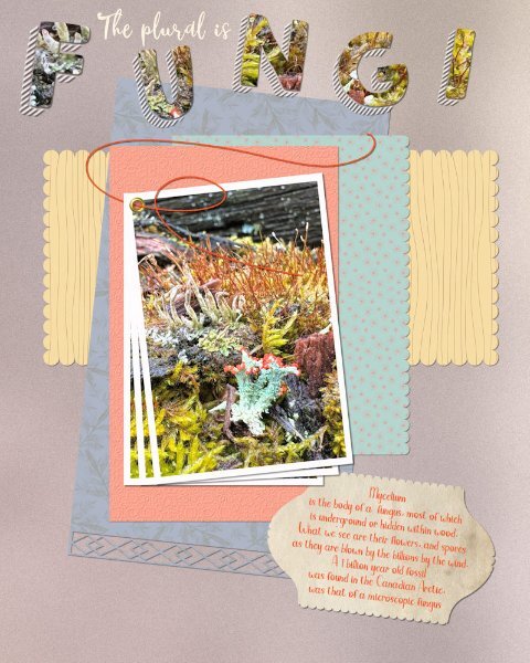
Here is my font challege page. I was in a scallops frfame of mind when I was creating this page. Earlier this week, we had sleet, and a lot of rain, the following day Mother nature's smallest and oldest living organisms exploded into an aray of colour out in the trees. Ok, I had to down on my hands and knees to view the show, but none the less it was spectacular.
-
I assume you have tried all of the obvious, like uninstalling and reinstalling. Are you able to use another version? I would seriously recommend you contact geek squad, the worst they can say to you is that they are unable to help, yet they just might be able to delve deep into the workings of your computer and fingers crossed possibly find a solution, it can't do any harm.
-
They are ever such a handful, but a delight to be around. They come riding with us, even to the beach, they love the beach.
-
Its not fininshed yet I have to add a dreamy feathery look to the rather harsh cut off of the legs. The hardest and time consuming part has been done.
-
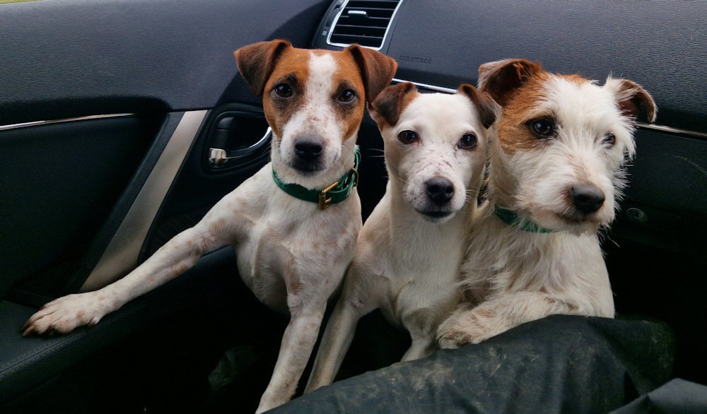
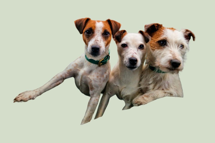
My daughter sent me a photo of her three girls. Tot in the middle is the mother of the other two. Smudge and Bramble is the wire haired one. They are Parsons terriers. I started the extraction last night, after watching the advanced extraction masterclass in the campus. It is an older video, but most helpful. It was a tedious, eye staining task. Yet, althouogh it's not perfect, I'm happy with the end result. I've sent it to my daughter, which she will get tomorrow morning. I given her a choice of background colours. Here is one one them.
-
I was planting an idea for you, as I couldn't replicate your appealing unique style, should you run with the idea, you will create it with your own style, making it your own. I'm certain that it will be fabulous what ever you do.
-
I think you have a done a lovely job. I like the split frame effect. If I may, I'm going to make an alternative suggestion using a frame or the split frame technique and I have also posted an example even though it's not the split frame effect, it is still a frame, and I feel it will work equally as well. Duplicate the photo, hide one. Create the frame/frames. Using the magic wand select outside the frame, contract by a few pixels, then invert. Now you can edit the photo not in the frame or frames, reduce the opacity, blur, add a texture, its up to you. I would then place the hearts up in the left corner, with a few words. I added an out of bounds effect, for that I used the hiden photo. You could have the bouquet just out of the frame.
- 208 replies
-
- 12
-

-

-
You can never have to many tuts/masterclasses on shadowing, and Carole has many of them. Although they are at the bottom of the food chain, 99.9% can and do out run any 4 legged predator. I have coyotes, foxes, badgers, GH Owls and Hawks, and yet the Hare population is growing. By all account only Eagles and the largest of the Hawks and Owls can and will take down Hares successfully, even then 75% will get away relativley unharmed. They do get stressed easily. Their eyes reveal a great deal about their wildness, and how they are constantly on the alert, as they are free, unlike those kept in captivity tha tare dependant on humans. Also, even with domesticated animals, they don't understand that when they are injured and in our care or rehab us humans are trying to help them. I have been finding their discarded white winter coats. I'm sure mice, voles, birds and many other creatures will be uising it to line their nests with. It is so fine and soft to the touch, and blows in the wind like fine feathers do. I'm looking forward to spotting this year's young ones.
-
My last page for April 2024. I read the latest post in the blog. Using a table in digital scrapbooking. Something I have never considered doing, so I thought I would give it a try. Folded ribbon and ribbon are Carole's scripts, the lace is a brush. Created a grungy overlay for the papers, the leaves is a paper template used as an overlay. Everything else is my own. Oh yes, I mustn't forget Carole's heart corner punch.
-
All horses like to pick through straw, straw bedding should always be wheat straw and no other, especially not Barley. Since silage and haylage took off, it has been the preffered roughage for horses, as unless hay is properly made, it's dust/spores can cause breathing problems such as COPD. The same goes for dusty straw bedding. It is also more nutritious than hay.
-
All haylage and silage bales have to be wrapped, due to the higher moisture content to keep the air out otherwise the feed can be contaminated with botulism, which is a bacteria that likes the higher moisture, which can kill live stock and horses. Haylage is dryer than silage, ideal for horses. We did both, round and square bales and silage pits, which would be compressed down with heavy equipment, and covered. Unwrapped bales would be straight forward hay. Just thought I'd tell you.
-
I don't think any of us ever complete a page as we previously envisage. I whole heartedly agree with you that it is certainly great fun. Also a wonderful surprise to see the end result. There is a tutorial, I had to look it up for you, so you can check it out. Split photo effect. Lab 10-8.
-
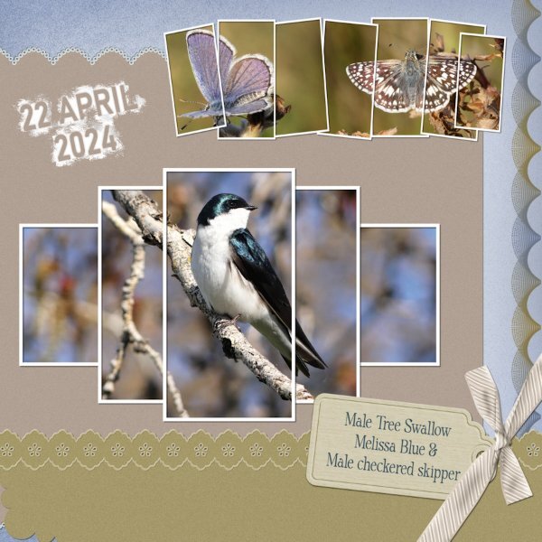
I started out with the best intentions of sticking to the sketch, by creating something using the grid. That soon went out the window, when I decided to use multiple frames instead of the set blocks in the sketch. Some of you will have the frame with the Swallow in as I created a template and made it available to download, back in 2021 I believe. The other frame I created today. The tag is mine, the bow is one of Carole's scripts, along with the decorated bottom paper. The design on the right is created using the brush and brush variance tools, which can be found along with many others in the brush variance masterclass. Birds and creatures of all kinds are now making an appearance, for me this a positive sign that Spring is for me literally around the corner.
-
You are right Sharla, it does grow in woodland areas often amongst the bluebells in the UK, as it did in our wooded area. I used to cook with it. It has a milder flavour.
-
Cristina, your page is the perfect quintessence of what is available in the creative scrap. Multitude of frames, papers and more. As always your page is most appealing. I don't know if anyone else has done the same as myself. I printed off all the previews when I first joined. In latter years I would use my owns work in each preview. Since the Lab, I add which lab the tutorial can be located. When I have filled a sheet, I print it off. I can thumb through those pages at leisure anywhere. I do the same with the fonts I have accumilated over the years. Not a vast amount, as I'm not a fontaholic. I do like a paper trail.
-
Check out the image in my response. It's the original post.
-
I have you to thank for starting the ball rolling on using layered quick pages. Hence, I thank you very much!!


.jpg.f09f49a6e8cea282ca457b3474ec5f79.jpg)