-
Posts
803 -
Joined
-
Last visited
-
Days Won
8
Everything posted by Suzy
-
Ditto. That double scallop is really nice, and so are the wonky stitched circles! I might have to go to that Lab and see if I can do these, too! ( along with scripting and Travel Tales, LoL! Good th8ng the weather is so hideous here! ) The water paper is also really, really nice. I remember that from Chattanooga, but now it looks like ocean water. ?
-
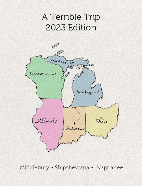
Thank you, Mary! It was supposed to look like the road maps from the 1950s and 60s, ,but I realized that the old map was VERY light and only the state borders were darker, as if the were outlined with one of those thick chisel tip markers. I would have LOVED to do that, but holy cow, it would be a LOT of work, so I used a different layer and just lightened them then put the black overlay on top. (So I can change the colors if it becomes necessary…I think I might have a lot of red, white and blue photos, but I don’t remember. I just sent the whole lot of them from my phone to Dropbox so I can pick them up with my desktop.) You’ll have to stay tuned for the terrible trip part, but know I am the world’s worst travel agent. Someday I’ll make a book about my week long vacation to Memphis. Michele, that texture on your Ireland map is delicious! How did you do it? and I borrowed your location marker idea, too, Bonnie! Jenifer Lyn, such a beautiful, intricate LO. I had to go to Photobucket to take it all in! A one-way ticket, though? Your family would be devastated! The rest of you have awesome maps and so exotic! everybody’s is so professional looking. What always strikes me is how we all have the same directions, and every single one is so different from the next!
-
- 275 replies
-
- 11
-

-

-

-
They just look fakey-fake and overdone when I use them, but when you show them they literally look like die-cut paper you have painstakingly glued to the background. I also don’t have your artistic eye for placing them. When one should choose to do a curved corner VS when to do a sharp 90 degree corner, for example. I think what I appreciate most is that I already know your have the full array of these, so 6, 7, 8, maybe 9 choices? You always seem to choose the exact perfect one for each LO. So while you can help me use them and I can watch a video, it doesn’t allow for just knowing what choice will just look right. (And yes, I could sample them all, but I don’t want to spend my life choosing a fancy border!). I also only have 2 of them. One is the squares because jagged edges are not welcome on my LOs, and I forget what the other one is. And before you get too puffed up with the compliments, ? I also like the layouts with the ragged and torn edge papers…almost the opposite of these fancy borders…..another skill where it looks complete fake and contrived when I do it and other people’s look just perfect. ?
-
This is beautiful, Sue. The edge border frame brushes are gorgeous. I wonder if they’re intuitive or if you are super-skilled at using them, and I’d be wondering if I bought the wrong ones because I couldn’t get mine to look like that! Mary, that cat is perfection! I LOVE it! Is that another CF Spark? If so, it is a winner!
-
I agree. That spread is really, really great, Ann! I signed up, but I’m not sure how far I’ll make it. Maybe I’ll make huge layouts on very small (short and close to home) trips. I do have a question: What should we do if we see a grammatical or spelling error in a LO by an English-speaking participant? Do we point it out or let it go? The reason I ask is because a number of people confused its and it's in past workshops and I'd hate if they had their projects printed. It's is short for it is only; it does not denote possessiveness. (For the possessive, it's its. hahaha.)
-
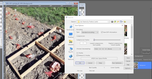
Yay! All set. I totally forgot the problem was saving to .psp, even though I had posted the query just an hour before. The bad news is I had used that open as a copy just for this LO (after not using it for 3-6 months) so bad there. Meaning I have to remember this when I get the error message next time, probably next February. At least it's in a good heading (PSP) instead of the Q&A thread which I would never have thought of and it might have scrolled way down, too. Fingers crossed, thanks for posting this caveat, Susan!
-
Ooooh! I see. I misread what you said about the .jpg. Ok. I will look into this after the Q&A. Personally, if I were running the PSP show, I would have file compatibility listed under Preferences. And it would be for all instances of save and save as, unless manually overridden by using “save copy as” and then “options”.
-
I don't see a difference - here is a .jpg with only the background layer. Save as is the exact same (butI didn't click the drop down s you could see beneath it. )
-
I don't know how to do compatibility preferences. My screen looks different from yours on "save as --> options" Yes and no on opening in vector. The vector is there, but the layers are merged. and the text is uneditable.
-
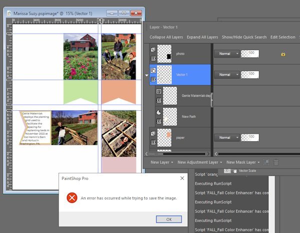
Cassel, we talked about this before, but I can't find the thread. You wanted me to document the inability of PSP 2022 to save text which has been typed into a shape. Since I can't find the original, I don't remember how we left it, except I was to send you an example or another example...I simply do not remember! Here is an example. Luckily it wasn't terribly intricate and didn't take a long time as it did the first time it happened. Is there any fix for this? I have three more to do! I know one of the fixes was to save with .psd, but my version of PSP will just rasterize the text so it's uneditable. And in this case it merged the text with the vector shape I used (which I had planned to hide as soon as I was finished editing).
-
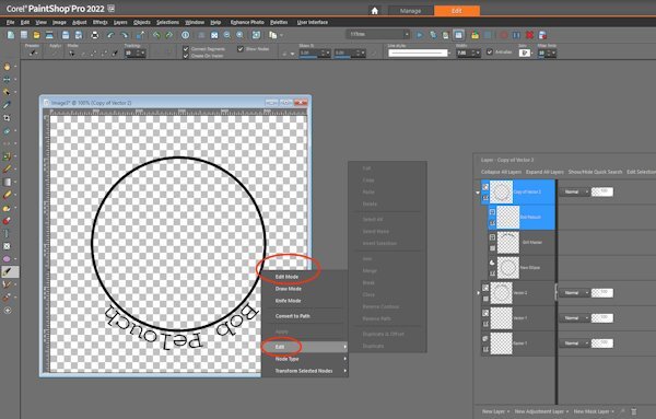
Anita, you are putting me to shame!!! Cassel, I am missing something because near the end, right when you start adding the bottom text, which is 7:52 on the Lesson 5 Vector Video, "reverse path" doesn't show up as a choice (it's grayed out). In frustration, I clicked around trying to figure out what went wrong, and I fixed it. Um, but I don't know what I did because it was the equivalent of a PSP temper tantrum. When I look at the settings, though, I am in edit mode (my half eaten tom and jerry fish is backlighted), but there is no instruction to do that!) Is this enough of a question that you can figure out what I'm doing wrong? Updated to add -- I have been re-trying this and re-reading, and I have since deleted the top text (which would be visible, if the bottom layer were turned on, but it's not.) as per your photos, but it still isn't working. I cannot get the "reverse path" to be visible. Question: When I duplicate, am I also duplicating the instruction where it has been converted to path, or do I have to do that again?
-
Ooops! I’m so sorry. I remember reading about that setuparp on the Corel forum, but I must have remembered it wrong.
-
Ann, The setuparp.exe has to do with Painter. Is it possible you did setup.exe, but failed to do setuparp.exe?
-
Susan, i bet you have Particle Shop. Go to effects > plugins > and Painter shows up, right? Click Painter and one more fly out has Particle shop. I’m not at my computer now, so I could have made a mistake, but if you can find Painter from within PSP, click on it. That’s where you’ll find Particle Shop. They couldn’t have hidden it any deeper within the menu system if they tried! And yes, the flower I made took 20 seconds and I used the fur brush in Particle shop. I didn’t have any dog or cat pics handy, LOL.
-
I would never have guessed that in a million years! Thank you, Jenifer!
-
Yes, a tablet and a pen gives way more control. Do you have that? Mine works, but it is from last century, and this was a mouse and my desktop. Change the size and it will hide the imperfections, not on'y of my terrible “mousing” but also jaggy edges (assuming you can find a brush that’s small enough.)
-
Well, THANK YOU for this! I saw the cost of the brushes (admittedly the most expensive were at the top) and never went all the way down to the bottom! AND I got 10 Free brushes on top of the 11 it came with! And this is with PSP 2022 Pro Here is my new hybrid - a double furry daffodil. Made with a mouse in case you can't tell because Susan is right - controlling it is next to impossible.
-
Nooooo! I know I’m not Susan, but I love one button to push. ?.
-
A certain person might want to know the steps to take on this because all her photos are kind of hazy. Also the difference between the haze removal and one step photo fix (the end result, not the differences in the tools used).
-
Ann, You are absolutely right. So easy! So Simple. Thank you for briging it up -- I hardly remember even downloading it. The brush (out of 11 as long as we're counting, LOL!) I chose to work with first was "grunger" I slid the size to way high and went to town messing up a picture of a daffodil with little specs. Another one makes the kind of smoke you guys had on your tea cups in the vector class. Another one is the art brush and it looks like it mixes some colors. There are some settings, but I would probably use it to add texture to some background papers at least at first. But 5 free extra brushes would be fun, ;))))) P.S. Broadway engraved is at Dafont
-
Shoot! It really does work, doesn’t it? Last week, as late as Thursday, I could buy PSP Ultimate for $39.99 USD. Friday it went to 59.99 and today it is 79.99! I’m fairly sure this is because of the addition of Particle Shop as a freebie, which I already have from PSP 2022 (but not the 5 free brushes, LOL!) I need to see that video you found because I don’t recall ever opening a particle Shop. I’m not even sure how to access it! I do want the artistic effects scripts, but once again, like the fonts, I’d like to know what they are!
-
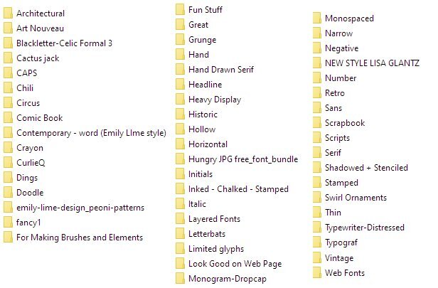
Here is a list of mine, but this is after years and years and years! Cactus Jack was from 1996. It has Western Fonts. Retro is divided into 1930s, 40s, 50s, 60 and 70s. (meaning a separate Vintage on the list is a mistake) Script is a world unto its own. When the novelty script fonts and girl-ish novelty fonts first came on the market, the big boys like Bitstream, Linotype and Monotype didn't quite know what to do, so they added a bunch, but they didn't sell. Adobe was starting to go great guns and making inroads that way, too. Adobe was able to sell the more girly fonts, why couldn't they? (The answer is that Adobe hired more women and had more fonts designed by women) So the big houses would have these contests, and I might have been the only person who entered because I won a whole bunch of them, week after week. :)). The commercial advertising houses didn't like them, but people like me did. But people like me were not going to spend $25.00 a font -- well, maybe I did, but not enough to keep a type house in business! So companies with desktop publishing software like Microsoft, Word Perfect, PSP etc, bought them in bulk to offer as "free if you buy this program". At the same time, fonts were being offered at Best Buy and Office Depot on CD Rom, 1000 for $19.95. All the CD Rom people had to do was scan the font and put it through the software. Skip any kerning pairs or alternates and give it a similar name. Voila! You now could own your very own Gill Sans. Fast forward to today, and that's why most places don't allow you to make alphas from their fonts.


