Cassel
-
Posts
5,838 -
Joined
-
Last visited
-
Days Won
17
Everything posted by Cassel
-
D- Dragonfly
-
You are talking about the Tools toolbar, correct? For me, it would grab the toolbar, move it close to the top corner and double-click at that point, like telling it to go to the corner! Maybe for you, you can drag it to the middle of the left side before double-clicking?
-
Did you try double-clicking on it?
-
It is a new month and new projects. Show off what you are working on in March be it a scrapbook page, a collage, a tutorial, or anything else you want. We are curious and want to see, learn, and get inspired. These threads are quickly becoming a fantastic source of inspiration, support, and friendship. Keep them coming! Remember to size down your image to about 600x600 pixels and save it in .jpg format before posting it (if you are creating a double page, you can resize it to 1000 pixels in width if you don't want to post the pages separately). Here are a few guidelines for everyone: when you post a project, give as much information on your sources or techniques used. It will help others who are curious and would like to do the same. if someone uses something that you like on their page, ask where they got it. Sometimes, you can go get it too and it will be better quality than trying to extract it (as it would have been resized to post in the forum anyway). if it is something that they did from scratch, ask how they did it. It would be so helpful to everyone! if you like a photo and would like to “play with it”, ALWAYS ask permission. Sometimes, there are some limitations and the person is not allowed to let others use it. Don’t get them in trouble. Usually, people are happy to say yes (if they can) when you ask politely. And if you get permission, you might get a better-quality image than the resized image anyway.
-
The theme for March is INSECTS. Insects are all around us, from the buzzing bees in the garden to the delicate butterflies fluttering through the air. Whether they are helpful pollinators, fascinating creatures with unique patterns, or even pesky bugs that sneak into our homes, insects are a part of our everyday world. Do you have photos of insects in nature, at a butterfly exhibit, or maybe a fun childhood memory chasing fireflies? If not, you can always tell a story and use stock images, illustrations, or themed embellishments like bees, ladybugs, or dragonflies to bring your layout to life. Remember, you can also share older layouts you’ve already made—you don’t have to create a brand new one! Let's get creative! Let's go! Post your project in the gallery.
-
In March, our monthly theme is INSECTS. Insects are everywhere! From the tiniest ants to the most colorful butterflies, they play an important role in nature. Some are helpful, like bees that pollinate flowers, while others can be pests, like mosquitoes and aphids. There are insects with wings, some that crawl, and even a few that glow in the dark! Let's find words starting with each letter of the alphabet that relate to anything about insects—types of insects, their body parts, their habitats, or even actions they do. I'm sure we’ll uncover a fascinating variety! If we get stuck on one letter, we can skip it after 24 hours, sound good? Let's get started!
-
The idea of one photo a week was quite popular in 2024, and it encouraged participants to take photos and showcase them without having to create a whole layout for them. In 2025, I will offer you a little twist on this. Again, the idea is only to showcase a single photo at a time. You can showcase them as a flashcard, emphasizing the letter (you can use these free cards as a basis to create your own). Of course, if you want a different format, you can use a polaroid frame, a slide, or a playing card (like Susan was doing in 2024). Choose the format you want, and keep it throughout the year. But just make sure to emphasize the first letter! Every 2 weeks, you will be asked to take a picture of something, at home (or around your home) that starts with a specific letter of the alphabet. The goal is just to be on the lookout for ANYTHING that can be photographed. You can stage the object however you want, or just take a picture of it in its natural environment. For example, you can showcase your favorite Mug, or your Pillow, or your Fireplace. You can practice your photography skills if you want, but you can just capture things as they are. Let's just encourage each other. This is a no-pressure thread. And if you skip a letter or two, you can always come back. You know your alphabet so you can easily catch up, whenever you need to. Let's continue with the letter E. It could be your cozy Electric blanket, a shiny Espresso machine, your trusty Extension cord, or that old Egg timer in the kitchen! What will you showcase?
-
If you listen to the radio, it is the topic. If you are on break at work, it is the topic. If you go to the Tim Horton's, you will hear people talking about the weather. I guess, we have so much variety and range in weather/temperature/events, there is always something to talk about!
-
It is a fairly high frequency sound so it is possible that you don't hear it as well as others since high frequencies are the first ones people lose in aging (wow, didn't ever think that my professional training would serve me in this forum!).
-
Interesting to hear that it is not something new. How long have they been using those in the NICU?
-
What do volunteers provide at your hospital? Do they knit or crochet some specific things for patients/families? Share those fun ideas and even better if you happen to have pictures.
-
That is when you activate the Fill tool.
-
Here: Do you have the layer active? If you want to add a different Adjustment layer, it will be created above the active layer and will affect all the layers below it. Of course, if it is the bottom layer, it is ok, but otherwise, it would need to be GROUPED with the layer itself (we did that in the lesson to change the color of the text). Then, additional Adjustment layers can be added in the same group if they are to apply to the same layer. In fact, Adjustment layers work in Affinity pretty much the same way as in PSP.

-
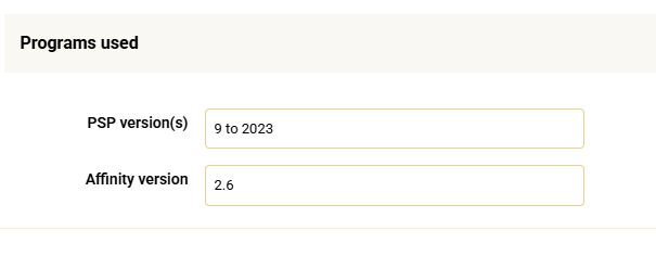
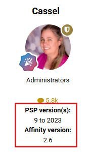
We have added a feature that will help others guide you, if you happen to have any technical difficulties or questions. Step 1. Go to your forum Profile Step 2. Click Edit Profile Step 3. Scroll to the bottom and you will see Programs used. Fill out the information as appropriate for your usage. Step 4. You will see that information appear under your name, in the forum. This will be helpful when you ask a technical question, so we know what program you might be referring to.
-
- 5
-

-

-

-
@Anja Pelzer Great photos to use with that four-part template. @Jeni Simpson It is great that you found a way to make the page more consistent with the others. The overall look will be improved for sure. @Carolyn Rye To fill the frame (or anything) to change its color, I found out that if the source is "Current Layer & Below", it won't work. You have to change it to "Current Layer" to work. Try that and see if that is the issue. When you created the frame on the four-part page, did you copy a rectangle and resize it? Thank you for your compliment. I know PSP pretty much by heart, but for Affinity, I am still learning. I feel just like when I started with PSP, 20 years ago. The difference is that YouTube didn't exist back then, so the exploration and learning was much slower then! @Cristina I will have to look at the 2.6 version and if needed, I might have to redo the tutorials OR have a clear description of the differences. @Harmony Birch I love how you adjusted the gap between the sections for the Day7 project. @Jacques Do you have more photos?? I want to see more pages! @Corrie Kinkel If you want to direct viewers to more photos, or a website, you can use a QRCode on that back cover. @Rene Marker Both pages are great and have different appeals. @Jen Brown Your pages make me want to go back to sewing!!! @Lynda DiGregor I am always amazed how that same background colorized differently makes your own project so cohesive. @Connie Collier I am glad to see you caught up. Do you have plans to print those pages? @Gerry Landreth I would have to look closer to what you are experiencing. Is it still in a mask format? If so, it works just like a mask in PSP: black will block, so can you brush black/white in the specific area? @Anne Lamp I can certainly envision those pages in a single magazine sitting on the coffee table. What a great piece of conversation! @Jean Naumann If you didn't mention the "cheating", nobody would have noticed! 🙂 @Linda Rexford Thanks for the information about the difference with 2.6. I will check it out.
-
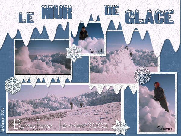
I made a page, a few years ago, with photos of an ice wall that appeared in our town, on the beach. This happened at the same time as the Winter Canada Games, in 2003. Since it was quite a sight, several bus trips were organized to see it. My boys did climb on it before warnings were put in place to prevent that as it would be dangerous. I will look for videos of that ice "crawling" on the beach. It was quite a sight!
-
Yes it is. https://creationcassel.com/store/index.php?main_page=product_info&cPath=7_10&products_id=311
-
It merges the group so then, the photo is trimmed to the size of the mask.
-
@Euka I am glad that the program upgrade fixed your issue. @Jeni Simpson You can definitely create lots of textures and with a little bit of work, make them seamless too. @Jean Naumann It is fun that we almost have "live" photos! @Carolyn Rye Yes, learning new tricks and techniques can be a bit challenging, but with repetitions, it will get easier. @MoniqueN. Looking forward to seeing your magazine pages, even if they are not all of the same format for now. You might be able to resize them later. @Jen Brown I am particularly enjoying seeing all those embroidery/sewing projects! @Jenny MacKay Great pages. If you plan on printing them or displaying them together, make sure you create some consistency. For example, some pages have shadows, others don't. Some text looks printed on the paper, some look like they are paper cutouts. They can all be great, but it might give a more cohesive look together. @Jacques I will have to explore that option too. I still have a lot more to explore! @Connie Collier These pages are meant to be revised throughout the workshop since I am not teaching all the techniques on the first day. As long as you keep a layered version of your pages-in-progress, you are encouraged to go back and tweak the previous pages. @Corrie Kinkel That is really the perfect photo for that template! I love to see some of those extra templates. @Rene Marker That is frustrating. It has not (yet) happened to me so I don't have any suggestion/explanation for that text issue. I'll keep an eye on that and if it happens to me, I will explore further (and also put notes in my notebook). It looks like saving in PSD in Affinity does not save the "mask" part, unless it is PSP that can't read it. I wonder if there are specific settings needed for the file to be usable in PSP? @Linda Rexford It is nice and very subtle how you used photos as backgrounds. @Anne Lamp That is a magnificent tree and perfect for this template. @Clarine This will end up to be such a wonderful album for her! @Donna Sillia It is fun to see how even a resized template can still be used effectively. @Art Kuiper If you are inspired by what others post, I am sure others are inspired by yours! @Gerry Landreth It is a great idea to post both pages together. If you make them as a double page in one image, you can make them up to 1000 pixels in width. The 600 pixels limitation is mostly for the single pages since it makes them 600 pixels high. That last page, where you cut the template diagonally gives a great result. I think you are the first one to cut diagonally! @Susan Ewart That reminds me of a show called "Third rock from the sun". It didn't last too long, but I remember watching it. @DianeM That photo is perfect for the 4 quarters template!
-
Once a week, there is a radio show that has been on for many years. It is called Vinyl Tap. It is 2 hours of songs that are picked around a particular theme. Sometimes, it has to do with a word, sometimes, a topic, sometimes it is another particularity (like "unlikely duets"). Winter is still in full swing, and what better way to embrace the season than with a song-inspired scrapbook page? For this challenge, use a song title or lyrics that include the words COLD, FREEZE, or SNOW. Whether it's a chilly love song, a frosty ballad, or a wintry classic, let music set the tone for your page! Here are some song ideas to get you started: Let It Snow! Let It Snow! Let It Snow! – Frank Sinatra Do You Want to Build a Snowman? – Frozen (Disney) Baby, It's Cold Outside – Dean Martin A Hazy Shade of Winter – Simon & Garfunkel Are you up to the challenge?
-
@Carolyn Rye I see you also feel like adding a thin frame around the pages is tieing them together well. @Connie Collier Interesting how that gradient will match the two pages. And yes, those simple designs are meant to be quick and "clean". Although you took a while to remember how to turn the text on your page, I bet you will remember next time! @Ann Seeber IF you have major pixellation on text, check if the Anti-alias is set to Sharp, Smooth, or Off. Typically, if it is set to Off, it will be VERY pixellated. @Krystyna Nicholls I am not sure if you are using PSP or Affinity, but in your cover page, we still see the grey template. You might want to size up your photo to hide that and get it to the edge of the page. The two-color effect on the third page is quite effective with the color you chose. @Jacques It is a good idea to use the guide, if you want to be precise in splitting the template. It works well. @Ria Pieck - van Ee First of all, welcome to our Campus and to this workshop. You should not have any trouble catching up as the pages are so simple to make. If you have any photo that are "damaged", you can follow this webinar on YouTube that I led, a few years ago. But hopefully, you will have lots of great photos to share. @Cristina Of course, templates are a great starting point, and depending on the user's "comfort" with the program, some will have to follow them closely, while others will create something different, like you do! 🙂 @Jen Brown It is interesting that I had never heard the word "mugrug". I always called them "coasters", but since English is not my native language, I just use what I learned! But I think that "mugrug" is much more descriptive! @DianeM Adding a frame is great for displaying a white page in this forum, but you might end up liking it and keeping it too! @Susan Ewart That is a fun oddity to document and share. That is the kind of story that is not usually told but make for great conversations! @Art Kuiper Of course, man-made waterfalls are not uncommon and they deserve to be showcased too. @Donna Sillia Yes that script will move the elements (including the photos) while not distorting them. That is why they will occasionally be overlapping. @Anja Pelzer Great use of the directional brushes/tubes. @Rene Marker These templates are so simple that, like you, I might even skip the splitting and just place the photos on the page. The technique would likely be more necessary if the shapes were other than rectangular. You are working a lot with two programs at once! Good work. @Corrie Kinkel Remember that you can always re-arrange the order of the pages to tell your story. And you also have access to additional templates as a DIAMOND member (I added them to the Day 1 page). @Lynda DiGregor I am impressed of what that texture looks like when colorized. Great creative use of it! @Anne Lamp It is common to take more time looking through photos and picking which one to use than to work on the page, especially with simple pages! @Harmony Birch You are right that offsetting the large/small photos on both sides makes the page well balanced. @Linda Rexford The two color title looks great. @Euka What version of Affinity do you have? Are you still using version 1? @Jeni Simpson When you clip a photo to a template, make sure you drag it until the template layer turns blue. Is that causing issues?
-
Yeah, it was a good game. Even better since Canada won! 🙂
- 1 reply
-
- 2
-

-
@Jean Naumann A split color title can be difficult to read. Sometimes, it might require a super simple font to get a good effect. Another way you can go is to split the title in two lines and have only a full line in white. @Carolyn Rye You know, not-so-perfect photos are just more "natural" photos in my opinion. That often tells the story even better than others. @Jenny MacKay I am sure you will catch up quite easily as the pages are often very quick to complete. @Anja Pelzer Interesting how you used the chain link fence picture tube. I had to look twice to realize that they were different than the photo. Great idea. @Jacques I see you also had to change the orientation of the "photo area" to match your photos. That is perfect! @Ann Seeber That is a great way to showcase many photos at once. @Jen Brown Maybe I should do that with my fabric stash! I actually have made Christmas stockings, with strips of fabric by colors. A couple of years ago, I had to make 12 stockings; it was not easy to find 12 different "colors" and enough scraps in each of them. Orange was quite limited! @Cristina A great way to practice some more. I still have to go through the tutorials to repeat the steps! @DianeM Those pages with the horse are so "clean" and inviting. Will you keep the rectangle blue or will you change it? @Anne Lamp You added a great looking frame! @Art KuiperThose templates are very well suited for your vertical photos!! @Connie Collier That gradient on the frame gives a great result. I agree with removing the small frame. The large one does a good job of showcasing your photo. @Rene Marker I so wish I had an explanation (and a solution) for your 2023 issues with the Text tool. Although I have some issues, I don't remember it crashing on me while using that tool. How frustrating that could be!!! As for Affinity, I also hate the fact that it always default to whatever THEY decided. Not only the font, but other settings too and on different tools too. Although I might not have much weight in any decision, I did report that as a suggestion: keep the last used setting for any tool! @Donna Sillia The font on the title is quite interesting. Did you mention what font it is? I don't remember seeing that before! @Jeni Simpson The yellow of the word "Wall" looks great on the photo and is the perfect match for the flower! @ClarineJust out of curiosity, did you try to get the text in half with a different color? It is not a requirement, but just an opportunity to practice, even if you don't end up using it. @Corrie Kinkel It is amazing how the yellow you picked for the rectangles make the photos stand out! @Harmony Birch That is such a good idea to add a frame that goes around both pages in a continous shape!
-
You don't have to uninstall anything. You can keep both versions as they are working independantly. In fact, it is a good idea to keep that version in case you want to do something in 2023 that is not working correctly (there are some bugs in all versions).
-
Affinity Photo 2.6 is now available. I checked with my contact (the one who got that 90-day trial for all of you) to see if those of you still using the trial version COULD upgrade to 2.6 and here is her response: I’ve checked with the technical team and yes they can update and use 2.6. If they have ‘automatic check for updates’ when they next go into the app it will give them a pop up to install the new update. If they don’t have automatic updates they will go to the Affinity Name (Affinity Designer) at the top left of the app and in the drop down they will see ‘check for updates’, click this and it will automatically download the update and install it. One great new feature of that version is the Object selection tool, which allows you to select any object on your image or even a section of the object (like the hair, the face, the hand, the sweater, etc.). Check this video for an illustration of what is new in 2.6: