Leaderboard


Popular Content
Showing content with the highest reputation on 10/10/2023 in all areas
-
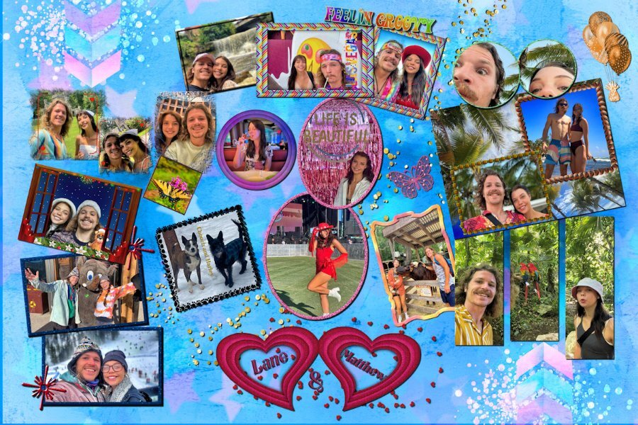
I have been working on this collage for my grandson. He sent me the pictures that he wanted to include. I made the hearts and the arrows and used a lot of techniques learned in the Travel and Magazine workshops. The background was made using the plug in gmic. The original size is the poster size 24 by 36 and will be on canvas from Easy Canvas.
 4 points
 -
That is the nice thing about this platform. We are all so different from each other. We seem like a good-sounding orchestra together.4 points
-
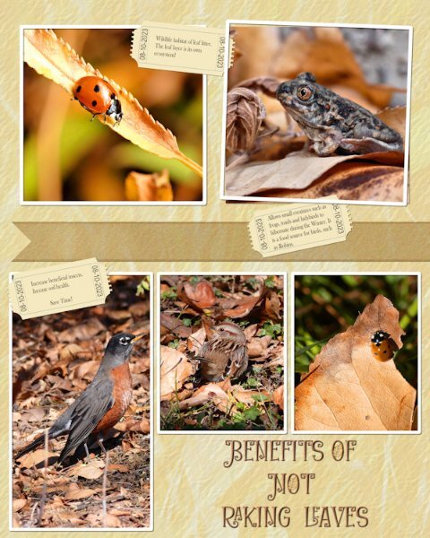
Thank you for that Sue. It was pretty easy to imagine it that way. I love leaves too, especially this time of year. The color in the dried ones are so nice. And I have an indoor cat who makes it her mission to try and capture them as they fly by the window outside, so in turn, I spend a lot of time watching the leaves she is trying to chase down. We also have big trees on our street and in the fall it's raining leaves, really spectacular to watch. I have a co-worker that I walk into work with and we are constantly stopping to look at leaves or various natural things, we are delighted when we see a little whirlwind with circling leaves in it. The other day the wind was making the leaves tumble across the pavement and the leaves make the mose interesting sound. although I did say it sounded like giant alien insect feet scampering about (at least that's what Hollywood wants me to "think" is giant insect feet scampering about). Nature is awesome.3 points
-
Donna this will make a lovely poster and a wonderful memory for your grandson. Quite something else than a usual picture frame for a couple of photos that you can buy, this is unique!1 point
-
What a great layout! I love those arrows and little stars. I like that all the frames are different. the Christmas one is so cute.1 point
-
That will be great on a wall Donna!1 point
-
We all have different approaches to starting a page, and seeing it through to its fruition. You and I couldn't be more different in our approach, from start to finish. I always start with a photo or photos, from there the photos determine the colours, and layout of the page. I have very few resources. Probably a dozen kits. I do have a nice small selection of elements. Also a small collection of fonts that I favour, and use repeatedly in projects. I like to create my own elements, and papers. So in a nutshell, my way of working is to select photos, and see where they lead my creativity. My aim is always to focus on showcasing the photos, with a minimalistic, and relevantly plain no fuss papers. That doesn't mean I don't like busy scrapbook pages, on the contrary, I do. It's just not in my nature or my style to create pages like that. You must sometimes have a heck of time deciding what kit etc to use. Only joking! I never started out a scrapbooker, which may have something to do with my style, and approach to showcasing photos.1 point
-
I like this one way better!1 point
-
I changed the font for the main text Heading. As I didn't like the font used for the font challenge. Although it isn't Halloween themed, it is a very seasonal, appropriate page, for this time of year.
1 point
-
This font isn't one I would have chosen myself. I can see that it would appeal to some for a particular Halloween project. Halloween has never appealed to me, probably because it isn't that popular at home, certainly not when I was growing up, as it is in North America. I wanted to participate in the challenge. I edited some of the letters to my liking, added leaves from another font. The letters A and E, I resized, moving the letters before them closer, by changing the text to character shapes. Inner bevel. Photos were taken yesterday. Background paper is a photo, 2 overlays, and a texture.
1 point
-
I love that background effect.1 point
-
I already did a Halloween layout for the theme of this month. We don't have a long tradition of Halloween festivities, nowadays it is more common, but it doesn't appeal that much to me. The grandkids are in the States and they of course participate. If I was there at this time of the year I would take a lot of photos, but over here no.... The Witch Mystery font however is a nice one and I used it for this layout featuring the "Windmills of Kinderdijk" (Netherlands), a Unesco World Heritage Site. Funny enough my cousin, who came along, and I, have never been there! We have both live not very far away from Kinderdijk, but as it is with things that are nearby we never got there because we thought: oh we can always do that. So last week we went to see those mills for ourselves and had a great day with fantastic weather and being offseason it was not congested as it can be in the summer. We didn't have to wait to take the little boats that ferry you along the 19 mills that are there. I have photos of the inside of one of the mills that we could visit, may I use those in another layout. Oh and all the mills dating from the 16th century and up are still in working order. They are designed to pump the water out of the canals to the river to keep the land dry and the other way around. Nowadays there are 2 pumping stations that do the same with electric machinery and the mills are a backup system. For this layout I used template Lab 12-11and 4 of the photos I took that day. When we arrived, it still was a bit hazy and I used one of the hazy photos as a background, copied it and the used the blendmode Burn which made it more like a silhouette, but not as black. Then an overlay called Windy Pastels (Inky deals) with the blendmode Difference. I was trying different overlays to get something interesting and I like this result, it gives a sort of painting effect. Some embellishments from my stock and the other font is Aura.
1 point

.jpg.74d3420d2013f8bca83a1d4c0e89cfd8.jpg)