Jump to content

Master Classes


Are you being inspired by a master class to create new projects? Post them here and make sure you specify which Master Class you used as a guide or inspiration.

Make sure to resize your projects to about 600x00 pixels and upload a jpg version.

If you want, you can create an album for yourself, so all your Master class-related projects can be put together under your name.


Albums

  1. Doska - Masterclass Album

    Hi all,
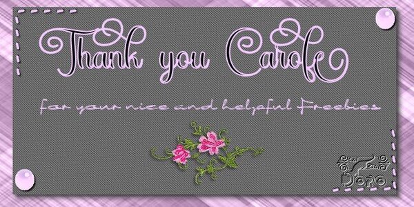
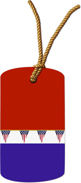
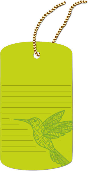
    since fonts are an important building block for my scraps, I started with the font and stitching tutorials. Since joining Creative Fabrica, I know something about glyphs. However, PI did not support this. And it's wonderfully easy to do in PSP, which makes me very happy. That's why I started with a simple thank you card, which I also published in DS at Carole's Freebies.
     

    • Album created by Doska St.
    • Updated
    • 2 images
    • 2 album comments
    • 2 images
    • 2 album comments
  • Who's Online   0 Members, 0 Anonymous, 4 Guests (See full list)

    • There are no registered users currently online
  • Image Comments

    • I think I initially posted this in the wrong year so here is this year's pic.
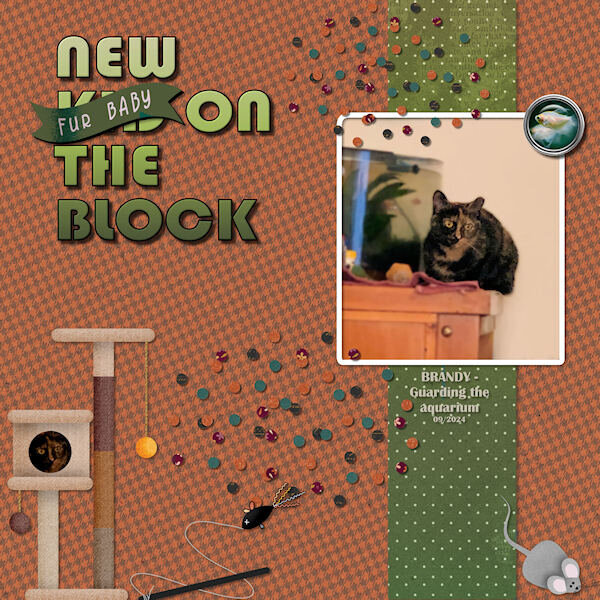
    • LESSON 3 - NEW FUR KID ON THE BLOCK 😉 This is the photo I showed earlier of Brandy guarding the aquarium with the White Skirt Tetras. (I made a flair button using a photo of the tetra). I used the kit Carole offered cpjess-Behold-Autumn and I incorporated some cat accessories from the Gina-Jones-Every-Day-is-Caturday kit. I reduced the opacity a bit on the background paper. The title font is Bauhaus 93, the Fur Baby banner is from Gina Jones. The scatters are from the Autumn kit. 
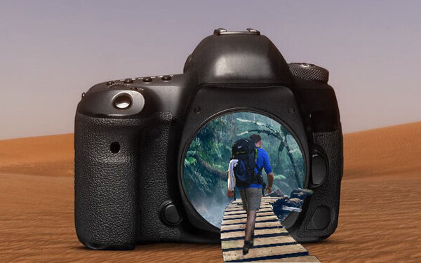
    • My finished project looks alot different than the others.  I have been struggling with how to add elements from one photo to another.  I think I got it. But, Instead of sandwich makings ending up on a plate, I used several different hummingbird photos and added them all to one pic.  I even found a Monarch that finished off my photo.  
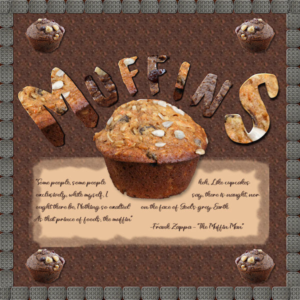
    • This one was pretty much a Dan original layout with Dan original Alpha characters.  I didn't do the whole alphabet; I just created the characters I needed for this.  I made a small script that will create the character after you size it and place it with black border and white fill on top of your chosen background and then put it in a layer on the project.  I used two different muffins (the ones in the layout) for the backgrounds alternating and running the script for each individual letter.  I used the Cloud Craft Font for the letters.  The "caption" is a portion of the lyrics from the song: The Muffin Man done by Frank Zappa.  He is sort of an "acquired taste" musically and some of my fellow hippies from the 60's and 70's will remember him LOL.  I bordered it with a muffin pan turned into a tube.  I think I could have done something different with the corners...I was unable to figure out a size and step to prevent the overlaps.  Used the vector tube script to create each edge then the move tool to line everything up.  Getting better but still learning (constantly).
    • My Lesson Two - A birthday card for my step-daughter, Beth Seeber-Wilson. She'll be 57 this year, the youngest of my 3 girls. She's the grandmother of Sonya, whose birthday is also coming in June. I'm having a bit of fun with Beth, as you can see... 😉
  • Gallery Statistics

    • Images
      2.1k
    • Comments
      165
    • Albums
      27

    Latest Image
×
×
  • Create New...