Forum Replies Created
-
AuthorPosts
-
My goodness, two outstanding pages. I can see you have put a tremendous amount of time and effort into them. I have one word for you Cristina, kudos!
Here is the frame. It is one I did in May 2020. I see from the screen shot that it’s a rectangle. Your frame has been rotated, but if you look in the top left corner of my image, there is a small white glow, on your frame it’s on the top right. There are also other similarities. I have to say that it is my frame, but I didn’t post it anywhere to be used. This is ever so strange. The only explanation I think of, is someone downloaded it and extracted the frame to use it.
Now I’m completely baffled! I checked my picture tubes, and I don’t have it as just a frame, but as I said before I only ever create those frames around a photo, no two frames are the same. I don’t use the picture frame tool.
Ann, I didn’t post the frame anywhere. Someone must have extracted the frame and posted it. I was quite surprised to see it this morning.
Annie, thank you for your kind words on the page. Depending on the project I have created more elaborate frames. I agree, you have to be careful, as to not make the frames distract the eye from the photo/image.
No. All my frames are unique, no two frames are the same. They are created for one photo only.I use add borders to create them. On closer inspection of your page, the frame appears to have been extracted from the photo. I’d appreciate it if you could recall where you obtained it from. I have posted many files in the Facebook group, but not one of these style of frames.
Very nice Ann. I’m curious to know where you got my frame from?
Anne Lamp, what a lovely Wren story. I to have done a similar thing as you, bought a new roll of hose pipe, rather than disturb a sitting Robin on her nest. I have several Wren houses, and two pairs of old boots, which I bought cheap from a church jumble sale, years ago, which I have nailed to trees. The Wrens and other small birds love them to build their nests in. Thank you for your kind comment. You did a great job on your Song page.
A better view of the frame I created.
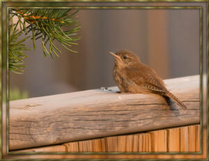
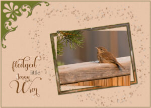
An ecard I made for a dear friend. Her name is Jenny, and I always make birthday cards for her using a Wren photo. In the UK, we refer to the Wren as Jenny Wren, a term of endearment. I omitted the private Birthday greeting. This is a North American fledged House Wren, the same as what we get in the UK. A simple fine frame, Cassel corner punch. Using the brush variance palette, I created the stars.
It was in the spam folder, the very first time that has happened.
Carole, although I registered, I didn’t get a confirmation email.
Anne, I haven’t done tatting for years. I went twice a month to a a ladies tatting guild in our village, they were so much older than me, and extremely experienced at tatting, They taught me so much about tatting.
Helen, that is so much better, it really is lovely. Well done. Check your text settings, perhaps you used a texture on it.
Ann, that looks like an interesting script. Nicely done.
Helen, very nicely done, signature and motivational tags are fun to make. May I make a suggestion? Place the text beneath the flowers, for a more realistic look. Or place the left flower.in the top left corner and tilt the text. Place the bottom right flower flush with the corner.
Kayaking.
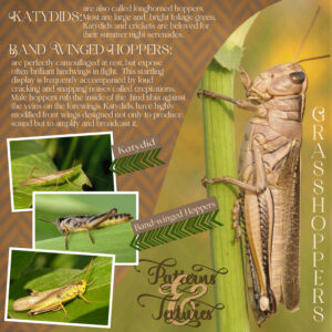
Thank you so much Annie, I thought to myself when I was posting, that you would appreciate the little info about the grasshoppers. I will certainly be using this intertwined effect in many of my wordart projects. It was my first attempt.
That was quick Annie, I love the layout, and the colours, which enhances the photo. You could almost be self sufficient. There isn’t anything nicer than cooking veggies straight from the garden, the flavour is far superior to bought produce, and then you have free range eggs. Two very practical hobbies to have. I spell veggies with two g’s, I would have thought the Australians would spell it the same as us in the UK. The Canadians don’t refer to vegetables as veggies, as we do. Nor do they refer to it as a veggie patch, but as a garden. To me a garden has a lawn and flower beds. To Canadians they refer to a garden as a yard.
Here is a intertwined text, for better viewing.
Dare I post my first page in August 2021? I absolutely love these creatures, with their external skeletons, rich in textures and patterns. There is so much I could write about them. They emerge as mini versions of themselves, as they grow they have to molt, shedding their external armour, to make way for a bigger one. I saw an advert on the telly recently, and I just had to copy it. Where the & was intertwined with the other words. I can’t even remember what the ad was for. I thought it was kind of cool, and different. All my own work, and photos (macro).
My dear friend Annie, your work is always superb, you always put so much time and thought into them. Even though I’m very much a minimalistic creator, I always love everyone’s work. I often wish I could add more, when I do, I don’t like it, and remove them. Yet when I see other pages I absolutely love them. No matter how hard I try, I just can’t fetch myself to fill my pages with elements. Your page is beautiful, you have a knack for matching colours too. You did a grand job on the threaded ribbon, much better than mine, I created mine to look flatter than yours, (or tried too) as your paper or card pieces appear thicker than mine. To give my threaded ribbon purpose for being in the page, I added a date to it, with a blend mode. Did you forget to add a shadow to the gem stone on the shell? You could have put a hole in the shell and threaded a ribbon through it. You have my honest thoughts on this page. I’m not one that gets easily offended. I also try not to offend anyone with my comments. I always appreciate honest constructive criticism. They always help me to look at my work in a different light, as we can all get in a bit of a rut.
I agree with Annie, beautiful work. If I may make just one suggestion, and it’s just me and my love for insects. I know that it’s a butterfly. I recognize it. 🙂 I would move the butterfly to the right by a few pixels to reveal some antennae, and part of the abdomen, possibly tilt it by 1%. Only to make it more obvious. Sometimes it’s just those very fine details that makes the page even more phenomenal.
Annie, what a beautiful page you created. It’s very unique. You clever girl.
I extracted the flower, to be used in other projects, also I’ll have the word art on hand for another project. Sunflowers aren’t delicate flowers, they are huge robust flowers, hence the reason for using bolder fonts. Added some gold to the SUNFLOWER word, and a little texture to the word SUNBEAM. I don’t grow sunflowers. When I go shopping on a Tuesday there are several gardens in the town, that have some very talented gardeners with green fingers. This is one of their flowers. This page will be more pleasing to the eye for those that don’t like insects.
Michele, I’d say it is amazing. Playing with the effects can generate some pretty cool unique patterns. I really do love it.
Mary, you have been a busy girl, beautiful pages, really well done!
Well this flyer may not be everyone’s cup of tea! I thought I’d give you a tiny glimpse into the very private lives of a couple of insects. I’ve done magazine covers, and newspaper pages to showcase my photos. There is a masterclass on the newspaper. I wanted to use the QR code that I made, I thought a flyer would be prefect for it. As for me I’m in my element crawling around on the ground looking for insects to shoot, usually at the time the sun is rising. Then thumbing the pages of my books to ID them and learn about their secretive lives. These are all macro photographs. Of course my photos are 4,000×3000 pixels, which mean a lot of fine details are not visible, due to being greatly resized.
Beautiful layout, it was well worth waiting for. You take beautiful flower photos to showcase, with layouts that do them proud.
Thank you ever so much Annie. I really do appreciate you taking the time to read my comments and view my pages. I have a simple style, which works for me, and the way I showcase my photos.
-
AuthorPosts


