Forum Replies Created
-
AuthorPosts
-
Thanks for the info Sue. After Bitdefender confirmed a clean file, I tried all the directions they gave me, but it still did not work. So I did turn off Bitdefender briefly, per how you said, and I got the file. YAY!! Thanks again.
Hi, Just wanted to let you guys know, that Creative Fabrica got back to me, and assured me there is no virus in the New Pose font file. They were very quick to respond. Also when I did a full system scan of my system, nothing turned up. So strange. For interest sake, I am sending to my virus checker support to see if they can figure it out, as I still cannot download it. 🙁 Too bad for me as I love the font, and as mentioned before, I have never had a problem before downloading from this site. Does anyone else use Bit Defender virus checker? Thanks
I love what you did with the New Pose font. I tried to download from Creative Fabrica, but there was a virus in the file.
Trojan.GenericKD.38682519
Just wanted the readers to know in case they want the font. I have emailed Creative Fabrica to let them know, as I have downloaded fonts from here before with no issue.
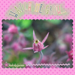
Hi, Yes Carole, I did add a redial blur to my Mask 6 background. Here is my pic for Mask day 7. I used elements from Bella Gypsy “In my garden” mini. I learned so much with these lessons. Thanks so much.
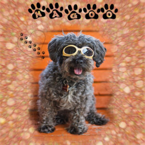
Carole, your grandson is adorable!! Here is my Mask 6 lesson. My dog Magoo in his doggles. I did the background both ways, then blended, and added a radial blur, then did some masking to tone it down a little around the picture. My font is Ennobled Pet, and I forget where I got it. My heart with paws is a brush.
-
This reply was modified 3 years, 5 months ago by
Sherie Dracup.
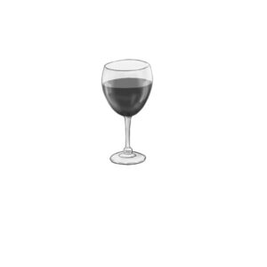
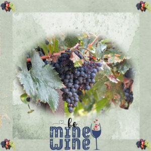
Hi, With the picture I chose, I did not have any brushes that kind of matched, so I opened a blank canvas, did the mask as per the video only in black, then I found a wine bottle and glass in Berna’s Playground, Saying Goodbye Freebie. I used the hue and saturation to make the elements black, then merged with the mask. I then did the instructions from Lesson 1 to turn it into an actual mask, then added my photo. The frame and grape element are from a free mini I downloaded from Digicats called Rosario’s Pizzeria. The wordart was from The free Ultimate Quotes Bundle 3, which I am sure I downloaded from Creative Fabrica. I guess I could have made brushes from the elements, which I did after with the wine glass, and it was easy to do. After making it I realized I probably should have used the hue and saturation to darken it, as I would have to darken it afterwords, unless I wanted it to be faded as it shows in the pic.
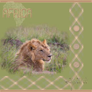
I have been trying to make my own masks for a while, but I could never get the edges to fade out. The tutorial showed me how this can be done. Thanks. Here is my pic. I did do a plaid again, and made it into borders, and used elements from Marisa Lerin’s Kenya collection.
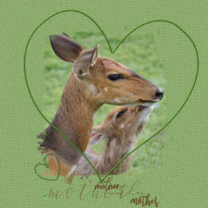
I used the mask provided, and made a pattern out of the picture working it until it was all greens. I used a few elements from the-studio-hello-mother-blog-hop, and a preset heart removing the inside to make the large heart frame.
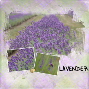
Hi, I got a little behind. Here is my pic from Mask 2. I did struggle with the plaid as it overwhelmed the flowers, so I blended few other pages to tone it down. I used the bee from an old download called Bird & Bees elements by Holly Wood. It was from a blog train. I also used the tag from another blog train from January 2017 by Triple J Designs. My font is Little Black Dress.
Hi everyone. Just went through the first lesson, and here is my pic. Used the Mad Dog font, I had downloaded for free sometime ago.
Looking forward to learning more about masks. Thanks
For the shadow class, I always wonder how certain shadows are skewed to look like there is more shadow in one area than another. I have attached an example which I hope explains what I mean. Thanks.
Peterborough, Ontario Canada
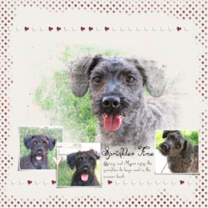
I made a facebook cover photo in Paint Shop with my dogs.
-
This reply was modified 3 years, 5 months ago by
-
AuthorPosts


