Forum Replies Created
-
AuthorPosts
-
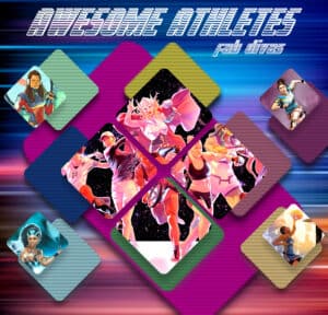
Finally found a project for the free colorful cubes collage from Corel last month. I found a collaboration between Marvel and ESPN for my Awesome Athletes pic. Just wish I’d had more time. I would have liked to have increased the size of the masks to show more of the four singular athletes. The font is voyage_fantastique; free from dafont and it has multiple styles.
Lynda, I found Esther on Dafont, free for personal use. It has all the glyphs, too!
Great stuff, everyone. I wonder why I always get the newsletters a few days late. Maybe it’s gmail.
F = Fennec Fox (hope I spelled it correctly.)
Ann, you are too funny!
Those are awesome, Sheila! I’m very impressed.
That’s an awesome font, Annie. Do you remember the name? I just love what you did with it.
That’s a great paper, Lynn.
Thank you, Cristina. I ended up needing an extraction and implant. Today is the first time I’ve been able to eat anything besides yogurt or apple sauce. My appetite is back and I can eat semi-solid food. Woo-hoo!
Thanks so much, Annie. And I love the macaws! The colors you used are perfect. Your Victorian elegance is wonderful and I don’t consider those things as mistakes. When you use something as inspiration, you put your own take on it which you did. The mask you made for Protea is absolutely stunning.
Connie, I don’t know how many times I’ve done the same thing. LOL
I already “loved” your cards on the FB group, Sue. They’re wonderful.
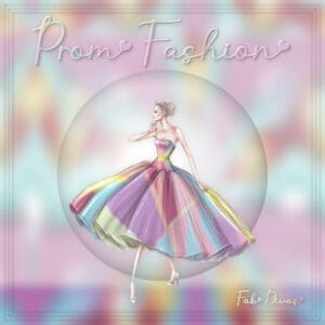
Headache or not, I still had to do the daily pic for my gaming group. I fell in love with the girl I found on pngwing; it wasn’t a great transparency so I had to clean it up a bit. Using freehand selection I selected a large portion of her dress, carefully avoiding the folds; copied and pasted it to a new layer. Applied seamless tiling, gaussian blur, and repeated. Resized it and copied it back to the original. Since there were transparent gaps, I added a white layer below. Added a bubble effect behind her. For the frames I selected all, contracted, applied the 3D cutout effect, and repeated. The font is Sweet Allita.
Thank so much, Cristina. I’m afraid the headache is being caused by a toothache. Waiting to hear from the dentist.
Too much wonderful work for me to comment on individually due to a horrible headache. But know that I love it all. <3
Great job, Mary.
Val, you are too sweet and I love your treasure map! (I always put all my comments in one post. I think keeping the blog uncluttered makes it easier to look at. That’s just my two cents.)
Annie, your boababs page is fabulous. The font fascinates me. You know I’m a font-a-holic.
Karon, you are always so kind and generous. Thank you. 🙂
Wow, Annie, I never knew that about silver dollars. Nature just amazes me. The background paper was a perfect choice. It really lets the florals shine.
Thanks for your comments. <3
Ann, that would have made a great birth announcement! And I love making plaids, too.
More from my gaming group this month. Remember…I don’t pick the themes; the game does. LOL
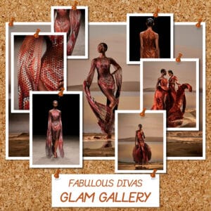
Glam Gallery: When I found these gorgeous creations from Dutch fashion designer Iris Van Herpen, I wasn’t sure how to display them all. I took inspiration from Carole’s new Cork script and her recent fasteners challenge (although I think it was technically a paperclip challenge).
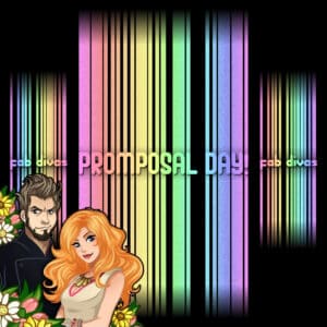
Promposal Day: I had no inspiration at all for this one. I’d been dying to use Cass’s Projection script and had lots of fun playing with it. I must have tried a dozen different versions of the script before I settled on what you see.
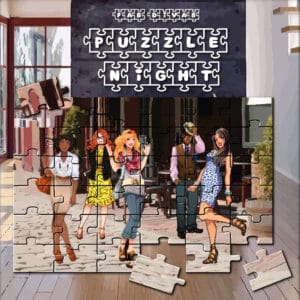
Puzzle Night: I purchased two of Carole’s jigsaw puzzle scripts for this one. I ended up using the Puzzle6x6 script so I could move some of the pieces. The characters and backgrounds are from the game. The font is Fontsbomb Jigsaw, free from FontSpace.
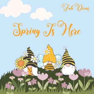
For my gaming group today…used mostly freebies.
Fairytails font from Creative Fabrica (on sale for $1.50; couldn’t resist. I’m a sucker for fonts with added glyphs.)
Bee Gnomes from Creative Fabrica
The rest is from ALFLT Mar 2021 Blog Train-Meg Scott Studio
Great stuff, everyone! So creative.
Thanks so much, Mary. <3
Thanks so much for your kind words, Lynda and Annie. They mean so much.
Lynda, you are tempting me with that mandala script. It looks like so much fun.
Anne, playing is the best way to learn, after Cassel’s classes, of course. I have had more happy accidents than I can remember.
I LOVED my mustang, Minka. Ford might just want to use your page!
You’ve been busy, Bonnie. I can’t believe you were able to train your cats!
Lynda, that mandala script looks like a lot of fun!
I’ve been dreaming of Hawaii for decades, Anne.
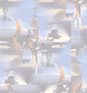
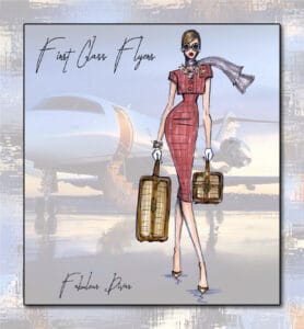
I wanted to make a background using the original pic (Hayden Williams, illustrator), but I didn’t want the colors from the woman on it. I selected her from the pic, inverted the selection, and deleted her. Applied Effects: Image Effects: Seamless Tiling; duplicated the layer several times and moved the layers around so the blank space was covered; merged the layers. Then I applied Effects: Distortion: Displacement Map using the Canvas Course map. I’m sure there’s an easier way to achieve this, but I make stuff up as I go, especially when doing the daily pic for my gaming group.
The font is Best Life, freebie from The Hungry JPEG.
Constructive criticism is always welcome.
It’s so bright and cheerful, Minka!
Great work! I have to watch the Filter Forge replay.
S = Sing
I’ve never used that effect on a frame, Lynda. After seeing yours, I’m going to have to try it.
Love what you did, Julia. If you send out Easter cards, you’re all set!
Annie, the game comes up with the daily themes; I have to come up with the pics. 🙂
Knick-Knacks…what a cute idea, Karon.
Karon, can we assume that is your lovely daughter? The layout is a wonderful way to showcase her. And thanks so much for your kind words.
Love your page, Laurie. I grew up in Brooklyn and live on Long Island, NY so I’ve always been near the ocean. Your pics bring me back to my childhood days spent at the beach.
-
AuthorPosts


