Forum Replies Created
-
AuthorPosts
-
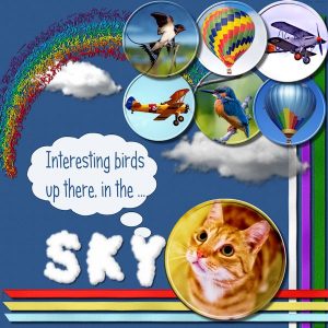
This is the page I made for the Sky Challenge. I added a sandstone texture to the solid color background paper. I created some ribbons with cass-Ribbon Factory Script and added cass-sprinkles-Rainbow element freebie. For the photos, I used a cutout effect based on the button tutorial. The title was done with cass-Cloud Alpha.
Sharon, I also took advantage of the trial Diamond membership and I could see that there are tons of good stuff. I have watched a few videos but haven’t done anything yet. Your flag came out very good. Nice work!
Hi, Sharon! Like Dawn said, we would like very much to see the elements you created.
Welcome!
Joanne K, I second that. It was really fun hunting all the pieces, and at the same time getting to know all the good things she has. Thanks, Cassel!
Dawn, all these details: sunray, page curl, cloud alpha etc came out so good together! As usual, I love the texture of your papers, a subtle detail that makes them stands out. Really nice page!
Marlene, glad to see you back.
To see all this devastation and losses of homes and especially lives caused by bushfires is very sad. Fortunately, nature regenerates itself and plants grow back again although it takes some time.
Like Sheila I also like very much the different stitchings and the texture and color of the papers. Nice work!
micfin, thanks for your kind comment! One of the good things here is the Campus is that we learn a lot from each other.
Dawn, thank you for your comment. 🙂 Like you said, it is an encouragement to one another.
It is the first time I am using the corner punches, although I have had the brushes for some time. I’ve seen you using it and always loved the effect.
Hi, Anja, welcome!
I really like your designs, beautiful colors and very creative! Here in the Campus you will have the opportunity to learn PSP a lot with the help of Cassel’s classes. Like Dawn said, looking forward to seeing more of your layouts.
Here is my contribution for this challenge. For the papers, I used a free icon from Wikipedia and ran the Cassel’s Embossed Script. Also used Cassel’s Corners Punched A brush. For the photo, I used one of the Distressed Edges freebies and ran the Split-Photo script. As I had 4 pieces of the photo and I only wanted 2, I merged them, and after that, I ran the Lifted Photo script.
For the papers, I used a free icon from Wikipedia and ran the cass-Embossed Script. Also used cass-Corners-PunchesA Brush. For the photo, I used one of the Distressed Edges freebies and ran the cass-Split-Photo script. As I had 4 pieces of the photo and I only wanted 2, I merged them, and after that, I ran the cass-LiftedPhoto script.
At the end, I added this cute cass-StripCluster-SpringThing1.
micfin, I like your layout very much … so colorful and creative. Great work!
And about your doubt, right now I can only think of creating the text in two layers, one for each word. Maybe others have a better idea.
Anja and Dawn, nice layouts, colors, and photos. Great work!
Dawn, I love the page edge and the preview book. I knew neither the font nor the script… I will add to my wish list 😉
I haven’t done anything yet to this challenge… Let’s see if I can come up with something.
Joe O, amazing what you did in vector. Great work!
Thanks, ladies, for the nice comments.
Dawn, I was struggling with this challenge; I made one layout and after I had finished it, I didn’t like and deleted it. 🙂 …It was after that that I thought of adding a clipart, a card with ingredients (to fill the hole) and so forth.
Cassel has great scripts and I am sure I don’t know half of it. I have a few and some I haven’t even tried yet. 🙂
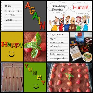
I had no idea of what to do for this challenge. I looked at many photos and still nothing. Then I found a few photos that I thought it could work. I have been watching some paper scrapbooking videos and came across with Project Life. So my page is kind of Project Life scrapbook, which has a very simple layout with pockets.
I used Cassel’s freebie Notebook-LoosePage1 and PlaydoughAlpha. I also used a free clip art from Clipartall.com.
lLots of things going on here! Nice to see that.
Royanne, that is really funny that mother and daughter did the same thing 30 years apart, and you are lucky to have both photos. Good memories.
<span style=”color: #000000; font-family: verdana, sans-serif; font-style: normal; font-weight: normal;”>liltiggerlvr, I am happy that you decided to share your page here. I think every project is important, and by looking at the photos I can see that it was a cold winter. Lately, we have had very little snow here. Thanks for showing us.</span>
Dawn, your page is lovely with these two cute baby koalas. Your mask is very pretty… something for me to learn in the future: to do my own masks. Nice idea of using the map of Australia with the script. Perfect.
Hi, Dawn and Sheila, thanks for the comments on my layout.
Sheila, very good idea of blending butterflies and flowers. I also like the use of a doily for the background, and the doily itself is very pretty with all these components. Nice work.
Dawn, I love your idea of blending the koala with the map of Australia. Very good!
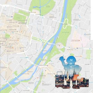
This is my contribution. My first attempts were not successful, but I finally manage to come up with something.
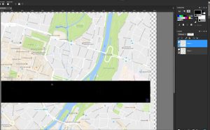
I try the technique with maps and images. The map I had to work quite a bit with the arrows but finally got it.
For the image, I use a tourist clipart and blended with a photo like explained in the tutorial. I added an outline to the final result. In the end was fun.
I attach the image of the maps matching perfectly and the final result.
Royanne, very nice way to blend the two photos and the result came out pretty good. What a beautiful bush of flowers… I love the color. Your granddaughter is adorable.
Royanne, I love your page. It begins with this lovely and sweet little girl! 🙂
The denim textured paper, the leather elements, the colors… Really great work! The challenges give us the opportunity to see all these amazing pages. I love it.
micfin, very good work! It’s nice to see other types of work with PSP besides scrapbooking.
Dawn, thanks for your comment on my page.
I really like your page and I love the denim textured paper… beautiful blue! I don’t know how to make my own denim paper… so many things to learn 🙂
I like the challenges very much. I see them as an exercise, where I put to work all Cassel’s tutorials, and also where I can integrate all the nice freebies she graciously give us. And not forgetting these great scripts she has.
Here is the image
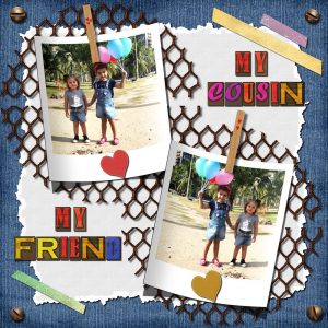
This is my contribution to this challenge. The denim textured paper background and the chicken wire element are Granny Enchanted’s freebies.
I made the white paper: Solid Color > Texture > Cassel’s TornEdge3 brush > Cassel’s TornEdge2 Script. I added Cassel’s Screwhead Picture Tube and Cassel’s WoodLetters freebie. I made the 2 leather hearts (Preset Shape > Leather Texture > Cassel’s StitchEdge2 Script. I made the Clothespin (Cassel’s Tutorial) and for the tapes, I used Cassel’s Adhesive Tapes Script on KAagard’s Evening Glow-Gradient Paper freebie.
Dawn, your page is gorgeous! I love the colors, the denim paper, the tags… And everything match perfectly with the photo. Another great page!
Dawn, I thank you for your lovely comment. I really appreciate!!
I am glad that you mentioned the mask because I failed to give the proper credit to the designer. This pretty mask is a freebie from cheyOkota – “cheyokota_Believe_mask”. I don’t know yet how to do my own masks. 🙂
Best wishes
Joe O, very nice wood sign. I like the color of the wood too.
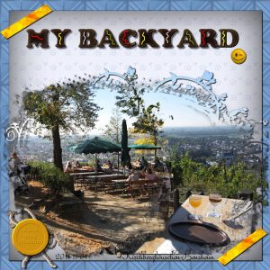
First I thought that as I don’t have a backyard, I wouldn’t participate in this challenge. Then I decide to “cheat” a bit and for the fun of it do something. So, this is what I came up with: I made the two papers: eyelet and plaid. The plaid I began with the basic, but then added layers that were 10 percent smaller than the previous one.
I decided to play a little with masks, so I used it on the 2 photos with the help of the “ClipToIt” Cassel’s script. Very useful script. I created the tapes, using the “AdhesiveTape script”.
Furthermore, I used the “Hamburger Alpha” freebie with an addition of differents condiments following Cassel’s tips. Besides ketchup and mustard, I added “mayonnaise and salsa verde”. 😉
I made the wax seal (Cassel’s tutorial) and added the rope tube. The smiley is a freebie from KAagard – “AllTheFeels-Flairs”.
Dawn, you really mastered the perspective technique; we can clearly see that comparing the two images. The corner punches give a nice touch to the background. Great work!
Marlene, Dawn, very nice pages, and really lovely memories.
-
AuthorPosts


