Forum Replies Created
-
AuthorPosts
-
K = Knitting
Again so many lovely pages are created!
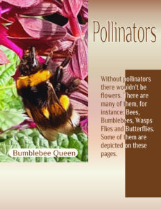
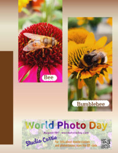
This are my pages for day 4 with the same settings. I adjusted the background gradient to match the photos and I changed the dimensions of the masks for the photos because I wanted a better fit without to much of the rest of the photo. There was a lot of free space on the right page and I couldn’t help myself and made another ad celebrating the World Photogaphy Day which is today. This time with my own QR-code and the logo found on the internet. The rest is made up.
For better visability here is my ad.
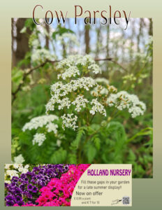
My day 3 page with an ad (thank you Sue for this challenge in a challenge)! As I used a font with an outline on the other pages I wanted to continue that and therefore only decreased the brightness to about – 175% to keep the outline visable. The photo on the ad is one I took 2 weeks ago in a “real” garden centre where we often come, it has a nice coffeecorner too. I also put a QR-code on it because that is what is nowadays usual. I didn’t make the QR cube, I have no idea how to do that and haven’t found a tut for it either. Carole an idea perhaps?
There are made so many lovely magazines so far, it is a pleasure to browse here.
Carole I like your suggestion to do a sepate page with ads as that is done in lots of magazines!
Monique, I like your theme, we have visited Appeltern too. You give their website in your comments, but as this challenge is to make a magazine why don’t you include that info on one of your pages?
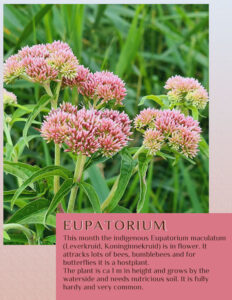
Day 2 and another flower with a matching story. I kept it very simple, same font and again the colors are from the photo.
Sue I like your adver and must look into that and see what I can come up with!
Gerry I like this one better; it is more a magazine to me and I can see it as a leaflet or poster too.
Ann, they are all lovely!
Annie, fantastic combination of the colors and that font is great! It is suppost to be summer overhere, but this years summer hasn’t been great sofar. Today it was raining again after a couple of nice days! I’m doing the magazine challenge right now but if time allows I’ll certainly try this palette because I like the colors and it doesn’t need to be about winter….
What a very nice and very different “magazines” are to be seen here! Wow, I like them all.
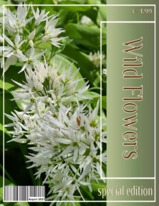
I have used a 8,5×11 format because I find that more a magazine instead of a scrapbook layout. A gradient under the title and I added a barcode; the colors I took from my photo and the font is Philosopher with an outline to gave it a little more body.
Looking forward to tomorrow.
E = Embroidery
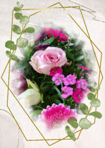
Here are 2 cards I made today when I was in great and unexpected need for cards and didn’t have the time to make them from scratch. Yesterday I had downloaded a freebie from Creative Fabrica just in case, not knowing that this case would come so soon. I used 2 photos with a mask I had done before, the left one is the bouquet I used in the Color Song Challenge earlier this week with that dark background and this card has a very different feel to it. So it shows that sometimes a quickie can look good too, at least I think so…….
Cristina you have made a great travel tale!!! So nice to see all those pictures because many years (12 to be precise) we planned to go to Portugal and Lissabon, everything was booked and 2 days before departure my husband became very ill and I had to cancel everything. Since then he cann’t travel anymore, so we never made that trip. Nowadays I travel on my own but somehow never made that trip.
Anne, thank you very much. I was surprised myself when I got this effect because I mostly use more subtle colors! Maybe I should do this a little bit more often when the colors “dictate” it.
Annie I like your red right hand layout, it has just enough red in it to make that color stand out.
A = Athletics
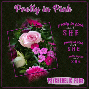
This is my color song challenge. Whenever I see something pink I immediately think of this song by the Psychedelic Furs from the eighties.That group isn’t a particular favourite of mine but the chorus stuck in my mind! I used the Simply Artsy template by Carole and made a background with the Kaleidoscope. I did that with subtle colors but it didn’t work until I used the blend mode difference and now the colors of the flowers really shine. The title font is Wake the Warrior with the text outlined. The other fonts are Breakaway, Calligraphy and WhiskeyCool. I had the same “problem” as Anne with the shadow on the frame and therefor I gave the frame a bevel to make it more defined.
Michele lovely and a good use of that template to make it yours!
Annie hope to “see” you later today at the masterclass! Your melancholia is stunning.
W = Weaving
S = Swimming
Hi everyone 🙂
I am in too; for me it is a new challenge and I’m looking forward to it. As you probably can guess my magazine will have flowers as its topic.
R = Reading
I see now, always to late, that I have a typo on the name of the painter Rembrandt van Rijn. Before I post this on Facebook I’ll correct this, but it will have to wait until tomorrow. I go to bed now.
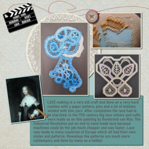
As most of you know by now I love taking photos of flowers, but I decided to set another hobby in the spotlights. I have been making lace for many years until my hands didn’t cooperate any longer. If you are making lace you have to keep a constant tension on the bobbins otherwise the lace becomes uneven and wobbly. So I stopped and sold all my materials!
This hobby theme is a nice way to show you some of the things a made and tell something about the history of lacemaking. The background is made by 2 lacepapers I found on Pixelscrapper and by using a blendmode; the lace doily is from Pixelscrapper too. The photo of the painting and the bobbins I found on the internet. The 2 lace photos show my own work. Furthermore I made a flairbutton with my own lace and a clapperboard. I used a template by AntebellumPress as an idea to make this page.
Annie, nice garden of yours, I hope you enjoy the eggs!
L = Lace making
Sue, I see what you mean and have adjusted accordingly, thanks and your comments are always appreciated; you are in this “game” so much longer then I’m! I love to learn from you.
Annie, I agree with you; no treaded ribbon although it was a requested element it doesn’t match well. I find your colorpalette so “not you” at all, if I may say so. This is really the first time that I have some minor critics. I should leave it and go on to a next new project/page, not everything can always be a 110%!
C = Cooking
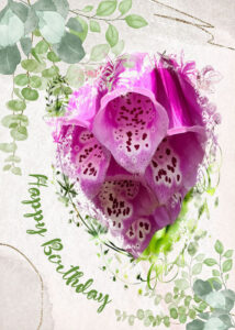
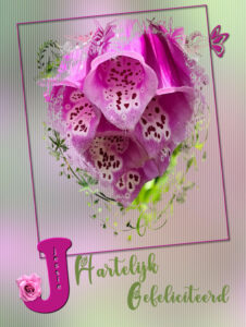
July is almost to an end and I just made this birthday card for a friend. I cann’t post it on Facebook, because she will see it there before her birthday is due! Background is photo with a blur and texture; another photo of a flower (Digitalis) I took on a walk passing by a nice frontgarden. The mask is by Jessica Dunn and I use it often for cards. Simple frame with a butterfly and the text is Green Love and Growloves. I put her name inside the initial and decorated with a flower. I just started with the Diamond Membership and this are the first tutorials I did. I made one for myself too for future use. Furthermore I have browsed the contents and will work my way through, at first glance it is quite overwhelming!!! But I love it.
Annie a lovely page, a real showstopper! Very well thought out.
Thank you Annie, the thinking out is often the hardest part of a lay out! I almost always start with the photo(s) I want to use and take it from there.
Thank you Sue and the advantage of taking photos from flowers is that they mostly don’t move; unless it is very windy of course. We have many days with a lot of wind!
-
AuthorPosts


