Home of the Scrapbook Campus › Forums › Showroom › Bootcamp – January 2022
Tagged: project 5
- This topic has 303 replies, 27 voices, and was last updated 2 years, 10 months ago by
Cassel.
-
AuthorPosts
-
January 26, 2022 at 5:09 pm #70458
Cassel,
Thank you so much for your guidance and help. I have learned more than ONE thing in Bootcamp. The rotation of the eraser to make the ‘pinking shears’ effect is brilliant! I must confess the first time I tried it I used the clone brush by mistake with a square brush, but it yielded the same results. I have learned to be more mindful of the shadows, careful with resizing, and I appreciate the free digital kits that have helped make these projects complete.
Oh, there are so many beautiful projects to view among this group of people. I love seeing the photos that are dear to your heart in your projects. I often looked for a ‘like’ or ‘love’ button to show my appreciation of your work. LOL!
About the eagle pictures, I live in central Mississippi, USA and I hike a lot with my cameras. I always look for wildlife and am blessed to have found two different eagle nesting trees within my area. I watch the habits and routes of animals and try to find the most discreet way to watch so I will not interfere or disturb nesting areas.
Have fun everyone,
Diane
January 26, 2022 at 5:25 pm #70459So nice to see all those beautiful and different projects.
great idea with the background Peter!
Sarah, Thank you!Day 9, Project 4.
These are pictures of my daughter when she was 6 years old, this year she will be 43 years old.
The font is Ravie.
I used paper and elements from a kit, themagnoliapatch.blogspot.com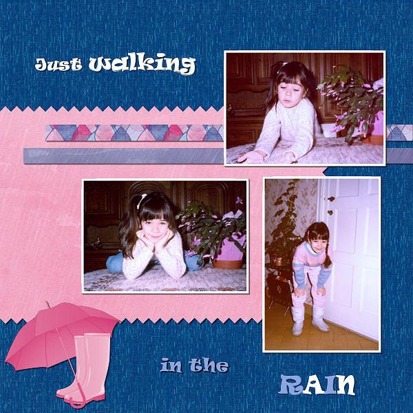 January 26, 2022 at 6:27 pm #70465
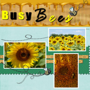
Ok I redid my Project 4 for the 3rd time. I was so tired after working on it most of yesterday that I forgot to change the Font on the second title word and I forgot to do shadows. So as I redid I tried to group (for the 1st time) the 3 photos, the pinked scissors paper, the two thin ribbon paper so I could move all that down on the page. At first I got a white border on the top of that selection and the right side. I can’t remember what worked but I tried moving the group and the pick tool to expand – something worked. It probably took as much time as moving each individual piece. Cassel I would like to learn how to group. I wanted the honey at the top expanded and behind the words so that is why the move of the rest near the bottom.
Diane thanks for your state where the eagles are nesting. I live in KY but not near the Western Part where they have been seen.
I am enjoy the rest of your projects!!
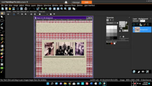
January 26, 2022 at 6:29 pm #70466Okay, I’m stuck again. I’m trying to put the white frame around the photo in project 4. I chose Magic wand, edit selection border, inside, 30 pixels. Selected the photo. You can see the border outlined in the screen shot. I clicked on a white color, selected Flood Fill, brought the crosshairs over the selected border, left-clicked. No fill.
Several questions:
(1) what’s going wrong?
(2) I see 2 small squares at the top-left of the Materials palette – is that what I need to click to select the fill color? One says “Foreground/Fill” and one says “Backgrund/Stroke.”
(3) If thqat’s not what I need to click, what is?
(4) If I wanted to use a texture rather than a color (I rather liked PSP’s “wood grain” texture), is that possible?
(5) After selecting the fill color/texture, the next step is to select “Flood Fill,” right? Then move the pointer over the selection area and click? That’s where I’m stuck. No filling happens.
This is particularly frustrating because I did this project last year and don’t remember having this much trouble.
Thanks again for your suppofrt and expertise.
January 26, 2022 at 6:52 pm #70467Peter, let me answer your questions right now.
1- I would need to see what settings are in the toolbar when you use the Fill tool
2- Yes, those two swatches allow you to use the top one if you left-click with your mouse, and the bottom one, if you right-click. Clicking ON those swatches will open the Materials properties dialog window where you can choose more colors, gradients and patterns.
3- See #2
4- Yes, by clicking on the swatch, you would have the option to choose any pattern you have, including wood grain if you have some.
5- Again, it might depend on the settings for the Fill command.
One thing though, you are currently working on a flattened version of your project. Most commands won’t behave as you intended. Do you have a .pspimage version to work with?
January 26, 2022 at 7:59 pm #70469I have been fighting with PSP2019 closing on me, so I have switched to PSP2020.
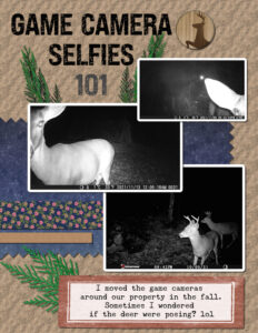
But my eraser brush has not given me what I was expecting. Instead of a pinked edge, I have blocks that are white, that have cut thru the background. I am working on the paper layer, and I even turned the background layer off, along with the photos….what am I doing wrong???
January 26, 2022 at 8:29 pm #70471Linda, did you use the Eraser tool or the Brush tool?
January 26, 2022 at 8:33 pm #70472Cassel–I used the brush! Oh, the details!!! Hate it when I can’t listen….
Thank you!
January 26, 2022 at 9:41 pm #70473wanted to let you know that i practiced with my guide today and that was the problem i was dragging it to slowly and to many positions at one time. i also relearned about the erase tool making the zig zag that is one tip i had forgotten about!
January 26, 2022 at 10:37 pm #70476Day 9 Project.
I changed the papers in this page multiple times! But I think I am done tonight.
I have learned to pay attention to the directions. Sometimes it is ‘re-learning’ something that I forgot. That seems to happen often….
January 26, 2022 at 10:45 pm #70480Linda, I recently gifted myself a trail camera. I’ve been thinking of creating a scrap page or 2. Thank you for posting your page. I’ll have to get serious about getting a page completed. Love your page!
January 26, 2022 at 11:44 pm #70487Thanks Bonnie!
Sometimes it is funny what photos I get….I think about putting a speech bubble on them and writing captions 🙂
January 27, 2022 at 1:40 am #70488OK, it looks like that long feedback post I added last night disappeared. Very strange, so I will have to repost for January 25th.
Susan, that lighter title is much easier to read.
Ann, I guess it feels more realistic to have an opaque cogwheel than a translucent one (unless it was made of glass). Your artwork layout is very original. Even thought the painting is no longer recognizable with the kaleidoscope effect, we can still identify the colors and “textures” of the original.
Gregory, with practice, you will also learn about using different textures, different angles, different sizes, etc. So many things can be done with PSP. Your “Friendship” layout is great; you used good shadowing and resizing of the photos.
Mary, missing one shadow is something common. Sometimes, while working on a project for a while, we don’t see details. It is often a good idea to leave our work for a while and come back later with a fresh eye and sometimes, the details are caught.
Marie-Claire, it is funny how now, as soon as I see a dog like that one, your name comes to my mind!!!! 🙂
Lavada, do you have a chance to enlarge those photos? I think they should be the stars. If you are using PSP2021 or 2022, there is a good feature to enlarge photos without distortion. I really like the little elements you added!
Peter, are you able to view the videos full-screen? It might help to view the cursor. Scanning the fabric gave a great background for your project. Make sure to keep that file for future use! You can even change the colors later for a completely different look.
Anne, for your layout, since the green area is fairly large, maybe you can also use a larger font to “fill” it. Those are beautiful feathers!
Theresa, it is interesting how you used “two-tones” for your cut-out edges. Very well done.
Diane, if you are using a lower opacity shadow, the blur should be larger. If your shadow is on a separate layer, you can still add a blur separately. It will be more consistent with a faint shadow.
Gramie, I think you might have forgotten the shadows in your “Busy Bees” layout.
January 27, 2022 at 2:12 am #70489Now, onto Jan 26th.
Mary, you used a different Eraser tip to create that “lacy” effect on the paper. That is a nice-looking one. I am glad to read that you learned something not just from the tutorials, but from other participants. That is the power of our community.
Sharla, with practice, some steps will become automatic, but it does take time. Did you use a picture tube from 2022 to add those birds on top? Great layout.
Liz, you might consider using a lighter color for your title to make it easier to read. Also, if you are using a thin font, don’t add any shadow because thin writing would be associated with ink, which has no thickness to create a shadow.
Gregory, it looks like you are getting more and more comfortable with those projects. Your shadows and layering are very well done.
Randy, don’t worry about being behind. You’ll have time to catch up. Your layout is very well done. I see that you followed the instructions to the letter in applying the shadows and resizing the photos without distortion. And the glitters behind the photos is really making them stand out!
Jeff, welcome to the bootcamp. Since the images have to be resized in the forum, I am not exactly sure about your photos. Do I read “Old chandelier parts”? Is there a specific reason that all the elements are so small on your image? I am just a bit puzzled. Could you clarify that? For your second layout, I would recommend that you use black for the shadows. Even if the background is a different color, the lower opacity will make that color show through without having to pick a different color for each different background. What kind of waterwork are those? Are they fountains or other types?
Pirkko, those are great photos. Personally, I would not have added the overlay on top of the photos, simply so it would not cover them. They are so beautiful!
Susan, yes, that Fill tool can be an issue because I rarely change my own settings, and I don’t think to point that out to the viewers. So many people have it set wrong, and they don’t know about it either. Glad it is set now.
Gerry, that is a great layout! Did you add a shadow on the title? I ask because I tend to say not to add shadows on titles, but you seem to have added one that is so faint that the text is standing out but the shadow is not obvious at all. It is a great example of the Drop shadow being used for NOT a drop shadow but for emphasis.
Anne, great photos. I think the title would deserve some shadows as the letters are bold enough to be cut out of paper, don’t you think?
Diane, I wish I had the function of “likes” in the forum!
Marie-Claire, those are cute photos of your daughter. Is it just my eyes or do they have a sort of pinkish tint? Maybe I should add a blog post on using the White Balance to tweak those colors.
Gramie, instead of grouping the photos, you can LINK them. It won’t allow you to resize them, but they will stay together. I have an article on linking vs grouping HERE. Typically, the Pick tool will override the links/group. Instead, you should use the Move tool.
Lavada, glad you managed the Guides in PSP9. It is an annoyance, but easy enough to get around it.
Linda, those are fun photos to showcase! One tiny suggestion: on the title, it seems to be on top of the tip of the branch, which you could not do with the ink of the title. Maybe just move the title higher on the page, or lower in the Layers palette? I think that adding speech bubbles would be a really fun idea.
January 27, 2022 at 6:42 am #70490Thanks Carole for all your comments and support. The birds were just a png file from the kit I was using, which I now can’t find. Picture tubes are another thing I still need to learn about.
January 27, 2022 at 7:05 am #70492Hi
I have seen several posts mentioning “tubes”.
What are they please and how do we use them?
Thanks, GregJanuary 27, 2022 at 8:21 am #70494Wow at the amazing work being displayed here! Especially great seeing what a difference the tweaks make that Carole suggests.
What I have learned or have been reminded of is that if a tool is not working as expected or supposed to, is to check all the settings! My magic wand and I have a love/hate relationship over settings.
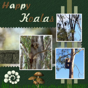
The papers and photos are mine as is the ball spiral. The grass is a tube from Corel and the mushrooms from my stash. I am going to redo the text.
The top and bottom are both phone photos and I included the top one as it shows the koala being on such a thin branch and they even go on thinner ones! He/she was way up and that was at full camera zoom.
January 27, 2022 at 9:05 am #70495Carole, well, actually I didn’t use an eraser tip this time; that is an edging I bought from you – love them and have used them a couple of times in layouts = they give a different feel. Have wanted to experiment with different brushes to edge papers, especially since you taught us about using the shift key.
January 27, 2022 at 10:18 am #70498Gregory and Sharla, here are two articles to explain what picture tubes are:
In addition, we have a few full-length classes inside the membership:
Picture tubes in PaintShop Pro
Finally, a full-length webinar I did for Corel:
January 27, 2022 at 1:16 pm #70502Carole,
funny, but nice the fact that now you have to think of me when you see a collie 🙂
Indeed, the photo’s of my daughter have a pink tint, they are scanned photos. I used the white balance, but still a pink tint remained. It would be nice to do a blog post about that.
January 27, 2022 at 2:01 pm #70504Anonymous
- 335

- Enthusiast
Fixed 🙂
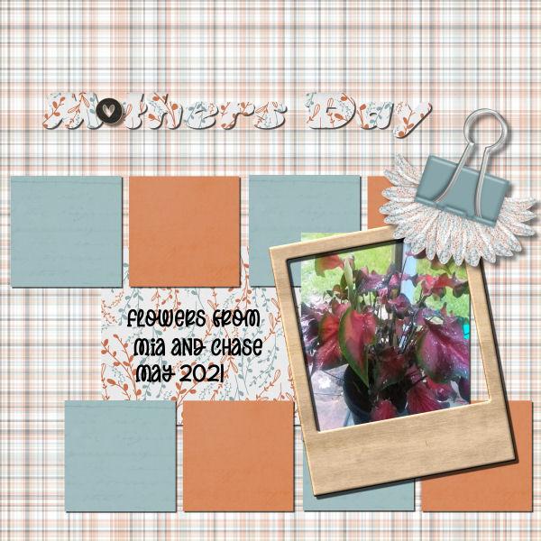
January 27, 2022 at 6:10 pm #70507with the photos i actually decreased the size because because they were 4000 x 4000(new camera did not have it set right at the time) so i should be able to redo it them with no problem.. i use jac9 and do not have any of the newer versions which means i could not do the text in lesson 5 like you showed with that version.
 January 27, 2022 at 6:27 pm #70508
Lavada, one tip if you have huge photos is to resize them to about 2000 pixels, so you can add them to your full-size page and then tweak their size with the Pick tool. In your case, you won’t need to size them up anyways!
January 27, 2022 at 6:28 pm #70509After much fussing and fretting, here’s Project 4. I was having trouble with the white photo outlines, and as far as I can tell, the problem was the settings on the flood-fill tool. Opacity had vbeen at 20 (20 percent, right?) and so on. I set all the settings to the same as with the Magic Wand, and made sure the crosshairs were right inside the selection border beforfe clicking. THAT worked. Finlly!
Several other issues:
(1) I have had repeated problems going back to text elements to edit them. Most often, I’ll click the “Text” tool, click or double-click the text, and PSP acts as if I were entering a new text element. I can’t figure out how to get back to previously-entered text to, say, highlight; or change font/size; or color. This predictably happens after I’ve performed other functions and decide to go back and edit. If I delete the text and re-enter it AND do all the changing/editing before any other action, the tool behaves pretty well. Is there something I’m missing?
(2) When I went back to copy a text layer and convert to raster, I saw both layers with text had “convert to raster” dithered out. Somehow, the top text was embedded in the layer of the paper it was typed on. I was not able to select it separately, and when I made the paper invisible, the text vanished also. When I did a drop shodow, both the paper and text got drop shadows, so my needs were met; but not as expected.
Anyway, it took a lot longer than expected, and a lot more effort. There are several successes that happened more despite, than because of my efforts.
I remembered several times when a teacher would hand me an assignment with the comment, “this will be a good learning experience.” I knew I was in for a rough ride, usually with a good reward at the end.
It’s been a great learning experience (really!)
January 27, 2022 at 9:42 pm #70517Anonymous
- 335

- Enthusiast
here is my last page for Bootcamp January 2022
the text is from the Bible and the palmleaf is from Pixabay
everything else i did myself
January 27, 2022 at 9:49 pm #70518Anonymous
- 335

- Enthusiast
I have learn very much here in BootCamp – Thank you Carole so much 🙂
now I understand many consept like element … shadow … title…
and … wow wow… scripting… but it is another case…
January 27, 2022 at 11:14 pm #70524Day 11 – Project #5:
**Edited to change the font on the poem.
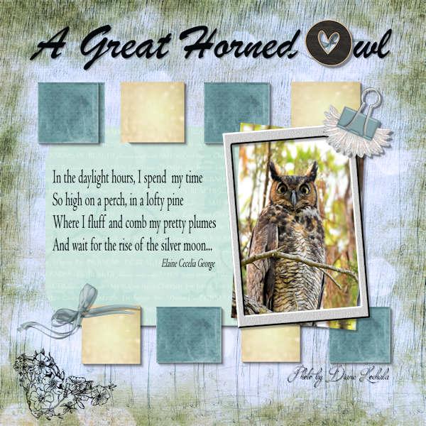
I enjoyed this project and tried to correct the blur on my paper shadows. I used one of my favorite owl pictures. During a quiet walk along a bayou on the coast, I happened to sense movement above me in one of the large trees. I saw a magnificent great horned owl! It was an unexpected blessing on a somber fall day. Enjoy!
Diane
-
This reply was modified 2 years, 11 months ago by
Diane Lochala.
January 28, 2022 at 3:13 am #70538Final project of the Boot camp and everything is mine. I see the spacing between 1st and 2nd box is a bit wide I will have to fix that. I was wanting to use the 2 photos somehow and decided to add them into the boxes.
Thanks for the Bootcamp Carole and to everyone who participated with such inspired creations that it is always a pleasure to scroll through the postings.
January 28, 2022 at 5:51 am #70542Thanks Carole for all your tips and tweaks.
January 28, 2022 at 5:55 am #70545Would love to learn about scripts do you have anytuts on them ?
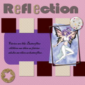
This last one was a joy i have done one for my daughtewr in lawtoo
As you can see in my name for my jpeg Day10-11marisalerin-fantasy-graphic-SPK22-600 the scrap is from marisalerin and the photo is from fantasy-graphic.com made by me and the 600 size
-
This reply was modified 2 years, 10 months ago by
Liz Kershaw.
-
AuthorPosts
- The topic ‘Bootcamp – January 2022’ is closed to new replies.


