If you have made a layout, mostly from scratch, you might want to turn it into a layered template, either for selling, or giving away as a freebie, or simply to reuse later for a similar project. This is a very simple process, although it could take a while, depending on the number of layers you have on your current layout.
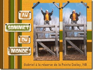 Start with a layered layout
It might seem obvious, but if you are using a flattened version of your layout, you will have to start from scratch. It is totally feasible, but it would not be 100% accurate, which might be ok too if you prefer (and here is a tutorial on how to do it). In any case, this technique will use a full size layered layout. Duplicate your image because you don’t want to edit your original!
Since you don’t want useless layers, delete all the hidden layers. If you hid them, you didn’t need them, right?
Beware of shadows
If shadows are on separate layers, you might choose to add them. Maybe the next user will find them convenient, especially if they use the exact same shapes. However, shadowed elements, on a single layer might be a problem as it would not make sense for the other users to cut their paper based on the shadow. If that is the case, use the Magic Wand set to Opacity mode and have a higher Tolerance setting around 50, click outside of the element and hopefully, the shadow will be selected, which you can then delete. Make sure you have Anti-Alias checked to smooth the edge where you delete, and even then, it is possible that you end up with a jaggied edge around that shape.
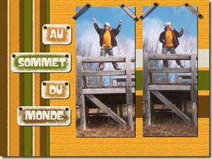 Remove text and other unwanted elements
If you have dates, journaling or a title on their own layers, there is usually no point in including it in the actual template simply because nobody will be using the same dates and text you used. Just delete those layers and replace them by some placeholder, where you can write “Journaling goes here” or “TITLE” where those elements were. They will only serve as indicators for the next user as to where to place the text (but we all know that they might change that too). If the journaling or the dates are part of a tag, don’t worry about them since they will disappear in the next steps.
You probably don’t want to include your own custom drawn elements in the template so you can remove them. Delete those layers. Maybe you used one layer with brushwork. The next user might not need that layer. Delete that one too.
You should be left with only layers that would be useful to the next user, either to place photos, cut paper shapes, or arrange elements.
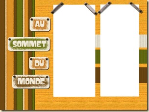 Turn the photos to white
Traditionally, the photo areas tend to be white or light color. It would be a good idea to choose one color and have all the photo areas of the same color, and something that you will not use elsewhere in the template. If you want to turn them to pure white, go with Adjust > Brightness and Contrast > Brightness/contrast and increase the Brightness to 255. If you want to use a color instead, you can either adjust the brightness to get a light grey that you can colorize afterward. This is not a strict rule, but it will guide the user. It would also be a good idea to change the label for those layers to “Photo”. Again, this is only for convenience.
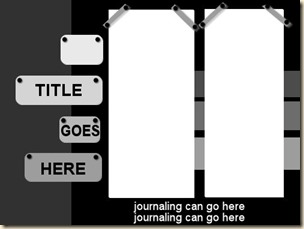 Turn the other layers to black and …
For the rest of the layers, you can simply go, one at the time to perform just a couple of steps. First, turn the layer to black by going Adjust > Brightness and Contrast > Brightness/contrast and lowering the Brightness to –255. This will effectively remove all the texture and details of the paper or element you want to convert to a basic shape. After that, increase the brightness to get some degree of grey, to your liking. If you prefer, you can also colorize that layer.
One layer at the time, repeat that process and either aim for various shades of grey, or all the same shade to then colorize different colors. If you are using a colored template, make sure the palette you choose looks harmonious.
Rename those layers
Finally, for convenience, rename the layers to something meaningful for the next user. It is likely that you will have some layers named something like “Copy of raster 22”. This is obviously useless, so rename it something like “Tag”, “Paper”, “Ribbon” or something similar. And it is ok to have 5 layers called “Paper” or “Flower” too!
Now, you should have a simple layered template that you can sell, give away or reuse yourself. Isn’t that easy? If you find that this process is tedious, it might be because you have a lot more layers that in this example. If that is your case, there is a script that will perform most of those steps for you while you watch. Check out the Template Maker script. It is just a simple tool to speed up the process.
If you want to learn more about using those templates once they are done, you can always check out the Master Class on Layered Templates in Paintshop Pro.
This simple technique can be applied to Paintshop Pro users, but also to other graphic program users. If you know anyone who might benefit from this technique, share the link around!





8 thoughts on “How to Create a Template from a Layout”
Thanks for sharing.
You are welcome. Hope you can use it.
What a great idea. It’s almost like scrapping backwards. Thanks for sharing!
You are welcome. Hope you can use that too.
Really great step-by-step information. Thanks for sharing.
Glad you like it.
What a handy little guide. Explained so well.
Hope you can use that information too.