Layered templates are very convenient ways to shorten the time it takes to create a layout or a way to beat the blank canvas syndrome by giving you a starting point. Even though some scrappers will like to use the layered template as is, it is more common to use the basic shapes and ideas and then change them to suit our photos, supplies, and mood. If you have already created a layout and still have a layered version of it, it is easy to transform it into a layered template (check this tutorial), however, maybe you don't have that version anymore, so what can you do? Although it is a little bit more work, it is still possible to create that layered template "from scratch". Here is how.
Choose the layout
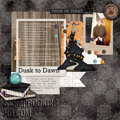
Obviously, you need to choose which layout you will use. If you have a large version of it, it is great, if not, you can get around it. We'll use this layout, from Melissa Shanhun to create a layered template.
Resize
Of course, you don't want to work on your original file, so you should duplicate it (Shift-D). It will also give you one copy to work on and one copy as a reference. Then, resize your duplicate to 3600x3600 pixels. That is the standard size for a full page layout.
Start shaping the papers
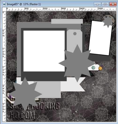
A lot of paper elements, mats, frames, have a simple shape, like a rectangle, a circle, a square, an ellipse. Using a new layer every time, draw a selection in the shape and size of the various elements of the page and flood fill them with various levels of grey.
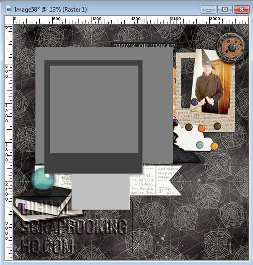
After a while, you will find that each new shape you add hides other elements from the initial image so it gets harder to see them all, especially if they have many layers. In that case, reduce the opacity of each new layer so you get to see the background image and still see which elements have not been "converted".

In some cases, you might have to tweak the shapes: you can cut out some parts using the point to point freehand selection tool (like in the tag or the bottom "ribbon") sometimes, you might use another basic shape (like for the frame) or even the Eraser tool (like for the tag hole). You don't have to be extremely precise in reproducing the initial image; this template is not expected to be a carbon copy.
Add the photo spots
Personally, I like to have the photo spots in white, so they are obvious to the user, however, that is not a requirement. I also like to have them "framed", again to make them stand out from other elements on the page, but that is still your choice. In order to have a framed shape, I use a Vector shape.
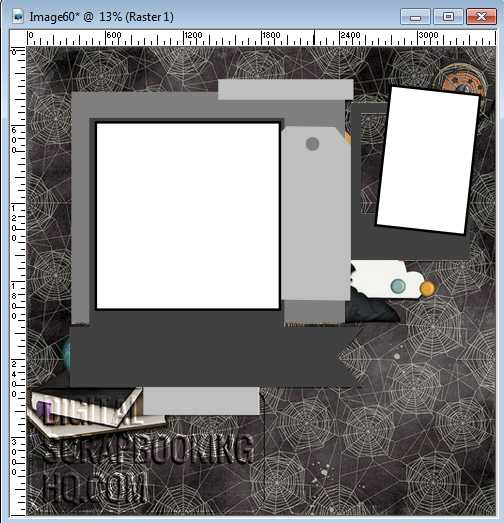
In this example, I cheated a little bit. The initial image used a poem inside the frame, but I replaced that area by a spot for a photo. In fact, maybe a user could place a photo in there, which is more typical of a frame, but since there is no hard rule to follow, the user might put some journaling in there, or even a decorative element, so having a photo place holder is only a suggestion for the user.
Add element spots
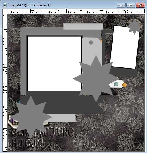
This time, it can seem like a daunting task to create the shape of the elements from the image, but you know what? You don't need to. Elements are often represented, in layered templates, by generic shapes, like flowers, stars and such. They only give a clue to the user that "there is a spot for an element of about this size". In this layout, there is a pile of books on the bottom left and a haunted house cutout in the center and a discrete element on the top right. Let's replace them by placeholders.
Rearrange the layers
The layers, at this point, are probably arrange almost randomly, in the order you create them, which might not be the same as in the original layout. Using the original image as a guide, adjust the layers to fit the result you want to get.
Adjust the colors
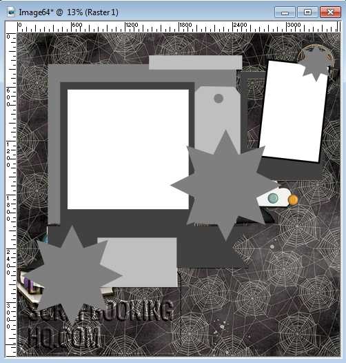
By using random levels of grey, you might end up with some elements with very similar grey and they don't stand from each other. In an actual layout, you would use shadows to create a separation, but in a template, you can't. Notice that the frame in the center is the same grey as the "ribbon" below it. To change that, activate the layout and change the Brightness for it.
Title and journaling
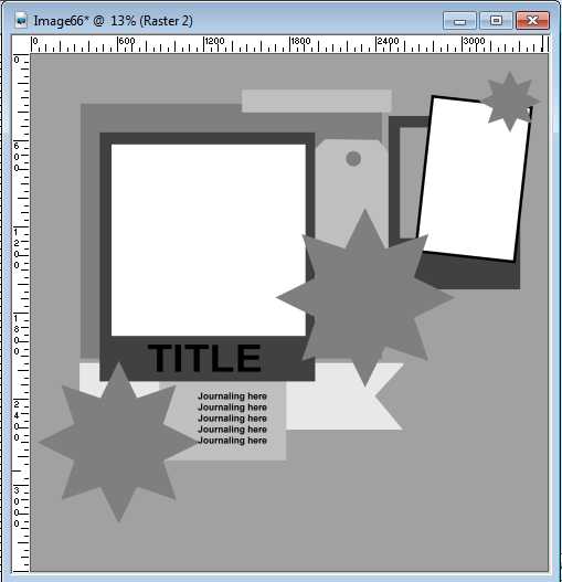
In most layouts, there is a place for a title and some journaling. Even though the scrapper does not need to use those, it is a good practice to add a placeholder for them, to give a placement suggestion.

Make sure you convert each text layer to a raster before moving to the next one, or they will be put into a single layer in the end.
Background
Now, it is time to add the basic background "paper" in your template. You can either flood fill that background layer with a solid color that is different from any other grey in the template or you can add a new layer if you don't fee comfortable removing that background "image". Once you are happy, however, you will remove it.
Rename the layers
At this point, you probably have quite a few layers. In order to help the next scrapper work more efficiently, rename the layers with "Photo", "paper", "title", "journaling", "element" and such. When the user has up to 50 layers to go through, this can be a time saver.
Save
In order to keep the layers intact, you need to save in a format that preserve them. Although you could save in .pspimage format, this would only serve those who use Paintshop Pro. If you want to help out other scrappers, especially those using Photoshop or Photoshop Element, you can save your image in .psd format, which is a native format for Adobe products.
And if you want to accompany your template with a sketch or even a preview, then, you need to resize it to 600x600 pixels and then, save as a .jpg format (which will flatten all the layers).
Now, you are ready to convert your favorite layouts into a layered template that your friends will be able to use for their own projects.






4 thoughts on “Creating a layered template from a flat image”
Great tips. Thanks so much.
You are welcome.
I often make a template from a layout, for my own use. I like the idea changing the transparency of the bits; I have always just moved my sample to the top of the pile, resulting in lots of duplicates.
I found the all grey layers were very confusing for me, even though it was a page I had previously made.
I make my own templates with shades of blue for papers, shades of green & orange for elements, and shades of pink for photos. I also try to vary the shapes of my placeholders a bit, without being specific about what an element is.
Were I would put the text, I type in date and subject for my original page, of credit info if it is a possible scraplift borrowed from a gallery.
Thank you so much for the extra tips!!
It is a simple system to use different colors for different parts of the template. Good idea.
Various designers also have their own preferences when using colors. There is no right or wrong way to create them; just a personal preference for everyone.