Sunbursts are commonly used in scrapbooking as a way to put the focus on specific content. It could be a story or a photo and the rays will typically converge toward that element. You can create your own sunburst template and customize it to suit your project.
Sunburst as a paper
The simplest way to add sunbursts to your layout would be to find a paper with that pattern and center your photo where those rays converge. That is a quick and easy method. You can create your own sunburst from a radial gradient. If you want an ordinary pattern, you keep the focal point in the center, but for something a little different, you can offset it.
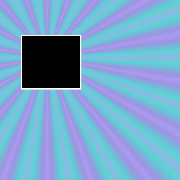
However, you might want something a little less regular or with paper patterns. That is when you will create a template.
Choose your focal point
When you create your template, you can center your focal point, or offset it, like in the example above. There is no right or wrong way to do it. You might want to use different placement of the focal point in different layouts. Experiment a bit to find what you like.
Let's decide on a central focal point. On your canvas, make a round selection in the center, and fill it with any color. Remember that it is a template so you are likely to replace it.
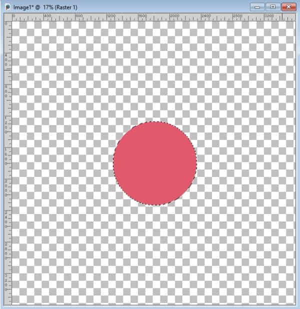
Deselect (Ctrl-D).
Create the rays
For the rays, you have several options to consider:
- do you want them to have even or uneven width?
- are you going to want them side by side or overlapping?
- will they to up to the edge of your project or stop short?
- do you want them to have the same length or be different?
Again, it is all a matter of personal preferences. For this tutorial, let's make the rays uneven, overlapped, and of different length.
Each ray will be created as a triangle, on its own layer. Add a new raster layer above that circle layer. Using the Freehand Selection tool, set to Point to point, create a first selection. Click at the point 1, then, in the center of the circle, and finally, double-click on point 3. This will automatically close the selection for you, in a perfectly straight line.
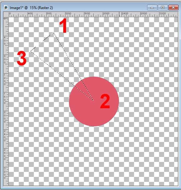
Fill with a grey color of your choice. Remember, this is only a template so the color does not matter. Deselect.
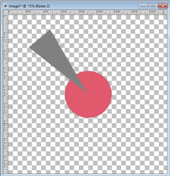
Repeat as often as you want to create as many rays as you want. Vary the length, the width, and the placement of each one. Always use the center of the circle as the middle point. Make sure that each one is also on its own raster layer. Vary the colors of each ray to make it clearer how they overlap each other.
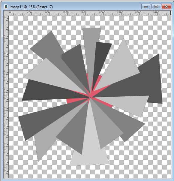
Although I chose to overlap the rays, I left some gaps too. It would be different if I wanted to have them all even, but I chose to make them uneven.
Keep the center or cut it out
At this point, you can choose to keep all the rays intact, and they will all appear under the photo or you can trim them. Either way, let's move the circle (which is our focal point), above all the ray layers.
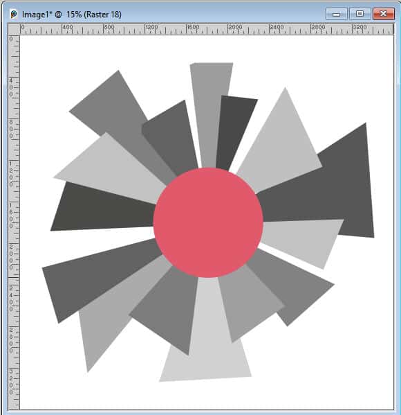
At this point, you might want to save this template as a .pspimage file to keep all those layers separate. If you choose to trim the rays, you can always do it afterward since the process is extremely simple. Let's do it.
Select the focal point, using the Magic Wand and expand the selection. Here, I expanded by 50 pixels, but you can choose to expand more or less.
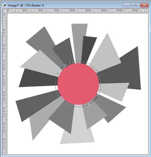
One layer at a time, activate each ray, and hit the delete key. In the end, you will have a sunburst with a little gap around the focal point. Deselect.
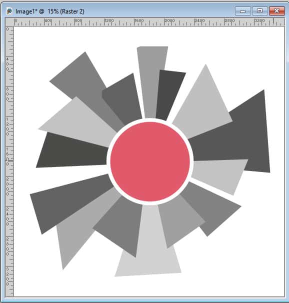
Replace the rays with papers
Although it is possible to just colorize those rays, you are more likely to want to replace them with papers you have. If you are using a kit that includes many papers, you will have matching papers. To replace each ray with a paper, follow these simple steps:
1- open the paper you want, and place it just above the ray you want to replace
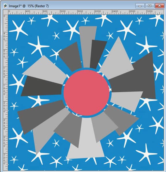
2- Activate the ray layer. With the Magic Wand, click outside of where you know they ray is.
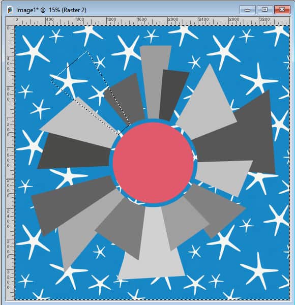
3- Activate the paper layer. Hit the Delete key and deselect (Ctrl-D).
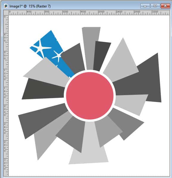
Repeat for each of the segments with different papers.
Adjust the angle of the papers
If you have some papers that are directional (with straight lines for example), it might make sense to align those directions along the rays. Let's try with this striped paper.
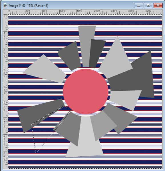
Notice how the stripes are at an odd angle for that specific ray. To make it more eye-pleasing, I could rotate the paper before making my selection. Since it is hard to know precisely, what angle to rotate, I will reduce the opacity of the paper layer, and use the Pick tool to rotate it.
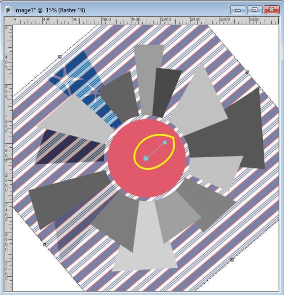
In this example, since the focal point was in the center, I can easily guess the angle while rotating that middle node and align it with the ray. If the paper does not cover a long ray, I could just move it. After all, the ray is only half the width of the paper, at the maximum.
Then, repeat the same steps as before.
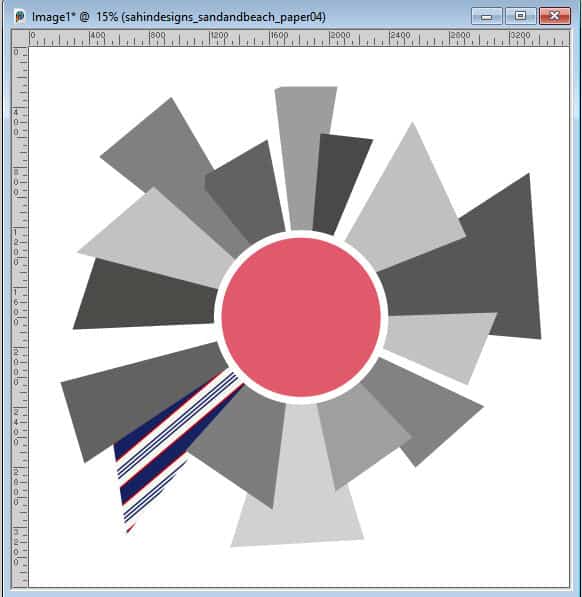
Then, repeat for each ray. You can adjust the size of the papers if you find that the pattern is too large for the size of the rays. It also gives you a chance to reuse the same papers multiple times, at different scales to give a different result.
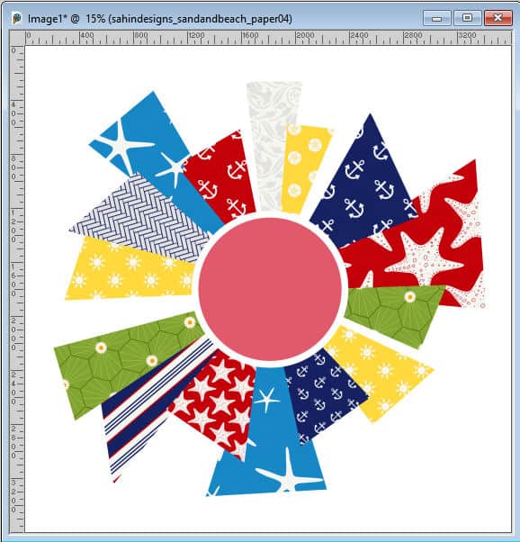
Add the photo and background
In this template, the focal point is a circle. You can use the exact same technique to replace it with your photo. Then, add a background paper below the whole composition.
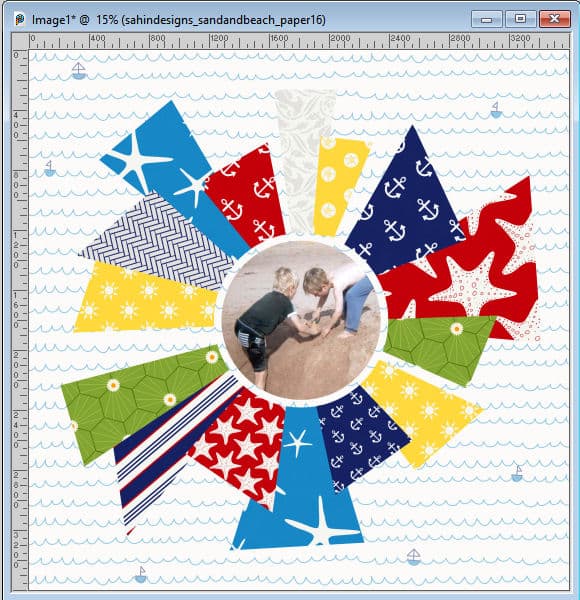
Of course, you can still use the photo in a square/rectangular format, for with this template, we took the time to trim the rays, so why not use that round shape!?
Finish it off
Now, it is up to you to customize your layout by adding a title, some journaling, and other decorative elements if you want. Everything is allowed! Remember to add the shadows to all those papers and elements!
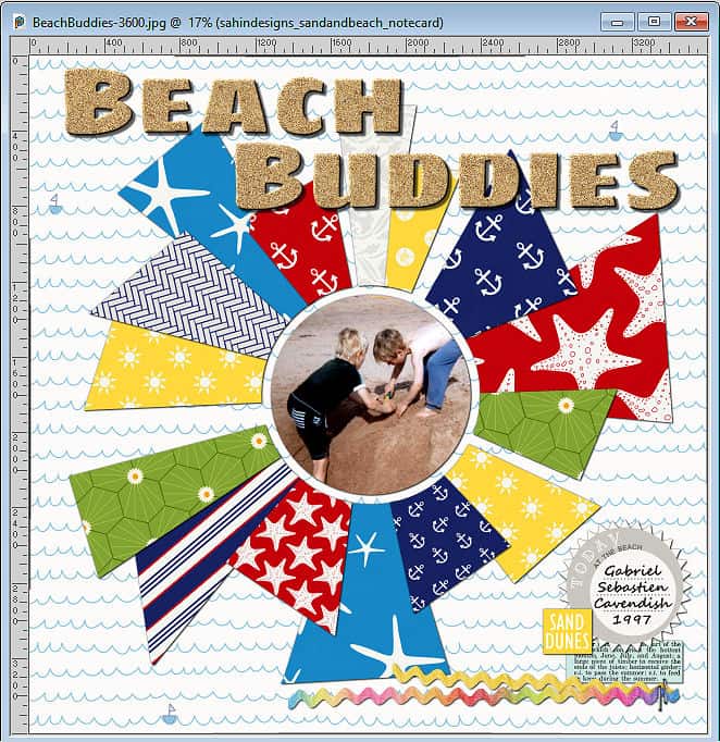
I found that most of the papers had little to not texture so they looked flat on the layout. To add some definition, I used reversed shadows on all the paper elements. If you want more information on reversed shadows, check out this article.
For this layout, I used the kit Sand & Beach from Elif Sahin available HERE.






4 thoughts on “Create your own sunburst template”
Great idea:) Nobody says “With one photo you can do nothing”. Carole’s text and template is very, very good:)))))))))))))))
Love it!
Since I am not a paid subscriber to Digitalscrapbook.com it would cost me $8.00 for the Sand & Beach kit. 🙁
Of course, you don’t have to use the same supplies I used. Since you would be creating a template, you would then use any supplies you already have.