
In creating digital projects, we have to be well aware of the power of shadows so we can replicate their effect and avoid a flat digital look, especially if we want to have a realistic layout. You already know that shadows will indicate the source of the light, the thickness of the element, and its distance from the surface the shadow is cast on. However, there is another way to use the Drop Shadow command in PaintShop Pro to mean something else.
"Fake" or "reversed"
Although there is no official term for this, I tend to call it either "fake shadow" or "reversed shadow". The reason I call it "fake" is that it is not the real shadow as we know, cast because of the light shining on the object. I will also call it "reversed" because it will be be placed in the opposite direction of the actual expected shadow.
Why use a "reversed shadow"?
Working with digital colors and patterns, there is often some missing texture. In real life, single light source will cast an obvious shadow. However, there is rarely just one light source as light is bounced all over a room, on the walls, on other objects, etc. That light is faint but it still causes a slight change in color on all sides of an object. It is quite faint, and that is likely why it is often ignored.
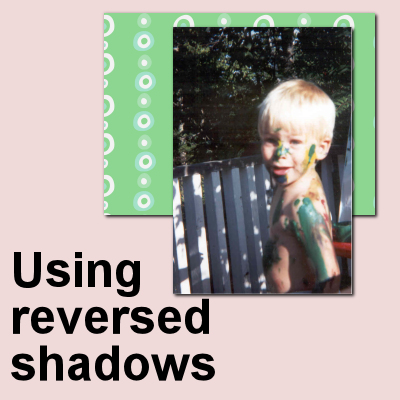
Look at the image below. The photo and the papers have a normal shadow, indicating a light source on the top left.
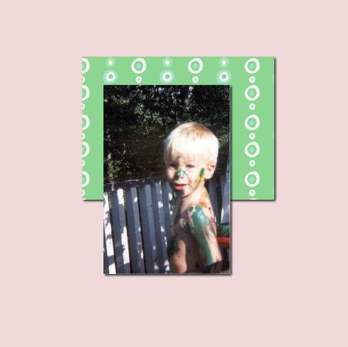
However, do you notice how the top left sections of the photo and the paper seem to be very "flat" and seem to have no separation from the layer just below? When adding a "reversed shadow", you can see that the different layers have more volume, all around.
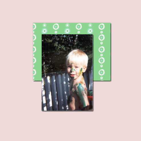
The difference might not be obvious, but you can see a distinction between the green paper and the pink background.
Another situation where you will want to consider using a "reversed shadow" is if you are using very similar (or even identical) papers or patterns layered on each other. Even with a regular shadow, you can see that this star is still not looking realistic.
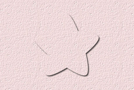
Compare that with this version with a "reversed shadow".
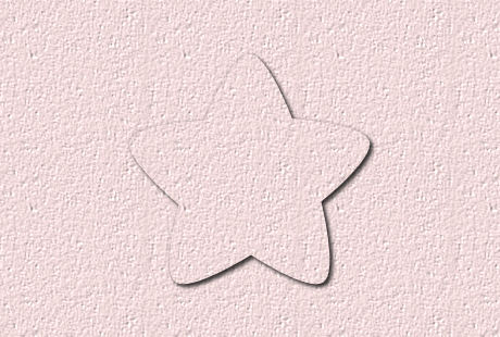
Isn't that clearer to the eye, where the edges of the shape are?
How to add the "reversed shadow"?
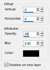
Since you do not want to create an obvious shadow opposite of the expected one, you need to add a subtle shadow. With the Drop Shadow command, you can often choose an offset of 0 both for vertical and horizontal, a low Opacity and small Blur.
It is really no different than adding a regular shadow, except that we want it to be discrete and subtle.
Do we add a "reversed shadow" to every element?
Probably not. The whole purpose of a "reversed shadow" is to add some separation when there isn't one already. If the element already has some bevels or texture or there is no flat appearance, a "reversed shadow" might not be necessary. Also, if the paper or background is very dark or busy, that kind of shadow might not be showing anyways. On the other hand, if you have several papers that are identical or very similar, a "reversed shadow will be essential.
Give that "reversed shadow" a try on some of your projects.


2 thoughts on “Using “reversed” shadows”
It is always good to have new tools -or- to find new ways to use tools differently.
I definitely see the difference with the star. It is not quite so noticeable in the other for me.
I know with some fonts, you kind of lose part of the letter. I think that this could help there, perhaps.
I was thinking that a script that did both the regular shadow and the reverse shadow on a single object might be good, especially if we bind it to an icon.
I created a script and wanted to be able to bind it. I was not sure if the script “Interactive script playback toggle” would work with the binded (bound?) icon, but it does, so I can change my values.
Or I can just do it manually if I prefer.
I also created my custom settings (instead of default) for “normal” shadow and “reverse shadow” for the times I want to do it manually.
Thank you for this mini-tutorial.
Good example with the star made of the same paper.