
Until version X5, the Materials Properties dialog window in PaintShop Pro has stayed unchanged. With version X6, Corel introduced a new Materials Properties window with additional functionalities. However, some users didn't like this new palette as they lost some features they liked. In version X8, Corel offered the option to use the older interface. Which one is best? Let's have a look at the pros and cons of each one.
The "old" Materials Properties
Until version X5, the Materials palette was unchanged, other than the various icons under each swatch. You would have three tabs on top of the palette to let the user choose colors in different ways.
The Frame tab displays the colors with the Hue frame, and inside the frame, for the same hue, you get the different Lightness and Saturation.
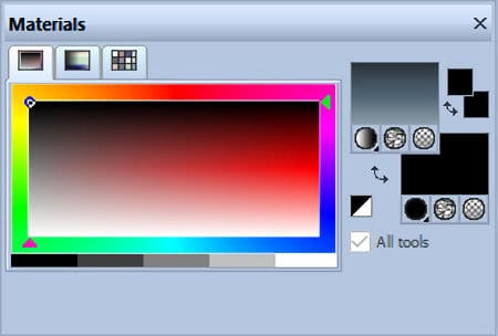
The Rainbow tab displays the colors with varying Hues (vertically) and Lightness (horizontally). There is no option for Saturation variation.
The Swatches tab will display the swatches that were set by default and any additional swatches you created.
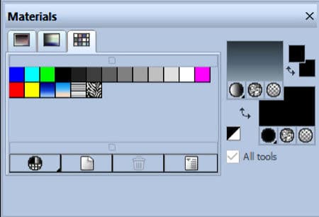
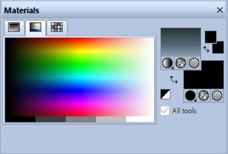
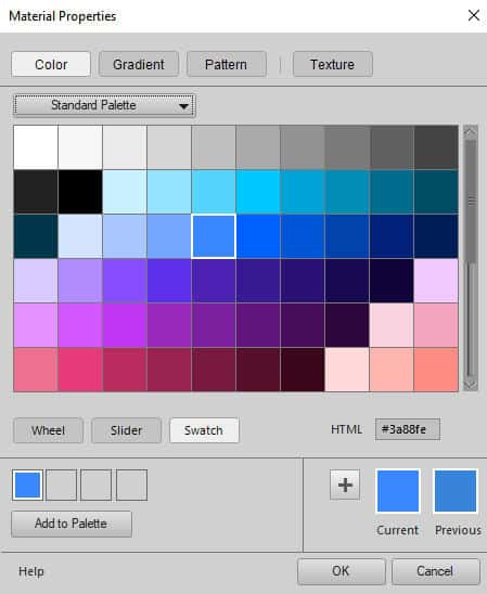
When clicking on the swatches on the right, it will trigger the Materials Properties dialog window. It will offer three tabs: Color, Gradient, Pattern.
The Color tab will be similar to the Frame tab in the Materials palette, where the Hue is determined by the outside circle, and the Lightness and Saturation will vary in the center.

This tab also offers some swatches for quick access to solid colors and you can tweak the saturation afterward.
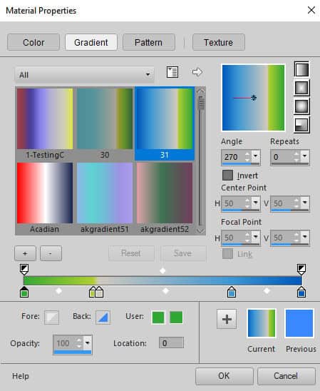
The Gradient tab, as expected, displays the gradients available in your system.
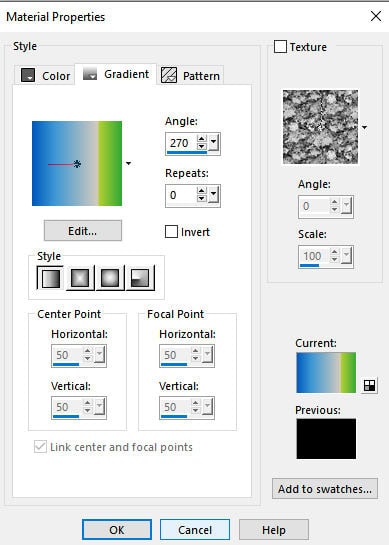
It has all the settings you would expect to use when selecting a gradient for your project.
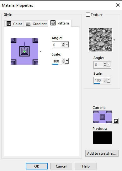
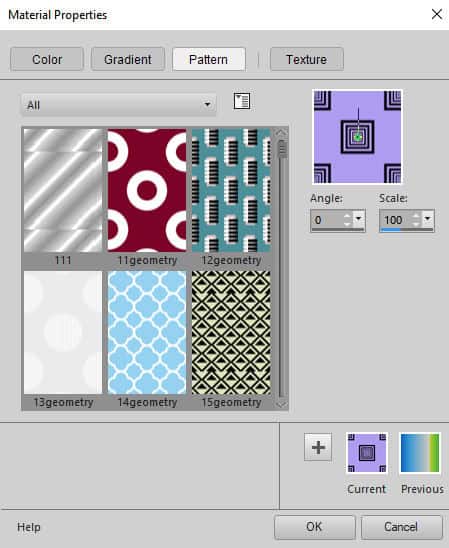
The Patterns tab will display all the patterns that PaintShop Pro can use, whether they are the default patterns or some you created.
For all those three tabs, you also have the option to select a Texture, with the possibility to change the Angle and Scale to what you need.
The "new" Materials Properties window
Since version X6, the Materials palette itself has not changed much. It still has the same three tabs (Frame, Rainbow, and Swatch). What has mostly changed is the Materials Properties dialog window. Let's have a closer look.
Once you click on one of the swatches to change the material you want to use, the initial window looks like this:
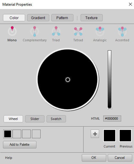
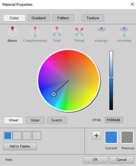
The slider on the right determines the Lightness of a color and by default, it is set to the darkess, which turns all the colors on the wheel to black. By increasing the Lightness, we can see the colors appear.
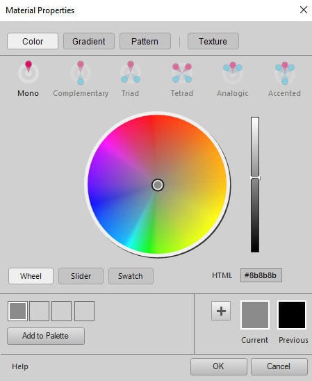
You can move the circle in the middle to select a color. The Hue is determined by where, around the wheel, the circle will go. And you determine the Saturation based on how close to the center you are (less saturated) or closer to the outer edge (more saturated).
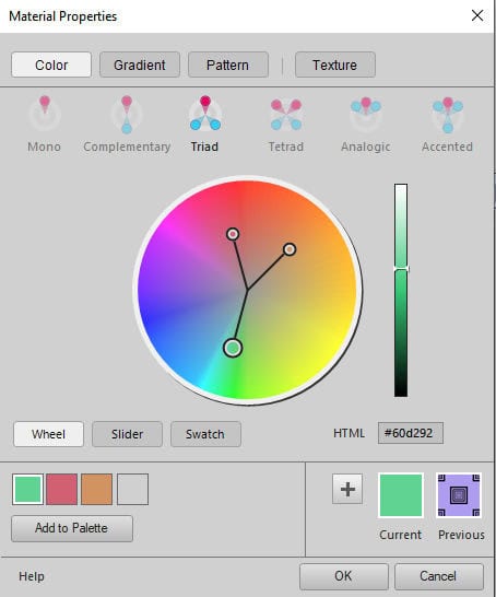
This dialog window also offers the user a way to select "matching" colors to create a palette. You can see what would be the complimentary color, or which colors would be in a triad.
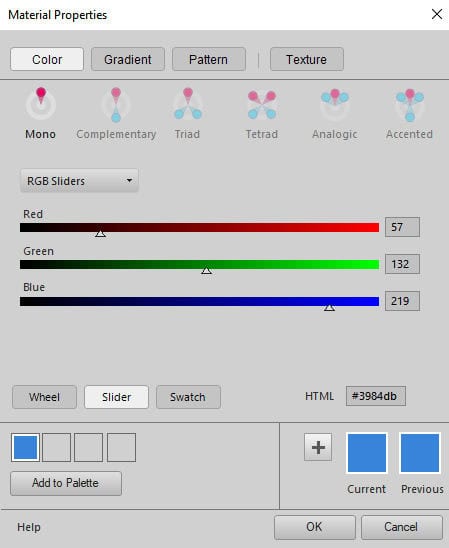
If you want to select a color based on the RGB values, you can choose the Slider option.
But if you prefer to select a color by clicking on a swatch, you can choose the Swatch button.
Under the Gradient tab, you will see the list of gradients and the same settings as in the "classic" window, although they are organized a bit differently.
Finally, the Pattern tab will give the list of patterns available.
Which one is better?
Of course, if you are already familiar with the "classic" Materials Properties window, you might be more comfortable in using it instead of the standard one. However, the santard palette has more options for you. It might just depend on your workflow and how you need to select swatches for your project.
If you need a quick way to select color, you might like the "classic" window, because it offers swatches right on the main dialog window, instead of having to click on a different button and then scroll through more swatches. You also have the various ways to access colors on the same window, whether you prefer to choose the Hue/Saturation/Lightness or the Red/Green/Blue, without having to change the display.
If you need to select colors to compose a palette of matching colors, the "standard" window will be your friend. The addition of the complimentary, triad, and other color matching types will be a great asset for you.
If you have a LOT of gradients or patterns to choose from, the "classic" window will let you view many more of them. The standard Materials Properties window will display 6 gradients/patterns, while the "classic" view can show many more:
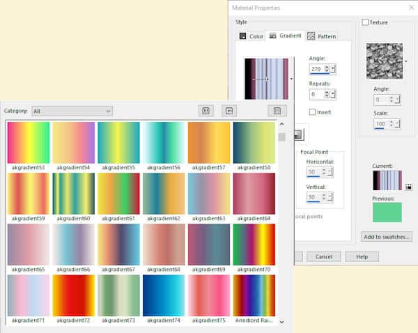
For the standard option, you will need to scroll to display all the supplies you have while on the "classic" palette, you can enlarge that drop-down window to look at quite a few of them. That means less scrolling to go through your whole stash.
What does your workflow look like? Which Materials Properties window would you prefer?
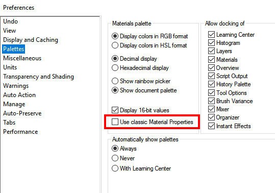
How to switch?
You can change the Materials palette under File > Preferences > General Program Preferences. From there, select the Palette option and you will see the "Use classic Material Properties".
Now, it is your turn to choose (or switch) your favorite Materials Properties window.