
Whatever project you create using PaintShop Pro, you are likely to use text at one point or another. Every time you use text, you have to ask yourself what font will be used. There are so many possible fonts, in different styles and types. What to choose? Let's have a look at one of those types of fonts: monoline.
What is a monoline font?
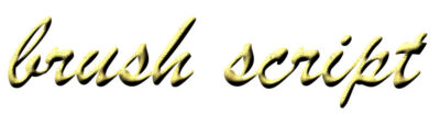
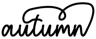
As the name indicates, monoline fonts will include various fonts in which all the strokes are the same thickness. Let's compare:
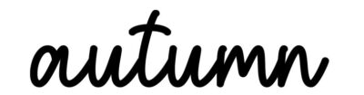
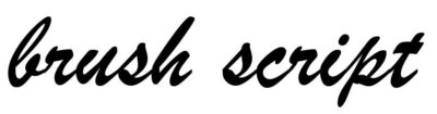
See how the "autumn" word has a stroke that is very even, while the "brush script" text has thin and thick areas, depending on the location on the individual characters. That is the main characteristic of monoline fonts. They are easy to identify that way.
Why use a monoline font?
Because the stroke is consistent throughout the whole text, a monoline font will look similar to the writing with a ball pen or a marker. If you want to write a text that will look like it is written by hand in a simple way, monoline fonts will be the best. Continuous text, like a paragraph, can benefit from using a monoline font as it will look like someone wrote it with a pen.
Other situations where you would want to use a monoline font is if you are writing on sand or snow or engraving. The evenness of a stroke created with a stick or a tip is what you are looking for.
Monoline script fonts also look elegant and don't require as much work for the reader to decipher.
Monoline fonts and effects
One big advantage of monoline fonts is that they can have a texture that will look like a continuous element. For example, if you want to create a wire text, using a monoline font will be essential. Let's compare the same effect applied to both fonts:
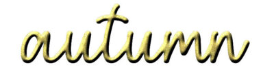
In the case of the "autumn" word, it has more of a wire look than the "brush script", which looks like a sculpture instead of a single element shaped in the letters. Of course, it also depends on the effect you want to get, in the end.
Monoline fonts are also easier to manipulate if you want to tweak some parts of them since you don't have to worry about the thickness to match the rest. If you want to add a tail or a decorative element, it is easier to match.
Script or not?
Monoline fonts can be found in scripts, but also in other typefaces that will not attach the letters together. As an example, this font, YELLOW, is also monoline, but it is not a script font.

Where to find monoline fonts?
There are many sources to find monoline fonts. Most font sites will have some, although they might not always be identified as such when you search.
Creative Fabrica offers a range of monoline fonts, like these.
Dafont has these fonts that you can choose from.
1001freefont has these monoline fonts too.
As you can see, there are many options available to you if you are looking for a monoline font for your next project.
And for more ways to use fonts, check out this article.


1 thought on “Using Monoline fonts in graphic projects”
I never realised there were that many fonts, I could have spent all day looking at these and finding projects to use these in. Thank you for leading me to the 1001 free fonts!