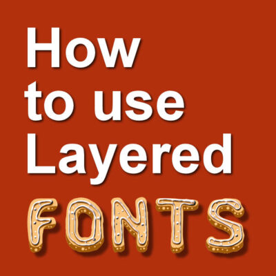

Fonts come in a wide variety. Some will be pretty standard, while others will have unusual features. Let's have a look at Layered Fonts, and how to use them.
What are Layered Fonts?
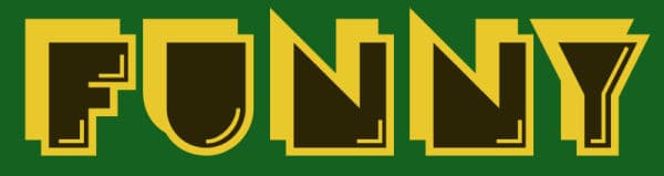
A layered font is, as its name indicates it, a font that includes more than one layer. Typically, when you type a word in your program, all the characters will be on a single layer. You can have a stroke or a fill or both, and if you want those on different layers, you can do it by duplicating the text and changing the attributes for each copy. Layered fonts, on the other hand, will include something else than a regular outline (that you could otherwise replicate with a simple stroke).
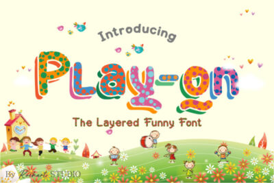
Layered fonts are not as common as regular ones but you can certainly find some around. For this tutorial, I will be using the font called Play-on that is available on Creative Fabrica, HERE.
To install or not install the fonts?
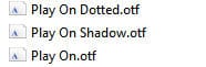
Depending on the files you get, you might have to install them on your computer. If you have only .tff files, you can use them by displaying them in a font viewer like TheFontThing or Nexus Font Viewer. They will be available to you in your PaintShop Pro without the need to install them "permanently". If you use TheFontThing, you won't be able to see the otf fonts. You will have to install them. However, if the otf font has extra glyphs, like in this case, I would have to have to install it to access those, no matter what font viewer I use. This font comes with three files:
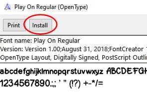
I will simply double-click on each one to get the Windows Font Viewer, and then click on the Install button.
Once that is done, all three "fonts" will be available in my PaintShop Pro.

Writing the base of your text
The layered fonts will typically consist of additional details layered on a base shape. In this example, the base shape is simply called Play On Regular. I will type in my text using that font. I can obviously choose any color I want since it is a font. I will make sure NOT to use a stroke (or outline) as I will rely on the additional layers for details.

Knowing that this font has three layers, I will go in the Layers palette, right-click on the Vector layer and Duplicate, twice.
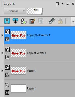
Since those layers will need to be perfectly aligned, I will group the three objects in the same vector layer. For that, I will click on the little triangle on the left of each vector layer, then click on the Object, and slide it into the initial layer.
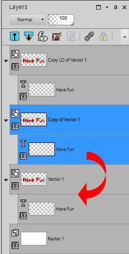
In the end, all three copies of the text will be in the same layer.
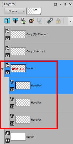
If you want, you can delete the now-empty vector layers. They are useless at this point.
If you plan on adding different textures, bevels or shadows to the individual objects, you might leave them on separate layers and link them instead of grouping them in a single layer.
Let's add the extra layers
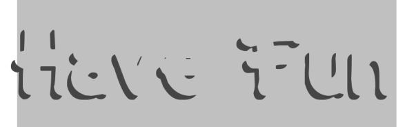
The main idea behind the layered fonts is that all the details will perfectly fit the other text, as long as they are aligned. Let's hide the top layer (so we will see the rest). Double-click on the second object in that layer to activate the text tool. The cursor will appear on the project. Highlight all the text.

At this point, let's change the font for the Play On dotted AND change the color so we can see the effect.

You can already see how this layer is different from the base one, yet, it is perfectly aligned as it only fills in the letters.
Let's do the same thing with the top object. We need to unhide it first, then double-click on it in the Layers palette, highlight it and change the font to Play On (shadow). Since it is a shadow, I will also change the color to grey.
I can already see the effect that is created with that specific font. Once it is applied, I get this result.

Now, if you look closely, you will see that the "top" layer that used the font called "shadow" is actually overlapping the base object (more visible on the "n"). I guess that would be expected with the name "shadow", so we can fix that by sliding that object below the base one.

What others examples of layered fonts?
I have found other layered fonts that could interest you. These cookies are from a font called Nyam and is available HERE.

With a little bevel, and some texture, this text can look like this:

This one is a fun font called Crack Man, and it is available HERE.
Finally, in the Creation Cassel store, there is one set of layered fonts called Two-Tone Stitch, and it is available HERE. This font includes dingbats instead of letters and numbers, and is meant to simulate various layers of threads for fantasy stitching.

Where to find those layered fonts?
Here are some sites where you can find some layered fonts:
What will you create with those fonts?
![]()


5 thoughts on “How to use Layered Fonts”
Thank you so much for this informative tutorial. I had downloaded a lot of layered fonts from Creative Fabrica and now I will try them out.
I saw the statement “On the other hand, if the files are .otf, you won’t be able to access them” but Nexus seems to make .otf files available in my version of Paint Shop Pro (I have last year’s; I didn’t upgrade). Is the inability to access them apply only to the layered font?
You are correct. NexusFont will display the otf fonts, unlike TheFontThing. However, I found out that the extra glyphs that often come with otf fonts will not be available, no matter what font viewer you are using. You will have to install the font to access all those fun glyphs. I corrected the text above to reflect that information. Thanks for pointing it out.
I have at least 2,000 fonts, I lke them very much to enhance a page!
I never thought to group them in the same layer. Always learning something new from you!