
Although shadows surround us every day, we don't analyze them in detail. We will spontaneously react to them because our brains have already integrated that knowledge. However, when we work digitally, we have to create those shadows from scratch in a way that they make sense. Let's see some basic tips to help you with your digital scrapbook projects.
1- Always in the same direction
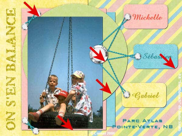
If you have a light source in one place, ALL the shadows will be in the same direction. This is important to remember this because even a small shadow in the wrong direction will give an odd impression to the viewer. Remember that our brain has integrated the meaning of shadows and even if it does not identify the culprit, it will realize that something is "wrong".
One common error in shadow direction might happen when one mirrors, flips, or rotate an element that is already shadowed. To avoid this issue, make sure you wait until all the elements are in place before adding shadows.
This also means that you have to be extremely careful if you use elements that already have a shadow.
2- Match the light spots
Many elements you can find to add to your digital layouts might have been extracted from an image and had a visible lighting source. Whether it is a button, a flower, or a paperclip, check for some lighter spots that might indicate the direction of the light source when the photo was taken. If you have a light showing on the left of an element, the shadow should go on the opposite side. This means that you will need to rotate some elements so that the light sources will match everything else.
Many elements will have a shiny surface, therefore will often have a light spot.
3- Respect proportions
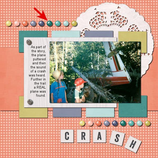
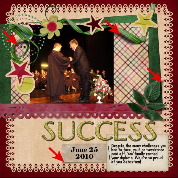
Thin elements like papers, photos, and stickers need a thinner shadow than thicker elements like buttons and flowers. If the shadows are not proportional, again, our brains will realize that something is "wrong". If a thin element has a large shadow, it will simply look like it is floating above the page.
The offset, blur, and opacity of the shadow have to be also proportional. The thin shadows with little offset will have lower blur and high opacity, while wider shadows will have more blur and lower opacity.
4- Keep shadows on a separate layer
Although this might not be visible to the viewer, it will be a big help to the scrapper. You will be able to tweak and warp a shadow on a separate layer, just enough to create interesting effects. It is totally impossible if the shadow is stuck to the element on the same layer. Another advantage of shadows on separate layers is that you can remove them if the elements have to be rotated, mirrored, or flipped, and readded later, correctly.
5- Keep it black
It might be tempting to change the color of the shadow because, as we look at shadows in real life, it looks orange on an orange surface, or blue on a blue surface, but that is not exactly what happens. In fact, the shadow is almost always black, as "lack of light", and it is the variation of opacity and blurriness that will let the color of the surface show through as orange, or blue, or green.

Can you imagine what color you would have to set your shadow if you had a multicolored background?
These are five basic tips for shadows, and if you follow those rules, your project will not make viewers cringe. If you want to go more in-depth into shadowing elements for a scrapbook page (or any other digital project), you can check out the full-length class Something about Shadows. And if you want to learn how to tweak those shadows for fancier effects, check out the class Lifted Shadows. You will be amazed what you can do with shadows!


1 thought on “5 tips for shadowing”
Love this page especially the image at the bottom that ribbon effect is awsome.
Theresa Orosz