
Whether you are following a tutorial from the DIAMOND membership, attending a live class in the Campus or watching a YouTube video where I demonstrate various techniques, you might be wondering if we are using the same version, because my workspace and tools seem to be different from yours. Don't worry. The reason they look different is that I have customized it to suit MY preferences. If you want to recreate the same workspace, you can follow the steps below. If you prefer your own, it is totally fine. Neither one is better than the other.
Workspace color
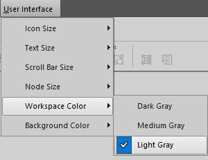
As I started using PaintShop Pro many versions ago, the workspace used to be blue. When version X2 came, it offered 2 choices for color: dark and light grey. At the time, I preferred light because I was used to that. Over time, medium grey was added and blue was also included, but only until version X5. So, I stuck with the Light Grey color, simply because it feels more familiar. Other people prefer dark workspace as they feel their photos stand out more. That is totally alright.
You can choose and change your workspace color under View > Workspace or, in more recent versions, under User Interface > Workspace.
Tabbed or untabbed
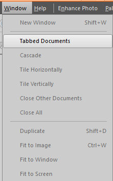
Since a lot of my work involves scrapbooking projects, I like a workspace the looks like my desk would, if I had various elements, papers and photos on it. I don't like to use the default Tabbed Documents as it is set to default in the latest versions of PaintShop Pro. This seems to be a setting that a lot of PaintShop Pro users are looking for, but they just don't know that the default setting can easily be changed.
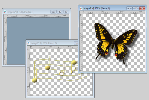
You can change that setting under Window > Tabbed Documents and uncheck that option.
Materials Palette
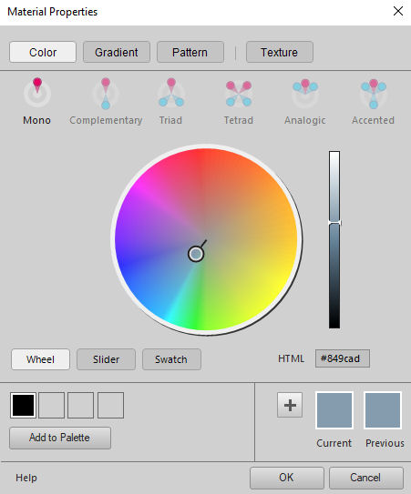
In PaintShop Pro X7, Corel introduced an extensive new Materials palette along with a completely new Material Properties dialog window. It offered a new color wheel and new features like the ability to choose various palettes of complementary colors or, matching colors. It has been welcomed by a lot of graphics artists and painters as it gave them even more power over the color options, however, my needs are much more modest and I prefer the simpler original Materials palette. Since PaintShop Pro X8, we have the option to use that original Materials palette.
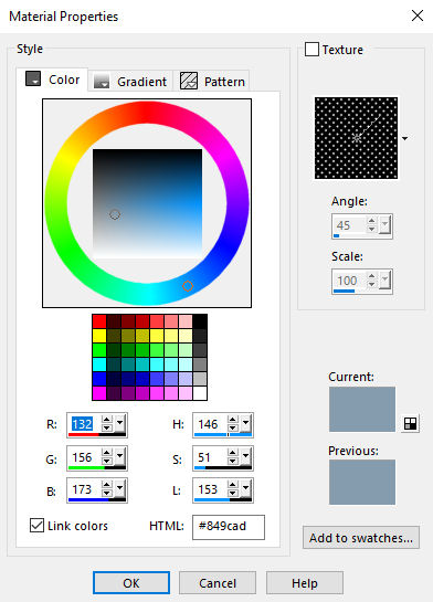
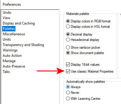
Go to File > Preferences > General Program Preferences, and select Palette. Check the option called "Use Classic Material Properties".
Add a ruler
I always like to have at least a vague idea of what size my images are. On the workspace, the image will often fill as much space it has available, whether it is 500 pixels or 5000. This can lead to issues when I need to layer different images together when I realize that one image is the wrong size for the project. Maybe the button is too small, or the overlay I want to use is 3 times too large. That is why I like to have a ruler. It does give me a sense of proportions.
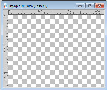
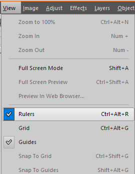
Go to View > Rulers and click on that. You will see a checkmark appear, and every image will have a top and a left ruler from this point on.
Now it is your turn to customize your own workspace the way you like it. And you won't feel like I am using a totally different version of PaintShop Pro than you are!


16 thoughts on “4 Ways I Set up my Workspace”
Like Ron, I can not get my materials pallet on 2021 to look like Cassel’s. I posted a picture of what I did on the Bootcamp page. Perhaps someone will be able to help us.
So far so good. Did note maybe a slight mistyping for the Rulers option: “Go to Image > Rulers and click on that.” I’m sure you meant “Go to View > Rulers and click on that.” In PSP 2021, kinda wish my classic Materials Palette looked like the photo shown above. Mine is square, no “RGB/HSL” and rest is small and crammed up below and to the left (Foreground/Background and Stroke/Fill) of the square color palette. Would there be a setting(s) I missed? Or, is it because I haven’t used it yet?
Ron, you are absolutely right about the error in the post. It has been corrected. Thank you for the catch.
As for the Materials palette, is it possible that you have a different “tab” active? There are three on top of those swatches.
If you are referring to those three icons (Frame, Rainbow & Swatches), I’ve tried them all. I must still not be clicking the right options/icons. Wish I could include a photo here of what it looks like.
Hi all!
My apologies for starting today. I am look forward for this – my first scrapbook tutorial.
Amparo
I LEARN SO MUCH.NOW I AM GOING TO PRACTICE AND IMPRESS MY FAMILY WITH MY SCRAPBOOK.THANK YOU
Thank you, you make it easy.
Thank you
I found some things not on your display but nothing about that it wont let me make a new space place to work but I hope to see better now on my software working like yours and like how you tell me the short easy to way to do things. thank You going to to see if not ill try to do the other thing ss you said, thank you you rock as a teacher.
I did that last night and it didn’t show up, I took a screen shot but can’t posted it here. Nothing I do will allow me to change it.
Edie, drop me an email with that screenshot. I’ll look at it.
Thank you for sharing your knowledge! I’m excited to learn!
thanks again for sharing your knowledge. I switched to light gray 😉
Thanks!!
Can you get the old color wheel materials pallet for the PSP 2020 I don’t care for the other color pallets?
Thanks Edie
Yes, in File > Preferences > General Program Preferences and click on Palettes on the left and check the Use Classic Material Properties. That is what is explained above, and that is what I use.
Great information – thank you!