When you are creating scrapbook layouts, one would typically work on one page at the time, gathering photos, stories and elements on that page. However, there are times when one page is not enough. That is when you get the opportunity to create a double-page that would appear as one unit when printed in a book. Let's have a look at various situations that could require a double-page.
Lots of photos
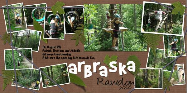
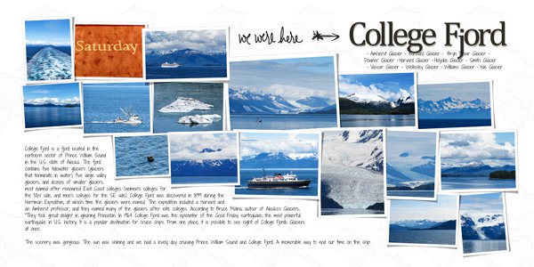
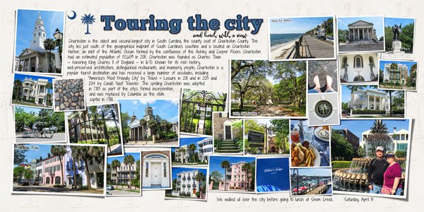
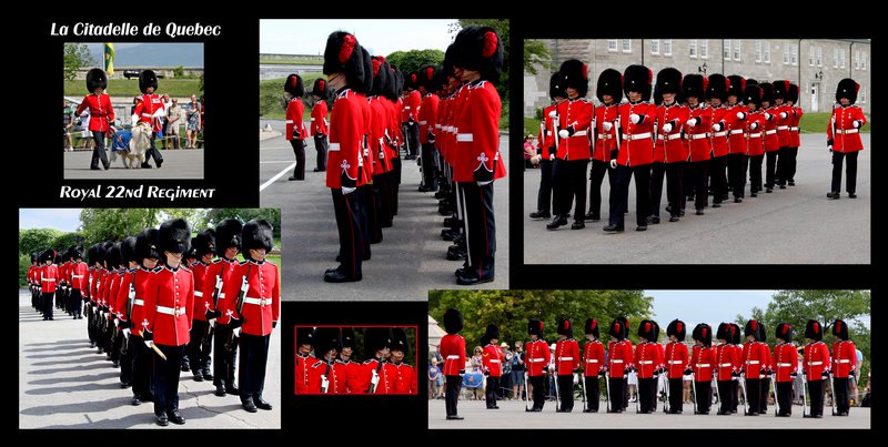
This is an obvious reason. On a single page, you can only include a limited number of photos unless you want to size them down a lot. In that case, they are not displayed at their best. Whether you have lots of photos of a particular event, a specific location or individual people, a double page offers you the space to showcase them.
Series of similar photos
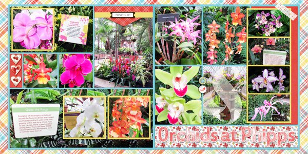
Although this can easily fall into the category of "lots of photos", these double-pagers have something else that ties both pages, and it is the fact that the photos are of the same type so it would be like a gallery of "something". This could be a great way to display your collection of teddy bears, the flowers of your garden, or


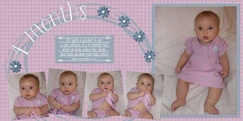
Timeline
The very format of a double-page allows you to create something that spreads widely. Creating a timeline often requires such a wide span, whether it could be a heritage layout showing various events in your family line, or the schedule of a trip, or the growth of your child, it is so much easier to have such a timeline on a double-page than trying to squeeze it into a single page.
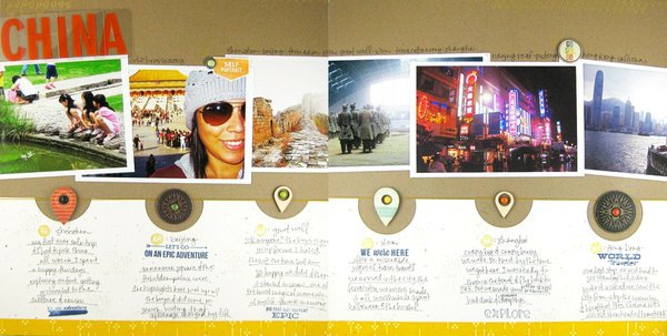
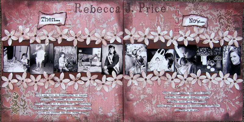
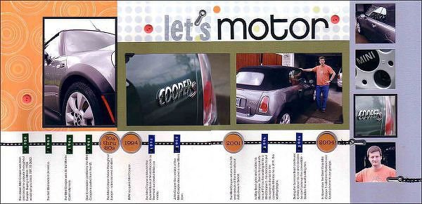
Panoramic photos
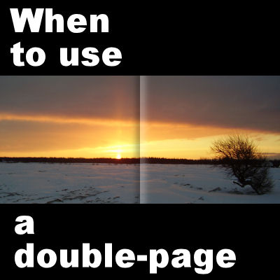
The basic format of a panoramic photo is usually much wider than regular photos, so they lend themselves very well to be displayed in a layout that is twice as wide as a single page. Nowaday, it is easier than ever to take panoramic photos with some cameras, and if you don't have that feature in yours, you can always use some tools to create one from individual images (read about the ICE program in this blog post).
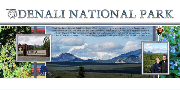
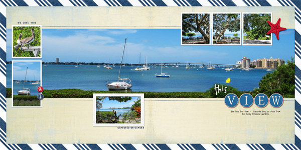
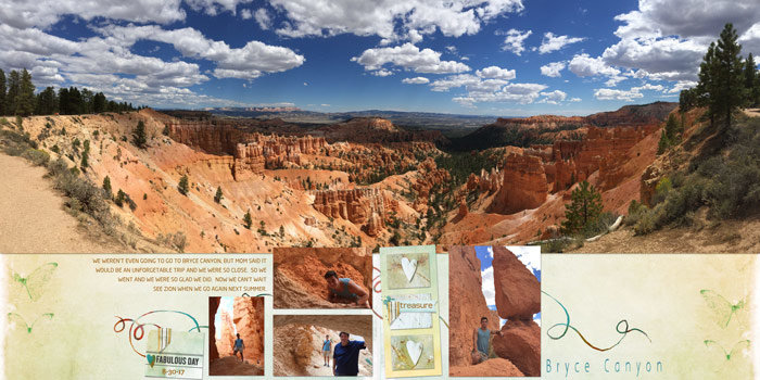

Large image to feature
Although this is close to the idea of a panoramic photo, maybe you just have one photo that you find particularly interesting and you want to display it as large as you can. With the newest cameras, you can now take very large photos that become a focus for your story. Why not use those on a double page, especially if they are in a landscape format?

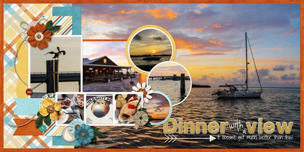
And occasionally, although the photo is not a panorama, nor a super big one, it has that special width in its format that makes it so much more interesting in a double page layout.
Do you have some double-pages in your own repertoire? What prompted you to create it as a double-page instead of a single page?
And if you have never done a double-page, why not give it a try? Especially if you want to print a book, it makes for a nice large project to display as one unit when you open the book.






2 thoughts on “When to use a double-page”
Since ALL of my pages are printed into Shutterfly books, I have to be very careful a about using a double page layout. If books are opened up to a very flat position it sometimes separates the binding of the book. SO, I leave a small bit of the background paper down the middle of the double pages so that the person viewing the book isn’t tempted to “flatten” the book out to see what is in the middle of the double page. I don’t really attempt to use a photo across both pages, but choose to use what will fit on a 12×12 page. I have used the left page for the part of a wide photo and the second page for the second part of the wide photo, but I do not continue those photos to the very middle edge of the two adjoining pages.
Yes, avoiding a photo in the very center is essential if you don’t have a flat book printed. The same goes for text (title or journaling) to avoid in the center for the same reason.