
In 2016, you'll probably be seeing a lot of these two colors, namely Rose Quartz and Serenity in various places throughout. Be it on new furniture, new paint job, new clothes and shoes, makeup, and many more that have to do with the latest trends. Why? Because these two lovely colors are officially Pantone’s Color of the Year for 2016.
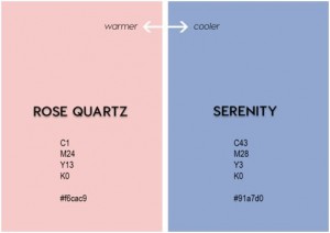 For digital scrapbookers, color themes are a common thing. In Paintshop Pro, you can use these colors by entering the following hex values: Rose Quartz is #F6CAC9 and Serenity is #91A7D0. Now it should be easy to customize your own color palette with these colors.
According to Pantone, “Whether in soft or hard surface material, the pairing of Rose Quartz and Serenity brings calm and relaxation. Appealing in all finishes, matte, metallic and glossy, the engaging combo joins easily with other mid-tones including greens and purples, rich browns, and all shades of yellow and pink. Add in silver or hot brights for more splash and sparkle.”
There is so much you can do starting with those two colors! Create some gradients. Find some complimentary colors, or a set of monochromatic ones. Create soft color papers and accent with more vibrant elements.
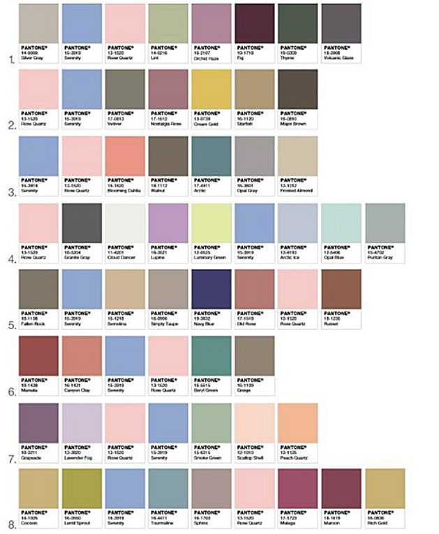
They also suggested colors palettes that I think would be great to use in digital scrapbooking layouts and kits. Even though each of those palette does include both colors, you can see how the palettes are very different from one another.
Because the colors, rose quartz and serenity, are versatile, you can easily create elements, backgrounds, and patterns in Paintshop Pro. In fact, it would be a great idea to start your first digital scrapbook layout for 2016 using these! Are you up to the challenge?
I previously posted a blog on 4 common paper patterns. You can use that as a guide and substitute the colors with the hex values, #F6CAC9 and #91A7D0 for Rose Quartz and Serenity respectively, and you’ll have your very own Color of the Year papers! You can use a variety of scripts and one of the palettes above to quickly generate an array of seamless tiles with those colors!
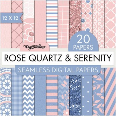
Here is an example of digital papers using those 2016 Color of the Year scrapbook pages (this is the only paper set I found using exactly those colors, but if you find more, mention them in the comments and I can add more resources):
As spring will be upon us soon enough, these colors are also perfect for the upcoming season. Do you like the colors, Rose Quartz and Serenity? What do you plan to make with these delightful color combos? Do share your thoughts in the comments below.
For more information on the Pantone color of the year (and if you need to order anything from Pantone), check this out.


2 thoughts on “2016 Color of the year”
I love both of these colors!! Well, I like any shade of pink, but this is one of my favorites. I can see using this all year long!
I would love to see your project using those colors. I also like them and really find it fun that Pantone is even suggesting complete palettes using them (less work for us!).